Responsive Web Design Services That Convert on Every Screen
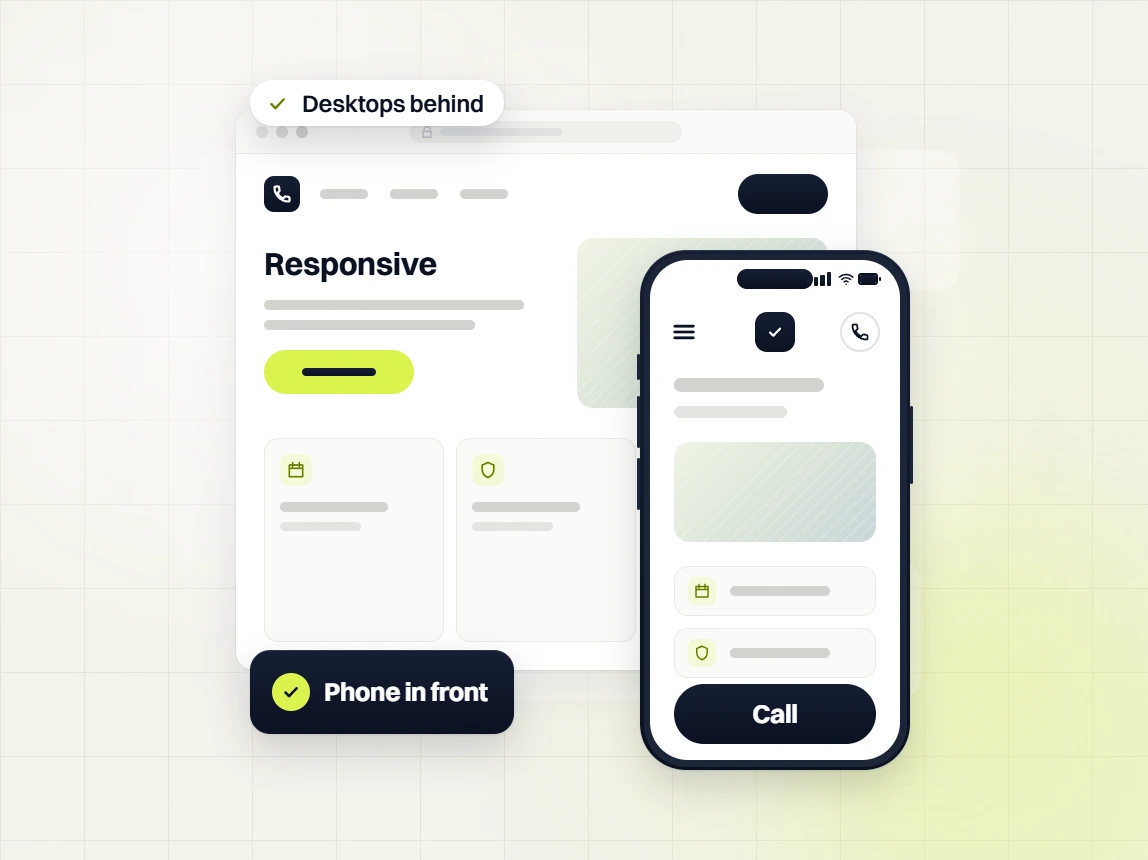
63% of your traffic lands on a phone. An unresponsive site sends visitors back to Google before they see your offer. Redefine Web builds mobile-first, then scales up to tablet, laptop, and desktop. Fixed fee. 30-day launch. Mobile Lighthouse 90 or better.
Three reasons your current site loses mobile visitors
Slow mobile pages drop out of Google's top 10
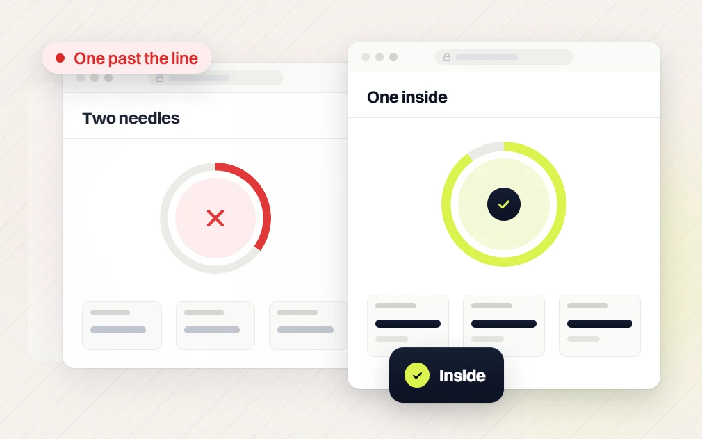
Mobile-first indexing ranks the phone version of your site. Missing Core Web Vitals costs 38% of mobile clicks year over year. Every Redefine Web build launches with LCP under 1.8s, INP under 200ms, and CLS under 0.05 on a throttled 4G phone.
Layout breaks at the widths your buyers actually use
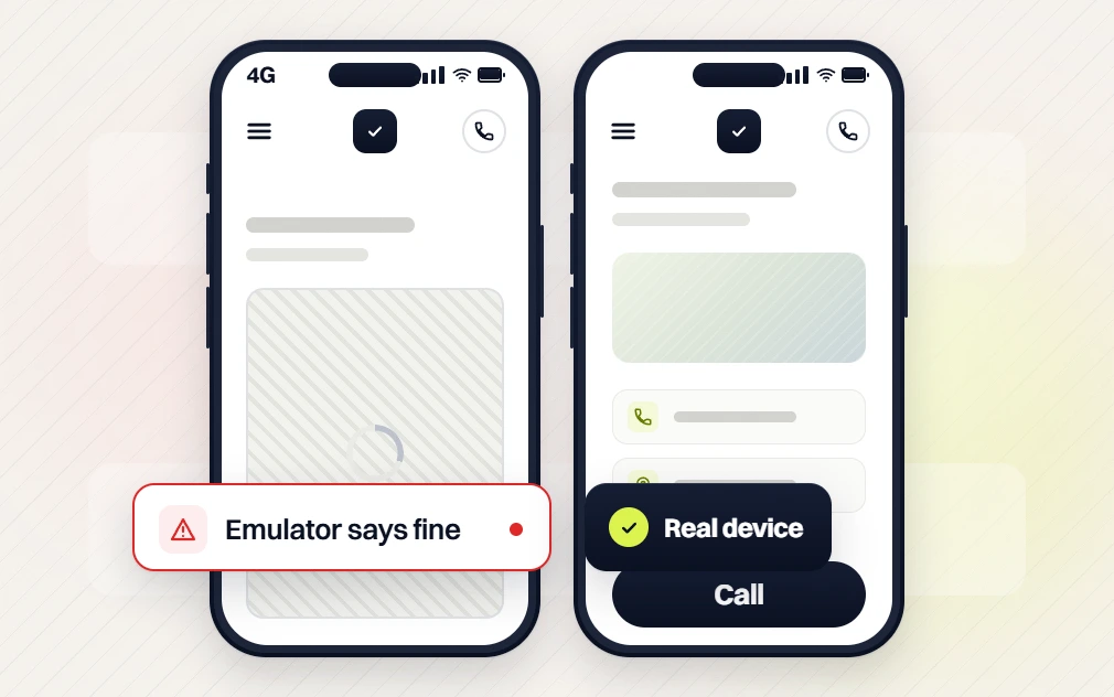
DevTools emulation misses real bugs. Every build gets QA'd at 390, 768, 1024, and 1440 on real hardware, not a resized Chrome window. If a component breaks on the CEO's phone, it does not go live.
Buttons sized for a mouse cost you mobile bookings
Desktop buttons work at 32px. Thumbs need 44px minimum with 8px of clearance. WCAG 2.5.5 makes it an accessibility rule, and every interactive element on a Redefine Web build meets it.
Three outcomes every responsive build produces
Conversion-first layouts, click-to-call above the fold, and a mobile-first form flow move the number that fills the pipeline by 25 to 45% per quarter.
Every page ships with Organization plus Service schema, an XML sitemap, and a full 301 map. Rankings start compounding on day one, not six months later.
Your name on the domain, your logins on the CMS, your team trained on the platform. Codebase, hosting, CRM keys, and analytics all move with you.
Four stages. Every step ends in a sign-off
Same rhythm across every responsive build. Each stage ends in a written deliverable your team can review, sign off, and hold us to.
Brief signed before we draw a pixel
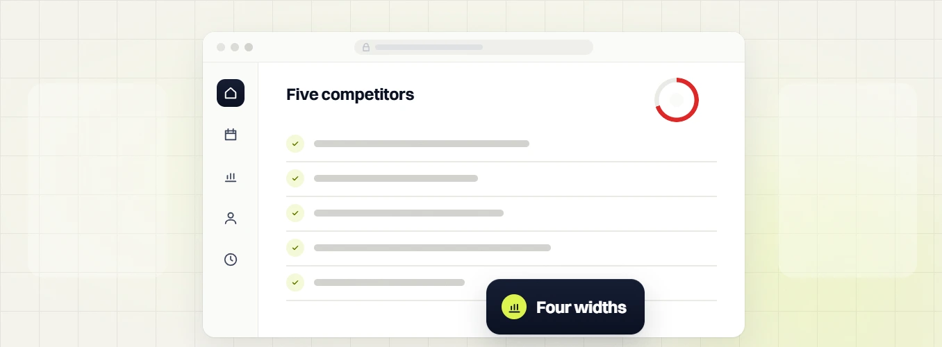
Owner interviews, a full audit of the current site, and a benchmark against 5 direct competitors at 4 viewports. You end with a written brief your leadership signs off before design begins.
Mobile-first design system
Wireframes validated against your top 3 conversion actions before pixels are drawn. Engineer reviews every component the week it is designed, so what looks right in Figma also holds up in code.
Responsive front-end build
Hand-tuned PHP on WordPress or Next.js by default. Every page launches with LCP under 1.8s, INP under 200ms, CLS under 0.05, and WCAG 2.1 AA verified by Axe plus a human on NVDA.
Off-hours cutover and 30-day watch
Cutover runs off-hours with a written rollback plan, a full 301 map, and uptime plus Core Web Vitals monitoring live from the minute the DNS record propagates. On day 31 you take the keys.
What you actually get from our responsive web design services
Fixed scope, fixed timeline, fixed outcomes. Every phase has a defined deliverable, a written sign-off, and a date on your team calendar.
Discovery that earns the brief
Nothing gets designed until we prove we understand the business. Two weeks of owner interviews, a full audit of the current site, and a benchmark against 5 direct competitors at 4 viewports.
3 to 4 working sessions with owner, sales lead, and ops lead. How buyers discover you today and why they convert or bounce.
Current site, GA4, ad accounts, CRM access, tracking pixels, performance baseline against Core Web Vitals on real hardware.
Side-by-side comparison of 5 direct competitors on mobile, tablet, desktop, conversion path, and organic visibility for target queries.
Every page of the current site graded at 390, 768, 1024, 1440 with a fix list ranked by revenue impact.
20 to 30 pages covering buyer persona, page architecture, conversion goals, technical scope, and integration plan.
Leadership signs the brief. Nothing moves to design until every open question has an answer on paper.
Mobile-first design system
Every design decision has to earn its place on the smallest screen first. Wireframes get validated against your top 3 conversion actions before pixels are drawn. Engineer reviews every component the week it is designed.
Type scale, color, spacing, button library, form library, card patterns. Documented and engineer-validated.
Home, services, about, case studies, pricing, contact, blog. Phone view first, desktop second, tablet reconciled between the two.
Every CTA passes a 44px floor with 8px clearance. Primary buttons hit 48px. Thumb-zone map documented per template.
Every conversion action prototyped and validated with your team before design polish begins.
Click-through Figma prototype of the full user flow, tested on real phones before we write production code.
Color contrast, focus states, and screen-reader flow reviewed against WCAG 2.1 AA before design is signed off.
Engineering that hits 98 PageSpeed on mobile
Slow sites lose leads, so Core Web Vitals is a hard launch criterion. Hand-tuned PHP on WordPress or Next.js by default. Every page launches with LCP under 1.8s, INP under 200ms, and CLS under 0.05 on a throttled 4G phone.
Fluid across phone, tablet, laptop, and large displays. Cross-browser QA in Chrome, Safari, Firefox, and mobile Safari.
Editor experience the ops lead can use without a developer. Pages, blog posts, and seasonal offers all self-serve.
LCP under 1.8s on mobile, INP under 200ms, CLS under 0.05. Verified with Lighthouse and CrUX field data before the site goes live.
Axe automated scans, manual audit, NVDA and VoiceOver screen-reader tests. ADA compliance is table stakes.
Every template validated on current iPhone, iPad, and a Pixel or Samsung. Throttled 4G. Real thumbs, real gestures.
JS bundle, CSS weight, image weight, and font count all live on a written budget. Regression fails the build.
Integrations that survive your next stack change
Your CRM, analytics, and review tools are not going anywhere in the next 2 years, so we build against them properly. Every integration ships with docs so a future vendor can pick up the work.
Sticky mobile CTA wired to tel: and to your booking tool (Calendly, Acuity, or a native form).
HubSpot, Pipedrive, or Zoho with server-side event forwarding for GA4 and Google Ads. UTM parameters preserved end-to-end.
WooCommerce or Shopify checkout tuned for 390px thumbs. Apple Pay, Google Pay, and Shop Pay wired in where the platform supports them.
Google, Yelp, Trustpilot, or Clutch pulled through review widgets that respect Core Web Vitals.
GA4, GTM, Search Console, and Bing Webmaster verified. Conversion events named to match your CRM stages.
Installable to the home screen, offline shell, and push notifications when the business case earns the extra 30 to 60% cost.
Launch with a written rollback plan
Cutover runs off-hours with the change window documented. Full 301 map, uptime and Core Web Vitals monitoring, and a 30-day watch so nothing goes sideways after the domain flips.
Every cutover ships with a documented rollback path so DNS can go back inside 15 minutes if a blocker appears.
Every legacy URL redirected to its closest new home. Zero 404s on launch day, verified with Screaming Frog and GSC.
Live monitoring from the minute the DNS record propagates. LCP, INP, and CLS tracked at the URL level, not just site-wide.
Coverage errors, mobile usability flags, and Core Web Vitals reports reviewed daily for a month post-launch.
One recorded session plus a written runbook so the ops lead can add pages, edit blocks, and update offers without a developer.
Day 31 you take the keys or roll into a maintenance retainer from $199/mo. Either path, the codebase and hosting are already in your name.
Four web design tiers for every stage of growth
Every line item listed. The quote you get is the invoice you pay. Take any tier as a project fee, or split it into the flat monthly plan.
Fast, credible site converting existing reputation.
Full booking engine: scheduling, checkout, customer reporting.
One brand, every office found, location-level tracking.
Design system the whole group launches on. Ops-team-spec integrations.
Every web design feature, tier by tier
HOVER ANY FEATURE FOR A PLAIN-ENGLISH EXPLANATIONWebsite + design +
Booking + patients +
SEO + visibility +
Care + support +
Real responsive builds, real numbers
Responsive web design questions answered
Everything owners ask before signing on a responsive web design engagement.
What is the main goal of responsive web design?
+
The main goal of responsive web design is to keep a site usable and readable on any device, from a 390px iPhone to a 1440px desktop. Redefine Web builds every responsive web design services engagement mobile-first, meaning the smallest breakpoint gets designed first and the layout scales up as the viewport grows.
What that looks like in code. Flexible CSS grid with rem-based type scale. 4 core breakpoints tested on real hardware at 390, 768, 1024, and 1440. Images served through srcset so a phone never downloads a 1440px file. Fonts subset to the characters your pages actually use. Interactive elements sized to a 44px tap floor per MDN accessibility guidance.
What that looks like on your revenue. Better mobile conversion rate. Better organic rankings under Google mobile-first indexing. Lower ad spend because Quality Score rewards mobile speed. And a lower support load for your team when customers stop calling to say the site is broken on their phone.
What is the difference between mobile-first and responsive design?
+
Responsive design is the technique. Mobile-first is the order you apply it in. Responsive means the layout adapts to any screen using flexible grids, images, and CSS media queries. Mobile-first means you design the smallest breakpoint first and add complexity as the viewport grows, instead of designing for desktop and stripping features away on phones.
Why the order matters. Mobile-first forces every page down to what actually earns a click on a phone. Content, forms, and CTAs get prioritized instead of squeezed. Load performance benefits because the base CSS and JS bundle stays small. Accessibility benefits because tap targets and font sizes get sized right the first time. Every responsive web design services build from Redefine Web starts at the smallest viewport and works up.
The result on a real project. Cleaner code, fewer breakpoints, a lighter payload, and a mobile Lighthouse score that clears 90 at launch without a last-week performance rescue.
Why is responsive web design good for SEO?
+
Responsive web design helps SEO in 5 ways. It aligns with mobile-first indexing, improves user experience metrics Google tracks, boosts Core Web Vitals scores, consolidates URLs and link equity into a single canonical, and lifts conversion from the traffic you already have every month.
The mechanics behind each one. Mobile-first indexing means Google ranks the mobile version of your site, per Google Search Central, so a responsive build is the baseline for every ranking query. UX metrics like bounce rate, dwell time, and pogo-sticking all improve when the mobile layout works. Core Web Vitals like LCP, INP, and CLS are ranking signals with benchmarks published on web.dev/vitals. A single URL for phone and desktop keeps authority in one place instead of splitting it across an m-dot subdomain. Conversion rate lifts on the same traffic pool.
The commercial upside. Same traffic, more revenue. That is the payoff of a responsive web design services engagement done right the first time.
How much does responsive web design cost?
+
Fixed-price, published on the page. Redefine Web responsive web design services start at $799 for a Starter small-business build and scale to $18,000 or more for custom enterprise scope with CRM integrations and multi-region launches. Every quote is the number you sign, with no hourly billing or scope-creep clauses hidden in the SOW you get back.
The tiers by scope. $799 fixed for Starter, up to 5 pages on WordPress, mobile-first, Core Web Vitals green, WCAG 2.1 AA verified before launch. $1,299 fixed for Standard, up to 10 pages, blog, contact form with CRM routing. $1,999 fixed for Growth, up to 20 pages, on-page SEO on every URL, click-to-call plus click-to-book wired in. From $3,500 for custom scope with API integrations, ecommerce, or membership work. Or $99 per month pay-monthly for 24 months on the Starter tier if cash flow matters more than upfront cost.
What is not extra. Hosting, SSL, launch monitoring, and the 30-day post-launch watch are all included in every tier.
How many devices does a responsive website design agency test on?
+
Emulator testing is not real testing. Real hardware is. Every Redefine Web build gets validated at 4 defined breakpoints on real devices before we accept the release. If the site does not feel right on your CEO’s iPhone, it does not go live. That standard applies to every responsive website design agency engagement we take on, regardless of tier.
The real devices in the QA rack. Current iPhone (iOS Safari, real gestures, throttled 4G). Current Android (Chrome and Samsung Internet on a Pixel or Samsung Galaxy). iPad portrait 768px and iPad landscape 1024px. 1440px desktop on macOS Chrome and Windows Chrome. Every template gets QA’d on every device.
What we track during QA. Layout breaks, tap-target misses, form flow, scroll performance, and any regression against the WCAG 2.1 AA checklist. Every bug filed gets a written retest before launch, and the QA log ships with the handoff so your team can rerun any test after go-live.
What breakpoints does a responsive website need?
+
Four widths carry 84% of US web traffic in 2026: 390px (iPhone), 768px (iPad portrait), 1024px (iPad landscape and small laptop), and 1440px (standard desktop). Every Redefine Web responsive build gets designed at these 4 widths and tested on real hardware at each. Anything past 4 usually adds bugs, not conversion value on the pages that matter.
Why we stop at 4. The layout should fluidly scale between the 4 anchor widths using CSS clamp() and container queries where they earn their keep. A 375px vs 390px branch adds QA cost without moving conversion. If the layout is fluid, it handles the 15px gap without a new media query.
What we do add on top. A print stylesheet for services businesses whose customers still print quotes. A dark-mode variant when the brand supports it. And a 1920px cap so the design does not stretch on ultra-wide monitors. Each of those slots into the same responsive framework, no separate template needed.
How fast does a responsive website need to load on mobile?
+
Fast enough to clear Core Web Vitals on a throttled 4G phone. LCP under 1.8 seconds, INP under 200 milliseconds, CLS under 0.05. Miss any of the 3 and Google’s mobile-first indexer drops your site out of the top 10 for the query, per benchmarks on web.dev/vitals.
The bar every Redefine Web build clears before launch. LCP under 1.8s means Largest Contentful Paint measured on a Moto G4-class device with 4G throttle, not a MacBook on WiFi. INP under 200ms means button and form response measured on real interactions, not synthetic scripts. CLS under 0.05 means no layout jump after first paint. Hero image reserves its box before it arrives, ads and reviews load in reserved slots, and font swaps do not push text around after the page has settled.
How we hit the numbers. Font subsetting, WebP and AVIF images, deferred non-critical JS, and a strict performance budget that fails the build if it drifts.
What is the touch target size for a mobile-friendly website?
+
WCAG 2.5.5 sets the accessibility floor at 44px by 44px with 8px of clearance between targets. Apple’s Human Interface Guidelines set the same minimum. Anything smaller becomes a fat-finger problem, especially on booking forms, checkout, and CTAs where a mis-click costs a conversion. Every mobile-friendly web design build we ship enforces the rule.
How we spec it on every build. Primary CTAs at 48px height minimum with 24px of padding on both sides. Secondary buttons at 44px minimum. Form fields at 48px height with a visible label above the input, never floating inside. Nav links on mobile at 44px tap area even when the visual glyph is smaller. Icon-only buttons get an aria-label plus a 44px hit box, always.
Why it moves revenue. A 320px tap target on a booking form fails on a thumb about 30% of the time. Bump it to 48px and misses drop below 5%. That is real bookings recovered on the same traffic.
PWA vs responsive website, which does my business need?
+
Responsive is the default. PWA is a specific upgrade you buy on top of responsive when the business case supports it. A responsive site loads in a browser like any other site. A PWA installs to the home screen, works offline, and can send push notifications, but it costs 30 to 60% more to build and maintain and only pays back for a handful of use cases.
When PWA earns its cost. Field-service teams who need offline access on job sites. Ecommerce brands with a repeat purchase rate over 30% where push notifications drive real reorders. Membership sites where returning visitors are the revenue engine. B2B tools whose customers open the site 3+ times a week.
Everyone else. A responsive PWA-lite build with an installable shortcut, offline shell, and a manifest is enough. You get 80% of the perceived benefit at 5% of the extra cost. Redefine Web scopes the PWA layer as an optional add-on to any responsive web design services build.
How long does a responsive web design project take?
+
10 to 16 weeks from kickoff to launch on a signed timeline. Small-business builds run at the low end. Custom scope with CRM integrations and multi-region launches sits at the high end. The delivery date lives in the contract, not the Slack channel, and it moves only when a scope change gets a written change order.
The standard timeline on every SOW. Weeks 1 to 2 for discovery and information architecture. Owner interviews, technical audit, content audit, competitor benchmark at 4 breakpoints. Weeks 3 to 6 for design system and page designs, mobile-first, engineer-validated the same week. Weeks 7 to 12 for the production build in WordPress or Next.js, with Core Web Vitals verified continuously against a written performance budget. Weeks 13 to 14 for cutover with a written rollback plan, plus 30 days of live monitoring after DNS flips.
What slows a build down. Missed content deadlines, late CRM access, or expanded scope mid-project. We flag every risk in writing on the weekly status call so the timeline stays credible.
Do you migrate content from the old website?
+
Yes, and this is where most agencies quietly cost you traffic. About 1 in 3 of your existing pages will get retired on the way over because the data shows they are not earning their keep. The other 2 in 3 get audited page-by-page, cleaned up, and mapped to a new URL before we touch DNS.
Every migration includes the following. Full content audit, every URL scored on traffic, ranking, and conversion. Retire, rewrite, or redirect flagged on a spreadsheet you sign off on. A 1:1 or many-to-1 redirect map, every legacy URL has a target on the new site. Zero 404s on launch day, verified with Screaming Frog and Search Console. A rewrite pass on kept pages, banned words stripped, mobile-first formatting applied, structured data added.
Post-launch, we watch Search Console daily for 30 days and file a report on any coverage error, mobile usability flag, or Core Web Vitals regression that shows up after the domain flips.
What if I want changes after the responsive website launches?
+
You get 2 paths after launch, both fixed-price. Take the monthly maintenance retainer from $199/mo and small edits, security patches, plugin updates, and managed hosting are all included in the fee. Or quote each new project separately as scope comes up over the year. Redefine Web does not bill hourly for either path, and every price is on the page before you sign anything.
What the 3 maintenance tiers cover. Essential ($199/mo). Monthly security patches, plugin updates, managed hosting, and 1 hour of content edits every month. Growth ($299/mo). Everything in Essential plus 3 hours of edits, monthly performance report, and quarterly Core Web Vitals audit. Scale ($499/mo). Everything in Growth plus 6 hours of edits, priority response inside 4 hours, and a monthly strategy review with the account team.
What is not billable. Bug fixes on anything we built get patched at no extra cost during the 30-day watch, and security patches ship inside 24 hours across every tier.