
Website speed test sites hand you a number out of 100, and that number is a simulation of one page load on one machine, scored against a curve. Directly underneath it, on the same report, sits a second set of numbers collected from people who really visited your site. The two often disagree. The one most people screenshot is the one that matters least.
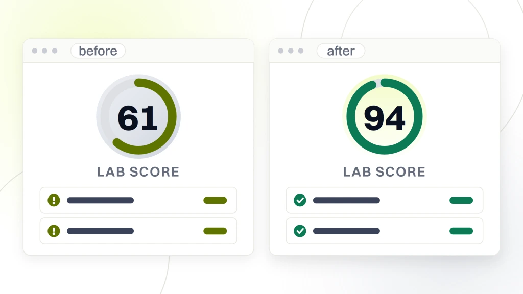
This costs real money in a specific way. A team spends a quarter lifting a score from 61 to 94, ships nothing a visitor would notice, and the assessment that Google actually reports on the same page stays exactly where it was. Meanwhile the one metric that measures whether your buttons respond when tapped is not in the score at all, because the tool that produced it cannot measure that metric. None of this is hidden. It is documented, and almost nobody reads it.
What website speed test sites actually return, and why some test the wrong thing
Start with a problem nobody writes about, which you can settle in one second. Search for website speed test sites and the results are not all measuring the same object. Some measure your page. Others measure your broadband line. The tell is the unit. If your result came back in megabits per second you measured your own internet connection and learned nothing whatsoever about your website, so you want a connection tool rather than anything described on this page. If it came back in seconds, milliseconds or a score out of 100, you measured a page, and the rest of this article is about that number.
Page tools take a URL and load it. Connection tools take nothing and push data to your own device to measure your household or office link. Both are called speed tests, both rank for the same phrase, and Google’s own results block asks both questions side by side, how you test a website speed and what the best website is for checking your internet speed. Those are two different purchases, and people land on the wrong one more often than you would think, conclude the site is fine because the number was large, and move on.
Once you are on a page tool, the rest of this article applies. Speed is one slice of what a site gets graded on, and our website audit page sets out the full list and where speed sits inside it.
The two numbers on one report, and which one counts
Google’s own tool shows both, stacked, with no warning that they come from different worlds. Getting this one distinction straight makes the rest of the report readable.
Google’s documentation defines them plainly. Field data “is a historical report about how a particular URL has performed, and represents anonymized performance data from users in the real-world on a variety of devices and network conditions”. Lab data “is based on a simulated load of a page on a single device and fixed set of network conditions”.
Read those two definitions against each other. One is a population of real visits. The other is one load, one device, one fixed network. They are not two views of the same thing and they were never intended to agree. The score out of 100 is built from the second. The Core Web Vitals assessment, the part that says pass or fail, is built from the first.
So the correct reading order is bottom first. Look at the field section, see whether real visits passed, and only then read the lab score as a diagnostic tool for working out why. Treating the lab score as the verdict, which is what its position at the top of the page invites, is how quarters get spent on the wrong work. Everything that follows is a consequence of this single split.
What the score out of 100 is made of
The score is not a stopwatch reading. It is a weighted average of five separate lab measurements, and the weights are published, which means you can work backwards from your score to what is dragging it down.
| Metric in the lab score | Weight | What it is reacting to |
|---|---|---|
| Total Blocking Time | 30 percent | Script work that locks the main thread |
| Largest Contentful Paint | 25 percent | How long the biggest visible element takes to appear |
| Cumulative Layout Shift | 25 percent | Content moving under the reader after it appears |
| First Contentful Paint | 10 percent | How long until anything is drawn at all |
| Speed Index | 10 percent | How quickly the visible area fills in |
Those are the Lighthouse weights as Google documents them. More than half the score, 55 percent, is decided by script blocking and the layout settling down, neither of which is about your server being quick. A site on fast hosting that ships a heavy tag manager and a late-loading font will score badly, and no amount of hosting will fix it, because the two heaviest weights are not measuring hosting.
That is genuinely useful. It tells you that when your score is poor, the first two places to look are third-party scripts and elements that arrive late and push the page around, in that order, because they carry more than half the weight between them.
Why the score is a curve rather than a measurement
Here is the part that changes how you should talk about your score in a meeting, and it is stated openly in Google’s scoring documentation.

Each raw metric is converted into a score using real website data as the reference. In Google’s own description of the calibration, “the 25th percentile of HTTP Archive data becomes a score of 50 (the median control point), and the 8th percentile becomes a score of 90 (the good/green control point)”.
Sit with that. A green 90 is not a statement that your page is fast in any absolute sense. It is a statement that your page sits roughly in the fastest 8 percent of the sites in a large public archive of real websites. The bands follow the same logic, with 0 to 49 marked poor, 50 to 89 needs improvement, and 90 to 100 good.
Two consequences follow. The first is that chasing the last few points gets brutally expensive, because you are climbing a distribution that thins out at the top rather than closing a fixed gap. The second is that the meaning of your unchanged score can drift, because the reference population is real websites and real websites change. A score is a percentile with a percentage sign on it, and percentile is the word that should be in your reports.
Why the same page scores differently twice in a row
Run the same URL twice within a minute and the number moves. This is the single most common reason people stop trusting these tools, and the cause is documented rather than mysterious.
Google lists the sources directly. “Variability in performance measurement is introduced via a number of channels with different levels of impact. Several common sources of metric variability are local network availability, client hardware availability, and client resource contention.” Its scoring documentation adds more, naming split tests and changes in the ads being served, traffic routing changes, testing on different devices such as a high-performance desktop against a low-performance laptop, browser extensions that inject scripts or modify requests, and antivirus software.
Notice how many of those are about the machine running the test rather than about your website. A lab result is one sample drawn from a noisy process, and a single sample has no error bar printed next to it, which is why it reads as more precise than it is.
The working fix is unglamorous. Run any page you care about several times, keep the worst result rather than the best, and never compare a number taken on one machine against a number somebody else took on theirs. A five-point move between two runs is noise. A twenty-point move after a deploy is a signal worth chasing.
What the Core Web Vitals thresholds actually are
The pass or fail assessment underneath the score runs on three metrics with published thresholds, and unlike the score these are absolute numbers rather than percentiles of other sites.
Largest Contentful Paint measures loading, and Google’s guidance is that a page should reach it within 2.5 seconds of when loading starts. Interaction to Next Paint measures responsiveness, and pages should achieve 200 milliseconds or less. Cumulative Layout Shift measures visual stability, and pages should maintain 0.1 or less.
Three numbers, three plain targets, and they are far more useful in a brief than a score is. A target of 2.5 seconds is something a developer can work toward and a stakeholder can understand. A target of 90 is a target to be in a percentile, which nobody can act on directly.
They also map cleanly onto complaints you already receive. Slow to show anything is Largest Contentful Paint. Tapped it and nothing happened is Interaction to Next Paint. The page jumped and I clicked the wrong thing is Cumulative Layout Shift. If you want the wider version of the question, what to run against a site and in what order, our guide to checking a site properly covers the sequence, and this piece covers the speed half of it in depth.
The 75th percentile, and why your average visitor is not the test
Knowing the three thresholds is half of it. The other half is knowing which visit has to meet them, and it is not the typical one.
Google’s guidance is that “to ensure you’re hitting the recommended target for these metrics for most of your users, a good threshold to measure is the 75th percentile of page loads, segmented across mobile and desktop devices”. The reasoning it gives for using that point is that “by focusing on 75th percentile values for our metrics, this ensures that pages provide a good user experience under the most difficult device and network conditions”.
So the bar is set by your slower quarter, not your median. A site can be comfortable for most visitors and still fail, because the assessment is deliberately looking at the people having a worse time on older phones and weaker connections.
This has a direct effect on what you should fix. Work that helps everybody equally moves the median and the 75th percentile together, which is fine. Work that only helps fast devices get faster moves your average and leaves the assessment untouched. If your field numbers will not budge while your lab score climbs, this is usually the reason, and it is a question about who your slower visitors are rather than about your code.
The 28-day window, and why today’s fix cannot show up yet
This one causes more wasted arguments than anything else on the report, and it is a single documented sentence.
Google states that its tool “reports real users’ First Contentful Paint (FCP), Interaction to Next Paint (INP), Largest Contentful Paint (LCP), and Cumulative Layout Shift (CLS) experiences over the previous 28-day collection period”. The field section is therefore a rolling four-week average of visits that already happened.
Ship a genuine improvement this morning and the field data cannot reflect it this afternoon, because 28 days of slower visits are still inside the window. The number will move gradually as old days fall out, which means a real fix looks like nothing for a week, then looks like a slow drift, and never looks like the step change that actually happened in your code.
The consequences are worth stating flatly. Judging a performance fix in the field inside four weeks is judging it on stale data. A lab score that jumps the same day is the correct instrument for confirming the change landed, which is the one job the lab number is genuinely best at. And anyone reporting a field improvement within days of a deploy has either misread the section or is describing something else.
The metric your score cannot contain
Look back at the five metrics in the lab score and compare them to the three Core Web Vitals. One of the three is missing, and it is missing for a reason that cannot be engineered away.
Interaction to Next Paint, the metric for whether your page responds when somebody actually taps or clicks, carries no weight in the lab score at all. Google’s guidance explains why in one clause, noting that lab tools cannot measure it because there is no real user input in a simulated environment. A robot loading your page does not click your menu, so there is nothing to time.
This is why a perfect score and a failing assessment can sit on the same report without either being wrong. Your page paints quickly and then a heavy script makes the first tap feel dead. The lab saw the painting. Only real fingers can find the rest.
Practically, it means responsiveness complaints from your own staff and customers are primary evidence rather than anecdote, because on this one metric they are the only instrument you have that works. Google’s broader position is that “while lab measurement is an essential part of delivering great experiences, it is not a substitute for field measurement”, and this is the clearest case of it.
Which of twenty findings is actually costing you
A speed report hands back a long list of opportunities with estimated savings beside each. Most teams work down it from the top. There is a better order, and it comes straight out of the weights and thresholds above.
- Anything failing in the field section, first, always. That is a real population of your visitors. A lab opportunity is a prediction about a simulation.
- Then whatever touches Total Blocking Time. It is 30 percent of the score on its own, and script weight is usually the cheapest thing to cut because much of it was added by somebody who has since left.
- Then the largest element on the screen. Layout shift and the biggest paint are 50 percent between them and both are usually one image, one font, or one banner that arrives late.
- Ignore anything with a saving measured in a few milliseconds. It is inside the variation between two runs of the same test, so you could not prove you fixed it.
That last rule removes most of the list. A report offering thirty savings will typically have three that exceed the noise floor, and the other twenty-seven exist because the tool is thorough rather than because they are worth a ticket. Reading numbers this way, in context, is the same discipline our explainer on SEO analytics applies to traffic reporting, and the failure mode is identical, which is treating a long list as a work queue.
What speed is worth to your ranking, in Google’s own words
Speed is sold as a ranking lever, usually with a number attached. Google’s own documentation on this is notably more careful than the pages that summarize it.
Its guidance for site owners says that good Core Web Vitals, “along with other page experience aspects, aligns with what our core ranking systems seek to reward”. Read the verbs. Aligns with, and seek to reward. That is a careful statement of direction, and the page does not quantify the effect, does not rank it against relevance, and does not promise a position change.
Which is the honest answer. Speed is a real input and it is not a lever with a published exchange rate, and anybody who tells you a given score is worth a given number of positions has invented that relationship, because the only party who could publish it has declined to.
The better argument for fixing speed does not need search at all. A page that responds when tapped keeps people who would otherwise leave, and that shows up in your own analytics with no algorithm in the middle of it. If you are trying to separate what moved your positions from what moved your speed, our walkthrough of SEO performance step by step deals with that side of the measurement, and our explainer on what an SEO ranking actually is takes the ranking numbers themselves, which this article deliberately leaves alone.
What a speed tool cannot tell you about your own site
Worth naming the limits plainly, because tools present a complete-looking report and the gaps are invisible.
A speed tool tests one URL. It does not know which of your pages earn money, so it cannot tell you that your homepage score is irrelevant because buyers arrive on product pages. It does not see logged-in experiences, checkout steps, or anything behind a form, which is frequently where the heaviest scripts live. It tests the page as an anonymous first-time visitor, so it misses everything cached for returning users.
It also cannot see your own field data unless enough real visitors exist to produce it. A page with too few visits simply has no field section, and people routinely read that absence as a pass. It is not a pass. It is no data.
That boundary is worth holding when you compare tools, because the differences between them are smaller than the things all of them share. Our comparison of free SEO tools covers what each returns and where its free tier stops, and our guide to how to conduct a website audit covers the non-speed half of a page review, which no speed tool attempts. The broader category, tools that check a site for things other than performance, is a different shelf again, and our website checker comparison is where that boundary is drawn.
What we would check first
Take the three or four URLs that actually earn money rather than your homepage, and run each one properly rather than once.
For each URL, write down whether the field section exists at all, whether it passes, the lab score from the worst of three runs, and the single heaviest opportunity in milliseconds. Four columns. That table tells you within half an hour whether you have a real performance problem, a measurement problem, or no problem, and those three need completely different responses.
Then agree, before any work starts, which number is the scoreboard and over what window. Given the 28-day collection period, a performance project judged in under a month will be judged on data that predates it. Pick the field assessment as the goal and the lab score as the progress indicator, and say so in writing, because a team without that agreement will always find one chart that says the work went well.
The judgment underneath it is whether speed is your constraint at all. Plenty of sites are quick and still convert badly, and a quarter spent on milliseconds is a quarter not spent on the thing that was actually broken. If you want that call made on your own pages before you commit anybody’s time, start with a free website audit and use what comes back to decide where the quarter goes.