A Calabasas aesthetics practice had clinical talent but no cohesive identity. We delivered a complete brand system — logo suite, typography, accessible color palette — paired with a mobile-first, conversion-focused site that opened the doors with credibility already established.
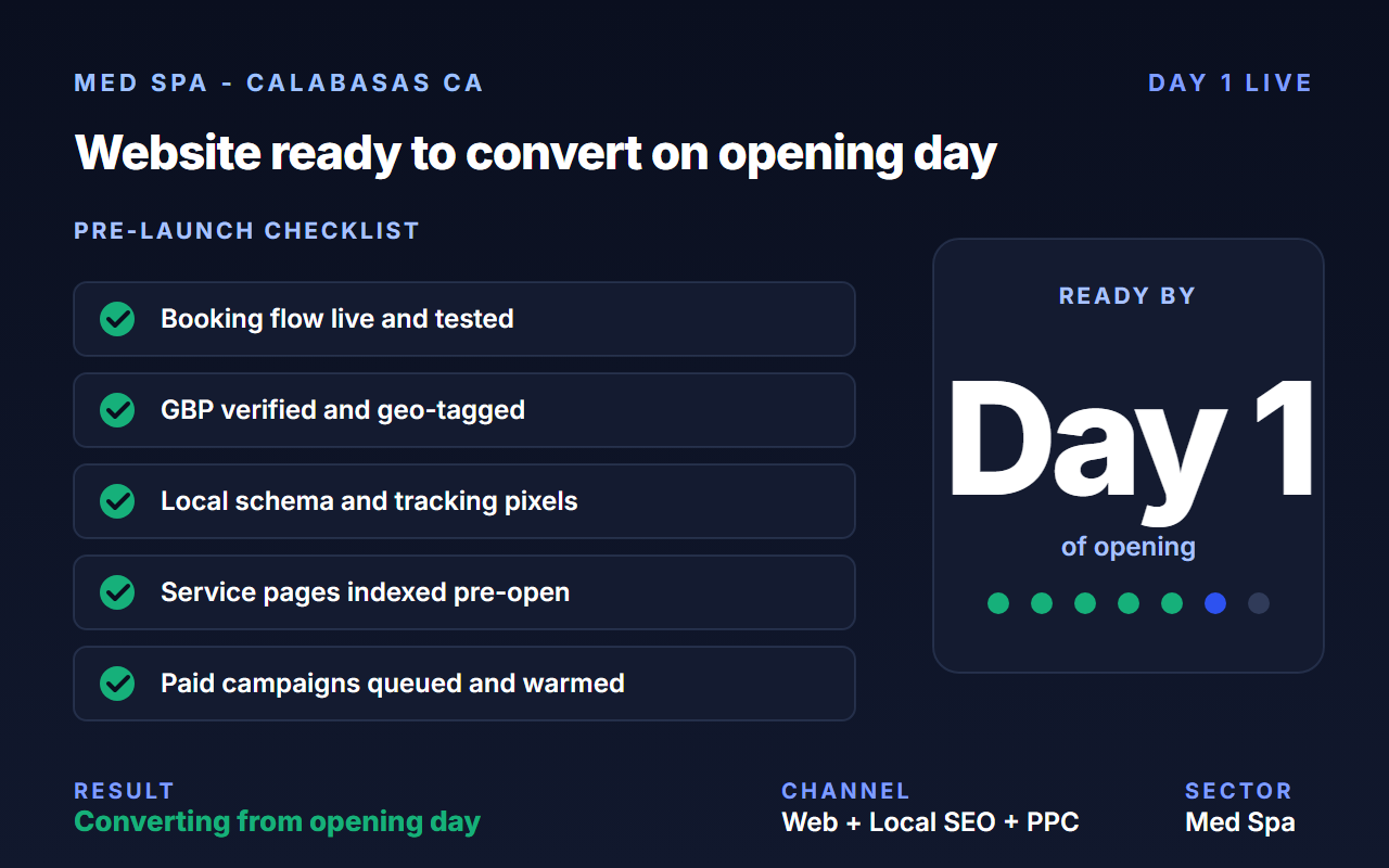
A new-build med spa in Calabasas, California — clinical leadership with strong word-of-mouth credibility from prior roles, opening into a market saturated with established names. The treatment rooms were finished and the team was hired. The brand was not.
Redefine Web was brought in to build the identity, website, and post-launch hosting so opening day looked as elevated as the experience inside.
The practice needed a brand that communicated medical expertise and aesthetic elegance — without leaning on the script-and-flourish clichés that saturate the market. And it needed to ship fast: opening was weeks away, not quarters.
Beyond the logo, every touchpoint — print collateral, social, in-spa, before/after templates — had to feel cohesive from day one so a new client couldn't tell the brand was three weeks old.
We ran a focused Brand Design Intensive — primary, secondary, logotype, and icon logo variations, a serif/sans pairing for editorial refinement plus clinical clarity, and a grounded color system anchored on Clay Rose with rich neutrals (Espresso, Taupe, Kohl).
The site was built mobile-first on WordPress with intuitive navigation, anchored booking, white-space-led layouts, and ADA-conscious color pairings tested against WCAG 2.0 AA contrast ratios. Treatments were organized by warm, human categories — not clinical menus.
Primary, secondary, logotype, and icon variations with a 40+ page brand style guide for cross-channel consistency.
Intuitive navigation, anchored booking, restrained typography, soft textures mirroring the physical space.
Every color pairing tested for WCAG 2.0 AA contrast — beautiful and compliant.
Service organization written to invite, not to read like a clinical menu.
Canva-ready templates so the team could publish social-first content without breaking brand.
The practice opened with a brand presence that matched the quality of the room and a website that converted curious browsers into booked patients from week one.
Whatever your stage. Exploring, evaluating, or ready to move. We meet you there. No pressure, no slide-deck theater.