
Beauty Web Design for Skincare Clinics and Salon Chains
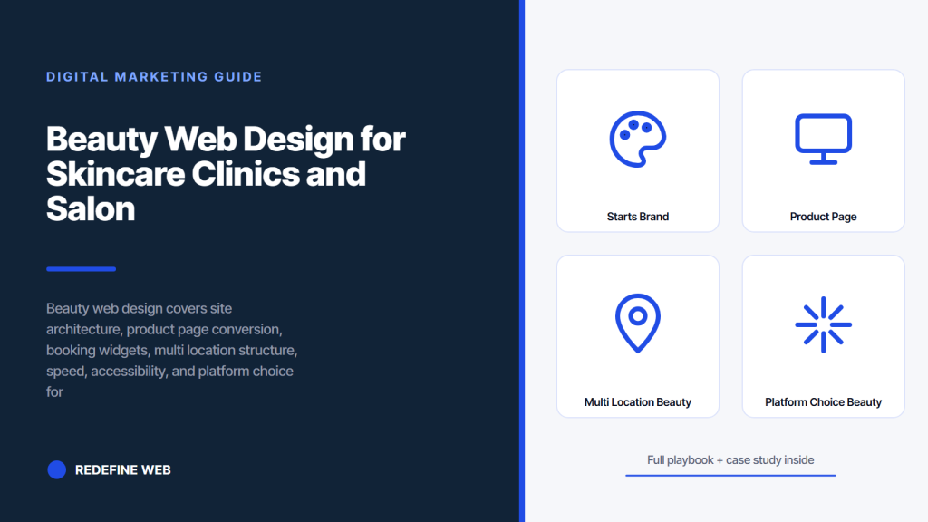
- Beauty web design starts with brand credibility page architecture.
- Product pages need seven conversion elements above the fold on mobile.
- Clinic sites run on a three step consult booking funnel.
- Multi location chains need location first architecture per branch.
- Speed under 2.5 LCP and WCAG AA are baseline site checks.
- Beauty web design starts with the brand credibility page architecture
- Product page conversion elements that pull weight
- Booking widget and consult funnel for clinic beauty web design
- Multi location beauty web design for salon and spa chains
- Speed page load and accessibility targets for beauty sites
- Platform choice for beauty web design across DTC and clinic
- Comparison table of beauty web design platforms and use cases
- Content depth and blog architecture for organic search compounding
- Case study Beauté Aesthetics New York on the site rebuild
- Timeline and cost math for a real beauty web design build
- Pick the right beauty web design partner for your brand
Beauty web design is the site build that turns a browsing skincare shopper into a repeat buyer, a spa researcher into a booked treatment, and a wholesale buyer into a shelf placement conversation. Beauty brands sell aspiration and outcome, which means every page has to carry brand credibility, ingredient trust, and a conversion path that respects the exact place the customer sits in the decision cycle. A generic ecommerce template ships a beauty brand into a race to the discount bottom. A tuned beauty web design lands the brand in a category leader position and holds average order value while conversion rate climbs.
This guide walks the version of beauty web design that Redefine Web builds for DTC skincare brands on Shopify, luxury aesthetics clinics on WordPress, salon and spa chains with multi location booking, and prestige beauty brands with retail plus DTC hybrid revenue. You get the site structure, the conversion elements that pull weight, page speed and accessibility targets, a comparison table of platforms, a real named case study, and a shortlist filter for hiring the right build partner.
Beauty web design starts with the brand credibility page architecture
Beauty web design starts with a page architecture that carries brand credibility before it asks for the sale. The homepage tells the founder story, the ingredient story, and the treatment result story on the first scroll. The product or treatment page carries the ingredient breakdown, the clinical evidence, the before after imagery, the price, and the booking or add to cart action inside a single scroll on mobile. The blog and content hub carries the education layer that ranks in search and warms the top of funnel visitor. The about and press page carries the credibility multipliers that the retail buyer and the investor check before any deeper engagement.
The base page count for a growth stage beauty brand runs 40 to 120 pages depending on SKU count and content depth. A DTC skincare brand with 15 SKUs needs a homepage, a collection page, 15 product pages, an ingredient hub with 20 to 40 ingredient pages, an about page, a founder story page, a press page, a shipping and returns page, a FAQ, and 20 to 40 content posts at launch. A luxury clinic needs a homepage, 15 to 25 treatment pages, a team page with 8 to 15 injector or esthetician bios, a location page per branch, a before after gallery, a financing page, an FAQ, and 30 to 60 content posts covering treatment education.
The information architecture matters more than the visual design polish. A beautiful site with a confused navigation loses 40 to 60 percent of the traffic on the first click. A moderately styled site with a clear path from home to product or treatment to booking keeps traffic on the site through the decision cycle. Read the beauty and skincare marketing hub for the full retainer scope covering site plus channel.
Product page conversion elements that pull weight
Beauty web design product pages need seven conversion elements above the fold on mobile. The product image gallery with 4 to 8 shots covering the packaging, the texture, the swatch, the before after, and the usage in context. The product name and price with the clear subscription discount option if applicable. The ingredient story headline with the two or three lead ingredients called out by name. The volume or size selector with clear pricing per unit. The add to cart button in a color that separates from the rest of the page. The star rating with the review count as a link to the review section. And the shipping and returns snippet with the specific number of days for shipping and the return policy.
Below the fold on a beauty product page runs the ingredient breakdown, the clinical evidence, the before after gallery, the how to use section, the customer review section with photo reviews prioritized, the frequently asked questions, and the cross sell or bundle section. Every element has a specific job. Beauty customers do more research on skincare and treatment products than any other consumer category outside of medical devices. Pages that skip the clinical evidence or the ingredient breakdown lose the informed shopper. Pages that skip the how to use section lose the first time skincare buyer.
Trust badges matter but only the right ones. Beauty accreditations and certifications carry weight. Vegan, cruelty free, dermatologist tested, and clinical trial completed all pull weight when they are real and documented. Generic payment badges do almost nothing on a beauty product page above $40 per unit. Redefine Web audits every product page against the current beauty accreditation standards before launch. See the Clean at Sephora program page for a reference on beauty accreditation weight.
Booking widget and consult funnel for clinic beauty web design
Beauty web design for a luxury clinic or med spa runs on the consult booking funnel, not the product page. The clinic homepage points to a treatment page. The treatment page carries the education, the pricing range, the treatment result imagery, and the consult booking button. The booking button opens a three step flow that asks for the treatment interest, the preferred date range, and the contact detail. Any booking flow with more than four steps loses 20 to 40 percent of the qualified intent between click and completion.
The consult page needs both a form fill option and a phone number that clicks to call on mobile. Luxury clinic bookings split 40 to 60 percent phone versus form fill depending on treatment complexity. High end injectable and laser treatments trend toward phone booking because the customer wants to talk to a human before committing. Skincare treatments and lower price consults trend toward form fill because the customer wants control over the schedule. Design for both without forcing one.
The confirmation email after booking is part of the beauty web design scope even though it feels adjacent. The confirmation email carries the treatment prep instructions, the location and parking detail, the injector or provider name if available, and the cancellation policy. Confirmation emails that skip the prep instructions lose 10 to 20 percent of the booked consults to no shows because customers arrive unprepared and reschedule. Read the Klaviyo beauty lifecycle email research for the current confirmation email benchmark data.
Beauty buyers scan story before they scan product. If your homepage opens with a shop-now grid, average order value stays flat. Move the story above the fold.
Multi location beauty web design for salon and spa chains
Beauty web design for a multi location salon or spa chain runs on a location first architecture, not a service first architecture. Every location gets a distinct location page with the specific address, the branch hours, the branch team, the branch phone, the branch booking widget tied to the branch calendar, and the branch specific reviews pulled from Google Business Profile. A single service page with a location switcher does not rank in local search and does not book treatments.
The location page structure needs seven elements to pass the local SEO check. The NAP information with schema markup. Real photography of the specific branch, not stock imagery or corporate photography of a different branch. The branch team with staff bios and specialty tags. The branch service menu with pricing. The branch booking widget tied to the correct calendar. The branch review section pulled live from GBP. And a branch specific frequently asked questions section covering parking, accessibility, and the specific booking policy for that location.
The homepage and service pages carry the brand identity and the service category depth. The location pages carry the local intent traffic and the map pack ranking. Beauty chain sites that skip the location page depth lose 60 to 80 percent of the local search traffic to competitors with the correct location first architecture. Redefine Web builds every salon and spa chain site with the location first architecture. See the beauty web design service page for the build scope reference.
Speed page load and accessibility targets for beauty sites
Beauty web design has to hit specific page speed and accessibility targets or lose Google ranking and customer trust. Largest Contentful Paint under 2.5 seconds on 4G mobile field data. First Input Delay under 100 milliseconds. Cumulative Layout Shift under 0.1. WCAG 2.1 Level AA accessibility compliance across every page. Any page failing on any target loses ranking, loses conversion, or opens the brand to accessibility lawsuits that cost $25,000 to $150,000 to defend.
The speed targets require specific build decisions. Image compression to WebP or AVIF with responsive sizes. Third party script deferral or removal for tracking pixels below the fold. JavaScript bundle trimming to remove unused code. Server side rendering or static generation for the top of funnel pages that receive organic traffic. A beauty site that ships without image compression discipline loses 30 to 60 percent of the page speed budget on hero imagery alone. Every beauty product page has 4 to 8 images at high resolution and every one has to load fast.
The accessibility targets require specific design decisions. Color contrast at 4.5 to 1 minimum for text against background. Alt text on every product image and treatment image. Keyboard navigation through the entire checkout or booking flow without a mouse. Focus indicators visible on every interactive element. Screen reader labels on every icon button and form field. Beauty sites that skip accessibility compliance carry legal exposure that grows each year as ADA lawsuits target ecommerce categories. Read the WCAG accessibility reference for the current standard.
Platform choice for beauty web design across DTC and clinic
The platform choice for beauty web design depends on the revenue model. A DTC skincare brand with SKU velocity and subscription revenue runs best on Shopify or Shopify Plus. A luxury clinic with a booking widget and treatment content runs best on WordPress with a booking plugin like Vagaro, Boulevard, or a custom integration. A salon or spa chain with per location booking runs best on WordPress with a multi location booking plugin or a custom build. A prestige brand with retail plus DTC hybrid revenue runs best on Shopify Plus with a headless architecture for content flexibility.
The platform decision drives everything downstream. Hosting cost, plugin ecosystem, developer talent pool, and long term maintenance overhead all follow the platform choice. Shopify Plus carries a $2,000 to $8,000 monthly platform fee but includes hosting and covers most ecommerce edge cases without a plugin stack. WordPress with WooCommerce carries a lower platform fee but requires a managed host at $50 to $500 per month and a plugin discipline that most in house teams struggle to maintain. Custom headless carries the highest build cost but the lowest long term maintenance overhead once the initial build stabilizes.
Redefine Web defaults to Shopify for DTC skincare, WordPress for luxury clinics and salon chains, and headless architectures for prestige brands with complex content needs. The platform choice locks in the site for 3 to 5 years typically, so getting the choice right at the start saves 6 to 12 months of migration pain in year two.
Comparison table of beauty web design platforms and use cases
The comparison table below sorts beauty web design platforms by brand shape and shows the base build cost range, the monthly platform and hosting fee, the ideal use case, and the ongoing maintenance overhead. Use the table to sanity check a proposal from a build partner. If a partner recommends WooCommerce for a $5 million DTC skincare brand, ask why they chose it over Shopify Plus.
| Platform | Build cost range | Monthly fee | Ideal beauty use case |
|---|---|---|---|
| Shopify | 15,000 to 60,000 | 39 to 399 | DTC skincare under 2M revenue |
| Shopify Plus | 60,000 to 250,000 | 2,000 to 8,000 | DTC skincare over 2M revenue and prestige hybrid |
| WordPress WooCommerce | 25,000 to 120,000 | 50 to 500 | DTC brands needing content depth and custom flows |
| WordPress with booking plugin | 18,000 to 65,000 | 50 to 300 | Luxury clinic single or multi location |
| Custom headless architecture | 120,000 to 400,000 | 500 to 3,000 | Prestige brands with retail plus DTC hybrid |
Cost ranges scale with brand complexity, not agency markup. A DTC skincare brand with 15 SKUs and 40 content posts lands at the floor of the Shopify range. The same brand at 80 SKUs, 200 content posts, subscription revenue, and international shipping lands at the ceiling. Any partner quoting a flat number without scoping the SKU count, content depth, and integration complexity is quoting on incomplete information. Read the beauty website maintenance and hosting reference for the ongoing side of the site build cost.
Two mistakes to avoid on the platform choice. First, do not pick WooCommerce for a brand that needs Shopify Plus. The plugin discipline required to run WooCommerce at scale burns 8 to 20 hours per month of maintenance time that Shopify Plus absorbs into the platform fee. Second, do not pick Shopify Plus for a brand that only needs standard Shopify. The 2,000 dollar monthly floor buys features a growth stage DTC brand under 2 million in revenue will not use for another 18 to 24 months. Match the platform to the current revenue tier and the next 18 months of growth, not the aspiration five years out.
Content depth and blog architecture for organic search compounding
Beauty web design that ranks in organic search runs a content architecture with three layers. The pillar page layer covers 8 to 15 in depth treatment or category guides at 3,500 to 6,000 words each. The cluster page layer covers 40 to 120 focused topic articles at 1,500 to 2,500 words each. The ingredient or treatment page layer covers 20 to 60 evergreen reference pages that anchor internal linking and rank for long tail informational queries.
Every content page needs a specific intent match, a schema markup treatment, an internal link structure that pulls the reader toward the product or booking page, and a keyword optimized meta title and description. Beauty brands that skip schema markup lose the featured snippet placement to competitors who do the schema work. Beauty brands that skip the internal linking discipline see the pillar pages rank but the product pages never inherit the authority. Both moves take developer time at build and content team time monthly.
The content team math for a growth stage beauty brand runs 12 to 30 pieces per month across the three content layers. That volume requires a beauty specialist writer, an editor with category knowledge, an SEO strategist tracking search intent shift monthly, and a designer producing the imagery. Any content program that skips one role produces content that reads or ranks poorly. Redefine Web runs the full four role stack on every beauty content retainer. The founder who thinks one freelance writer can replace the four role content team is the founder wondering next January why the ingredient hub they paid for still ranks on page four.
Case study Beauté Aesthetics New York on the site rebuild
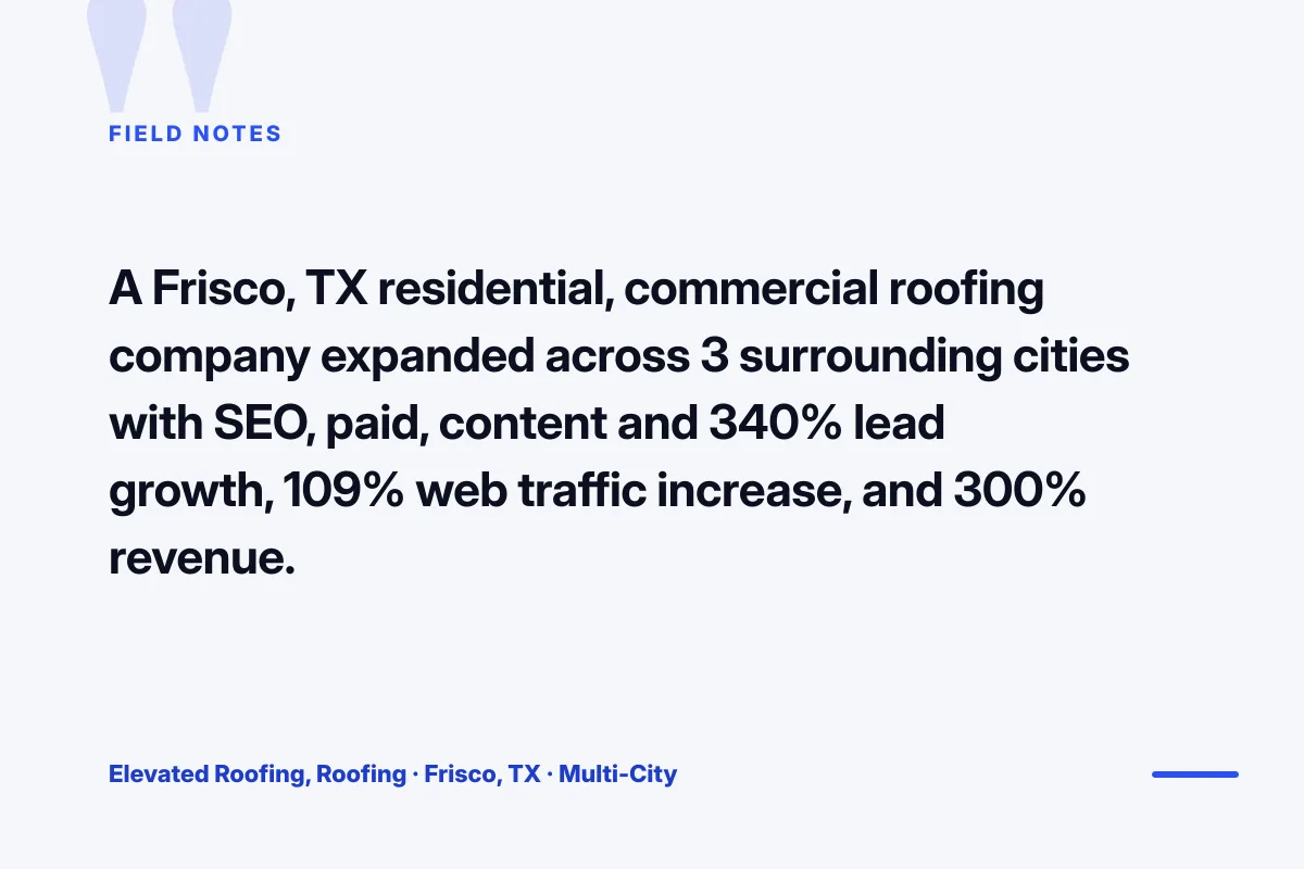
Beauté Aesthetics New York is a Manhattan luxury beauty and aesthetics clinic that ran a full beauty web design rebuild as the anchor of a broader digital engagement. The pre engagement site carried the reputation of the clinic in the offline market but did not carry the digital funnel to convert the reputation into booked consults. Weak digital UX. A consult booking flow that lost qualified traffic between the treatment page and the confirmation. A blog that did not rank because the content architecture was flat.
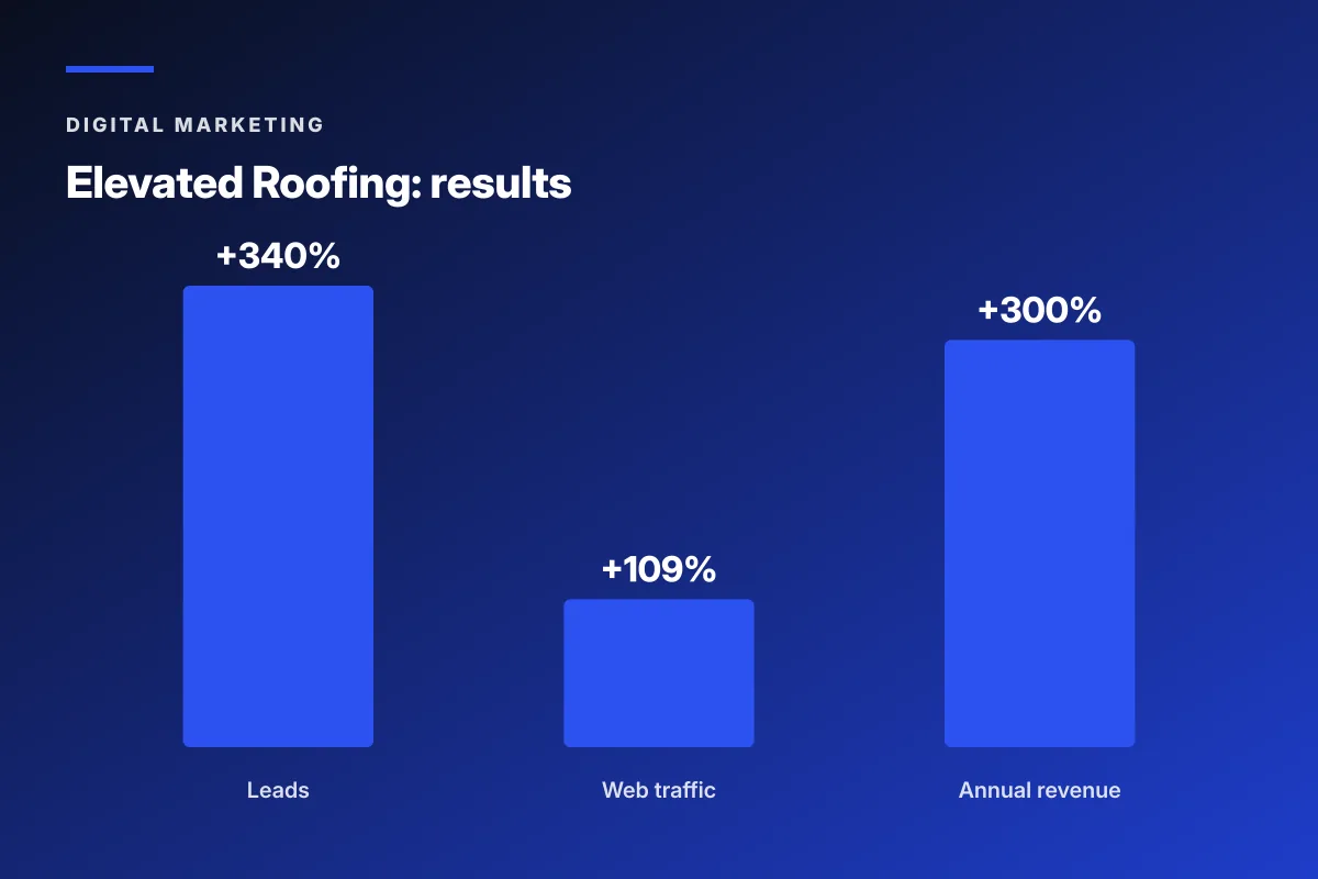
The rebuild ran a luxury visual bar on the homepage and treatment pages, a three step booking flow with real time availability, treatment specific landing pages for the highest margin injectables and laser services, a location page for the Manhattan flagship with GBP integration, and a content architecture with pillar pages on the top treatment categories and cluster pages on the specific treatment questions. The build hit the page speed targets on mobile and passed WCAG accessibility on every page. Twelve months post launch, lead volume grew 166 percent, new users grew 88 percent, and consult conversion climbed 27 percent.
The Beauté engagement is the shape a luxury clinic should look for in a beauty web design partner. Not a template drop with a booking widget bolted on. A full architecture with brand credibility, a tight booking funnel, treatment specific pages, location depth, content compounding, and speed plus accessibility compliance. Every element carries a specific job in the funnel and the total pushes the primary revenue metric, booked consults, forward every month.
Timeline and cost math for a real beauty web design build
The timeline for a real beauty web design build runs 12 to 20 weeks depending on scope. Discovery and architecture takes 2 to 3 weeks. Visual design takes 3 to 5 weeks. Development takes 4 to 8 weeks. Content population takes 2 to 3 weeks parallel to development. QA and pre launch testing takes 1 to 2 weeks. Any partner promising a 6 week timeline is either running a template with minor customization or is going to miss the launch by two months.
Cost math scales with the brand complexity as covered in the platform table. A DTC skincare brand on Shopify with 15 SKUs and 40 content posts runs $15,000 to $35,000. The same brand at 80 SKUs and 200 content posts runs $40,000 to $85,000 on Shopify or $60,000 to $150,000 on Shopify Plus. A luxury clinic on WordPress runs $25,000 to $65,000 depending on treatment page count and booking integration complexity. A multi location salon chain runs $35,000 to $90,000 depending on location count and per location content depth.
Post launch runs a maintenance retainer at $399 to $1,999 per month depending on platform and traffic volume. The maintenance retainer covers core updates, plugin updates on a staging first workflow, security monitoring, backup and disaster recovery drills, and speed and accessibility monitoring. Any partner that hands over a site without a maintenance retainer plan is handing over a site that will break inside six months.
Pick the right beauty web design partner for your brand
The right beauty web design partner for your brand depends on the revenue model, the platform choice, and the content depth ambition. A DTC skincare founder needs a partner strong on Shopify or Shopify Plus with a beauty specific creative portfolio. A luxury clinic founder needs a partner strong on WordPress with a booking integration portfolio in aesthetics or med spa. A salon chain founder needs a partner strong on multi location WordPress builds with per location content architecture. A prestige brand founder needs a headless architecture specialist with retail plus DTC hybrid experience.
Three moves this week to move from shortlist to signed partner. First, audit three prospective build partner portfolios and confirm beauty category specific work at your brand tier. Second, ask each partner for a page speed and accessibility audit of your current site before quoting the new build. Third, ask each partner for the maintenance retainer plan post launch and confirm the retainer covers staging first updates and speed monitoring.
Where Redefine Web fits on that filter. Beauty and skincare DTC on Shopify and Shopify Plus, luxury aesthetics clinics on WordPress, and multi location salon chains all sit in scope. Prestige headless architecture builds get referred to specialist partners. See the beauty SEO company page for the search side of the site build.
Beauty web design that pays for itself carries brand credibility on every page, a tight conversion path from home to product or treatment to booking, content depth that compounds in organic search, speed and accessibility that pass Google and legal checks, and a platform choice that matches the revenue model. Beauté Aesthetics New York found the fit that grew booked consults 166 percent. Your beauty brand can find the fit that turns the site from a brochure into a compounding revenue channel.

Frequently asked questions
What does beauty web design actually cover on a real build?
Beauty web design covers the full site architecture with homepage brand credibility, product or treatment pages with seven conversion elements above the fold on mobile, a content hub for organic search depth, an about and press page with credibility multipliers, and platform specific integrations like Shopify subscription or WordPress booking widgets. Speed and accessibility compliance sit on top of every page, not as a launch afterthought, because both drive ranking and legal exposure.
What does a beauty web design build actually cost?
A DTC skincare brand on Shopify with 15 SKUs and 40 content posts runs 15,000 to 35,000 dollars. The same brand at 80 SKUs and 200 posts runs 40,000 to 85,000 on Shopify or 60,000 to 150,000 on Shopify Plus. A luxury clinic on WordPress runs 25,000 to 65,000 depending on treatment page count and booking integration. A salon chain runs 35,000 to 90,000 depending on location count. Timeline runs 12 to 20 weeks for a real build.
Which platform is right for beauty web design?
A DTC skincare brand with SKU velocity and subscription revenue runs best on Shopify or Shopify Plus. A luxury clinic with a booking widget and treatment content runs best on WordPress with a booking plugin like Vagaro, Boulevard, or a custom integration. A salon or spa chain with per location booking runs best on WordPress with multi location booking. A prestige brand with retail plus DTC hybrid revenue runs best on Shopify Plus with a headless architecture for content flexibility.
What page speed and accessibility targets should beauty web design hit?
Largest Contentful Paint under 2.5 seconds on 4G mobile field data, First Input Delay under 100 milliseconds, and Cumulative Layout Shift under 0.1 for Core Web Vitals. WCAG 2.1 Level AA accessibility compliance across every page including product images, booking widgets, and checkout flows. Missing any target loses Google ranking, loses conversion on slow pages, or opens the brand to accessibility lawsuits that cost 25,000 to 150,000 dollars to defend in ecommerce categories where ADA case volume grows each year.
How does beauty web design differ for a multi location salon chain?
Multi location salon and spa web design runs on a location first architecture, not a service first architecture. Every location gets a distinct page with the specific address, hours, team, phone, booking widget tied to the branch calendar, and reviews pulled from the branch Google Business Profile. A single service page with a location switcher does not rank in local search and does not book treatments. Location page depth is where the local traffic and map pack ranking come from.
What conversion elements does a beauty product page need above the fold?
Seven elements above the fold on mobile. The product image gallery with four to eight shots covering packaging, texture, swatch, before after, and usage. The product name and price with subscription discount if applicable. The ingredient story headline with two or three lead ingredients called out. The volume selector with per unit pricing. The add to cart button in a contrasting color. The star rating with review count as a link. And the shipping and returns snippet with specific timing.
Book your free 30-minute strategy call.
No spam, no sales rep. We use your email to schedule your call with a senior strategist. That is it.
More from the blog
View all articles → Digital Marketing
 Dental Marketing Tips That Compound Into New Patients
Read article Digital Marketing
 Ecommerce Marketing Strategies That Drive Real DTC Revenue
Read article Digital Marketing