
Mobile-first indexing is now the only way Google reads your online store. If your phone view lags, hides content, or breaks a checkout button, your rankings and revenue drop across every device. That is a hard fact for e-commerce owners in 2026, and most stores still get it wrong.
More than 64% of global web traffic comes from mobile devices. Google noticed and moved every site to mobile-first indexing by 2023. Your desktop site can look perfect and still lose the sale. The mobile version is the one Google sees, scores, and ranks. This guide walks through what mobile-first indexing means for e-commerce, the exact fixes that move the needle, and the pitfalls that quietly cost stores 20 to 40% of their organic revenue.
You will see real numbers from stores we have worked with, plus the technical steps to bring your mobile store in line with Google smartphone crawler. No fluff, no jargon. Straight tactics you can hand to your dev team on Monday.
What mobile-first indexing means for your store
Mobile-first indexing is Google rule that the smartphone version of your site is the primary source for crawling, indexing, and ranking. The desktop version still exists in Google eyes, but it is no longer the reference copy. If a product description, review, or FAQ block is missing from mobile, Google treats it as if it never existed.
That change flipped a long-standing SEO habit. Stores used to build feature-rich desktop pages and then trim them for mobile to keep things fast. Under mobile-first indexing, that trimming is what strips your ranking signals. Every schema tag, every image alt, every internal link has to appear on the phone view or Google ignores it.
For online stores, the stakes are higher than a blog or a service site. Product schema, price data, availability, review counts, breadcrumbs, and category links all feed the SERP snippet that decides whether a shopper clicks. Drop any of those on mobile and the snippet gets thinner, the click-through rate drops, and rankings soften over the next 60 days.
Mobile-friendly vs mobile-first indexing
A mobile-friendly site fits on a small screen without breaking. A mobile-first indexed site treats the phone view as the primary experience. The two are not the same, and confusing them is the number one reason stores stall in organic traffic.
You can pass Google mobile-friendly test and still fail mobile-first indexing. The mobile-friendly test only checks viewport, tap targets, and font size. Mobile-first indexing looks at content parity, page speed, structured data, and how Googlebot renders your JavaScript. A store that hides half its product tabs behind a click event will fail the second test even when it passes the first.
Why mobile-first indexing hurts most e-commerce stores
Online stores tend to run heavy templates, third-party apps, and image-rich pages. Every one of those is a mobile risk. Google smartphone Googlebot renders on a throttled connection at slower CPU, so the page speed you see on your gaming laptop is not the page speed Google measures. The gap between the two is where rankings quietly slip.
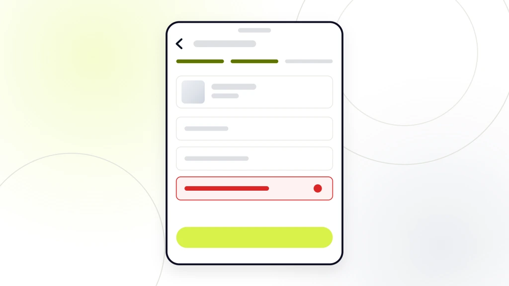
Three failure patterns show up in nearly every e-commerce audit we run.
- Content parity gaps. Product descriptions, reviews, or FAQs get collapsed or removed on mobile to save space. Google indexes the shorter mobile version and the page loses topical depth.
- Structured data drift. Product, Review, and Breadcrumb schema live in the desktop template and never make it into the mobile render. The result is thin rich snippets and lost SERP real estate.
- Core Web Vitals failures. Big hero images, render-blocking apps, and font waterfalls push Largest Contentful Paint past the 2.5-second threshold. Rankings drift down over 30 to 90 days.
Google smartphone crawler indexes only what renders on the phone view. Cut content on mobile and you cut rankings on every device.
The revenue impact is direct. Our work with RAFZ Cirkulära Interiörer, a Swedish sustainable furniture brand, showed the pattern in the extreme. Their plugin-heavy store loaded in 15 seconds on mobile, and cart abandonment was killing revenue. A lightweight custom rebuild cut load time to 2 seconds, dropped server requests by 82%, and lifted conversion rate 28%. The mobile signal was the entire story.
The 6 mobile-first indexing rules Google actually checks
Every store audit we run starts with these six checks. If you fix all six, your mobile-first indexing score climbs and the ranking recovery usually shows inside 60 days. If you skip even one, the others do less work.
1. Responsive design as the foundation
Responsive design means one URL per page, one codebase, and one theme that flexes across screen sizes. Separate mobile URLs (the old m.example.com pattern) are dead. Adaptive designs that serve different HTML by user agent create parity problems Google punishes. Responsive is the only supported path in 2026.
If your store is on Shopify, WooCommerce, or BigCommerce, the base theme is likely responsive. Custom apps and page builders are where responsiveness breaks. Test every template type (home, category, product, cart, checkout) at 375 pixels wide before you sign off on a launch. Run your templates through a responsive web design checker to spot layout bugs early.
2. Content parity between mobile and desktop
Every word, image, video, and link that helps Google understand a page has to appear on mobile. That includes product descriptions, spec tables, reviews, FAQ blocks, cross-sells, and internal navigation. Accordions and tabs are fine as long as the content sits in the HTML source. If a click event fetches the content after page load, Google may not see it.
The easiest audit method is to view the mobile source of your top 20 pages and word-count the visible content. If the mobile version is more than 20% shorter than the desktop, you have a parity problem. Fix it by moving the content into the mobile template as expandable sections, not hidden behind JavaScript.
3. Core Web Vitals on mobile
Google Core Web Vitals for mobile are the ranking floor for e-commerce. The three thresholds are LCP under 2.5 seconds, INP under 200 milliseconds, and CLS under 0.1. Stores that meet all three see 20 to 30% higher organic click-through rates than stores that fail even one.
The biggest wins usually come from image work. Serve WebP or AVIF, size images to the container, lazy-load below-the-fold assets, and use a CDN. Second-biggest wins come from cutting third-party scripts. Every review widget, chat app, and analytics tag adds render time.
If your mobile LCP sits above 3 seconds, fix images and third-party scripts first. Those two changes recover 60 to 80% of the deficit.
4. Structured data on the mobile version
Product schema, Review schema, Breadcrumb schema, and Organization schema all need to render on mobile. Test each template type in Google Rich Results Test using the mobile view. If a schema block only appears in the desktop template, your rich snippets will thin out and CTR will drop.
For product pages, the priority schema fields are name, image, description, sku, brand, offers (price, priceCurrency, availability), and aggregateRating. Missing any one of those cuts the odds of getting product SERP features by roughly half. See our WooCommerce product page SEO guide for the exact fields your store needs.
5. Metadata parity
Title tags, meta descriptions, canonical tags, hreflang tags, and Open Graph tags all have to match between mobile and desktop. A common failure is a mobile canonical pointing to a desktop URL that no longer exists, which sends Google a mixed signal and can drop the page from the index entirely.
6. Crawlability of mobile assets
Robots.txt should not block Googlebot from CSS, JavaScript, or image files needed to render the mobile page. If Googlebot cannot load your CSS, it sees a broken layout and scores you accordingly. Fetch a few key URLs in Google Search Console URL Inspection tool and check the rendered HTML for parity with what a real phone sees.
Fixing content parity without hurting UX
Content parity is where most e-commerce teams get stuck. The mobile screen is small, and shoppers do not want to scroll through 3,000 words of copy on a product page. The fix is not to strip content. The fix is to structure it.
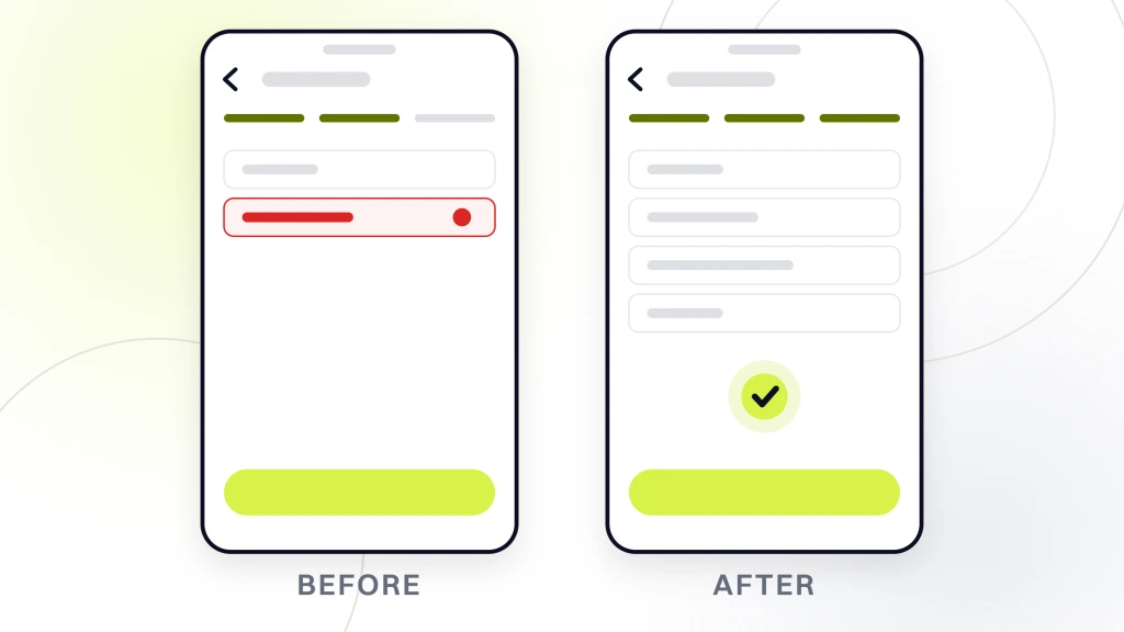
Use collapsible sections for spec tables, warranty, shipping, and long-form descriptions. Every section starts open on desktop and closed on mobile, with the content sitting in the HTML source from the first render. Google indexes it, shoppers get a clean layout, and both audiences win.
Reviews are the second parity trap. Third-party review widgets often lazy-load reviews via JavaScript, which means Google sees a page with zero visible reviews. Switch to a widget that renders review HTML server-side, or store a snapshot of the top 5 reviews as static HTML on the page. Aggregate rating still passes through the JSON-LD schema block.
Cross-sells and related product blocks are the third trap. If your desktop template shows 6 related items and your mobile template shows 2, you have cut 4 internal links off every product page. Multiply that by 5,000 products and the site loses tens of thousands of crawl-priority signals overnight.
Mobile Core Web Vitals for e-commerce
Core Web Vitals are the technical spine of mobile-first indexing. Google published the metrics in 2020 and moved INP into the core set in March 2024. For e-commerce, the practical thresholds are stricter than the baseline. Product pages carry more images and scripts than a typical blog.
Aim for LCP under 2.0 seconds on 4G, INP under 150 milliseconds, and CLS under 0.05. Stores that hit these tougher targets tend to pull ahead of competitors even in crowded categories.
Image optimization for mobile
Images are the biggest lever for mobile speed. Every product page has 5 to 20 images that need to load fast without pixelating. Serve WebP with a JPEG fallback, size each image to the container width, and set width and height attributes to prevent layout shift. A single 800KB hero image can drag LCP past 3 seconds on 4G.
For our client Abigail Ahern, a luxury home décor brand, tightening the mobile image stack was part of the SEO restructure that drove a 179% ecommerce revenue lift over 12 months. Paid-social ROAS climbed to 3,000% once the mobile landing pages finally loaded fast enough to convert paid traffic.
JavaScript and third-party scripts
Every review widget, chat pop-up, exit-intent modal, analytics tag, and A/B testing script adds render time. Audit your third-party scripts every quarter and drop anything that is not tied to revenue. The typical e-commerce store carries 15 to 30 third-party scripts, and cutting to under 10 usually recovers 300 to 500 milliseconds of LCP.
Font loading
Custom fonts block text rendering by default. Use font-display swap in your CSS so text renders in a fallback font first and swaps to the custom font when it loads. This one line of CSS can drop LCP by 200 to 400 milliseconds on mobile.
How mobile-first indexing changes on-page SEO for product pages
Product pages carry the heaviest SEO load in an e-commerce site, and mobile-first indexing changes the rules. The old habit of front-loading keywords into a 500-word desktop description does not translate to mobile. Shoppers scan on a phone, and Google now scores your page by what those scanning shoppers actually engage with.
Structure the mobile product page in this order. Product name and price above the fold. Add-to-cart button visible without scrolling. Short 2-sentence value proposition. Photo carousel. Spec bullets. Long description in a collapsible section. Reviews. Cross-sells. Every element is in the HTML source, so Google indexes the full page in the source, and the shopper sees a clean layout.
Keyword placement follows the same content parity rule. If your primary keyword sits inside the desktop-only H1 and the mobile template uses a shorter H1, Google indexes the shorter version. Make sure the primary keyword appears in the mobile H1, the first paragraph, and at least one collapsible section header.
Category page changes
Category pages under mobile-first indexing need a short block of intro copy above the product grid, filter and sort options that render in HTML (not JavaScript-only), and pagination or infinite scroll that Google can crawl. Infinite scroll without a paginated fallback often leaves 60 to 80% of a category products un-indexed.
Internal linking on mobile
Mobile menus often hide 70% of the internal links a desktop menu shows. That kills crawl depth and link equity flow across the site. Fix it with a mobile-friendly mega menu that renders every category link in the HTML source, plus contextual breadcrumbs and cross-links inside product descriptions.
Common mobile-first indexing mistakes that quietly kill revenue
These are the failure patterns we see in nearly every e-commerce audit. Each one is fixable in a sprint. Skip any and you leave revenue on the table.
- Hidden content behind click events. Product tabs, reviews, or FAQ blocks that only render after a user click get skipped by Googlebot. Move the content into the HTML source and toggle visibility with CSS.
- Missing viewport meta tag. Without a viewport tag, mobile browsers render the page at desktop width and shrink it. Google flags this as a usability failure.
- Interstitial pop-ups on mobile landing pages. Full-screen pop-ups that block content on entry are a ranking penalty for mobile. Age gates and cookie banners are the two allowed exceptions.
- Slow product image galleries. Sliders that load all 20 images on page load kill LCP. Lazy-load everything after the first image.
- Broken hreflang tags on mobile. International stores often forget to sync hreflang between mobile and desktop templates. Google may serve the wrong country version to shoppers.
- Non-clickable phone numbers. Every phone number on a mobile page should use a tel link. It is a small conversion win and a mobile usability signal.
- Text too small to read. Body text under 16 pixels forces shoppers to pinch-zoom. Google penalizes this in the mobile usability report.
Our Google Ads client Boogie Board, the reusable writing tablet pioneer, hit mobile parity as part of a broader optimization program. Landing page speed and structure work brought cost per conversion down to $31 across $650K in managed ad spend, with an 11% lift in conversion rate. The mobile experience decided whether the ad click became a sale.
Auditing your store for mobile-first readiness
A full mobile-first audit takes about 4 hours for a mid-sized e-commerce store. You can do it yourself with free tools, or hire an e-commerce SEO agency to run it and hand you the fix list.
Start with Google Search Console URL Inspection tool. Fetch 10 URLs (home, 3 categories, 3 products, cart, checkout, blog post) and compare the mobile rendered HTML to the desktop rendered HTML. Note every difference in content, schema, or internal links.
Next, run PageSpeed Insights on the same 10 URLs. Record LCP, INP, and CLS for each. Anything above the mobile threshold gets added to the fix list.
Third, run the Rich Results Test on 3 product pages, 3 category pages, and the home page. Confirm every schema block that appears on desktop shows on the mobile render.
Fourth, open your top 20 pages in Chrome DevTools with device mode set to Moto G4 and 4G throttling. Word-count the visible content. Compare to the desktop word count. Flag any page where mobile is more than 20% shorter.
The full audit output is a spreadsheet with URL, issue type, impact rating, and fix. Sort by impact and work through the top 20% first. That is where 80% of the ranking recovery lives.
How long mobile-first indexing fixes take to move rankings
Rankings do not jump overnight after a mobile fix. Google needs to recrawl the mobile version, update the index, and re-score the page against competitors. The typical timeline is 21 to 45 days for a single page, 60 to 90 days for a full-site rebuild.
Speed the timeline by resubmitting your XML sitemap in Search Console after each round of fixes. For high-priority product pages, use the URL Inspection tool to request individual indexing. Google usually recrawls within 3 to 7 days.
Track ranking movement in a tool like Ahrefs, Semrush, or Rank Tracker. Watch for the whole cluster of pages (home, category, top products) moving together. If one page moves and the rest lag, you have a page-specific issue rather than a site-wide fix.
Get your mobile-first e-commerce SEO on track
Mobile-first indexing is not a project you finish. It is the new baseline for how Google reads your store, and the stores that treat it as ongoing work pull ahead of competitors that treat it as a one-time audit. Content parity, Core Web Vitals, structured data, and mobile-friendly UX all compound over time.
If you want a partner to run the audit, build the fix list, and execute the technical work, our e-commerce SEO audit services cover the full mobile-first checklist. SEO retainers start at $999/mo for foundation work, $1,499/mo for growth stores, $2,499/mo for scale-tier programs, and from $4,500/mo for enterprise catalogs. For teams that want the full ecommerce program, the ecommerce sales funnel retainer pairs SEO with paid and CRO under one roof.
The stores that win in 2026 treat the mobile version as the primary product. So does Google. Build for that reality and the rankings follow.