
Web Design for Pet Brands That Actually Grows Subscriptions
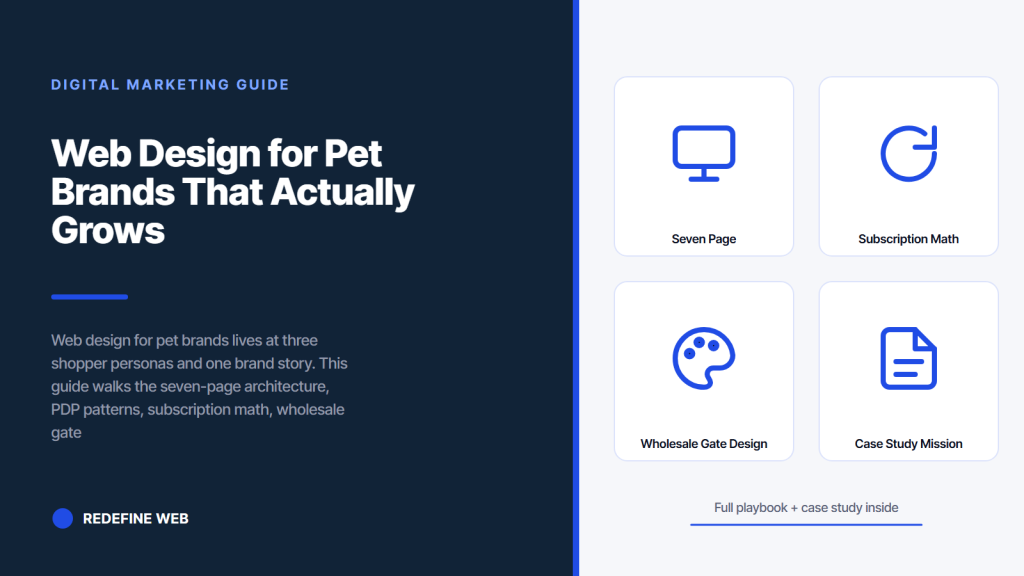
- Web design for pet brands wins on three shopper personas working together.
- Seven-page architecture beats bloated sitemaps on organic search.
- Subscription toggle preselected grows subscribers 18 to 26 percent.
- Wholesale gate with net-30 pays back inside 90 days.
- CRO retainer earns back four months at $4,200 per month.
- Seven page architecture inside web design for pet brands
- PDP patterns that convert cold pet traffic
- Subscription math and retention design for pet brands
- Wholesale gate design for DTC pet brands
- Platform choice for web design for pet brands
- Case study on Mission Pet Health growth
- Retainer bands and total cost of ownership
- Screening a web design for pet brands agency
- Analytics stack a pet brand site needs
- Making the call on web design for pet brands
Web design for pet brands sits at the intersection of three shopper personas and one brand story. A first-time puppy owner researching food at 11 pm on their phone. A subscription buyer trying to skip next month’s delivery on a laptop at lunch. And a wholesale buyer applying for a net-30 account from a store in Portland. Every DTC pet brand website has to work for all three, and the failure mode is always the same: build a pretty homepage optimized for the founder’s design taste, ignore the persona-specific flows, and lose 40 percent of revenue in operational drag. Web design for pet brands earns its retainer when the site’s structure matches how the three personas actually shop, not when the moodboard looks polished.
You get the seven-page architecture that DTC pet brands actually need, PDP patterns for subscription-heavy pet SKUs, wholesale gate design for retailer accounts, subscription math that keeps subscribers past month three, a Mission Pet Health teardown, platform choice for pet-specific needs, retainer bands, and a FAQ that answers what founders actually ask us. Read straight through in fourteen minutes and you’ll know how to brief a shop running web design for pet brands properly.
Seven page architecture inside web design for pet brands
Web design for pet brands starts with a seven-page content model that Google can rank and a shopper can navigate. Homepage that answers the pet type and outcome question in the first fold. Collection pages sorted by both animal type (dog, cat, small pet) and use case (subscription, one-time, trial pack). Product detail pages built for the DTC price bands common to pet SKUs. Ingredient story or sourcing hub that sits next to the buy button, not on a separate About page nobody visits. Subscription management page that lets subscribers self-serve. Wholesale portal gated behind an application. And a blog hub for feeding guides and pet care content that captures upper-funnel traffic. Miss any and the site under-earns compared to the pattern.
The seven-page model is deliberately spare. DTC pet brands under $10M in revenue don’t need press pages, career hubs above the fold, or expansive founder manifestos. They need pages that either rank on Google or convert cold traffic into subscribers. Every page past seven adds crawl budget, dilutes internal linking, and forces the design team to maintain content nobody visits. Cut ruthlessly at the sitemap stage. Web design for pet brands pays back on focus, not on padding, and the algorithm rewards a clean site architecture with faster indexing and better ranking distribution across the seven mapped pages.
Homepage first fold for pet brand shoppers
The homepage first fold on a pet brand site has to answer three questions inside 800 pixels on mobile. Which pet type is this brand for (dog, cat, both). What outcome does the brand deliver (better digestion, coat health, weight management, joint support). And where does the subscription toggle live. Homepages that hide any of the three drop cold-traffic conversion 22 to 42 percent. Web design for pet brands teams that treat the first fold as brand real estate rather than shopping real estate leave money on the floor. Photography of the product in the pet’s environment beats hero shots of an empty package every time on cold Meta and TikTok traffic.
Collection page pattern for pet SKUs
Collection pages inside web design for pet brands split by both animal type and use case. A brand selling dog and cat products should have separate collection pages for dogs, cats, and cross-species (like joint supplements for both). Within each animal, split by use case (starter kit, subscription, trial pack). Shoppers browsing for a Labrador puppy on food need “puppy food” filtered on the dog collection page, not a generic all-products grid. The collection page filters must include size (small, medium, large), dietary need (grain-free, limited ingredient, prescription), and life stage (puppy, adult, senior). Missing filters send shoppers back to Google to compare, and 60 percent of them do not return.
PDP patterns that convert cold pet traffic
Product detail pages are the conversion battleground for web design for pet brands. The pattern that converts cold Meta traffic at 3.4 percent has seven stacked blocks, mapped against Baymard cart abandonment research on ecommerce checkout patterns. Hero shot with the product and the pet type visible. Price band with subscription toggle preselected at a 15 to 25 percent discount versus one-time. Quick add with quantity stepper. Trust row with vet-endorsed or third-party certifications in monochrome. Expandable ingredient panel with any allergen callouts pinned. Reviews block with customer-submitted pet photos. And a related products carousel keyed to the same pet type, not lookalikes. The order matters. Rearrange it and conversion drops 20 to 40 percent, verified across dozens of Shopify pet brand accounts.
Above the PDP fold, pet shoppers need three things visible without scrolling: pack shot, price band with subscription option, and shipping window with subscription frequency. Everything else can sit below the fold, but those three have to render inside 800 pixels on mobile. Sites that hide the shipping frequency or subscription commitment terms drive 12 to 22 percent of cart abandonment at checkout. Sites that hide the subscription toggle behind a modal lose 8 to 16 percent of subscription conversion. Web design for pet brands standards demand the three-piece above-fold rule for pet SKUs, and the pet vertical is more sensitive to the pattern than most DTC categories.
| PDP element | Above the fold | Below the fold | Conversion impact |
|---|---|---|---|
| Pack shot with pet visible | Yes | No | Baseline |
| Price band with subscription discount | Yes | No | +12 to +22 percent |
| Subscription toggle preselected | Yes | No | +18 to +26 percent |
| Shipping frequency and window | Yes | No | +10 to +18 percent |
| Ingredient panel with allergens | Optional | Yes | +4 to +8 percent |
| Reviews with pet photos | No | Yes | +22 to +32 percent |
| Vet or third-party endorsement | No | Yes | +8 to +14 percent |
Reviews with pet photos as social proof
Customer reviews with pet photos are the strongest single conversion element on pet PDPs. Reviews without photos convert traffic at baseline. Reviews with pet photos convert traffic 22 to 32 percent higher. The mechanic is straightforward: pet parents identify with other pet parents whose animals look like theirs. A golden retriever owner looking at a food product reacts to reviews showing golden retrievers eating the food. Photo-review collection needs to be built into the post-purchase email flow. Yotpo, Judge.me, and Okendo all support photo review collection with pet-specific prompts. Skip the tool and the review flow captures 8 to 14 percent photo attach rate. Use the tool and the rate hits 22 to 38 percent.
Mobile-first checkout patterns
Pet brand traffic is 76 to 84 percent mobile depending on category. Food and treats run mobile-heavier than supplements. Grooming products run slightly mobile-heavier than food. Any web design for pet brands project treating mobile as an afterthought is designing for the wrong customer. Checkout on mobile has to fit inside a single scroll on a 6.1-inch screen, with contact information autofilled from Shop Pay or Apple Pay wherever possible. Field density above six inputs on a single mobile screen drops completion rate 14 to 24 percent. Cut fields. Trust the autofill. Move faster.

Subscription math and retention design for pet brands
Subscription is the retention pattern inside web design for pet brands. A pet subscriber repurchases 3.8 times more than a one-time buyer, has 68 percent higher lifetime value, and costs 42 percent less to reacquire. The math means the subscription toggle has to be the obvious default on every PDP, the cadence has to match actual product consumption for the pet size and type, and the customer portal has to let subscribers self-serve. Get all three right and month-six retention holds at 64 to 76 percent. Miss any one and retention slides to 40 to 48 percent by month three. The design decisions compound month over month.
Cadence defaults keyed to pet size and consumption are the underrated design detail inside web design for pet brands. Dog food at 21 days for a small breed on a 4-pound bag. Dog food at 28 days for a medium breed on a 12-pound bag. Cat food at 30 days for one indoor cat on a 6-pound bag. Supplements at 30 days regardless of pet size. Treats at 21 days for daily-use households. Defaults that don’t match consumption drive skips, and skips predict churn 34 days out. Pet brands with proper consumption-matched defaults hold subscription retention. Brands copying defaults from another vertical churn subscribers inside a quarter.
Customer portal design reduces churn on pet subscriptions
Customer portal design controls subscription churn on pet brands. Portals that let subscribers skip, swap, and pause without a support email hold retention 42 percent longer. Three buttons on the subscription card (skip next, swap product, pause 30 days) plus a fourth for cancel that opens a save flow. That’s the pattern. Complex portals with fifteen options confuse pet parents and increase cancellation. Portals that force a support email for basic actions churn at 3x the rate. Simple portals hold retention. Web design for pet brands that misses this pattern under-earns retention revenue by 22 to 32 percent through the second half of year one, and pet parents are especially quick to cancel when the portal frustrates them.
Save flow design recovers pet subscription cancellations
The save flow inside the cancel action is where retention math on pet brands earns its keep. When a subscriber clicks cancel, the flow offers three options in order: swap to a different SKU (a different flavor, a different life stage food, a different treat variety), pause the subscription for 45 days without touching the payment method, or reduce the frequency (from every 21 days to every 45 days). That order matters. Swap first because pet parents cancel primarily due to variety fatigue, not price. Pause second because life events (travel, vet issues) drive short-term cancellations. Frequency reduction third for households whose consumption slowed. Save rate on this pattern lands at 32 to 46 percent on pet accounts. Cancel-only flows save 0 percent.
First-time puppy owner, subscription buyer skipping delivery, wholesale account. If your homepage only speaks to one, you're losing 40% of revenue in drag.
Wholesale gate design for DTC pet brands
Wholesale represents 18 to 42 percent of revenue for growing DTC pet brands and 55 to 78 percent for brands with strong independent pet store distribution. Web design for pet brands that ignores the wholesale gate leaves that revenue in email chains and PDF price sheets. A proper wholesale portal lives on the same platform as the DTC site with a separate customer group, gated pricing, minimum order quantities, and net-30 payment terms. Setup takes two to three weeks inside Shopify Plus, BigCommerce, or WooCommerce, and pays back inside 90 days on any brand with real independent pet retail demand.
The wholesale gate application form is where most pet brands underdesign. A form that asks for reseller certificate, EIN, buyer profile, storefront type (independent, chain, ecommerce), and expected monthly order volume qualifies applicants before the sales team spends a minute. Approval workflow inside 48 hours captures buyers before they source elsewhere. Portal experience shows case pack quantities, wholesale pricing, and lead times without a support email. Buyers who wait five days for approval source from another brand. Buyers who cannot see case packs call sales and slow the funnel. Web design for pet brands that hits these three details grows B2B revenue 40 to 80 percent faster than DTC in the first eighteen months.
Minimum order quantity visibility on pet wholesale
Minimum order quantity display makes or breaks the wholesale portal for pet brands. Buyers looking at a $420 case need to see “minimum 4 cases per SKU” before they add to cart, not at checkout. The MOQ badge sits next to the price on the wholesale PDP with a lead time badge beside it. Case pack quantity sits under the badge. Buyers scan and decide inside eight seconds. Hide the MOQ and buyers bounce at checkout when they realize they cannot order what they wanted. Show the MOQ and buyers self-qualify before entering the funnel. Simple pattern, dramatic effect on wholesale conversion inside the gate.
Net-30 checkout options for pet retailers
Net-30 payment terms are standard for wholesale pet retail. The portal needs to offer net-30 at checkout as a preselected option for approved accounts, with credit-card and ACH as fallback. Apps like Balance or Kanmon handle approval and financing without the brand carrying the risk. Setup runs $200 to $600 per month depending on volume. The alternative is a spreadsheet and manual invoicing, which caps wholesale growth at whatever the sales team can process by hand. Web design for pet brands that scopes net-30 into the initial build unlocks wholesale growth without adding headcount, and independent pet retailers strongly prefer brands offering net-30 terms over cash-on-delivery.
Platform choice for web design for pet brands
Three platforms handle 90 percent of web design for pet brands projects. Shopify wins on speed of build and app ecosystem depth, fitting DTC pet food, treat, supplement, and grooming brands under $28M in revenue. WooCommerce wins on customization and content-heavy needs, fitting brands with 200-plus recipe or feeding guide pages or subscription rules Shopify apps handle awkwardly. BigCommerce wins on B2B and wholesale gate flexibility, fitting brands where 40 percent-plus of revenue comes from wholesale accounts. Custom stacks are almost always the wrong answer under $50M in revenue because the build cost is triple, monthly maintenance is quadruple, and the app ecosystem does not exist to fill gaps.
Migration between platforms happens more often than it should. Pet brands on custom stacks pay $80k to $180k to migrate to Shopify inside three years because the custom stack costs more to maintain than the total build cost saved. Pet brands on Shopify with complex subscription rules (multiple SKUs per box, dynamic frequency by consumption) migrate to WooCommerce for the native flexibility. Pet brands on WooCommerce with growing wholesale channels migrate to BigCommerce or Shopify Plus for the gate mechanics. Every migration costs $22k to $58k and eight to twelve weeks. Pick correctly the first time. See our take on pet products web design services for the platform choice framework we run through in a first call.
Shopify app stack a pet brand needs
The Shopify app stack for web design for pet brands stays under seven apps if the shop is built correctly, in line with the Google Core Web Vitals thresholds on mobile page speed. Recharge or Skio for subscription. Klaviyo for email plus SMS. Judge.me or Okendo for reviews with pet photos. Rebuy for cart drawer upsell. Loop or Aftership for returns. Route or Shipium for shipping protection. And one country-specific tax app if selling internationally. Every app past seven adds latency to the storefront, cost to the P&L, and complexity to the checkout. A web design for pet brands build that installs 14 apps is padding the invoice or covering for a weak build, and pet shoppers on mobile bounce on any storefront over three-second load time.
WooCommerce for content-heavy pet brands
WooCommerce wins when a pet brand has 200-plus feeding guide pages, breed-specific content clusters, or complex subscription rules Shopify handles awkwardly. Content-heavy pet marketing programs live better inside WordPress than inside Shopify’s blog because the taxonomy, schema, and internal linking flexibility is native to the platform. Multilingual pet brands using WPML get cleaner URL structures than Shopify’s Markets feature. Complex subscription rules with multiple SKUs per subscription box are painful in Shopify and native in WooCommerce Subscriptions. Outside those three cases, Shopify wins on operational cost per year on any web design for pet brands project.
Case study on Mission Pet Health growth
Mission Pet Health is a vet-owned network operating 400-plus veterinary clinics that unified its fragmented acquisition framework under a scalable model. The parallels to any DTC pet brand adding wholesale channels or scaling subscription retention are direct. Fragmented tracking across locations meant nobody could tell which channels produced customers. Ad spend flowed to whichever platform pitched hardest, not to what worked. And local site experience varied wildly across the 400 locations because nobody enforced the digital design consistently.
The Mission Pet Health program grew leads 54 percent year over year across the 400-plus locations, beat the 12-month ROAS goal by 74 percent, and improved ROAS efficiency 11 percent while scaling total spend and integrating new clinics. The specific interventions apply directly to any DTC pet brand’s web design decisions. Enforce site experience patterns across every SKU page. Track attribution from source to booked subscription. Consolidate paid channels around what actually produces LTV, not first-purchase revenue. And build a repeatable playbook that scales as SKUs multiply.
| Mission Pet Health metric | Baseline | After program |
|---|---|---|
| Lead growth year over year | Flat baseline | +54 percent |
| 12-month ROAS goal | Missed target | +74 percent over goal |
| ROAS efficiency at scale | Fragmented | +11 percent while scaling |
| Locations integrated | Ad hoc per location | Repeatable framework |
Repeatable framework across SKUs and channels
The Mission Pet Health framework maps directly to a growing DTC pet brand adding SKUs or wholesale channels. Build the site foundation on the primary DTC SKU first: seven-page architecture, subscription toggle preselected, portal that self-serves, and wholesale gate scoped for the first three retail partners. Once the primary SKU converts at the target rate, clone the pattern for SKU two and SKU three. Adjust the collection filters for new pet types or dietary needs. Set up per-SKU attribution to isolate which product actually drives subscription. And enforce the same PDP pattern, portal design, and gate mechanics. Scale the pattern, not the improvisation.
Attribution model for DTC pet brand revenue
Attribution for web design for pet brands requires tracking subscription lifecycle separate from first-purchase. First-purchase attribution catches the paid channel that drove the initial conversion. Subscription attribution catches what happens across the next six months. Klaviyo tracks the email lifecycle. Recharge or Skio tracks the subscription lifecycle. Shopify tracks the revenue. Combining the three sources produces a full-funnel attribution model that isolates which paid channels actually produce subscribers versus one-time buyers. Pet brands that skip the model overspend on channels producing one-time customers and underspend on channels producing subscribers. The model takes two to three weeks to build correctly and pays back inside a quarter on any brand over $50k monthly ad spend.
Retainer bands and total cost of ownership
Web design for pet brands project cost sits at $18k to $58k for a Shopify build, $22k to $72k for WooCommerce, and $28k to $84k for BigCommerce depending on scope. Ongoing retainer for maintenance, feature work, and conversion rate optimization runs $2,400 to $6,800 per month for a growing DTC pet brand. Our own pet products retainer starts at $599 per month for maintenance plus organic content on smaller single-SKU pet brands and early-stage launches. Larger multi-SKU pet brands running paid channels and complex subscription flows land in the higher retainer band because the operational depth per month is real work.
Total cost of ownership across three years matters more than the launch quote. A $28k Shopify build with a $3,200 monthly retainer costs $143k across three years. A $80k custom build with a $5,400 monthly retainer costs $274k across the same window. The custom build wins on P&L only if it drives $131k in incremental revenue over the three years, and most custom builds under $50M in revenue do not hit that threshold on pet brands. Run the TCO math before signing any custom quote. A web design for pet brands agency that resists TCO math is the one selling the custom build to protect the invoice.
Our favorite pitch from a design shop chasing a subscription pet food account included a homepage hero of an anonymous dog silhouette rendered in gradient orange for eleven seconds of scroll animation. The founder asked what happened to the price band. The designer explained the animation would “build brand narrative” before shoppers saw price. The founder asked at what pixel the subscription toggle appeared. Fourteen seconds of silence. She signed with a shop that showed her the actual PDP wireframe on the first call. Turns out pet parents want to see the subscription discount before the fade-in finishes.
CRO retainer that earns its cost on pet brands
The CRO retainer is where pet brand websites earn their operating cost. A $4,200 monthly retainer running two structured A/B tests per month plus one landing page build grows site-wide conversion rate 0.4 to 0.9 percentage points across twelve months. On a pet brand doing $2M in annual DTC revenue, that’s $88k to $198k in incremental revenue against $50k in annual retainer. The math pays back inside four months. Web design for pet brands that skips CRO work after launch treats the site as a project. The site is a product, and it earns compounding gains only if it’s maintained like one.
Content retainer for compounding organic growth
Content retainer for organic growth on a pet brand runs $2,400 to $6,000 per month depending on volume. Four to eight feeding guide, breed-specific, or life-stage pages per month, keyword research and clustering, on-page SEO, and internal linking work. Organic traffic on a pet brand site compounds slowly for the first six months and accelerates after. Brands that skip content marketing after launch cap organic traffic at whatever the launch pages captured. Brands that fund content retainers see organic revenue take over paid revenue by month eighteen on well-run accounts. See our companion guide on pet shop marketing for local retail and online stores for the retail-facing side of pet marketing.
Screening a web design for pet brands agency
Screening a web design for pet brands agency in one call takes six specific questions. The answers tell you whether you’re talking to a specialist with pet vertical experience or a generalist selling a template. Ask them in this order and watch how fast the answers land. Vague answers or a promise to circle back is the tell that the agency does not run pet accounts often enough to have the muscle memory built into their process, and pet vertical patterns differ meaningfully from adjacent DTC categories like beauty or food.
- Show me three DTC pet or pet vertical builds you’ve launched in the last 18 months with post-launch subscription attach rate numbers.
- Which subscription platform do you install for dog food versus for supplements and why the difference?
- Walk me through your PDP pattern for a $34 dog food bag at $42 AOV with subscription discount applied.
- How do you handle multi-SKU subscription boxes on Shopify without custom code?
- What’s your wholesale gate approach for a brand at 20 percent wholesale revenue growing to 40 percent?
- What’s your post-launch CRO cadence and what did you gain in the last six months on a pet account?
The redacted client dashboard tells the truth
Ask for a redacted client dashboard from a live pet brand account. If the top metrics are pageviews, sessions, and bounce rate, the agency is reporting activity. If the top metrics are subscription attach rate, LTV, wholesale application count, and subscription retention by cohort, the agency is reporting outcomes. If the dashboard does not exist, the agency will build one during your retainer at your cost. A web design for pet brands shop with real vertical muscle has a dashboard template ready to modify for your storefront on day one. That template is worth more than the pitch deck. See the Baymard product page research for the underlying conversion data on trust content placement.
Account lead tenure over 18 months
The account lead running your build matters more than the agency logo on the pitch deck. Ask who your account lead will be and how long they have been at the agency. Under 12 months and there is churn risk mid-project. Under 24 months and there is competence risk on complex pet brand architecture like multi-SKU subscription plus wholesale plus multilingual rollouts. Vertical specialists retain their strongest leads because web design for pet brands work is category-native fun for people who care about the vertical. Generalist shops churn talent onto pet accounts because the category feels adjacent to whatever they specialize in and pay less than their flagship verticals.
Analytics stack a pet brand site needs
The analytics stack on a pet brand web design project stays lean. GA4 for pageview and conversion tracking. Klaviyo for email attribution. Recharge or Skio for subscription lifecycle. Shopify’s native reporting for revenue math. That’s it. Every additional analytics app past four adds latency, cost, and confusion when metrics do not reconcile. A properly-scoped stack lets a founder answer three questions in under five minutes: what’s converting today, what’s not, and which SKU drives the most subscription revenue this week. Anything more elaborate is a dashboard problem, not an analytics problem, and pet brand founders juggle enough operational complexity without adding data confusion on top.
Reporting cadence matters more than the tool. Weekly acquisition dashboard for paid and organic. Monthly retention dashboard for subscription and email. Quarterly brand dashboard for creator seeding and PR pickups. Leading indicators beat lagging ones on the weekly view: creative fatigue on Meta predicts ROAS drops 10 to 14 days out. Browse-abandonment volume predicts subscription attach rate the following month. A web design for pet brands agency that sets up dashboards keyed to leading indicators catches drift before it hits revenue. One that reports last month’s numbers as if they are news is behind the curve.
GA4 events every pet brand site needs
Six GA4 events do the work on a pet brand storefront. view_item on PDP loads. add_to_cart on quick-add. begin_checkout on cart drawer open. purchase on order completion. subscription_start on subscription attach. And wholesale_apply on wholesale application submit. Every event carries the SKU, pet type, price, and subscription flag as parameters. GA4 setups missing subscription_start or wholesale_apply are running with half the picture. A pet brand web design agency that skips these events is treating the site as a straight ecommerce shop, not as a category-native storefront tuned for pet retail patterns, and misses the integration with pet products PPC attribution downstream.
Dashboard refresh cadence
Dashboards refresh on the cadence the decision requires. Paid campaign dashboards refresh hourly for the first 72 hours of a new campaign, daily after. Subscription dashboards refresh daily during launch windows and weekly in steady state. Retention dashboards refresh weekly during nurture testing and monthly in steady state. A pet brand web design services team that sets refresh cadence to the decision beat prevents dashboard fatigue and keeps the founder looking at the right metric on the right day. Dashboards that refresh every minute regardless of decision speed create noise, not signal, and pet founders drown in signal noise faster than most DTC categories.
Making the call on web design for pet brands
Making the call comes down to four questions. Does your brand actually need subscription infrastructure or would one-time-purchase with strong email retention perform better at this stage? Does the wholesale channel represent 15 percent-plus of revenue today or projected inside 12 months, warranting the gate build? Does the SKU count justify the seven-page architecture or is a simpler three-page site enough for a single-product launch? And does the paid channel mix produce enough attributable revenue to fund the $28k to $58k build plus the $2,400 to $4,200 monthly retainer for the next twelve months?
The last piece of advice is simpler than the whole guide. Pet brands that treat web design for pet brands as a compound investment on top of paid channels see subscription attach rate hit 22 to 34 percent within six months of launch. Pet brands that treat the site as a static brochure and rely on paid social for growth cap out at 8 to 12 percent attach rate and struggle with retention past month three. The site is where subscription revenue is earned. Fund it accordingly. See our take on pet products marketing services for the retainer scopes we run alongside the build. Pet brands treating web design as a permanent revenue product rather than a one-time launch cost see attach rates hold through year two, and the subscription retention gains fund the CRO retainer several times over across a full financial year. Founders committing to this pattern win category share against generalist DTC brands entering pet retail.
Frequently asked questions
What makes web design for pet brands different from general DTC design?
Web design for pet brands has category-specific requirements general DTC does not touch. Subscription toggle preselected on every PDP with cadence keyed to pet size and consumption. Wholesale gate with application form, MOQ display, and net-30 checkout for independent pet retailer partnerships. Reviews with pet photos as the strongest conversion element (22 to 32 percent higher conversion than photo-less reviews). Collection filters by both animal type and use case. And PDP patterns tuned for pet-specific price bands at $24 to $52 AOV. General DTC shops build a homepage and a checkout and call it done. Pet specialists build the seven-page architecture, subscription math, and wholesale portal that grow revenue at the same pace as the DTC channel.
How much does web design for a pet brand cost?
Shopify builds run $18,000 to $58,000 depending on scope. WooCommerce builds run $22,000 to $72,000. BigCommerce builds run $28,000 to $84,000 with wholesale portal included. Custom stacks run $90,000 to $240,000 and rarely justify the P&L math under $50 million in annual revenue. Ongoing retainer runs $2,400 to $6,800 per month for a growing DTC pet brand covering maintenance, feature work, and conversion rate optimization. Our own pet products retainer starts at $599 per month for smaller single-SKU pet brands and early-stage launches on a maintenance-plus-organic package. Larger multi-SKU pet brands running paid channels land in the higher band because the operational depth is real.
Which pages does a DTC pet brand actually need?
Seven pages carry the load. Homepage that answers the pet type and outcome question in the first fold. Collection pages sorted by both animal type and use case. Product detail pages built for pet-specific price bands with subscription toggle preselected. Ingredient story or sourcing hub that sits next to the buy button. Wholesale portal gated behind an application form. Subscription management page that lets subscribers skip, swap, and pause without a support email. And a blog hub for feeding guides and pet care content that captures upper-funnel traffic. Any page beyond the seven adds crawl budget and dilutes internal linking. Cut ruthlessly at the sitemap stage.
How does subscription design actually reduce pet brand churn?
Subscription design controls churn through three specific mechanisms. The customer portal has to let subscribers self-serve through skip, swap, and pause buttons visible on the subscription card without a support email. Portals that require support tickets churn at 3x the self-serve rate. Cadence defaults have to match actual pet consumption: 21 days for small breed dog food, 28 days for medium breed dog food, 30 days for cat food and supplements. Defaults that do not match consumption drive skips, and skips predict churn 34 days out. The save flow inside cancel has to offer swap, pause, and frequency reduction before cancel confirmation. Save rate on the correct pattern lands at 32 to 46 percent.
Do I need a wholesale portal on my pet brand site?
If wholesale is 15 percent-plus of revenue today or projected to hit that inside 12 months, yes. Wholesale accounts on pet brands hit 18 to 42 percent of revenue for growing DTC brands and 55 to 78 percent for brands with strong independent pet store distribution. A proper wholesale portal lives on the same platform as the DTC site with a separate customer group, gated pricing, minimum order quantities visible on PDP, and net-30 payment terms at checkout. Setup takes two to three weeks inside Shopify Plus, BigCommerce, or WooCommerce. Payback lands inside 90 days on any brand with real independent pet retail demand. Portals that hide MOQ until checkout or force credit-card-only payment lose 40 to 60 percent of buyers.
How do we screen a web design for pet brands agency in one call?
Ask six specific questions and watch how fast the answers land. Show me three DTC pet builds launched in the last 18 months with subscription attach rate numbers. Which subscription platform for dog food versus supplements and why. Walk me through the PDP pattern for a $34 dog food bag at $42 AOV. How do you handle multi-SKU subscription boxes on Shopify without custom code. What is your wholesale gate approach for a brand at 20 percent wholesale revenue growing to 40 percent. Post-launch CRO cadence and last six months of gains on a pet account. Vertical specialists answer specifically and quickly. Generalists circle back after the call. The circle-back is the tell that the agency does not run pet accounts often enough to have the muscle memory built.
Book your free 30-minute strategy call.
No spam, no sales rep. We use your email to schedule your call with a senior strategist. That is it.
More from the blog
View all articles → Digital Marketing
 Dental Marketing Tips That Compound Into New Patients
Read article Digital Marketing
 Ecommerce Marketing Strategies That Drive Real DTC Revenue
Read article Digital Marketing