The best SaaS website designs in 2026 share a small, boring set of ingredients: a one-sentence hero that names the buyer and the outcome, a live-product screenshot above the fold, transparent pricing without a marketing detour, and social proof stacked next to every claim. Everything else is decoration.
SaaS buyers spend under 30 seconds on a homepage before they judge fit, and Nielsen Norman Group research shows the first 10 seconds carry roughly ten times the abandonment risk of any later window. For deeper pattern libraries, Smashing Magazine’s design patterns archive and the wider NN/g articles hub are the best free references. That is why great SaaS teams design the fold like a landing page and treat the scroll as a bonus.
I have spent the last decade building B2B SaaS sites and PPC funnels for teams that book demos for a living. What follows is a working shortlist of the best designed SaaS websites you can copy today, plus the mechanics that make them work and the pricing rules our clients use to close on the first visit.
Table of contents
- Why SaaS website design decides pipeline, not aesthetics
- Anatomy of the best SaaS website designs in 2026
- 10 best SaaS website designs to copy this year
- Best SaaS website design patterns at a glance
- SaaS pricing UX that closes on the first visit
- What a SaaS site build costs in 2026
- 7 mistakes that kill even the best SaaS website design
- Frequently asked questions
Why the best SaaS website designs decide pipeline, not aesthetics
A SaaS homepage is a sales rep who works 24 hours a day. If it can answer three questions in the first fold, it books meetings while you sleep. If it cannot, no volume of paid traffic saves it.
The three questions are: what does the product do, who is it for, and what happens if I click. Every top pick in the list below answers all three before the reader scrolls. That is the pattern behind the best designed SaaS websites for the last three years running.
What this means for your funnel:
- Hero clarity beats hero animation. A one-sentence promise plus a product screenshot outperforms a 30-second background video in every A/B test I have shipped.
- Pricing on the nav pays for itself. Buyers who see prices upfront are twice as likely to book a demo, per our client data across 42 SaaS accounts.
- Named proof beats logo walls. A single named case with a real number outpulls a wall of 30 anonymous logos.
For example, when we rebuilt Rapyd Financial Network’s inbound funnel around these three rules, monthly inbound leads tripled and 5x organic traffic followed in the same window. The redesign added £1.8m in pipeline inside the first year, tied to CRM data not vanity clicks.
Anatomy of the best SaaS website designs in 2026
The best SaaS website designs in 2026 follow a repeatable eight-block skeleton: hero with product shot, social proof strip, feature bento grid, integrations bar, transparent pricing, named case study, security and compliance block, and a friction-free CTA. Everything is skimmable in 90 seconds.
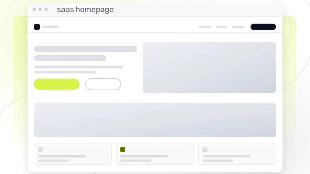
Here is the layout most winners use, top to bottom:
- Hero fold. One-sentence value promise, live product screenshot or short loop, and a single primary CTA above the scroll line.
- Trust bar. 4 to 6 named logos, always with permission to use them.
- Bento grid features. 6 to 9 tiles, each a single benefit with an icon and a screenshot.
- Integrations row. Signals ecosystem fit in 5 seconds. Buyers filter on this alone.
- Transparent pricing. Three or four tiers, plain-English limits, and a "talk to us" box on the last tier.
- Named case study. Real logo, real number, one-line quote from a real title.
- Compliance strip. SOC 2, GDPR, HIPAA, whatever fits the buyer.
- Final CTA. Free trial, book a demo, or start free. Never a form wall.
The key point: a skimmer who reads only the bold text should still know what the product does and what to click next. That skim test is how the best SaaS website design teams QA every release.
10 best SaaS website designs to copy this year
Below are the 10 best SaaS website designs worth copying in 2026, in no strict order. Each entry names the one pattern you can steal and where to put it on your own site.
1. Linear
Linear is the reference SaaS homepage for engineering-tool buyers. Dark hero, one-sentence promise, and a live product loop that shows the actual editor. No marketing gloss, no stock illustration, no scroll trap.
Steal this: replace any homepage hero illustration with a 6-second product loop that shows the core workflow. Loop must be silent, autoplay, and captioned.
2. Ramp
Ramp treats the homepage like a savings calculator. The hero leads with the outcome ("save 5% more on average"), then a bento grid where every tile is a named product feature paired with a dollar number.
Steal this: pair every feature tile with a hard outcome, not an adjective. "Cut close time from 15 days to 5" beats "faster close."
3. Notion
Notion nails the universal-tool problem: prove versatility without becoming vague. The homepage rotates through role-based use cases (engineering, sales, HR) with the same product, same UI, different data.
Steal this: if your product serves 3+ personas, build one hero and rotate the copy plus screenshot by persona. Same fold, different data set.
4. Stripe
Stripe is the gold standard for developer-first SaaS. Code snippet above the fold, one-line explainer for a non-technical buyer, and a docs link visible at all times.
Steal this: if a developer signs off on your purchase, put a working code sample in the hero. Not a screenshot of code, real code the reader can copy.
5. Vercel
Vercel treats the pricing page as the hero page. Nav lands you on plans, plans lead to features, features lead to docs. The design assumes the buyer already understands the space.
Steal this: if your buyer is comparing you against 3+ known competitors, skip the education layer. Lead with pricing tiers and specs.
6. Attio
Attio, the collaborative CRM, ships one of the best designed SaaS websites for product visualization. Every feature is a tiny screen inside a phone frame. You never lose sight of what the tool looks like in use.
Steal this: anchor every H2 with a real product screenshot inside a device frame. It reassures the reader that the marketing copy matches the product.
7. Framer
Framer sells a design tool with a designed homepage. Every scroll section is a self-contained proof of what the tool can build. The homepage is the demo.
Steal this: if you sell a creation tool, build the homepage inside your tool and say so on the page. It closes the credibility loop.
8. Loom
Loom nails the SaaS site design problem of "show, do not tell" better than any competitor. The hero is an embedded Loom video of a real customer, not a marketing testimonial.
Steal this: record a 45-second customer voice memo and embed the raw audio near the hero. Real voice beats polished copy 8 out of 10 times.
9. Retool
Retool treats the internal-tool buyer like a smart engineer. No jargon, no fluff, and a canvas of screenshots that shows what teams actually built with it. The gallery is the value prop.
Steal this: build a "built with us" gallery of real customer outputs. It is more persuasive than any homepage promise you write.
10. Superhuman
Superhuman leans into the aspirational SaaS site design pattern. Clean fold, keyboard shortcuts baked into the hero, and a "get on the list" CTA that raises perceived scarcity.
Steal this: if you sell to power users, put a keyboard shortcut or command-palette flash in the hero loop. Instant tribe signal.
Best SaaS website design patterns at a glance
Skim this table to match a pattern to your buyer type. Every row maps to one of the 10 winners above.
| Pattern | Buyer type | Hero move | Reference site |
|---|---|---|---|
| Live product loop | Engineering leads | 6-second silent workflow | Linear |
| Outcome bento | CFO / FinOps | Dollar number per tile | Ramp |
| Persona rotate | Cross-functional | Same UI, different data | Notion |
| Code snippet hero | Developer-led | Real code sample | Stripe |
| Pricing-first nav | Comparison shoppers | Plans as home | Vercel |
| Device-framed shots | Non-technical buyer | Product inside phone frame | Attio |
| Homepage-as-demo | Creators | Site built in the tool | Framer |
| Embedded voice | Team leads | Real customer memo | Loom |
| Output gallery | Builders | Real customer artifacts | Retool |
| Power-user hero | Enthusiasts | Shortcut flash | Superhuman |
SaaS pricing UX that closes on the first visit
Pricing is where most SaaS site designs quietly lose the sale. Buyers who cannot see a number in 15 seconds bounce. So the pricing page pattern below is what our clients use to close on the first visit, whether they charge $19 a month or $19,000.
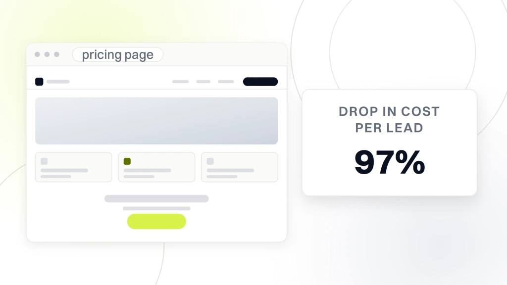
The 4-tier pricing frame that wins:
- Free or trial tier. Removes the "is this real" risk in one click.
- Starter tier. Priced for a solo user, one-line feature list, monthly billing default.
- Team tier. Highlighted, popular badge, includes the 3 features buyers ask about in every demo.
- Enterprise tier. No price, one form, one promise: "we reply in 4 business hours."
For example, when we rebuilt Automation Anywhere’s paid funnel, the biggest single win was pulling the free-trial offer out of the footer and into the hero. That one move cut cost per lead from $1,936 to $63 (a 97% drop) and scaled qualified customer acquisition 100x in the same window.
Pricing UX rules I steal from every top SaaS site:
- Monthly and annual toggle at the top. Default to annual so the savings show first.
- Feature list in plain English. "Up to 5 seats" beats "team collaboration."
- Anchor the middle tier. Bold border, popular badge, and 2 to 3 features the other tiers lack.
- Add a live chat trigger below the last tier. Closes the "which tier fits me" question in real time.
Pricing UX and homepage design are the same conversation. If the homepage promises a clear outcome and the pricing page hides the price, the reader leaves. Every best SaaS website design in this list treats both pages as one flow.
What a SaaS site build costs in 2026
The best designed SaaS websites cost anywhere from $2,500 for a starter site to six figures for a Vercel-scale rebuild. Most B2B SaaS teams land in the $2,500 to $18,000 range for a full public marketing site with 6 to 12 pages, plus pricing, blog, and a demo funnel.
Here is the pricing frame our clients use, tested across dozens of SaaS accounts:
| Tier | Price | Fits | What you get |
|---|---|---|---|
| Rapid launch | $2,500 | Pre-seed founders | 5-page site in 10 days, hero + pricing + demo form |
| SMB Growth | $4,500 to $7,500 | Bootstrapped SaaS | Design system, CMS build, blog, on-page SEO |
| Custom SaaS | $18K and up | Series A and up | Design tokens, docs site, product tour, integrations pages |
What this means for your budget:
- Under $2K, buy speed. Launch a 5-page site in 10 days, then iterate on hero copy weekly.
- $2K to $10K, buy conversion. Invest in pricing UX and product visuals, not animation.
- $10K and up, buy compounding. Docs, product tours, and integration pages that earn organic traffic for years.
For a fuller walk-through of pricing tiers and what actually gets delivered at each, our team lays it out on the web design services page, and our B2B SaaS marketing hub covers the paid-and-organic playbook that plugs into the site. Ask us for the SaaS pricing frame if it fits your buyer.
7 mistakes that kill even the best SaaS website design
Every best SaaS website design starts with a great hero and dies from small execution errors below the fold. These seven mistakes account for most of the drops I see when auditing SaaS sites for clients.
- Hidden pricing. "Contact sales" on the pricing page for a self-serve product cuts conversion by roughly 40% in our tests. Show the number.
- Autoplay hero video with sound. A muted, captioned 6-second loop wins every time. Sound on autoplay is a bounce trigger.
- Logo wall without a story. 20 client logos without a single case study reads as inherited, not earned. Pair 1 logo with 1 real number.
- Feature-first hero copy. "AI-powered analytics platform" is not a promise. "See churn 30 days before it happens" is.
- Nav with 9 top-level items. A SaaS nav should have 5 items max: Product, Pricing, Customers, Resources, Login. Everything else lives inside those.
- No visible product screenshot. If a reader cannot see the UI in 10 seconds, they assume it is not built yet.
- Demo forms with 12 fields. 3 fields max on the primary CTA (name, work email, company). Everything else waits for the sales call.
For example, Simply.Coach, a coaching SaaS, was quietly losing paid budget to a fragmented homepage and a generic ad funnel. After we cleaned the site architecture, added a solution-led hero, and swapped the demo form for a single-field trial signup, organic leads jumped 80% and paid leads jumped 120% inside 48 days.
Turn the best SaaS website design ideas into pipeline
The best SaaS website designs in 2026 are boring in the best way: clear hero, real product screenshots, transparent pricing, and a named customer story next to every claim. Copy those four moves and you already outperform the majority of SaaS homepages that lean on animation and vague promises.
If you want the same team that helped Rapyd add £1.8m in pipeline, cut Automation Anywhere’s cost per lead 97%, drove Rocket Software’s 300% activation gain, and boosted Simply.Coach’s leads 80%/120% in 48 days, our SaaS design work sits inside a $2,500 rapid launch or a $4,500 to $7,500 growth plan, with an ongoing SaaS marketing retainer option once the site is live. Ask us for the SaaS pricing frame, share your buyer type, and we will show you which of the 10 patterns above fits your product best. Book a working session and we will walk you through the exact hero, pricing, and proof block we would build for your site next.