Responsive dental websites in 2026 are the technical baseline for patient acquisition, not a nice-to-have. Over 60% of dental searches happen on a phone. This guide covers the 8 mobile-first must-haves, the Core Web Vitals thresholds Google actually measures, the booking-flow patterns that convert 30 to 60% higher on mobile, the pricing math on a full redesign, and the 3-week workflow to move a stalled practice site from desktop-first to mobile-first without losing organic rankings during the switch.
You already know why they matter. What most sales pitches skip is the specific mobile-first checklist that separates a site that reads on a phone from a site that actually books patients on a phone. This guide walks the 8 technical must-haves in 2026, the page-speed benchmarks that separate ranking sites from stalled ones, the booking-flow patterns that push conversions 30 to 60% higher on mobile, and the redesign math for a practice stuck on a desktop-only or half-responsive build. You’ll see how mobile page speed drives Google Ads quality score, where practices lose 40% of leads to forms that break on iOS keyboards, and the workflow to move a dental practice from desktop-first to mobile-first without losing organic rankings during the switch.
One more definition up top. A mobile-first practice site is one codebase that adapts its layout, font sizes, tap targets, and content hierarchy to whatever screen size is rendering it. Not a separate m-dot site. Not a mobile theme plugin that overrides the desktop design with inconsistent results. One build, tested across all device widths, designed from the phone outward first.
Why responsive dental websites matter more than they did 3 years ago
Google switched to mobile-first indexing in 2023, so the mobile version of your dental site is the version Google uses to determine rankings. Not the desktop version. If the mobile site is slow, hard to navigate, or shows stripped-down content compared to desktop, you are being ranked on the worse version. That single change flipped the priority for every practice with a decade-old site built desktop-first.
The patient behavior data reinforces this. A prospective patient searching for a dentist at 7pm is almost certainly on a phone. They search “dentist near me,” scan 3 or 4 results in the Map Pack, click one that looks credible, and want to either call or book in under 60 seconds. A site that forces them to pinch-zoom to read the phone number, loads a 5-megabyte hero image, or pushes the booking form below 2 screens of desktop-first content loses that patient before they become a lead. In short, the friction cost of a non-mobile site is measured in lost bookings per week, not in abstract UX complaints.
Core Web Vitals for responsive dental websites
Google measures mobile page quality through Core Web Vitals, a set of 3 performance metrics that directly affect your rankings in mobile search results and the Map Pack. Every dental site needs to hit green on all 3 on mobile, not just desktop. Miss any single one and organic ranking gets capped no matter how strong the content is.
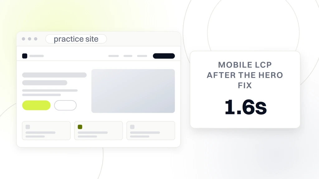
- LCP (Largest Contentful Paint) under 2.5 seconds on mobile. This is the moment the biggest element in the visible viewport finishes loading. On a dental site, that is usually the hero image or the H1 with the practice name. Slow LCP is the single biggest ranking cap for dental practices in 2026.
- CLS (Cumulative Layout Shift) under 0.1. This measures how much the page jumps around during load. A booking button that shifts down 40 pixels since a late-loading ad slot pushed it fails CLS and burns conversion at the same time.
- INP (Interaction to Next Paint) under 200 milliseconds. INP replaced FID as a Core Web Vital in March 2024. It measures how quickly the site reacts when a patient taps something. A slow booking button that takes 400ms to respond feels broken, and Google reads it that way too.
Meet all 3 thresholds on mobile and you clear the technical bar for ranking. Miss any single one and organic performance stays capped no matter how strong the content or backlink profile is. Run PageSpeed Insights against your homepage, top 3 service pages, and contact page monthly. Note the mobile scores. Track the trend across releases.
Why LCP is the single most consequential metric
LCP is the mobile ranking cap most dental sites trip on. The typical culprit is a hero image exported at “quality 90” from a phone or camera, weighing in at 2 to 5 megabytes. On a 4G connection, that image takes 4 to 8 seconds to fully render. LCP fails. Rankings stall. Fix the hero alone, target under 100KB with WebP or AVIF, and mobile LCP typically drops from 4.2 seconds to 1.6 seconds inside a single release cycle. That change usually correlates with a 15 to 25% jump in organic ranking on treatment queries inside 60 days.
The 8 technical must-haves for responsive dental websites
A fully mobile-first practice site carries 8 specific technical elements. Any missing element caps performance on mobile and costs bookings on the exact device where the majority of your patients decide. This is the checklist to run against your existing site or any new build before signing off.
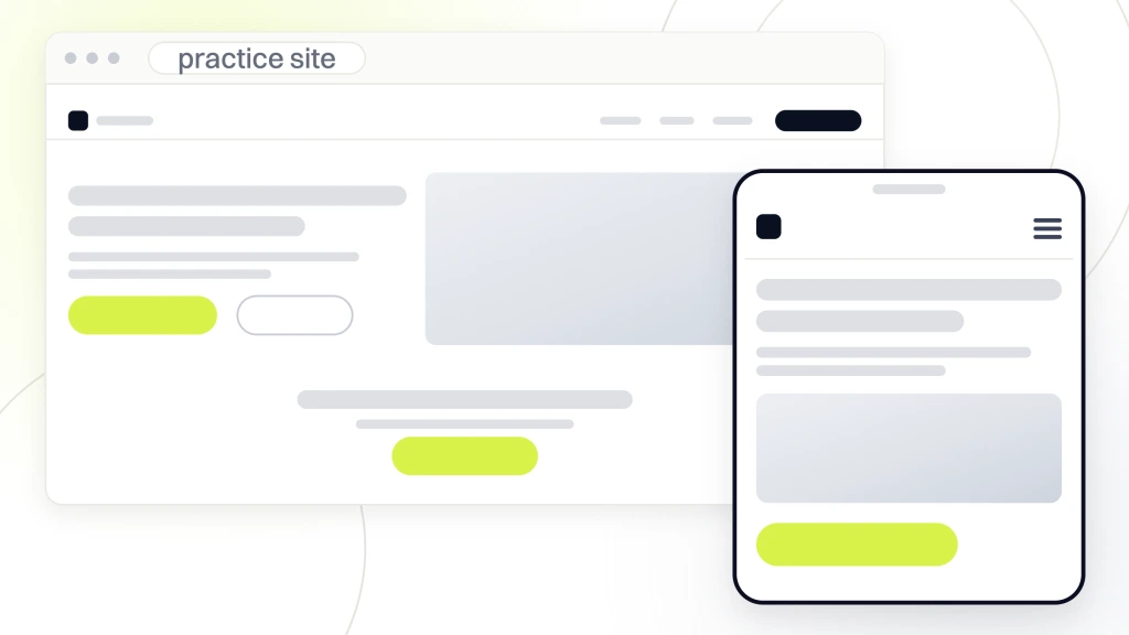
- Viewport meta tag. A single line in the head that tells the browser to render at device width. Skip it and phones render the site at 980px and scale it down, which breaks every layout. This is a 30-second fix that saves the entire mobile experience.
- Fluid grid layout. CSS grid or flexbox with percentage widths, not fixed pixel values. Content flows from a 3-column desktop layout to a single column on phones without breaking.
- Responsive images with srcset. The browser picks the smallest image that still looks sharp on the device. Skip srcset and a phone downloads a 2MB desktop image on a 4G connection every time.
- 44px tap targets. Buttons, phone numbers, and menu items sized at 44 by 44 pixels or larger. Apple’s Human Interface Guidelines set the standard, and Google’s mobile-friendly test enforces it.
- 18px minimum body font. Anything smaller than 18px on mobile fails the readability bar and pushes patients to pinch-zoom. Under 16px triggers Google’s mobile-friendly warnings directly.
- Mobile-optimized booking form. Under 5 fields on mobile, real input types (tel, email) so the right keyboard opens, and no floating labels that break iOS Safari accessibility.
- Click-to-call phone links. Wrap the practice phone number in a tel: link so tapping it dials from any phone. On dental sites, click-to-call typically drives 30 to 45% of total inbound patient calls.
- Core Web Vitals green on mobile. LCP under 2.5 seconds, CLS under 0.1, INP under 200ms, all measured with real-user data in Google Search Console.
The fuller answer on total build cost lives in our guide to dental website development, which covers the discovery-to-launch timeline, PMS integration, HIPAA-safe form handling, and the 8-week production schedule that most single-location practices follow. Read it before locking scope with any vendor.
Booking flow patterns that convert on mobile
Two booking flow patterns win consistently on mobile. The single-step form asks name, phone, and reason for visit all on one screen with a big submit button. Best for practices without real-time PMS integration. The multi-step wizard walks the visitor through reason for visit, then provider, then time slot, then contact info, each on its own screen with a progress indicator. Best for practices with real-time booking integrated with the PMS. The single-step form converts higher on volume but produces lower-quality leads. The wizard converts lower but produces higher-intent bookings. Match the pattern to how the practice handles the calendar, not to what looks nicer in a demo.
Mobile navigation patterns that keep patients booking
Mobile navigation on these sites collapses into a hamburger menu on phones. The pattern is 90% standard, and the remaining 10% is what separates a working navigation from a confusing one. The 3 details worth locking in are a sticky top bar so the hamburger is always visible during scroll, a click-to-call phone number always visible in the top bar, and a book-appointment button always visible in the top bar (either next to the hamburger or as a bottom-anchored sticky button).
Inside the hamburger menu, prioritize the top 4 links (About, Services, Reviews, Contact). Skip 12-item mega menus on mobile. Skip drop-down animations that take longer than 200 milliseconds. Skip “our history” pages nobody clicks. Focus the mobile navigation on the actions a patient came to take, which are understanding who this practice is, seeing what treatments are offered, verifying social proof, and booking. Everything else is secondary on mobile.
The sticky booking button
The single highest-impact mobile navigation pattern for dental sites is a sticky bottom-anchored booking button. The button stays visible at the bottom of every page as the visitor scrolls. Tapping the button opens the booking flow directly. Practices adding this pattern typically see a 20 to 40% jump in booking form completion rate inside 30 days, measured through Google Analytics conversion goals. The pattern costs about 3 hours of developer time to implement. The ROI shows up in the first month, and the pattern compounds every month after that.
How to test a mobile-first practice site on real devices
Test the site on real devices, not just Chrome DevTools emulation. Real devices produce different rendering since iOS Safari, Android Chrome, and Samsung Internet each handle CSS differently. Skip real-device testing and the site probably goes live with a broken booking form on iOS 17 that nobody caught before launch. The 20-minute end-to-end test below catches 90% of issues before patients ever see them.
- Test on iPhone (any model in the last 3 years) with iOS Safari. Covers roughly 55% of dental site mobile traffic.
- Test on an Android phone (Pixel or Samsung) with Chrome. Covers roughly 40% of mobile traffic.
- Test on Samsung Internet browser separately. Handles CSS grid and viewport differently than Chrome.
- Run PageSpeed Insights against every key page, meaning home, top 3 service pages, and contact.
- Run Chrome Lighthouse audits on desktop against the mobile simulation. Compare scores.
- Run WebPageTest for real-world speed data across geographic regions and connection speeds.
- Test forms end-to-end. Submit a real appointment request, verify it lands in the practice inbox and the PMS.
- Test click-to-call. Click the phone number, verify it dials from an iPhone and an Android.
- Test the sticky booking button. Verify it stays visible during scroll and opens the booking flow on click.
- Test the mobile hamburger menu. Verify it opens, closes, and navigates correctly on both iOS and Android.
The test cadence
Run the full mobile test suite 3 times per year on any responsive dental site. iOS and Android push major browser updates that break rendering on sites that haven’t been touched in 12+ months. Practices that skip the annual test cadence usually discover a broken mobile booking form 6 months after iOS pushes a new autofill pattern, which shows up as a 20 to 30% drop in mobile bookings that took 3 months to diagnose. Preventable. Set a calendar reminder.
Responsive dental websites vs mobile dental websites
Responsive dental websites use one code base for all devices. Mobile dental websites, as a separate concept, usually mean a dedicated m.example.com URL serving a separate mobile-only site. The mobile-URL pattern was a 2011 solution that Google now discourages. Responsive is the default in 2026 and produces better SEO since the URL structure stays clean and the crawl budget goes further. The distinction still matters for practices running legacy m-dot infrastructure, so a quick disambiguation is in order.
Practices still running m-dot URLs should consolidate to a responsive design. The consolidation takes 4 to 6 weeks and about $3,500 to $8,000 depending on the size of the existing sites. The upside is 15 to 25% organic ranking gains inside 90 days as Google reconsolidates the site under one URL structure, and 20 to 30% lower Google Ads cost-per-click as landing page quality score improves under the unified responsive stack.
The m-dot migration
Migrating from an m-dot mobile dental site to a responsive design requires 4 steps. Build the responsive design that renders correctly on both mobile and desktop. Set up 301 redirects from every m-dot URL to the corresponding desktop URL. Update Google Search Console properties. Monitor rankings for 6 weeks post-launch. Practices that skip the 301 redirect step lose 30 to 50% of organic traffic during the transition, which recovers over 3 months but hurts the quarter’s patient acquisition volume badly on both organic and paid channels.
Case study on a mobile-first practice site rebuild
Smile Design Dentistry, a 50+ location DSO across Central Florida and Tampa Bay, hit predictable ceilings on paid patient acquisition when per-location landing pages loaded slow on mobile and booking forms broke on iOS Safari. Redefine Web rebuilt landing pages to hit Core Web Vitals green across every location, restructured PPC by funnel and geography, and layered CallRail analytics on top so campaigns optimized on actual booked patients. The result was a 20% jump in PPC conversion rate, a 30% drop in cost per call, and consistent scale across all 50+ offices.
North County Dental Care in Vista, CA is the deeper mobile-first rebuild story. The 20-year practice had strong offline reputation and near-zero organic visibility. Redefine Web rebuilt the site as a secure, mobile-first practice site with fast pages and service pages built to convert. Local SEO cleanup on NAP citations, GBP optimization, and technical SEO repair ran in parallel. From 2021 to 2024, the practice hit 1,000% patient growth (from 1 to 2 new patients monthly to 12 to 16), 385% more organic traffic, and 500% ROI on marketing spend across the full program. The mobile-first site was the platform every other channel loaded onto.
What the responsive rebuild actually produced at iSmile Dental Spa
iSmile Dental Spa in Carmichael, CA is the premium-practice version of the same story. Before the rebuild, the site was non-mobile-friendly, non-HTTPS, missing metadata, and averaging 1 to 2 new patients monthly from digital. Redefine Web built a secure HTTPS mobile-first site with specialized pages for sedation dentistry and periodontal treatment, then layered local SEO, PPC, and video on top. Inside 6 months the site ranked on page 1 for 75 keywords. Organic traffic climbed 800%. Patient volume climbed 900%, from 1 to 2 monthly to 12 to 14 consistently. ROI landed at 500%.
VP Dental and the fragmented-agency fix
VP Dental, a 20+ year practice led by Dr. Valerie Preston, had strong reputation but 2 agencies splitting web from SEO, which inflated cost and diluted performance. Redefine Web unified the site rebuild and the SEO retainer under one strategy. The outcome was 100% growth in new monthly patients, $8,100 in added monthly revenue, and 776% more search impressions on the practice’s core service queries.
Common mobile-first mistakes on dental sites
Practices trip on predictable patterns during the build. The most expensive mistake is skipping real-device testing and discovering a broken mobile booking form 3 months post-launch. The second most expensive is compressing hero images at “quality 90” instead of properly targeting under 100KB, which drags mobile LCP over 3 seconds and caps organic rankings on treatment queries. The mistake list below is what to watch for on any new build or audit.
- Skipping real-device testing on iOS Safari and Android Chrome.
- Compressing hero images at “quality 90” instead of targeting under 100KB.
- Building forms with more than 5 fields on mobile.
- Using floating labels that break iOS Safari accessibility.
- Serving desktop images to mobile devices instead of using srcset.
- Hiding important content on mobile with display:none, which Google may treat as low-value.
- Using pop-up modals that cover 60% of the mobile screen without a visible close button.
- Missing the viewport meta tag, which makes the site render at 980px on phones instead of adapting.
- Not setting width and height on images, which causes CLS problems.
- Ignoring INP (Interaction to Next Paint), which replaced FID as a Core Web Vital in 2024.
Redesigning to a fully responsive practice site
Single-location practices with under 10 pages, and multi-provider practices with 25+ pages, custom PMS integrations, and specialty content sit in the $2,500 Starter, $4,500 Growth, or $7,500 Pro small-business web design tiers. Multi-location groups with 5+ location pages typically pair the site build with a $199, $299, or $499 per month maintenance plan that covers hosting, security, backups, and performance monitoring. The pricing is transparent and the scope is fixed before work begins.
The redesign timeline runs 6 to 12 weeks end to end. Week 1 covers audit of the existing site and mobile UX. Weeks 2 through 4 cover responsive design, mobile-first mockups, and stakeholder review. Weeks 4 through 8 cover development, PMS integration testing, and staging QA. Weeks 9 through 12 cover real-device testing, 301 redirect map, DNS cutover, and post-launch monitoring. For a full walkthrough of the vertical, see our dental marketing hub and pair the redesign with a dental SEO retainer for SEO ranking recovery post-launch.
What the redesign math produces
A mobile-first redesign typically produces 15 to 30% organic ranking gains inside 90 days as Google re-crawls and rewards the mobile-first improvements. Mobile conversion rate goes up 20 to 40% as the form and booking flow start working correctly on phones. Google Ads cost-per-click drops 15 to 25% as landing page quality score improves. Combined, most practices see payback on the redesign inside 6 to 9 months for a single-location practice booking 30+ new patients monthly. The math holds across every case study in the section above.
Final call on the mobile-first practice site
Responsive dental websites are table stakes in 2026 practice marketing. Every dental practice should be running one, and every dental practice not running one is losing 30 to 60% of possible mobile patient acquisition volume to competitors with mobile-first sites. The math isn’t close. The technical implementation is well-understood. The tooling is mature. Practices holding out on non-responsive designs in 2026 are usually protecting a sunk cost from a 2014 build, and that sunk cost keeps compounding.
Practices ready to move should audit the current site on PageSpeed Insights, note the mobile Core Web Vitals scores, and compare to the 2.5s LCP, 0.1 CLS, and 200ms INP targets. Below the targets on any metric, the redesign math pays back inside 12 months. Our team runs a 20-minute diagnostic that pulls mobile speed, form testing, and competitor comparison data, then returns a recommendation with the actual math for the practice. Book the diagnostic from our dental website design services page, or read the counter-view on when a dental website builder makes sense before the redesign spend.