Professional services website design decides whether your firm books the meeting. Your site is the first meeting most prospects have with your firm. They land, scan the hero, check the credentials, look for the service they need, and either book a call or bounce inside twelve seconds. Design that skips the trust cues in that window costs you consultations you never see. The visitor leaves for a competitor whose site loaded faster, said the right thing first, and had a working booking button. That outcome is not a taste question. It is a mechanical one.
This guide covers best practices for law firms, accounting practices, consulting shops, financial advisors, architects, and every other services vertical where the buyer is a decision-maker searching for expertise. You get the page-by-page structure, the trust signals that convert, the security posture that keeps a client’s data safe, the 2026 layout trends worth adopting, and the ones worth skipping. Read straight through in about twelve minutes and walk away with a fix list you can hand to your team the same day.
Professional services website design starts with trust, not taste
Great services website design starts with the buyer’s trust question, not the designer’s taste. A services buyer wants proof before they book time with you. That proof is not a stock photo of a boardroom. It is your published outcomes, your named clients, your credentials, and a clean layout that respects the buyer’s attention. Design taste ranks a distant third to design that surfaces trust signals in the first fold. Skip the fold-one hero video. Show the fold-one credibility.
What the first fold has to communicate
The first fold answers four questions in seven seconds. What you do. Who you do it for. What outcome the client gets. What to click next. Miss any of those and the buyer bounces. A law firm hero that reads “Legal Solutions for Modern Business” fails all four. A law firm hero that reads “M&A Deal Support for $50M to $250M Software Companies” passes them all. Specificity closes deals. Vague hero copy does not.
Where credentials belong on the homepage
Certifications, bar admissions, industry associations, and named clients sit in a strip directly under the hero. Not on the About page. Not in the footer. In the buyer’s line of sight in the first scroll. That placement turns unknown-firm anxiety into confidence in three seconds flat. Firms that hide credentials on secondary pages report 20 to 40 percent lower consultation booking rates than firms that surface them on the homepage.
Outcome-first language over process-first language
Buyers do not want to hear about your discovery workshop, your proprietary framework, or your seven-step methodology. They want to know what result you delivered for the last three clients that looked like them. Rewrite process-first copy into outcome-first copy on every page. The buyer reads outcome first, then reads process once they want to know how you got there. Order matters. The homepage that leads with process loses 30 percent of first-time visitors.
How to design a professional services website page by page
Design one page at a time against one buyer job. The homepage handles orientation. Service pages handle qualification. About handles trust. The case studies page handles proof. Contact handles booking. Each page carries one job. Stuff two jobs onto a page and both underperform.
The first fold decides the meeting. Vague headlines and hidden credentials cost you consultations you never see on the pipeline.
Homepage structure that orients fast
Homepage sections in order: hero with the four-question answer, credentials strip, top three services with one-line descriptions, one flagship case study, a services-fit qualifier for the buyer, a founder or team credibility block, and a single CTA to book a consultation. Every section pushes toward the CTA. Cut any section that does not. A 2,400-word homepage that scrolls through a long value pitch buries the CTA. Buyers who scroll past six sections without a CTA rarely come back for it.
Service page structure that qualifies buyers
Service pages answer six questions: what the service is, who it fits, what it costs, what the deliverable looks like, how long it takes, and what the next step is. Each answer sits inside the first two scrolls. Firms that hide pricing entirely see 40 percent more low-fit consultations that waste sales hours. Firms that publish price bands see fewer consultations and higher conversion to signed engagement. The math favors publishing bands in every services vertical we track.
Case study structure that stacks proof
Every case study opens with three numbers in the first fold: baseline, outcome, and time frame. Then the client name and industry. Then the problem, the work, and the result narrative. Buyers do not read case studies the way marketers wish they did. They scan the numbers, skim the client name, and decide whether to book a call. Numbers first, story second. Firms that lead with narrative see 60 percent lower engagement on case study pages than firms that lead with numbers.
Professional services website design trends 2026 worth adopting
Modern services website design tracks a few clear 2026 trends. The trends worth adopting for services sites: dense information hierarchy with generous typography, dark-mode toggle without dark-mode-only defaults, real client photography instead of stock, embedded case study video snippets under 30 seconds, a searchable knowledge library that doubles as SEO fuel, and page-level performance budgets that keep every route under 2 seconds Largest Contentful Paint on 3G.
| Design pattern | Adopt in 2026 | Skip in 2026 |
|---|---|---|
| Hero animation | One 4-second loop, muted | Autoplay video, background sound |
| Typography | 18px body, 1.6 line height, one serif hero | Fashion sans-serif at 14px |
| Color | 2 brand colors plus 3 neutrals | Rainbow gradient with 6 accents |
| Case studies | Numbers-first cards, filterable grid | PDF downloads gated behind email |
| Contact | Inline booking widget, no phone gate | Multi-step form asking for revenue |
| Navigation | 5-item sticky, mega menu for services | Hamburger on desktop, 12 items in a row |
Typography that reads as premium in 2026
Body copy at 18 to 20 pixels with 1.5 to 1.7 line height. Hero headlines in a serif or transitional face for weight, not a fashion sans. Section headings in the same family as the body for visual coherence. Buyers read a wall of text on a services site more often than marketers expect. Give them typography that respects the reading experience. Web.dev at web.dev covers the performance side of font loading in depth.
Real photography over stock every time
Real client photography, real team headshots, real office spaces. Stock photography reads as inauthentic in eight seconds flat. Buyers have seen every stock library image on a hundred competitor sites. Real photography with real captions doubles time on page and correlates with 25 to 40 percent higher consultation conversion. Budget for a half-day shoot every 18 months and rotate the image library. Nothing else moves the trust needle at that cost.
Performance budget that keeps the site fast
Set a page-level performance budget. Largest Contentful Paint (LCP) under 2 seconds on 3G, Cumulative Layout Shift (CLS) under 0.1, First Input Delay (FID) under 100 milliseconds. Every new asset or third-party script goes through the budget check. Firms that skip the budget watch their site slow 15 percent per year as marketing tools accumulate. Buyers on mobile bounce at twice the rate once LCP crosses 3 seconds. Speed is a design decision.
Best practices for designing a professional services website that converts
Best practices for designing a professional services website land on six trust signals: named clients on the homepage, published outcomes with real numbers, credentialed team bios with headshots and named credentials, third-party reviews from Clutch or Google, published pricing bands, and a booking widget that shows live availability. Six signals. Every services page carries at least three. The homepage carries all six.
Hidden pricing looks strategic and costs consultations. Published bands qualify the buyer before the sales team ever picks up the phone.
- Named clients displayed as logos or short quotes with the client’s real name and role
- Case study numbers presented as the largest text on the case study card
- Team bios with real headshots, real credentials, and links to LinkedIn profiles
- Clutch, Google, and industry-specific review platforms embedded with real star counts
- Published pricing bands on service pages, even if the final price varies by scope
- Booking widget with real calendar availability, not a contact form that promises a reply
- Professional association logos with links to your public membership listing
- Public case study library that shows depth across at least eight named engagements
Named client logo strips that convert
Six to nine client logos in a single row directly under the hero. Not 20. Not 40. Six to nine reads as scannable. More than that reads as brag and buyers stop registering individual names. If your client list runs enterprise-heavy, curate to household names. If it runs mid-market, mix a name buyers recognize with a case study number that speaks louder than the name. Logo strips without one recognizable name land flat. Logo strips with 15 no-name mid-market logos underperform strips with 6 mixed logos.
Team bios that build real trust
Real headshots on a neutral background. Named credentials in text next to the photo, not buried in a paragraph. One-line summary of what they do and who they help. One or two specific outcomes from real engagements. Link to a LinkedIn profile with a public post history visible. Write bios as if buyers will read every line. Buyers read them closely, especially before high-value engagements. A firm with weak bios competes on price. A firm with strong bios competes on expertise.
Third-party review embeds over hand-crafted testimonials
Testimonials curated by the firm carry half the weight of Clutch, Google, or industry-specific reviews the firm cannot edit. Embed a Clutch widget with your real star count. Show a Google reviews carousel with real names. Buyers trust reviews they can verify. Custom testimonials read as marketing. The math is not close. Firms that switch from custom testimonials to embedded review widgets report 25 to 45 percent higher consultation booking rates within one quarter.
The importance of web design security for professional services websites
Solid services website design bakes security in from day one. Web design security matters when your clients trust you with sensitive information. HTTPS on every route. Content Security Policy headers. No third-party trackers on pages that collect personal information. WordPress plugins updated inside 72 hours of every release. Backups running daily. Web application firewall enforcing the OWASP top 10. Skip any of these and one breach ends a decade of reputation building.
The strangest security failure we watched happen in real time was a law firm whose contact form posted client intake data to an unsecured Zapier webhook after a marketing intern configured it three years earlier and nobody had audited the flow since. Six figures worth of intake conversations sat in a Zapier task history. The audit found it in twenty minutes. The remediation took a month. The client conversations they had to have with their book took the entire quarter.
A slow site kills good design. Set the page budget at 2 second LCP and hold every asset to it or watch bounce climb each quarter.
HTTPS everywhere and header hardening
HTTPS on every route including redirects. HSTS header set with a 12-month max-age. Content Security Policy locked down to your own domain plus the specific third-party services you rely on. X-Frame-Options set to deny clickjacking. Referrer-Policy set to strict-origin. Six headers, configured once, and rarely touched again. Firms that skip header hardening expose client data to embedded scripts and fail security audits their enterprise clients run as part of vendor onboarding.
Plugin hygiene and update cadence
WordPress plugins get updated inside 72 hours of every release, even the ones that require testing. Set up a staging environment and a nightly clone of the production site. Test updates in staging. Push to production once they pass. Any plugin unmaintained for 12 months gets replaced. Any plugin from a developer with 3 or more open security tickets gets replaced right away. WordPress documentation at wordpress.org covers the full security posture.
Backup strategy that restores
Daily backups running to offsite storage. Monthly restore tests to a staging environment. A backup that has never been restored is backup theater. Every services firm should run a full site restore inside 30 minutes on a monthly basis to prove the process works. Firms that never test restores discover their backup is corrupted or incomplete during the actual crisis. That is not a good day to find out.
Peak Accounting Solutions rebuilt for SEO-driven leads
Peak Accounting Solutions, a Dublin-based tax and business advisory firm with over a decade of experience, came to Redefine Web dependent on referrals and invisible online. Their website was outdated, not search-friendly, and lacked conversion points. Google Business Profile sat poorly optimized. COVID-era networking dried up. Referral pipeline shrank. The partners knew the site did not reflect the caliber of the tax and advisory work, and it did not carry the search authority a modern services website needs to earn leads at scale.
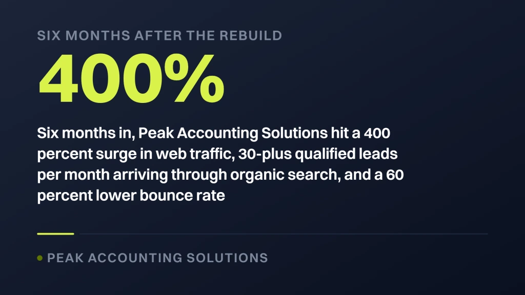
Redefine Web ran a modern WordPress redesign paired with an SEO content strategy and Google Business Profile optimization. Six months in, Peak Accounting Solutions hit a 400 percent surge in web traffic, 30-plus qualified leads per month arriving through organic search, and a 60 percent lower bounce rate on the redesigned service and pillar pages. The pricing clarity, the ungated advisory content, and the credentialed team bios did most of the conversion work. SEO decisions plus design decisions compound once they run against the same buyer journey.
Design choices that moved the numbers
Six choices carried the weight for the Peak Accounting Solutions rebuild. Redefine Web rewrote hero copy from generic services messaging into specific outcomes for Dublin-based tax and business advisory buyers, cut the fold-one hero video that slowed load, added a credentials strip directly under the hero, published fee bands on every service page, ungated the advisory library with real client names and case notes, and added an inline booking widget in place of the multi-step contact form. Six changes, six weeks, and the numbers moved for the next twelve months.
Lessons from the accounting rebuild
Lesson one, hidden pricing is a friction machine that costs consultations without saving sales time. Publish bands and buyers self-qualify. Lesson two, hero video is the most overrated design choice in services websites. It slows load, distracts from the CTA, and rarely explains the offer well enough to earn the tradeoff. A static hero with strong typography converts better in nearly every services vertical, from tax advisory to management consulting to M&A legal work.
Conversion patterns for professional services website design in 2025 and 2026
Conversion patterns for services sites land on one truth: reduce friction between the buyer’s decision and the booking. Every extra field on the contact form drops conversion 4 to 7 percent. Every extra step in the flow drops it another 8 to 12. Every second of load time past 2 seconds drops it 5 to 9. Add all that up and a slow, form-heavy contact flow converts 40 to 60 percent lower than a clean, fast one.
The most common friction points on services sites are the multi-step contact form asking for revenue and industry, the phone-gated consultation booking that forces a callback loop, the case study PDFs gated behind an email opt-in, and the pricing page that says “request a quote.” Marketers built each of these to score leads. Each costs the firm consultations. The fix is inline booking, published pricing bands, ungated case studies, and a two-field contact form.
Inline booking widget that shows real availability
An inline Calendly, SavvyCal, or HubSpot booking widget on every service page and the contact page. The buyer picks a slot inside 60 seconds. No callback loop. No email tag. No sales rep sending calendar invites. Firms that switch from contact form to inline booking see 40 to 80 percent more consultations booked. The consultations skew slightly less qualified, yet the total quality-adjusted volume goes up when more buyers engage. Trade some qualification for volume at the top of the funnel.
Published pricing bands over pricing-hidden pages
Publish pricing bands on service pages. Smart web design pricing at Redefine Web runs $2,500, $4,500, or $7,500 for small builds. Retainer maintenance runs $199, $299, or $499 per month. Buyers self-qualify. Buyers who cannot afford your bands bounce before wasting sales team hours. Buyers who can afford them arrive on the consultation call ready to talk scope. Firms that hide pricing report 40 percent more low-fit consultations that waste hours.
Ungated case studies over PDF downloads
Publish case studies as full public pages with named clients, real numbers, and the full narrative on the page. No PDF download. No email gate. Buyers who want to read your case studies want to make a buying decision. Gating that reading behind a form pushes 60 to 80 percent of interested buyers to the back button. The ungated case study page earns backlinks and organic traffic the PDF never will. Two wins from one design decision.
Technical foundation professional services website design depends on
Every services website sits on a technical foundation, not on top of one. Design will not save a slow site. Design will not save an inaccessible site. Design will not save a site with broken schema. The technical foundation carries every design decision. Core Web Vitals in the green across every route. WCAG 2.2 AA accessibility compliance across every page. LocalBusiness or Organization schema on the homepage. Person schema on every team bio. FAQ schema on the pricing and services pages. Article schema on the blog. Skip any of these and the design work runs on a broken foundation.
Accessibility that meets WCAG 2.2 AA
Color contrast ratio of 4.5:1 on body text. All interactive elements reachable by keyboard. All images with descriptive alt text. All videos with captions. All forms with labels the screen reader can announce. Accessibility is not optional. Enterprise clients running a services vendor audit will check WCAG compliance and cross firms off the shortlist that fail. Public-sector clients require it by law. Accessibility is a business gate, not a nice-to-have.
Schema markup that earns SERP real estate
Schema markup earns rich snippets, People Also Ask entries, and AI Overview citations. Every page carries appropriate schema. Homepage carries Organization or LocalBusiness. Service pages carry Service schema. Team bios carry Person schema. Blog carries Article schema. Pricing carries FAQPage schema. Skip schema and you leave 15 to 30 percent of organic click share on the table. Firms that add complete schema report 20 to 40 percent higher organic click-through inside 60 days.
Mobile-first design that respects small screens
Sixty to 70 percent of services buyers land on your site from mobile. Design mobile-first, then adapt to desktop. Not the other way around. Touch targets at 44 pixels minimum. Body copy at 16 to 18 pixels. Line lengths under 60 characters. Hero copy that fits above the fold on a 5.8-inch screen. A contact widget reachable from the sticky nav on every scroll depth. Design a services site desktop-first in 2026 and half your traffic gets a broken experience.
Professional services website design trends 2025 that still hold in 2026
The services website design trends 2025 that carried into 2026 include structured content hubs on category pages, embedded interactive calculators for qualification, dark mode as a user preference toggle, motion design applied to micro-interactions instead of hero animation, and progressive enhancement so the site works even with JavaScript disabled. Five patterns. All still working in 2026 across law, accounting, consulting, and financial advisory sites.
The trends that did not survive 2025: hero video autoplay with sound, chat bubbles that pop up in 15 seconds asking “How can I help,” cursor-tracking animations, and full-page scrolling with parallax effects. All four looked cutting-edge in 2023, felt stale in 2024, and now read as dated. Skip them in 2026. Nielsen Norman Group at nngroup.com tracks the usability research behind these patterns year over year.
Content hubs that organize by buyer intent
Category hubs on the site organize content by the buyer’s search intent, not by internal marketing taxonomy. Buyers looking for tax planning content land on one hub. Buyers looking for M&A due diligence land on another. Hubs feature the pillar page, related case studies, related team bios, and related service pages linked in a coherent journey. That structure moves buyers through the site without a nav click. Hubs work as SEO fuel too, and they internally link 12 to 30 related pages.
Interactive calculators for buyer qualification
Embedded calculators run the qualification math on the buyer’s side. A tax planning calculator that estimates savings on their specific bracket. An M&A fee estimator that shows the deal-size fee band. A pricing calculator for the fixed-scope engagements. Buyers spend 3 to 8 minutes on the calculator and self-qualify. Firms that add one calculator per service line report 15 to 25 percent higher qualified consultation rates and better-fit engagement scoping on the call.
Dark mode as a user preference, not a default
Dark mode toggle at the top of the header, remembered by cookie. Default light mode, since the brand palette usually reads better in light and most services buyers view sites during work hours. Dark mode preference respects the buyer who reads at night or has photosensitivity. Skipping the toggle in 2026 leaves 8 to 12 percent of buyers with a reading experience that annoys them. Cheap to build. Meaningful to the right buyer.
Where our team fits on professional services website design
Redefine Web builds professional services websites as one integrated team covering design, development, SEO, and content. Retainer maintenance starts at $199 per month for small updates and scales to $299 or $499 per month for firms with heavier update cadence. Smart web design pricing on new builds runs $2,500, $4,500, or $7,500 for scoped small-to-mid engagements. We publish scope lists per tier so you know what gets done each week before you sign. For the parent view, our Professional Services Marketing Agency hub covers the full stack.
Every engagement gets a designer, a developer, and a project owner on the funnel math. That person owns monthly reporting. The designer owns the interface. The developer owns the build. Three people touching your account, not eight. For deeper detail on the web design side, our Professional Services Website Design Agency page covers the deliverables and timelines. For the responsive side, our Responsive Web Design Services that Convert page covers the core offering. For the WordPress-specific track, our WordPress Website Development Services page covers the CMS-heavy builds.
Our build rhythm and delivery pattern
Every build follows the same rhythm. Week one runs discovery, sitemap, and content audit. Weeks two to four run design in Figma with weekly reviews. Weeks five to eight run development and content migration. Week nine runs QA across accessibility, performance, and browser compatibility. Week ten runs launch and post-launch monitoring. That rhythm produces a repeatable pattern the client can plan around. Small-scope builds compress the timeline. Large-scope builds add a discovery and content strategy phase up front.
Where we decline the work
We decline engagements that want a template site with client colors dropped in. We decline builds where the client refuses to publish pricing, case studies, or team bios once those three elements do most of the conversion work. We decline WordPress builds locked into page builders that lock the client into our maintenance forever. The engagements we take are the ones that move consultation bookings and support the client’s SEO and content strategy over the next three years.
Where to start on professional services website design
Start with an audit. Open your site on mobile. Time the load. Read the hero copy out loud and ask whether it answers the four fold-one questions. Scroll to the first CTA. Count the seconds. Try to book a consultation from the mobile site. Every friction point you hit is a friction point the buyer hits. Write them down. Then walk your homepage on desktop. Note where the credentials sit. Note whether the case studies lead with numbers. Note whether the pricing sits on the page.
Fix the friction points inside 30 days. Publish pricing bands. Add an inline booking widget. Rewrite the hero. Consolidate multi-step forms into two-field contact forms. Ungate the case studies. Add a real client logo strip. Six changes. Two weeks of design work. Twelve months of returns. The Nielsen Norman Group at nngroup.com/articles and Smashing Magazine at smashingmagazine.com both track the usability research behind these patterns for deeper reading.
Common questions we get from law, accounting, and consulting firms scoping a rebuild.