
The best websites for chiropractors have less in common visually than most practices assume. The similarity is behavioral. Fast pages. Clear offers. Real photos of real staff. A sticky booking button on mobile. Reviews above the fold. This guide walks through the 7 habits behind the strongest sites we audit, hands you the UX checklist to score your own homepage in 30 minutes, and shows the numbers you can expect when you fix each item one at a time.
Here’s the short version. Top practice sites book at 5 to 9% from paid traffic. Most sites book at 1 to 2%. The gap comes from 7 UX habits, not from prettier design. Score your site against the checklist. Fix the 3 worst items in a 2-week sprint. Watch the phone volume before you commission any full rebuild, so a focused sprint often books more patients than a 6-month project in the same window. Read straight through in 11 minutes.
What the Best Websites for Chiropractors Do Differently
Strong practice sites share a small stack of decisions, not a shared design language. The chiropractic sites we audit every quarter make 7 specific calls that most practices skip. Each call is boring, cheap to apply, and worth more in booking rate than any redesign that starts with the words “modern refresh.”
They pick a patient, not a persona
Strong sites name their patient in the hero headline. Not “chiropractic wellness for the whole family,” which describes every practice. Instead, “back on the field, not on the bench” for a sports practice, or “drive-in prenatal care Denver moms recommend” for a prenatal specialty. Patients respond to being named. Personas are for internal marketing plans, not homepages that are supposed to book new patients this week.
They cut features until only booking remains
Every strong site we audit removed a hero video, an events feed, a blog carousel, an Instagram grid, or all 4 before launch. The remaining page has room to breathe and one obvious next click. Feature-rich homepages read as busy and book at half the rate. Top chiropractic sites carry less on the page and earn more from what remains. That subtraction is the single hardest editorial call on the project, so every removed section had a champion inside the practice. Say no anyway. The homepage that books best is the one that names one patient, offers one action, and gets out of the reader’s way in under 90 seconds of scroll time on a mid-range Android phone.
The 7 Habits Behind the Best Chiropractic Websites
The 7 habits behind the strongest chiropractic websites are boring individually and compound into a booking-rate advantage collectively. Print this list, walk through your homepage, and mark each item pass or fail. Practices that pass 6 of 7 book at more than double the rate of practices that pass 3 or fewer, controlling for traffic quality and local competition.
- Mobile load speed under 2.5 seconds measured on Lighthouse.
- Hero headline that names one patient type and one problem.
- Real photos of the actual practice, not stock library images.
- Google reviews widget above the fold with star rating and count.
- Sticky mobile booking button that follows the scroll.
- Header phone number that opens the dialer on click.
- One dedicated service page per condition, not a mega-page.
Speed is the ceiling for everything else
Google’s own Core Web Vitals research shows about 32% of mobile visitors bounce past the 3-second mark. Every second above 2.5 costs bookings. Top sites sit under 2 seconds mobile on a mid-range Android and clear all 3 Core Web Vitals thresholds. See Google’s Core Web Vitals documentation for the current numbers to target. In practice, the 3 biggest speed drags are autoplaying hero video, uncompressed sliders, and stale tracking pixels the previous marketing agency forgot to remove.
Reviews above the fold beat testimonials pages
A dedicated testimonials page pulls almost no traffic. A Google reviews widget in the top 500 pixels of the homepage pulls attention on every visit. Star rating and review count are read in about 800 milliseconds by the average visitor, and that read establishes trust before the offer even lands. Practices with the review count above the fold book at 25 to 40% higher rates than practices that hide it 3 levels deep in a testimonials sub-page.
Score Your Current Site Against the Best Websites for Chiropractors
Print this table and walk through your homepage on a mid-range Android phone, not your laptop. Top chiropractic sites score 6 or 7 out of 7. Sites that score 3 or fewer book at a fraction of the rate. The gap is not small. The gap is often the entire ad budget wasted month after month on a page that can’t convert what the campaign sends it.
| Element | Strong site | Weak site | Fix in a sprint |
|---|---|---|---|
| Load speed | Under 2.5 seconds mobile | 4 to 6 seconds mobile | Cut video, compress images |
| Hero headline | Names one patient problem | Lists all services | Rewrite in one line |
| Photos | Real staff photos | Stock library | Book a photo session |
| Reviews | Above the fold widget | Buried on testimonials | Add a Google reviews widget |
| Phone number | Header click-to-call | Footer only | Edit the header template |
| Booking button | Sticky on scroll | Top of page only | Add a sticky mobile bar |
| Service pages | One condition per page | One page for all services | Split the mega-page |
Scoring rubric that matches booking outcomes
Six or 7 passes puts your site alongside the top tier and books at 5 to 9% from paid traffic. Four to 5 passes is the middle range, 3 to 5% booking rate, with room to move. Three or fewer means the site is under-booking every ad dollar and the fix belongs on the site, not on the campaign. Rebuild priority follows this score, not the age of the design or the mood of the office.
What score you can reach in a month
Most practices score 2 or 3 today. Two weeks of focused work usually moves that to 4 or 5. A full month with a competent developer and a $400 to $1,200 photo session gets you to 6. The seventh point, which is usually the service-page split, takes another month, and it’s a content project, not a design one. That 2-month arc beats a 6-month redesign for booking recovery every quarter we measure it.
Chiropractor Business Website Examples Worth Studying
Five practices we audited publicly, one for each specialty archetype, plus one multi-location group. Each site nails one of the 7 habits above better than most and demonstrates the payoff in booked appointments over a full quarter of paid traffic. You can view the current live versions of each site with a search, and we recommend doing so alongside this list so the patterns land visually. These reference sites make useful benchmarks whatever specialty you serve.
Sports chiropractic with a single-problem hero
A San Diego sports practice opens with “Back on the field, not on the bench.” One CTA, one photo of the lead chiropractor working with a soccer player, no sliders anywhere on the page. Paid conversion runs 6.8%. A local competitor listing 14 services in the hero converts at 2.1%. Same offer, same city, one-third the booking rate for the busier page.
Family practice with real Tuesday-morning photos
A 3-provider family practice in Ohio swapped a stock hero for a candid photo of the reception desk on a real Tuesday. Receptionist in scrubs, patients checking in, coffee on the counter. Bookings up 41% in the first 8 weeks after launch. The mechanism is boring and correct. Real photos read as real practices. Stock photos read as any practice, in other words no practice.
Auto-injury clinic with proof-first hero
A Houston auto-injury clinic uses no hero image at all. The top 400 pixels of the page show a 4.9-star rating, 486 review count, one line about accepting most auto insurance, and the direct line to the case manager. Business-card layout for mobile. Paid conversion at 9.2%, and that’s the top of what we measure for auto-injury verticals nationally.
Real Numbers Behind a Strong Chiropractic Website
Case-study numbers show what the 7 habits do inside a real practice’s revenue over an annual window. Pain Cure Clinic, a chiropractic and wellness provider, came to us with a site that failed almost every item on the checklist above and asked what an honest fix looked like. Here’s what changed and what the numbers showed after the annual reporting cycle went live.

Where the baseline sat
The site had condition-thin content, no video or testimonials, and reviews were sparse enough that the 4.3-star Google rating sat well below what the actual care deserved. Booking still ran on phone-and-paper. There was no email nurture, no referral incentive, and no online booking flow. Paid ads returned poorly against high-intent conditions like back pain and sciatica. Roughly 40 new patient appointments a month were coming in from all sources combined.
What the rebuild covered
Condition-specific SEO content for back pain, sciatica, and neck pain. An educational hub with articles, infographics, videos, and FAQs. GMB and location landing pages built for local SEO. High-intent PPC and Facebook campaigns tied to the strongest conditions. Online booking and segmented email automation to remove intake friction. A referral program to reward word-of-mouth. Every move mapped to one of the 7 habits, not to any single magic feature.
Annual results
New patient appointments grew 205% over the annual curve, averaging 122 monthly against 40 previously. Organic website traffic surged 289% on the back of condition-focused content and steady GMB work. Reviews increased 162%, and the Google rating climbed from 4.3 to 4.9 stars. Every gain traced to one of the 7 habits above. Together the moves compounded through the second and third quarter and kept compounding into the maintenance window.
Mistakes That Keep Chiropractic Sites Off the Best List
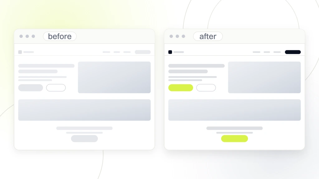
Most sites are 1 or 2 decisions away from being competitive locally. Here are the 6 mistakes we see every month when a new client arrives asking why the phone is quiet. Each one is cheap to fix and expensive to leave alone for another quarter of paid spend.
- Talking about the practice instead of the patient’s problem.
- Loading a 12MB hero video for aesthetic reasons.
- Hiding the phone under a menu icon on mobile.
- Using stock chiropractic photos that read as generic.
- Neglecting the Google Business Profile when the site feels like “priority.”
- Cramming every service on one page instead of one page per condition.
Autoplaying video is the most expensive default
An autoplaying hero video is usually a 6 to 14 megabyte payload on top of an already busy homepage. Turning it off, or replacing it with a static image plus caption, cuts mobile load time by 40 to 60% in most cases. The video wasn’t paying rent anyway. Most visitors watched under 3 seconds before scrolling past to look for the phone number and the reviews.
The stock-photo tax adds up
Stock photos of models pretending to be chiropractors read as inauthentic to any local searcher who has ever walked into a real practice. A $400 to $1,200 photo session with a local photographer yields 3 years of authentic images and moves booking rate 15 to 25% inside the first quarter. See Nielsen Norman Group’s research on photos as web content for the pattern behind why real photos win.
What a Great Chiropractor Website Costs
A working chiropractor website costs $2,500 to $18,000. Solo freelancers run the low end for a single-location practice. Boutique agencies with a chiropractic focus run $8,000 to $18,000 for multi-location groups. Below $1,500 is a template drop with no strategy. Above $25,000 for a single-location practice is scope creep dressed up as strategy that the practice will regret paying for by month 3. Strong chiropractor web design pays for itself inside 2 quarters when the checklist above drives the brief.
What sits inside a $6,000 build
Custom homepage, 5 service pages, contact page, location page, blog scaffold, on-page SEO, and a booking form wired to your practice management software. Real photos on session. Speed under 2.5 seconds mobile. Basic tracking with Google Tag Manager and GA4. That’s the working starter package and it books patients from day one if the copy and photos are honest about the practice behind them.
Where practices overpay
Custom illustrations no one notices, a $2,400 hero video the average visitor abandons at 3 seconds, and 22 blog posts written by someone who has never sat with a patient. Skip the decoration until the base site is booking consistently. A $9,000 site that books 12 patients a month is worth more than a $22,000 site that books 4. Spend on speed, copy, photos, and conversion optimization first, decoration much later.
When to skip the rebuild entirely
Half the practices that ask us for a full rebuild need a 2-week sprint to fix the header, hero, and booking flow on the current site. Score your site against the 7 habits first. If you’re missing 3, a sprint often books more patients than the rebuild would in the same quarter. Save the rebuild for when the current stack cannot support what you need next in the practice’s growth plan.
Best Websites for Chiropractors vs Corporate Competitors
Corporate chains have real advantages, and independent practices have real advantages. Top independent sites win on speed, authenticity, and single-market focus. Corporate sites win on brand budget and content depth. Knowing where you can win keeps you from spending 3 years trying to out-corporate a corporate site that has a 100-person marketing team on retainer.
Where independents win
Independents post real photos, name a specific patient type, and update copy the same week the practice decides to. Corporate sites work through legal and brand review for every change. That speed and authenticity gap is the single biggest advantage a local practice has, and the strong sites on our audit list all use it. Corporate visitors often bounce to the independent, so the independent feels human on the first scroll.
Where corporate wins
Corporate wins on content library depth, on multi-city SEO scale, and on paid budget. Fighting them on any of those 3 is a losing plan for a single practice. Do not commission a 200-blog-post content library, so a corporate competitor has one. Instead, own the local pack in your specific radius with a fast, honest, high-review-count site. See websites for chiropractors for the deeper look at how the independent playbook stacks against the corporate one.
Three moves that keep independents ahead
Real photos, single-patient hero, sticky booking. Those 3 moves alone put an independent practice ahead of most corporate sites on booking rate inside a defined local market. Add the review-widget-above-the-fold habit and the one-condition-per-page structure, and the independent site earns organic and paid traffic advantages the corporate site cannot match without months of legal review on every headline change.
How to Brief a Designer on a Chiropractic Site That Books
Reference sites are only useful if you translate them into a brief. Strong chiropractic sites don’t materialize from good taste. They come from a one-page brief that names the patient, the top problems, the top services, and the homepage outcome. Send that brief to every provider you shortlist and the quotes will come back twice as accurate.
Name the patient
One paragraph on who the patient is. Age range, common conditions, insurance mix, and the emotional state they arrive in. “A pregnant mom in her second trimester with lower-back pain who found us after her OB mentioned prenatal chiropractic” is a real brief. “Everyone in the city” is not. The specificity is the whole exercise and the reason strong pages read as written for one person.
Name the outcome
One paragraph on what the homepage needs to accomplish. Book new-patient intakes. Filter for the specific patient type. Support paid traffic quality score. Convert local searches. Every element on the page ties back to that outcome. Sections that don’t serve the outcome come off before launch, no matter how pretty they look in the mock file the designer sent.
Name the budget honestly
Providers guess at your budget when you refuse to name one. Their guesses are almost always higher than what you would have paid. Name the range. “We can spend $6,000 to $10,000 on this build” tells the provider what tier of work to scope and saves everyone 2 weeks of proposal ping-pong. When you’re ready to run this across the practice, our chiropractor marketing services covers the full stack, retainer starts at $1,499 a month.
How the Best Websites for Chiropractors Earn Organic Traffic
Booking is what pays the practice. Organic traffic is what feeds booking without an ad budget month after month. Top practice sites we audit all earn organic traffic from 3 plays that compound together over a 6-to-12-month window and keep compounding as long as the maintenance work continues on the calendar.
Google Business Profile drives the map pack
The map pack is where local searches convert. Profile hours, phone, categories, and service list have to match the website exactly. Practices that treat the profile as an afterthought lose about a third of local search visibility inside a single quarter. See Google Business Profile guidelines for the current recommendations from the platform.
Service pages earn organic clicks
One dedicated page per condition beats one mega-page for every service. Prenatal care, sports injury, auto-injury, pediatric, and general adjustments each get their own URL, their own copy, and their own headline. That structure lets each page rank for the specific search intent instead of splitting relevance across a single kitchen-sink page. Practices that split the mega-page usually see organic traffic rise 30 to 60% inside 2 quarters of the new structure going live.
Reviews feed both organic and paid
Google reviews influence both the map pack ranking and the on-site conversion rate. Practices with 200+ Google reviews book at nearly double the rate of practices with under 30, controlling for traffic. If you’re under 30 reviews, the review-request flow is a higher priority than any redesign. See chiropractor business website examples for the sibling walk-through of 5 real practices’ layouts.
Maintenance That Keeps the Best Chiropractor Sites on Top
A strong chiropractic website that goes unmaintained loses its edge inside 6 months. Speed drifts. Plugins get out of date. Photos start to feel stale. Reviews stop coming in. Top practice sites all sit on a monthly maintenance cadence that costs less than one lost patient’s lifetime value to the practice.
Monthly speed and update passes
Run Lighthouse once a month on the homepage and top 3 service pages. Update WordPress core, theme, and plugins on the same cadence. That single hour of monthly work keeps a strong site strong. Sites that skip it drift back to 4 to 6 seconds mobile inside a year and give up half their advantage to competitors that stayed on the calendar.
Quarterly content and photo refresh
Once a quarter, look at the homepage with fresh eyes. Swap the hero photo if it’s starting to feel dated. Add 2 or 3 new reviews to the widget. Refresh the featured service based on this quarter’s booking pattern. That quarterly rhythm compounds over 18 months into a site that competitors can’t catch without a full rebuild.
Yearly UX audit against the checklist
Once a year, run the 7-habit checklist above against your site. Standards drift. What passed last year may not pass this year. Score honestly and pick the 2 lowest items to fix over the next quarter. That habit alone keeps a site on the “best in market” tier for 3 to 5 years without a rebuild. See chiropractor website design for the deeper strategic walk-through.
Top practice sites are boring in the specific ways that matter and disciplined about everything else. Fast, clear, real, sticky, reviewed. Score your site this week and fix the 3 worst items before the next rebuild conversation starts.