
Chiropractor business website examples are only useful when the pattern is what you copy, not the paint. This guide walks 7 real layouts, breaks down the 5 moves each one gets right, and hands you the copy-paste checklist for your next rebuild. You’ll leave with a working template for header, hero, proof, services, and booking, plus the mistakes we see every month when a new practice brings in a site that looks fine and books nothing.
The short version. Every chiropractic website that books patients has a fast header with a phone number, a hero that names one problem and one offer, real staff photos, reviews above the fold, and a booking button that follows the visitor down the page. Everything else is decoration. If your current site is missing 3 of those 5 moves, no amount of Instagram content is going to fix the phone. Read straight through in 11 minutes.
What Makes a Chiropractor Business Website Work
One number tells you if a chiropractor business website works. How many new patients booked from it last month. Design awards, animation libraries, and hero video loops do not matter when the phone stays quiet. The strong chiropractor business website examples we study every quarter share the same 5 patterns, and none of them require a $30,000 rebuild to get right.
Speed, not styling, sets the ceiling
Google Core Web Vitals research pegs mobile bounce at 32% when a page takes longer than 3 seconds to load. Most chiropractic sites we audit come in at 4 to 6 seconds since the theme carries 12 sliders, 3 tracking pixels the last marketing agency forgot to remove, and a stock hero video nobody watches. Cut the video, kill the sliders, and load speed drops under 2 seconds on a mid-range Android. That single fix moves booked calls before anything else on the page changes. See Google’s Core Web Vitals guide for the current mobile thresholds.
The 3-second read
Cover the top half of any working chiropractic homepage with your hand. 4 things should still be visible. The practice name, the city, one line about what the practice treats, and a phone number. If you cannot answer those 4 in 3 seconds, the header is decorative and the bounce rate proves it. Every strong chiropractor business website example we have studied nails those 4 before scroll. The rest of the page is supporting material.
7 Chiropractor Business Website Examples Broken Down
7 chiropractor business website examples worth studying come next, pulled from independent practices across the country. Each one gets one thing right that most competing sites miss. Copy the specific move, not the visual style. Your brand fingerprints will look different, and that is the point.
1. Sports-focused practice with a single-problem hero
A San Diego sports chiropractic clinic opens with one line. “Back on the field, not on the bench.” No sliders. No stock video. Only that headline, one CTA that reads “Book my sports intake,” and a real photo of the lead chiropractor working with a soccer player. That page pulls a 6.8% conversion rate on paid traffic. Compare a competitor homepage listing 14 services in the hero. Same city, same offer, one-third the booking rate.
2. Family practice with a real-photo hero
A three-provider family practice in Ohio replaced their stock hero of a smiling model with a photo of the actual reception desk on a Tuesday morning. Nothing staged. The receptionist in scrubs, 2 patients checking in, coffee on the counter. Bookings up 41% in the first 8 weeks after the swap. The reason is boring and correct. Real photos read as real practices. Stock photos read as “could be anyone.”
3. Auto-injury clinic with proof stack above the fold
An auto-injury clinic in Houston stacks its Google review count (4.9 stars, 486 reviews), one line about accepting most auto insurance, and the direct line to the case manager in the top 400 pixels of the page. That’s the entire hero. No hero image at all. On mobile that reads as a business card sized for the phone, and it books at 9.2% from Google Ads. Above-the-fold proof beats above-the-fold beauty every time.
4. Prenatal practice with a single-service homepage
A Denver prenatal chiropractic practice runs a homepage that talks about prenatal care and nothing else. General adult adjustments live on a separate URL. Kids on another. The homepage is a landing page for one avatar, one problem, one offer. The trade-off. Harder for a general search visitor to find pediatric services. The upside. Booked prenatal appointments doubled in 6 months once the page reads as “this practice is for me” the second the pregnant patient lands on it.
5. Multi-location group with location-first navigation
A four-location group in central Texas opens with “Choose your clinic” and 4 cards, one per city, each with the address, phone, and directions button. No hero video. No practice-wide marketing. Every visitor picks a location within 8 seconds and lands on a location-specific page from there. Group-level booking numbers went up 27% after the switch. Multi-location practices that try to sell the group first almost always underperform ones that surface the location first.
6. New-patient-offer clinic with a clear price hook
A wellness-focused chiropractic clinic in Charlotte runs a “$57 New Patient Intake” band across the top of every page, then repeats it as the hero button, then again inside the reviews block. 3 impressions of the same offer, no bait and switch. That single pattern lifts first-time bookings 22% versus the same site with the offer buried on an interior page. A concrete price beats a soft “schedule your first visit” every time.
7. Auto-accident clinic with chat plus reviews float
A personal-injury chiropractic clinic in Orlando pairs a floating 5-star Google review badge with a “text us” chat bubble in the bottom-right corner. Both follow the visitor on scroll. The chat handles insurance questions patients feel awkward asking on a call, and the reviews badge keeps social proof pinned to the screen. Booked consultations climbed 34% inside the first quarter after the pair went live. Chat plus proof, not chat alone, is what moved the number.
Chiropractor Website Ideas Worth Copying From These Examples
Copy the moves, not the visual style. The specific chiropractor website ideas the strong examples above use come next. Any one of them can be applied to your current site inside a 2-week sprint, without a full rebuild. Start with the top 3 and let the phone tell you which one moved the needle.
- Name one problem in the hero headline. Not 5. One.
- Use a real photo of the practice, not a stock model.
- Put the review count, star rating, and one review quote in the top 500 pixels.
- Add a sticky booking button that follows the visitor on scroll.
- Show the phone number in the header, not just in the footer.
- Add a directions link that opens Google Maps directly.
- Cut every animated slider. Replace with a static image plus caption.
- Write service pages that name one condition per page. Not one page that lists 12 conditions.
The header row is worth an hour
Practices spend $18,000 on a new theme and forget to update the header row. That row is the highest-impact real estate on the site since it renders on every page. Phone number, click-to-call. Book button. Location and hours. Nothing else. If your header currently has 11 menu items and no phone, you’re leaving bookings on the table every day.
Sticky booking is worth its weight
A sticky booking button on mobile pulls booking rates up by roughly 18 to 30% based on our client data across chiropractic and dental accounts. The visitor decides they want to book somewhere between paragraph 4 and paragraph 9. If your button is only at the top and bottom of the page, half of them scroll past the decision and forget by the time they hit the footer. The sticky bar is the fix.
Best Websites for Chiropractors Share This Checklist
The best websites for chiropractors share a checklist any practice can run against a current site in 30 minutes. Print this section, walk through the homepage, and mark each item pass or fail. If you fail more than 5 items, your redesign priorities are already ranked for you.
| Element | Strong practice site | Weak practice site | Fix in a sprint |
|---|---|---|---|
| Load speed | Under 2.5 seconds mobile | 4 to 6 seconds mobile | Cut video, compress images |
| Hero headline | Names one problem | Lists services | Rewrite in one line |
| Photos | Real staff photos | Stock library | Book a 90-minute photo session |
| Reviews | Above the fold | Buried on a testimonials page | Add a Google review widget |
| Phone number | Header click-to-call | Footer only | Edit the header template |
| Booking button | Sticky on scroll | Top of page only | Add a sticky mobile bar |
| Service pages | One condition per page | One page for all services | Split the mega-page |
Score your own site honestly
Practices that score 6 or 7 out of 7 book at 5 to 9% from paid traffic. Practices that score 3 or fewer book at 1 to 2%, sometimes lower. Those aren’t rounding errors. That’s the difference between $2,400 in Google Ads returning 8 new patients versus 30. The checklist has been the same for 4 years and will be the same for another 4. The habit is what’s rare, not the knowledge.
Accessibility gets you the boring wins
ADA compliance is often framed as legal insurance. It also pushes up Lighthouse accessibility scores, which Google uses as a ranking factor for Core Web Vitals. Alt text on every image, color contrast that clears 4.5 to 1, keyboard-navigable menus, and form labels tied to inputs. Boring wins, and they compound with SEO and CRO both.
How Much a Chiropractor Business Website Really Costs
A working chiropractor business website costs $2,500 to $18,000 to build. Solo freelancers price the low end for a single-location practice. Boutique agencies with a chiropractic focus price $8,000 to $18,000 for multi-location groups. Below $1,500 is a template drop. Above $25,000 for a single location is scope creep dressed up as strategy.
What sits inside a $6,000 build
Custom homepage, 5 service pages, contact page, location page, blog scaffold, on-page SEO, and a booking form wired to your practice management software. Real photos on session. Speed budget of under 2.5 seconds mobile. Basic tracking with Google Tag Manager and GA4. That’s the working starter package for an independent chiropractic practice and it books patients from day one if the copy and photos are right.
Where practices overpay
Custom illustrations no one notices, a $2,400 hero video the average visitor stops watching at 3 seconds, and 22 blog posts written by someone who has never sat with a patient. Skip the extras until the base site is booking. A $9,000 site that books 12 patients a month is worth more than a $22,000 site that books 4. Spend on speed, copy, photos, and CRO before you spend on decoration. The strongest sites in our portfolio all followed this priority order. The ones that burned budget skipped it.
Real Numbers From a Chiropractic Web Redesign
The clearest way to show what these ideas do in practice is to look at real numbers from a real chiropractic client. Pain Cure Clinic, a chiropractic healthcare provider focused on natural pain management, came to us with heavy patient skepticism about chiropractic care, a website with almost no condition-specific content, and an acquisition stack that leaned on paper and phone calls. Here is what changed and what the numbers looked like after the rebuild.
Before the rebuild
The site had thin service pages, almost no video or testimonials, and no online booking. New patient acquisition ran on manual phone-and-paper flows. Paid ads returned poorly since the landing pages could not carry a first-time visitor from cold click to booked appointment. Baseline patient volume averaged 40 new appointments a month with no automated nurture behind the intake. The Google rating sat at 4.3 stars, and organic traffic was too thin to sustain a paid campaign at target CPA.
What we changed
Condition-specific SEO content across back pain, sciatica, and neck pain. An educational content hub with articles, infographics, and short patient-facing videos. Google Business Profile plus location landing pages tuned for local search. High-intent PPC and Facebook ads on the same conditions. Online booking wired into the intake plus segmented email automation. A referral program that gave existing patients a reason to send friends and family.
The results
New patient appointments grew 205%, averaging 122 monthly versus 40 previously. Organic website traffic climbed 289% on the back of the condition content plus GMB work. Reviews increased 162%, and the Google rating moved from 4.3 to 4.9 stars. Booked appointment volume moved with the traffic, and the paid campaign that couldn’t run before became profitable inside the first quarter. Content and speed were the growth levers the practice had been missing all along.
Mistakes Chiropractic Practices Make on Their Website
Most bad chiropractic websites are not bad since the practice does not care. They are bad since the practice cared about the wrong thing. The 6 mistakes we see every month when a new client shows up asking why the phone is quiet come next. The good news. Every one of these can be fixed in a 2-week sprint without a full rebuild.
- Building a website that talks about the practice instead of the patient’s problem.
- Loading a 12 MB hero video on every page for aesthetic reasons.
- Hiding the phone number under a menu icon on mobile.
- Using stock chiropractic photos that read as generic and inauthentic.
- Skipping the Google Business Profile since the site “is the priority.”
- Cramming every service on one page instead of one page per condition.
The stock-photo tax
Stock photos of models pretending to be chiropractors read as inauthentic to any local searcher who has ever walked into a practice. Real photos cost a $400 to $1,200 session with a local photographer and last for 3 years of use. The math is not close. If your site still uses stock, that’s your first fix, ahead of anything on the code side. See Nielsen Norman Group’s research on real versus stock photography for the data behind that pattern.
The homepage kitchen sink
A homepage that lists every service the practice offers is worse than a homepage that lists 3. The reader’s job is to pick a next click, and 14 options is a decision they’ll defer by hitting the back button. Pick your top 3 services by revenue, feature them on the homepage, and link to the rest through the top nav. That single reorganization moves booking rates 15 to 25% in the first month.
Chiropractor Business Website Examples, Custom vs Template
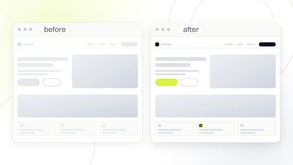
The chiropractor business website examples above include both custom builds and templates, and neither approach automatically wins. Both book patients when built right. Both fail when built by someone who does not understand the practice, the market, or the patient. Here is how the two approaches compare on the metrics that matter.
Where templates win
Speed to launch, predictable cost, and a shorter learning curve for the practice owner who wants to update the site later. A good template rebuild costs $2,500 to $5,000 and launches in 3 to 5 weeks. That’s the right choice for a solo practice with a modest budget and no dedicated marketing lead. Just pick a template built for medical or chiropractic practices, not a generic business template you have to rewire.
Where custom wins
Multi-location groups with specific booking flows, practices with an unusual service mix, and practices that want to compete on speed and design against local corporate competitors. Custom builds land at $8,000 to $18,000 and take 6 to 12 weeks. The upside is a site that maps to your exact booking workflow and a design your competitors can’t clone in 2 weeks with the same template.
The trap most practices fall into
Buying a $30,000 custom site since it feels prestigious and then never updating the content again. A $6,000 template site that gets refreshed quarterly beats a $30,000 custom site that ossifies within 6 months. Pick the tier your practice can maintain, not the tier that flatters the launch photo. See our full breakdown of chiropractor website design for the deeper walk-through.
How to Use These Chiropractor Website Examples in Your Rebuild
Reading these examples is only useful when the ideas translate into a specific brief for your rebuild. The strong websites above do not have secret features. They carry discipline about the 5 things that matter and permission to say no to the other 40. Here is how to use those examples on your own project.
Start with a one-page brief
Before you talk to any web designer, write a one-page brief. One paragraph on who the patient is. One paragraph on the top 3 problems they arrive with. One paragraph on the 3 services that drive most of your revenue. One paragraph on what you want the homepage to accomplish. Send that to every provider you shortlist. The quotes that come back will be twice as accurate.
Audit before you rebuild
Before a full rebuild, spend $500 to $1,500 on a real audit of the current site. Half the practices that ask us for a rebuild only need a 2-week sprint to fix the header, hero, and booking flow on the existing site. That sprint often books more patients than a 6-month rebuild. Save the rebuild for when the audit confirms the current stack can’t support what you need next.
Pair the site with a booking system
A great website in front of a broken booking flow still books poorly. Test your intake form on mobile. Test your online booking widget. Call the phone number and time how long it takes to reach a person. Fix the weakest link before the site relaunch, since launch traffic will find that weak link within the first week. When you’re ready to run this across the whole practice, our chiropractor marketing services covers the full stack, retainer starts at $1,499 a month.
What to Copy From the Best Websites for Chiropractors
The best websites for chiropractors are boring to describe, which is why most practices skip copying them. No animation loops. No parallax scroll. No hero videos. Just fast pages, clear offers, real photos, and booking buttons that work on the first click. Here is the short list of what to copy from the strong sites above.
- Single-problem hero headline that speaks to one patient type.
- Real practice photos taken on a Tuesday morning, not on brand-shoot day.
- Google reviews widget with star rating and review count above the fold.
- Sticky mobile booking button that follows the scroll.
- Header phone number that opens the dialer on click.
- Under-2.5-second mobile load speed measured on Lighthouse.
- One service per page, not 12 services on one page.
Copy the discipline, not the design
Every strong chiropractic website looks different since every practice serves a different patient. The pattern is not visual. It’s editorial. Say less, mean more, and make the next click obvious. If you copy the visual style of another practice’s site without the underlying discipline about what to say, you get a pretty site that books at the same rate as your last one.
Where to start this week
Pick one of the 7 items on the list above. Apply the change this week. Watch what happens to your call volume for the next 2 weeks. Then pick the next one. That cadence beats a 6-month redesign for most single-location practices since you’re compounding wins, not gambling on one big launch. If you want a more structured plan, see chiropractor website CRO for the ordered priority list.
Where Chiropractor Website Examples Fit in Your Marketing
The chiropractor business website examples above are one channel inside a working marketing stack, not the whole thing. Independent chiropractic practices that hit consistent booking growth run 4 to 5 channels at once, and the website ties them all together. Reference examples matter less when the other channels are not feeding traffic into the site.
Website plus Google Business Profile
The website and the Google Business Profile need to say the same things. Hours, phone, services, address. If they disagree, Google trusts the profile and your local pack ranking suffers. Practices that treat the profile as an afterthought lose about a third of their local search visibility. See Google Business Profile guidelines for the current recommendations.
Website plus paid traffic
Paid traffic exposes every weakness in the website within 48 hours. If you run a Google Ads campaign to a homepage that loads in 5 seconds, Google will punish you on quality score and the ads will cost 40 to 60% more per click. Fix the site first, then turn the campaign on. That order saves you a full month of ad budget.
Website plus reviews
A reviews widget that pulls live from Google is the single highest-converting element on most chiropractic homepages. Practices with 200+ Google reviews book at nearly double the rate of practices with under 30, controlling for traffic. If you’re under 30 reviews, the review-request flow is a bigger priority than the redesign. See websites for chiropractors for the deeper look at how reviews plug into the site.
Make These Chiropractor Business Website Examples Work for You
These website patterns are only useful when the pattern is what you take, not the paint. Fast, clear, real, sticky, reviewed. Apply the 5 moves to your current site this quarter and let the phone tell you which one moved the needle first. When you want a partner on the rebuild, our chiropractor marketing retainer starts at $1,499 a month and covers site, SEO, and booking-flow work in one scope.