Ask five agencies for a company website analysis methodology and four of them will send you something that measures search. Crawl coverage, rankings, page speed, link metrics. All of it useful, and none of it capable of telling you why the people who did arrive left without buying anything. That question belongs to a different discipline with different instruments, and it is the half that usually goes unbought.
We sell this work, so read what follows as interested testimony and check it. Everything below is either attributed to a named researcher or organization with a date, or clearly labeled as our own ordering. That distinction matters more here than in most subjects, because this field is unusually full of impressive numbers that turn out to have no readable source behind them.
What a company website analysis methodology has to cover
A site gets judged on four separate things and they need four different instruments. Whether search engines can find it. Whether it loads quickly. Whether it is safe. And whether a person who lands on it can work out what you do, trust you, and complete the thing they came for.
The first three have mature tooling and produce numbers automatically. The fourth produces almost nothing automatically, which is why it gets left out of most packages. A crawler cannot tell you that your pricing page answers a question nobody asked, or that your form asks for a phone number three fields before anybody has decided to talk to you.
So the first thing to ask any provider is which of the four their method covers. Most answer three. Our website audit page sets out the full span, and the rest of this article is about the fourth one, because it is the one you are least likely to be offered and the one whose absence is hardest to notice.
Worth saying plainly what this half is called when it is sold separately. Usability analysis, experience analysis, UX audit and conversion analysis are largely the same activity under four names, which is a naming problem this field shares with the one next door.
The statistics problem, and the test that sorts it out
Before any method, a filter, because you will be quoted numbers in the first meeting and some of them do not survive being looked up.
The most repeated claim in this field is that every dollar invested in user experience returns one hundred dollars. We tried to trace it and could not. Every citation leads to a 2017 post on a business magazine’s contributor platform, which describes it as coming from a paid analyst report, and from there the trail is blogs citing blogs citing that post. The analyst firm is real and sells reports. What does not exist, as far as we could find, is a public document you can open and read the method in.
The same is true of the claim that ninety-four percent of first impressions are design related. Follow the citations and they point at a magazine, at unnamed recent studies, and at each other. We are not saying either number is false. We are saying neither can be checked, and a number you cannot check has no business in a document that is supposed to justify spending.
So here is the filter, and it costs nothing. For any figure in a proposal, ask who published it and what it was measured on. If the answer is a name and a method, keep it. If the answer is that everybody knows it, delete it. Applied honestly, this removes most of the statistics in most decks in this field, and what survives is genuinely useful.
What a number that survives the filter looks like
Three examples, all of which we did open and read, so you can see the difference in shape rather than take the filter on trust.
Nielsen Norman Group summarizes the finding as users leaving web pages in 10 to 20 seconds, while “pages with a clear value proposition can hold people’s attention for much longer”. Underneath it names the research, from Chao Liu and colleagues at Microsoft Research, who analyzed page visit durations across 205,873 different web pages and more than two billion dwell times, and found the time follows a Weibull distribution. Named people, named institution, sample size, and a stated shape.
Baymard Institute publishes an average cart abandonment rate of 70.22 percent and says directly that “this value is an average calculated based on 50 different studies”, then lists all fifty with their publishers and the dates each was retrieved. Read the list and the individual studies run from 55 percent to over 84 percent, which is the most useful part and the part that never gets quoted.
The third is the one that changes budgets, and it has its own section below. Notice what all three have in common. You can find the disagreement inside them. The unsourced numbers have no inside at all, which is precisely why they sound so confident.
The established part of the method, and whose it is
A methodology article is an invitation to invent a framework, give it a name, and present it as how this is done. We are not going to, because the backbone of this work already exists and has a named author and a date.
Heuristic evaluation is the standard technique. One or more evaluators walk a site against a short list of principles and record every place it violates one. The principles almost everybody uses are Jakob Nielsen’s, published on 24 April 1994 and described as “10 general principles for interaction design”, called heuristics “because they are broad rules of thumb and not specific usability guidelines”.
They are not a hunch. The article records that they were derived from earlier work with Rolf Molich and then refined “based on a factor analysis of 249 usability problems” to produce the set with the most explanatory power. The organization notes that while the wording has been updated, the ten themselves “have remained relevant and unchanged since 1994”.
If a provider presents you with a proprietary ten-point framework, ask what it adds to this one. Sometimes the answer is good. Often the answer is that it is this one with the numbers reordered and a trademark on it.
The ten principles, and how to run them yourself
You can do a rough version of this in an afternoon, and a rough version done by you beats a polished one nobody commissioned.
- Visibility of system status, and match between the system and the real world.
- User control and freedom, and consistency and standards.
- Error prevention, and recognition rather than recall.
- Flexibility and efficiency of use, and aesthetic and minimalist design.
- Help users recognize, diagnose and recover from errors, and help and documentation.
Scope it the way we do, to your three highest-value journeys rather than your whole site. The path from an ad to a form. The path from a search result to a product. The path a returning customer takes to find what they bought. Walk each one and write down every point where the site breaks one of the ten, with the URL and what you expected instead.
The output will be longer than you expect and most of it will be small. That is the correct result. Experience problems are rarely one catastrophe, they are forty small frictions, and the reason they persist is that no individual one is ever bad enough to get its own ticket.
Why five people is a serious sample
The most common objection to watching real people use the site is that a handful of them proves nothing. The published mathematics says otherwise, and this is the third sourced number.
Nielsen Norman Group’s position is blunt. “Elaborate usability tests are a waste of resources. The best results come from testing no more than 5 users and running as many small tests as you can afford.” The reasoning is given rather than asserted. Working with Tom Landauer, Nielsen published a formula for how many problems n users will find, where the key term is the proportion one single user uncovers, and states that “the typical value of L is 31%, averaged across a large number of projects we studied”.
Roughly a third from the first person is why the curve flattens so fast. By the fifth person you are mostly watching problems you have already written down, and the sixth is worth less than a second round of five after you have fixed something.
This should change what you buy. A proposal offering one large study late in the year is offering the expensive shape. Several small rounds, each followed by changes, is the shape the research supports, and it is also the only shape that produces fixes rather than a document.
The accessibility pass, and why it is not optional
One part of this analysis has an actual international standard behind it rather than a set of principles, which makes it the most checkable pass in the whole method.
The Web Content Accessibility Guidelines are developed through the W3C process, and the W3C describes the goal as “providing a single shared standard for web content accessibility that meets the needs of individuals, organizations, and governments internationally”. The documents “explain how to make web content more accessible to people with disabilities”. Versions 2.0, 2.1 and 2.2 exist, and 2.2 is also an approved ISO standard, ISO/IEC 40500.
Two things follow for your methodology. Because it is a written standard with numbered criteria, a finding here is either met or not met rather than a matter of taste, and any provider can be asked which version and which conformance level they tested against. A report that says accessibility with no version number has not really done this pass.
Legal obligation varies by where you operate and we are not going to characterize it here. What is true everywhere is that the same fixes which satisfy the standard, real text alternatives, working keyboard navigation, sufficient contrast, labeled form fields, also fix ordinary usability problems for everybody.
What the behavioral tools show, and what they never will
Heatmaps, scroll maps and session recordings are the visible part of this discipline and the part most likely to be demonstrated to you in a sales meeting.
They are genuinely good at one thing, which is telling you where to look. A form field that everybody focuses and abandons, a section nobody scrolls to, a button being clicked that is not a button. These are real signals and you would not find them by reading the page.
What they cannot supply is the reason. A recording shows a person hesitating for eleven seconds and then leaving. It does not show whether they were confused, interrupted, comparing you against a competitor in another tab, or reading carefully and deciding you were too expensive. Those four have four different fixes and the recording is identical in each case.
Which is the whole argument for pairing them with the five-person sessions. The tools find the where at scale, people supply the why, and a methodology that buys only the first half will keep producing confident explanations that nobody tested.
The ordering we use, which is ours rather than anybody’s standard
Everything above is other people’s work and attributed to them. This section is not. It is the sequence we run, offered as a working preference rather than as established practice, and you should feel free to disagree with it.
We start with the accessibility pass, because it is the only part with a pass or fail standard and it seeds the finding list with things nobody can argue about. Then the heuristic walk of the three highest-value journeys, because it is cheap and it generates the hypotheses. Then the behavioral data, used to rank what the walk found rather than to discover things, since a ranked list of known problems is more useful than a fresh pile. Then five people, aimed specifically at whatever the first three could not explain.
The reason for that order is that each stage narrows the next one. Watching five people with no hypotheses is expensive and vague. Watching five people to settle three specific disagreements is an afternoon that ends an argument.
A provider running a different order may have perfectly good reasons. What should worry you is a provider who cannot say what their order is, or who runs every stage on every engagement regardless of what the earlier stages found.
Turning findings into something that actually gets fixed
Experience findings die in documents more reliably than technical ones, because a technical finding names a broken thing and an experience finding names a disagreement about a judgment call.
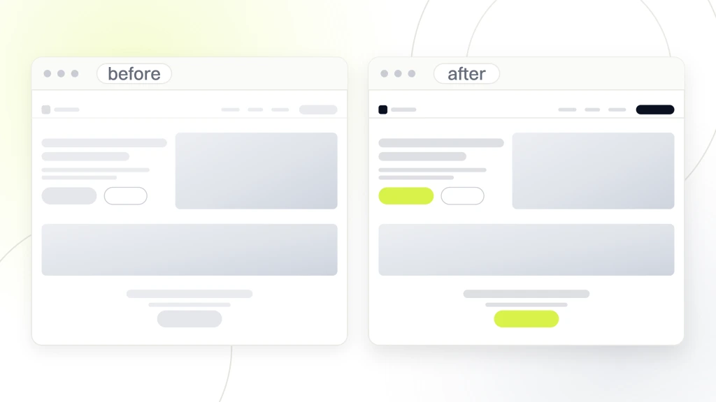
So each one needs four things. The journey and the URL where it happens. What the person was trying to do. What the site did instead, described as behavior rather than as an opinion about the design. And which of the ten principles or which success criterion it breaches, so the finding has something behind it other than the evaluator’s taste.
That last column is what makes these findings survive a meeting. The button is ugly is an opinion and will be argued with forever. The button does not confirm the order was placed, so people submit twice, is a violation of a named principle with a named consequence, and it gets fixed.
How findings should be structured and sequenced once written is a subject of its own, and our guide to what goes in a report covers the columns and the ordering rule from the search side, which transfer across unchanged.
Where this sits beside the analyses that measure search
This is the boundary worth being explicit about, because the word analysis is doing four jobs and buying the wrong one is common and expensive.
Speed analysis asks how fast the page arrives and is covered in our piece on what speed test sites measure. Safety and hygiene checkers ask whether the site is broken or dangerous, which our website checker comparison takes apart. Search position is its own family, separated properly in our explainer on SEO ranking, and what any score out of 100 is built from belongs to our piece on what an SEO score is made of.
All four of those measure whether the site can be found, reached and trusted by a machine. This one measures whether it works for the person who already arrived. They are complements, not competitors, and the honest position is that a site can pass every one of the other four and still convert badly, which is the situation most of this work exists to fix.
If the search half is what you actually need, that is a different purchase and our search engine optimization services page sets out those scopes instead.
What no methodology in this field can tell you
Worth naming the limits, since this discipline oversells itself as readily as the one next door.
It cannot tell you whether people want what you sell. A perfectly usable site for a product nobody needs converts badly and every finding will be small, which is itself the finding. It cannot tell you your price is wrong, because hesitation looks the same whatever caused it. And it cannot predict the size of a gain, since the only honest way to know what a change is worth is to make it and measure.
It also cannot be done once. The heuristics have held since 1994, but your site, your audience and your competitors have not, and a document from two years ago describes a site that no longer exists.
Anybody promising a percentage uplift before looking is doing something the published research in this field does not support, and the cleanest way to test a provider is simply to ask where that number came from.
What we would check first
If you are choosing between proposals this week, three questions separate them faster than reading the documents will.
Ask which of the four dimensions their method covers, and listen for whether the fourth is a real pass or a sentence. Ask where each statistic in their deck was published and what it was measured on. Then ask what happens after the report, because a methodology that ends at a document has been designed to end at an invoice.
And before any of that, walk your own top three journeys against the ten principles yourself. It takes an afternoon, it costs nothing, and it means you arrive at the first meeting with a list, which changes the conversation from what could you look at into here is what I already found. If you want the wider sequence of checks a site should get, our guide to checking a site properly sets out the order.
If the honest answer is that nobody has looked at any of this, a free website audit is a more useful starting point than another proposal, because it tells you which of the four dimensions is actually your problem before you buy a method aimed at one of them.