An SEO report dashboard is a screen showing current numbers, refreshed on a schedule, that somebody glances at between other tasks. That is a different product from the monthly document your agency sends, and the difference is not cosmetic. A dashboard answers what is happening now. A report argues what it meant and what to do next. Putting the second job on a screen is why so many dashboards get opened twice and then never again.
This is about the screen as an artifact. What earns a place on it, what refresh rate you are actually buying, how the template vendors structure theirs, and what the tools cost. What belongs in the written document instead is a separate question, answered properly in our breakdown of what goes in an SEO report, which ranks the sections by whether the opposite result would change your decisions. Read that one for the document. This one is for the screen. If you want the underlying work explained first, start with what an SEO audit covers.
What an SEO report dashboard is, and how it differs from a report
An SEO report dashboard is a saved arrangement of live metrics pulled from your data sources and displayed together. The vendors are refreshingly blunt about how loose the category is. DashThis states on its own pricing page that “With DashThis, a dashboard is simply one marketing report. It can contain all your marketing platforms (i.e. integrations), sources, KPIs, and metrics” (dashthis.com/pricing, read 16 September 2026).
Read that carefully, because it is also a pricing unit. When a vendor says a dashboard is one report, the count you are being sold is a count of arrangements, not a count of metrics or clients. That matters the moment you have more than one site.
The functional difference between the two artifacts comes down to three things.
- Tense. A dashboard is present tense and always current. A report is past tense and fixed at the moment it was written, which is what lets it carry an argument.
- Reading time. A dashboard is read in seconds, standing up, between other things. A report is read once, in a chair, and then filed.
- Who supplies the meaning. A dashboard shows the number and leaves interpretation to you. A report supplies the interpretation, which is the part you are actually paying a person for.
Most disappointment with dashboards comes from expecting the third one. A screen cannot tell you why traffic fell, because the why is not in the data, it is in what changed that week. Expecting the dashboard to explain itself is expecting software to do the part that needs a person.
What a live screen does that a monthly document cannot
The case for the screen is narrow and real. There are exactly three things it does better, and if you are not getting one of them the dashboard is decoration.
The first is catching a fall before the month ends. A monthly document tells you in week five that something broke in week one. A screen someone checks on Monday catches it in week one, and the whole value of the format is compressed into that gap. This is the only argument for a dashboard that survives contact with a busy owner.
The second is settling arguments without a meeting. When two people disagree about whether something is working, a shared screen both can open ends the disagreement faster than a thread does, because both are looking at the same definition of the number rather than two exports taken on different days.
The third is making the work visible between reports. The month between documents is where trust decays, and a screen that moves is evidence that something is happening. That is a real benefit and it is also the one most easily faked by adding metrics that always look busy.
What it cannot do is the thing people buy it for. It cannot tell you what to do. Every recommendation you have ever received came from a person reading a screen, and no arrangement of tiles turns data into a decision on its own.
What belongs on the screen, and what belongs in the document
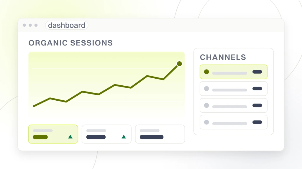
The test for every tile is whether a glance at it would change what you do this week. If the honest answer is that you would need to read a paragraph first, it belongs in the document instead.
| Put on the screen | Why it survives a glance | Leave in the document |
|---|---|---|
| Organic sessions against the same period last year | One line, one comparison, and a fall is visible instantly | Why the fall happened |
| Conversions or inquiries from organic | The only number connected to money, and it needs no interpretation | Whether those inquiries were any good |
| Indexed page count | A sudden drop is an emergency and is unmissable as a line | Which templates caused it |
| Positions for a short named set of commercial phrases | Readable at a glance if the set is small | The full keyword table, which nobody scans |
| Core Web Vitals status | Pass or fail, binary, no reading required | The fix list and what it costs |
| Uptime or crawl errors | Either there are none or there is a problem | The remediation plan |
Six tiles is a working dashboard. The most common failure is not a missing metric, it is thirty tiles arranged so that none of them is noticed, which produces a screen that is technically complete and practically unread. Density is the enemy here in a way it is not in a document, because a reader who has committed to a report will scroll, while a reader glancing at a screen simply stops.
One rule keeps it honest over time. Every tile needs an owner and an action attached to it before it goes on. If nobody can say what they would do when that number moves, the tile is there to look thorough and it should be cut.
Why refresh rate is the specification nobody checks
Dashboards are sold on the word live, and live means whatever the plan you bought says it means. This is the single most useful thing to check before paying, and almost nobody does.
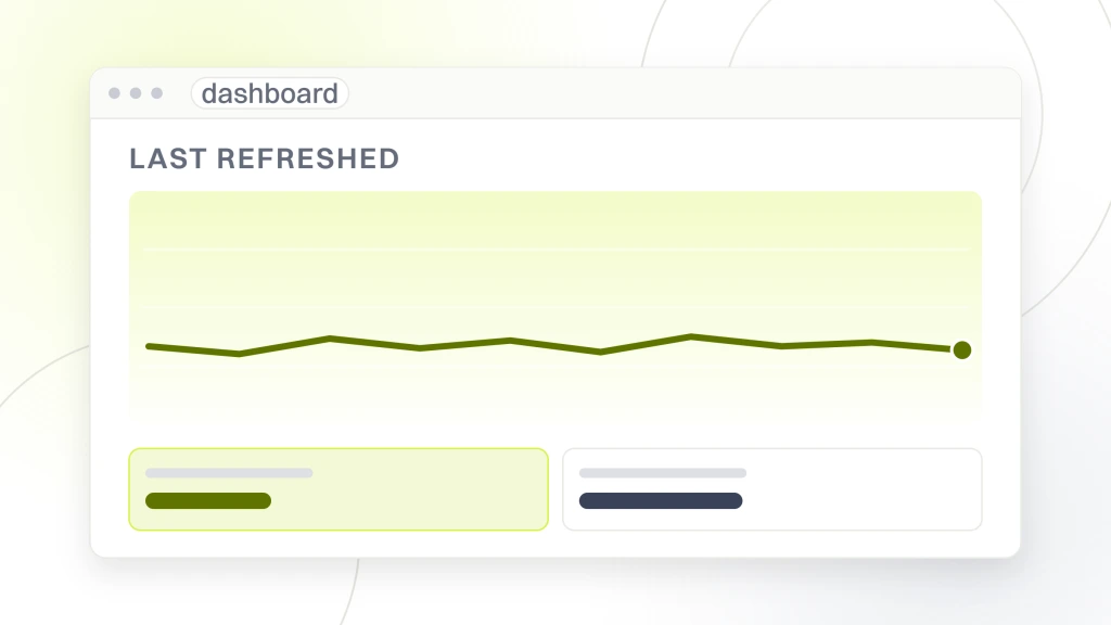
Klipfolio publishes the number outright. Its entry level Base plan lists a 4-hour data refresh alongside 3 dashboards, unlimited users and 130 or more data integrations, at $120 USD per month billed annually or $140 billed monthly (klipfolio.com/pricing, read 16 September 2026). A four hour refresh is a perfectly reasonable product. It is not real time, and the marketing word for it is still live.
That gap matters because the main argument for a dashboard was catching a fall early. If the screen refreshes every four hours and you check it on Mondays, your actual detection speed is a week, and you have bought a weekly report with a nicer interface. That is fine if you know it. It is not fine if you are paying for real time and reading a stale tile.
There is a second lag underneath the first that no vendor controls. The upstream sources have their own delays, and a dashboard cannot be fresher than the data feeding it. So ask two questions rather than one. How often does the dashboard pull, and how old is the data when it arrives. The answers multiply.
The practical consequence is that different tiles on one screen are honest at different speeds, and the screen does not tell you which is which. An uptime check can be genuinely current while a traffic tile beside it reports a day behind and a position tile reports a week behind, all rendered in the same style and sitting in the same row. A reader takes the whole screen as one moment in time because it looks like one, which is the quiet way a dashboard misleads people who trust it.
So label the lag on the screen itself wherever the tool allows it. A small note under each tile saying how current the number is costs nothing to add and removes the most common argument these screens cause, which is one person quoting a figure another person cannot reproduce because they looked at a different hour. If the tool will not let you annotate tiles, write the intervals down once and keep them beside the login.
How the template vendors actually structure a dashboard
The template libraries are worth studying even if you never buy one, because they show what the category has converged on. Databox, Geckoboard, Klipfolio, DashThis and Coupler all publish example arrangements, and the pattern across them is consistent.
The convention these libraries share is a small number of headline tiles across the top, each a single figure with a comparison against a previous period, then trend lines underneath, then tables last. That order is not decoration. It matches how a screen is read, which is top left first and then only as far as interest survives, so the numbers that must not be missed go where the eye lands.
The second pattern is that the templates are organized by data source rather than by question. You will see a block for search console data, a block for analytics, a block for rank tracking. That is how the software is plumbed, not how anybody thinks, and it is the main thing worth changing when you adapt a template. Group by the question being answered instead, and a tile from three different sources can sit together because they answer one thing.
The third pattern is that vendor templates are built for agencies reporting to clients, which means they lean toward looking thorough. An agency dashboard has a commercial job the owner’s own dashboard does not, which is demonstrating effort. Strip that layer out when you copy one. Which rank tracking source feeds the positions block is a separate decision, and our comparison of website ranking software covers the products that do it.
What the dashboard tools cost, and what the free tiers cap
All figures below were read from each vendor’s own pricing page on 16 September 2026 and each page states its currency. Prices in this category move, so treat these as a snapshot and check before you buy.
| Vendor | Published entry price | What that includes | Currency stated on the page |
|---|---|---|---|
| Databox | $0 a month, “free forever” | 1 user, 3 data sources, 50 AI credits a month | Not stated, though a zero carries no currency risk |
| AgencyAnalytics | $20 per client a month, billed annually | Priced per client rather than per dashboard | “USD” printed beside the figure |
| DashThis | $44 a month paid yearly, $54 monthly | 3 dashboards, 15 sources | “All prices shown are in USD” |
| Geckoboard | From $79 a month, billed annually | Entry Essentials plan | “All prices are in USD. VAT is not included” |
| Klipfolio | $120 a month billed annually, $140 monthly | 3 dashboards, unlimited users, 4-hour refresh | “USD” printed beside the figure |
Two structural things are more useful than the numbers themselves. The first is that three of the five meter you by dashboard count, and the entry allowance is two or three of them, three at DashThis and Klipfolio and two at Geckoboard. Since a dashboard is one saved arrangement rather than a quantity of data, a business with three sites is at or past that ceiling before it has built anything.
The second is that AgencyAnalytics meters by client instead, which is a different bet entirely and is cheaper for an agency with many small accounts and worse for a single business with one site. It also sells rank tracking as an add-on priced at $41.67 USD a month per 500 keywords billed annually, which is worth noticing because it means rank data is a metered resource rather than an included feature.
One caution that has nothing to do with value. At least one vendor in this category publishes its prices in euros rather than dollars, and several offer a currency selector, so the figure you see may not be the figure you are charged. Confirm the currency on the page before quoting a number to anyone, because four of the five pages above state it explicitly and that is not universal.
The metrics that look good on a screen and change nothing
Some numbers exist because they are easy to display and always move, which makes them perfect dashboard filler and useless as decisions. These are the ones to argue about before the screen is built.
- A vendor authority score. Invented by whoever sells the tool, not by a search engine, and moving it is not a business outcome. Our explanation of URL rating covers what those scores actually measure.
- Total keyword count. A site ranks for thousands of phrases nobody searches deliberately. The count rises on its own and tells you nothing about whether the right phrases moved.
- Average position across everything. An average across a thousand terms hides the twenty that matter. Our explanation of SEO ranking sets out why a single position number is weaker than it looks.
- Total backlinks. A number that mostly measures how much of the web is automated. New referring domains from places you would name out loud is the version worth watching.
- Bounce rate on its own. Without knowing what the page was for, it is unreadable. A page that answers a question fully and sends the visitor away satisfied scores badly.
None of these is fraudulent and each has a legitimate use in analysis. The objection is to their place on a screen read in seconds, where a number that always rises reads as progress. Share of the market you compete in is a more honest headline than any of them, and our explanation of SEO visibility covers how that is constructed.
How to build one without buying anything
Before subscribing to any of the products above, it is worth knowing that the free route covers the six tiles in the earlier table for most single site businesses.
Search Console supplies impressions, clicks, positions and the page indexing state, and it is first party, meaning it reports what the search engine actually did rather than what a licensed database estimates. Analytics supplies sessions and conversions. Looker Studio connects to both and builds a shareable screen from them, which is the assembly step most single site businesses are missing rather than the data. What it costs at each tier is the one thing to read on Google’s own pricing page rather than take secondhand, because the product has been renamed and re-tiered more than once and any figure quoted elsewhere, including any quoted here, ages faster than it looks.
The reason to pay later is narrow and specific. You pay when you need sources those two do not cover, when you need one screen across several sites, or when somebody other than you has to receive it on a schedule without asking. Those are real reasons and none of them applies on day one.
So build the free version first and run it for a quarter. You will find out which tiles you actually look at, which is information no vendor comparison can give you, and you will arrive at any purchase knowing the specification instead of guessing it. If the wider tooling question is what you are weighing, our comparison of free SEO tools covers what each free tier holds back.
What to check before you accept an agency dashboard
If a provider hands you a login, the screen is now part of what you are buying and it deserves the same scrutiny as anything else on the invoice. Four questions do most of the work.
- Whose account is it built in. If the dashboard lives in the agency’s subscription, it leaves when the contract does, along with the history. Ask what you keep.
- How often does it refresh, as a number. Not the word live. A stated interval, and what the upstream lag is on top of it.
- Which tiles would change what you do. Go through them one at a time and ask what action each triggers. Any tile with no answer is there to fill the screen.
- Does a conversion number appear at all. A dashboard with traffic and positions but nothing connected to inquiries has been built to be reassuring rather than useful.
A dashboard is not a substitute for the written read, and a provider offering the screen in place of the document has swapped a cheap artifact for an expensive one. The screen is generated. The interpretation is the work. Our guide to conducting a website audit covers what the underlying review should have found in the first place.
What we would do first, and what to ask us
With one site and no dashboard, we would not start with a vendor. We would build the free version from Search Console and Analytics, put six tiles on it, and give every tile an owner and an action before adding a seventh. Most of what gets bought in this category is a solution to a problem the free version would have revealed was not there.
Then we would run it for a quarter and delete whatever nobody opened. A dashboard gets worse over time by accretion, because adding a tile is easy and removing one feels like admitting something was wrong, so the deletion pass has to be scheduled or it never happens.
Now turn it on us, because we sell the work behind these screens. The test this article sets is that every tile has an action attached and that a conversion number is on it. Ask us which tiles we would put on yours, what each one would make you do, and what refresh interval you are actually getting. If the answer comes back as a longer list than you asked for, that is the failure mode described above and it applies to us as readily as to anyone.
So the first step is free. Open Search Console, write down the six numbers you would want on one screen, and see how many you can already answer. If you would rather have somebody look at the site underneath first, our free website audit is where to start.