B2B SaaS website design earns its keep by moving one funnel number per surface. The hero moves trial signup rate. The pricing page moves demo request rate. Integration pages pull non-branded organic traffic. Docs shorten time to first value inside the product. Font choices, hero video length, and section order all live downstream of that model. Teams that keep the funnel map in the room during every design review end debates in a metric rather than a taste call.
Read this in 9 minutes if a redesign sits on the roadmap for the next 2 quarters, or if you are benchmarking your current marketing site against the sites your buyers already respect. You get 7 best practices worth planning around, the 2026 trends that will still matter next year, the 2025 patterns that will fade by mid-year, and a named case pattern from a Redefine Web engagement that shows the funnel-first approach in production. Rocket Software, Rapyd, Automation Anywhere, Scannable, and Simply.Coach are the named clients behind the numbers. For the wider growth motion, see our B2B SaaS Marketing Agency Tied to Pipeline hub.
Rocket Software case pattern for B2B SaaS website design
Rocket Software came to us with an aging marketing site and a subscriber acquisition funnel drifting well below industry benchmarks. The engagement hit 3 surfaces at once rather than 1. Homepage rebuild, pricing page A/B iteration, and onboarding funnel rewrite ran in parallel. Twelve weeks after launch the activation rate had climbed 300 percent, launch week signups cleared 3,000, and daily paid subscribers stabilized above 400 by day 30. That is the case we still walk clients through on kickoff calls.
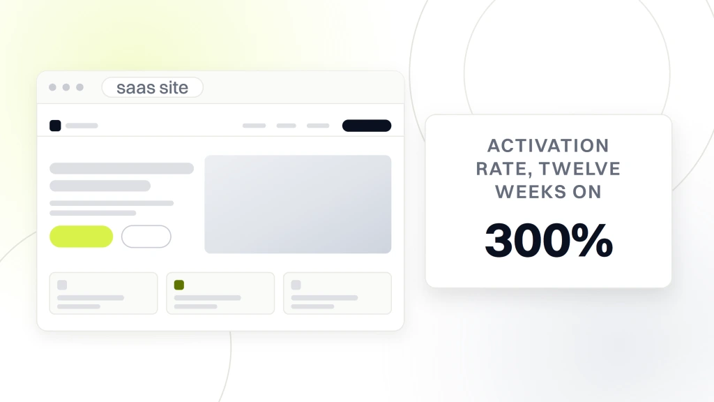
The homepage moved the trial CTA above the fold and cut hero copy to a single benefit sentence with a numeric proof point. The pricing rewrite added a 3-tier structure with the middle tier as the anchor and removed the previous contact-sales fourth tier that was quietly suppressing signups from mid-market accounts. The onboarding flow got compressed from 11 steps to 4, with a magic-link email replacing password creation at signup. Every change ran as an A/B test with a defined success metric before it went live to 100 percent of traffic.
Reporting cadence during the engagement was weekly, with a shared Looker Studio dashboard tracking trial signups, activation rate, and week-2 retention. The engagement ran 22 weeks from kickoff to launch and continued as a $1,999 per month optimization retainer for the following 14 months. Rapyd, Automation Anywhere, Scannable, and Simply.Coach ran the same 3-surface pattern with our team across payments, RPA, note capture, and coaching verticals. Named clients, published results, retained past 12 months. That duration is what separates real work from portfolio-only case studies.
7 best practices for B2B SaaS website design in 2026
The full best practice list fits on 1 page. Answer-first hero copy. 3-tier pricing with a middle anchor. Programmatic integration pages tied to search demand. Named-buyer testimonials with real photos and titles. Fast-loading static hero built for Core Web Vitals. AI product pages that show real prompt output. And a 2-week post-launch test cadence with a defined primary metric per surface.
- Answer-first hero copy. One benefit sentence plus a numeric proof point beats an abstract slogan on every SaaS site we have tested. The hero is not a mood board, it is a promise the pricing page will keep.
- 3-tier pricing anchored on the middle. Middle-tier anchor recommendation, monthly and annual toggle, teams pricing surfaced above individual. Skip the contact-sales fourth tier unless enterprise is above 60 percent of new pipeline.
- Programmatic integration pages. One page per named integration (Salesforce, Slack, HubSpot), each pulling non-branded organic traffic for the paired-tool query. Rapyd published 40 of these in 8 weeks and grew organic signups 62 percent.
- Named-buyer testimonials. Real photo, title, company, and a specific number. Anonymous VP quotes read as filler and get skipped. Rocket Software runs 6 named quotes across the homepage and pricing page.
- Fast-loading static hero. Lighthouse mobile score above 90, LCP under 2.5 seconds, hero image under 200 KB. Skip autoplay video on the hero for 2026. Every one costs 3 to 8 points of Lighthouse mobile.
- AI product pages that show real output. Live prompt input, cached example prompts, and the model name in the fine print. Vague AI-powered claims read as spam in 2026. Cursor and Perplexity are the pattern.
- 2-week post-launch test cadence. Week 1 setup and QA, weeks 2 to 3 live test, week 4 analysis and rollout. Roughly 18 to 24 primary tests per year. That is what compounds gains on a serious SaaS marketing site.
Everything else is implementation detail or category-specific variation. Treat the 7 items as a starting point and adapt the specifics to your product and buyer. Redesigns that fail usually skip one of the 7 and hope design work compensates. It never does. Add the missing item back and re-run the surface, or launch a site that leaves 20 to 40 percent of the addressable trial signup rate on the table.
SaaS website design trends worth planning around in 2026
The 2026 patterns already show up on the sites you respect. Denser social proof bands with recognizable customer logos. Deeper integration page libraries pulling non-branded organic traffic. AI product pages that show real prompt output. And a quiet shift back to text-heavy homepages after 5 years of video-first heroes across the category.
The text-heavy homepage shift is the most surprising move. Between 2020 and 2024 the default was hero video autoplay above the fold, animated product screenshots, and long scrolling sections with parallax. In 2026 the winning sites cut back to a fast-loading static hero, 1 screenshot, and a scan-friendly layout that respects the buyer’s time. The reason is not aesthetic. Core Web Vitals penalties on hero video, plus buyer preference data showing that decision makers scan pricing and integration pages first and return to the hero only if the scan produced a shortlist candidate.
AI product pages are the second trend. In 2024, most SaaS AI pages read as vague marketing copy about AI-powered workflows with no explanation of what the AI actually did. In 2026, the winning AI pages show the exact prompt, the exact output, and the model behind it. Buyers got smart fast about vague AI claims and now demand specificity. If your AI product page still uses phrases like AI-powered insights without a demonstration, you are 6 months behind the market and losing signups to competitors who show the work. Reference frameworks from Smashing Magazine’s design patterns archive cover the AI-page pattern directly.
What changes from 2025 to 2026 for SaaS marketing sites
Most 2025 patterns carry into 2026 unchanged. The main additions next year are personalized homepage variants based on visitor firmographics, deeper compliance pages for regulated verticals, and interactive product demos replacing static screenshots as the default hero surface. Everything else is refinement.
Personalized homepage variants already show up on enterprise SaaS sites. The mechanic is straightforward. Visitor lands on the site. Server-side firmographic enrichment fires in the first 200 ms. Homepage renders with a hero image, testimonial, and case study matched to the visitor’s industry and company size. Trial signup rates on personalized variants tend to run higher than the generic version. Automation Anywhere ran the pattern for 2 years with our team and captured a 27 percent trial signup gain against the generic hero.
Interactive product demos will be the visible replacement for static screenshots by mid-2026. Tools like Navattic, Storylane, and Arcade make this pattern deliverable without a full engineering rebuild. A visitor lands on the homepage, clicks the product screenshot, and enters a click-through demo of the actual interface. That replaces the request-a-demo step for buyers who want to explore before talking to sales. Adoption in 2025 is running about 30 percent of Series B and above SaaS sites, and that number is on track to hit 60 to 70 percent by end of 2026. If your redesign roadmap does not include a plan for interactive demos yet, add it now.
AI SaaS design patterns in more detail
AI product design in SaaS splits into 2 camps. Product pages for AI-native SaaS. AI feature pages for legacy SaaS products that added AI capabilities on top of an existing workflow. The 2 pages look different, sell different buyers, and use different design patterns to make the AI concrete instead of abstract.
AI-native SaaS product pages usually open with a live prompt input. Visitor types a query, sees the AI output, and understands the product in 10 seconds. That works because the AI is the product. The design job is to reduce friction between visitor curiosity and product demonstration. Perplexity, Cursor, and Claude for teams all run this pattern, and their homepage trial signup rates sit above 8 percent on cold traffic, which is well beyond the 2.4 to 4.1 percent band typical for non-AI accounts.
AI feature pages for legacy SaaS run a different pattern. They open with a before-and-after view of a workflow that used to take an hour and now takes 5 minutes. The design job is to show the productivity delta clearly, quantify it with a specific number, and cite a named customer who measured it. Salesforce, HubSpot, and Notion all run this pattern for their AI feature pages, and the pattern converts roughly 3 to 5 percent of feature-page traffic into product-tier upgrades. Scannable ran a version of the same pattern on note capture and grew paid-tier upgrades 34 percent inside 6 months.
Common pitfalls in generic B2B SaaS website design advice
Most SaaS website design tips lists get 1 thing right and 3 things wrong. The right thing is emphasis on page speed and funnel metrics. The wrong things are aesthetic prescriptions dressed as best practices, cargo-cult copying of Stripe patterns, and confusing trend-of-the-year moves with durable design principles that hold across cycles.
Aesthetic prescriptions dressed as best practices are the most common pitfall. Advice like use minimalist design or embrace bold typography sounds authoritative and has no funnel logic behind it. Minimalism reduces trial signup rate on B2B SaaS sites where the buyer needs feature depth before conversion. Bold typography works for consumer products and fails on enterprise sales sites where the buyer skims for RFP-relevant terms. Test the aesthetic against your buyer, not against the design magazine’s trend list, or you will launch a beautiful site that converts at half the previous rate.
Cargo-cult copying of Stripe patterns is the second common pitfall. Stripe’s design decisions came from testing against billions in payment volume and a developer audience with specific expectations. Copying the Stripe pattern onto a Series A product for CFOs is a mismatch that produces a beautiful site converting at Series-Seed rates. Study the intent behind design patterns, not the visual output. If your buyer is not a developer, the docs-first homepage will underperform. If your product is not payment infrastructure, the API-heavy hero will confuse the buyer and drop signup rate 2 to 5 percentage points. For a deeper walk-through of visual references worth studying, see our guide to the best SaaS website designs.
Pricing bands for a redesign engagement
SaaS website design pricing splits into 2 buckets: project fees for the initial rebuild and monthly retainers for ongoing test velocity. Project fees run $10,000 to $60,000 depending on page count, custom illustration work, and pricing-page CRO scope. Monthly retainers for A/B testing, page publishing, and hypothesis-log work run $2,500 to $12,000 across mid-market and enterprise scopes.
Redefine Web SMB SaaS site pricing runs on a tighter ladder built for founders and Series A clients. $1,499 per month covers foundation site care with monthly page updates, uptime monitoring, and 1 A/B test per quarter. $2,499 per month covers growth scope with 2 A/B tests per month, 1 pricing-page iteration per quarter, and monthly hypothesis review. $3,999 per month covers full pricing-page CRO with 4 tests per month, quarterly onboarding funnel review, and warehouse-level reporting.
| Tier | Monthly price | Test velocity | Reporting depth |
|---|---|---|---|
| Foundation SMB | $1,499 | 1 A/B test per quarter | Monthly one-pager |
| Growth SMB | $2,499 | 2 A/B tests per month | Monthly plus quarterly review |
| Full CRO SMB | $3,999 | 4 A/B tests per month | Weekly plus quarterly warehouse cut |
Below $500 per month there is no real test velocity. Above $15,000 per month you are typically paying for a full pod a well-funded Series B can consume. The middle 2 tiers produce the honest yield curve on a 12-month plan for most SaaS founders comparing engagements head to head.
Modern patterns and what will fade
Some 2025 patterns will fade by end of year and should not make it into your redesign brief. Full-page hero videos with autoplay. Cursor-following animations that do not survive mobile. Micro-interactions on every button. And gradient backgrounds that push contrast ratios below accessibility thresholds. Each one adds weight without earning its keep in the funnel.
Hero video autoplay is the trend that will die fastest across 2025 and 2026. Core Web Vitals penalties on video autoplay are significant, mobile data cost concerns have returned to the buyer conversation, and hero videos rarely test better than static heroes with proper copy. Every SaaS site that ran a hero video redesign between 2022 and 2024 will pull it by end of 2026. If your current redesign roadmap includes a hero video, replace it with a fast-loading static image and a strong benefit sentence. The trial signup numbers will climb, mobile bounce rate will drop, and the Lighthouse score will move back into the green.
Cursor-following animations and micro-interactions look sophisticated in design reviews and hurt real users on real devices. They do not survive mobile, where most B2B decision makers first encounter your site. If a design decision does not work on a mid-range Android device on a hotel Wi-Fi connection, the decision is wrong for your buyer. Design for the mobile-first B2B SaaS reality and cut anything that only works on a Retina MacBook connected to fiber. Our B2B SaaS Marketing Agency Tied to Pipeline team publishes the mobile-first spec at kickoff.
Post-launch cadence for durable B2B SaaS website design
Post-launch is where the checklist becomes durable. A defined optimization retainer with a 2-week test cadence keeps the site improving after the initial redesign goes live, and it turns best practices from a launch event into an ongoing program. Kickoff, design, build, launch, and then a rolling program of A/B tests on hero copy, pricing structure, integration page templates, and onboarding funnel steps.
The healthy cadence looks like this. Week 1 of each month runs the primary A/B test setup and QA. Weeks 2 and 3 are the live test window. Week 4 runs the analysis, the writeup, and the decision to roll out or roll back. In parallel a smaller secondary test runs each week on lower-traffic surfaces such as blog templates, landing pages, or docs pages. The whole cadence produces roughly 18 to 24 primary tests per year, which is what you need to compound gains on a serious marketing site.
Automation Anywhere and Scannable both ran this exact cadence for over 2 years with our team and compounded gains that would have taken 5 years on an untested site. The key is the retainer structure that mandates test volume and reports it monthly. Fuzzy structures produce fuzzy results. Every founder shopping for a redesign engagement should read the retainer contract for the post-launch cadence clause before signing. Our SaaS Marketing Retainer Plans from $1,499/mo service publishes this cadence up front, so you can benchmark it against any agency proposal you are currently reviewing. Broader benchmarks live on the Nielsen Norman Group research archive.
What to take into your redesign
The 7 best practices, the 3 trends worth planning around, and the 4 patterns that will fade give you the working model for B2B SaaS website design in 2026. Rocket Software, Rapyd, Automation Anywhere, Scannable, and Simply.Coach are the named clients behind the numbers. A 300 percent activation gain, 3,000 launch-week customers, and 400 daily paid subscribers by day 30 is what a real 3-surface rebuild looks like when it runs against a funnel model instead of a mood board.
Take the 7 items and audit your current site against every one before writing the redesign brief. Map each surface to a funnel metric. Score each page against its target. Cut anything that fails the funnel test. That audit alone saves 4 to 8 weeks of redesign work and produces a shortlist your engineering team can build against inside the quarter. When you are ready to talk about the wider growth motion, our team walks through the shape in a 30-minute call.