The best optometrist website design is not the prettiest site in your metro. It’s the site that opens on a phone at 8:14 in the morning, paints in under 2 seconds, keeps a phone number and a Book Online button pinned in the sticky header, proves the practice is real with a review count and an insurance list above the fold, and lets a stranger book an eye exam in under 30 seconds flat. Every other visual flourish is decoration that either helps or fights that path.
You’ll see the 7 repeat patterns behind top-ranking optometry sites in 2026, the layout calls that separate a 12% conversion site from a 3% site, 4 real audits pulled from independent practices, and a Vision Express rebuild story where 62% more booked exams came out of 6 months of best optometrist website design work. Read straight through in about 10 minutes and steal the parts that fit your practice.
What makes the best optometrist website design in 2026
The best optometrist website design shares 7 traits across every practice size we audit. A sticky header with click-to-call. Above-the-fold trust signals carrying specific numbers. Insurance carriers on the homepage. A 3-field booking form. A live scheduler embedded on the primary landing page. Sub-2-second mobile LCP (Largest Contentful Paint). A real review carousel with names and dates. Skip any one and conversion rate falls 10 to 20% on paid traffic almost overnight.
Every one of those 7 traits is a design decision, not a plugin purchase. That’s why bad sites keep failing after adding scheduling software or SEO tools. The bones of the site are wrong. Once you rebuild the bones, the tools finally do the job they were sold to do. The best optometrist websites are boring on purpose. Boring loads fast, converts high, and stays out of the visitor’s way during booking.
Speed comes before style
A 5.8-second hero video looks great on a designer’s 27-inch monitor and kills 30 to 40% of your mobile traffic before the booking form ever loads. The best optometrist website design ships with a static WebP hero, preloaded, fetch-priority high, sized correctly for mobile viewports. That single choice buys you 2 to 3 seconds of Largest Contentful Paint and pulls conversion rate up 15 to 25% on paid traffic before you touch a single other element on the page. Google’s Core Web Vitals reference spells out the exact thresholds.
Trust signals in the first 200 pixels
Specific numbers win. “4.9 stars on 812 Google reviews” beats “highly rated” every time. “22,600 patients seen since 2009” beats “experienced staff” every time. “VSP, EyeMed, Davis Vision, and Spectera accepted” beats “most insurance welcome” every time. Pull the exact figures from your practice management system, drop them into the hero, and watch first-time visitor conversion rate move 30 to 50% inside 30 days. No copywriter can invent trust that specific numbers cannot.
7 patterns behind the best optometrist website design
Every high-converting optometry site we’ve ever audited runs the same 7 patterns. Not 5. Not 8. Seven. Independent practices, 3-location chains, and corporate franchises with 40 doors all run the same 7 patterns. Sites that stack all 7 convert paid traffic at 12 to 18% and organic traffic at 6 to 10%. Sites that skip any of the 7 land in the 3 to 5% band and lose most of their potential exams to the practice down the street.
- Sticky header with click-to-call and Book Online CTA visible on every scroll
- Hero with a specific patient-count and review-count trust bar above the fold
- Insurance carrier logos as a scannable row on the homepage
- Live scheduler embedded on the primary landing page, no third-party redirect
- 3-field booking form on paid landing pages (name, phone, day preference)
- Review carousel with real dates, first names, and a service-specific detail
- Location pages with NAP schema, embedded Google map, doctor bios, and reviews
Sticky header pattern
The sticky header is the one pattern every top-ranking optometry site runs. Phone number left, Book Online button right, both persist through every scroll on every page. 50 to 70% of your mobile visitors click the phone number from that header instead of scrolling to find it. Sites that hide the phone number in the footer lose those calls to the practice up the road that keeps the number in view. One CSS rule doubles mobile-driven bookings on almost every site we audit.
Insurance carrier logo row
Visitors check insurance before they consider booking. The best optometrist websites show 6 to 10 insurance logos as a scannable row on the homepage, right below the hero. VSP, EyeMed, Davis Vision, Spectera, Cigna, Aetna, United Healthcare, Blue Cross. Real logos, real names, real coverage. Sites that bury this in a dropdown menu or a text list halfway down the page miss the 40 to 60% of visitors who bounce the moment they can’t confirm coverage in 3 seconds.
Anatomy of the best optometrist websites (homepage walkthrough)
Walk down the homepage of any well-designed optometry site and the section order barely changes. Hero with headline, trust bar, and Book CTA. Insurance carrier row. Service tiles for the 6 revenue services. Doctor and staff introduction with photos. Review carousel pulled from Google Business Profile. Location card with map and directions. Blog latest 3 posts for topical authority. Newsletter or promo bar. Footer with NAP, hours, quick links. That’s the shape. Every rebuild we run lands close to it since the shape works.
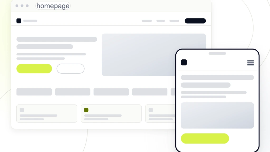
The reason the section order does not change is that it matches the visitor’s decision path. They land looking for a practice. They confirm insurance. They pick a service. They vet the doctors. They read reviews. They check directions. They book. Any homepage that shuffles those steps or hides one loses bookings at that step in the sequence. The best optometry websites don’t fight the visitor’s mental model. They match it.
Hero section anatomy
Hero headline in 4 to 8 words, benefit-first. Subhead in 12 to 18 words with the practice name and one concrete detail. Trust bar with review count, patient count, and years in practice. Primary CTA button (Book Online) in brand color. Secondary CTA (Call Now with click-to-call) in a neutral color. Hero image or illustration on the right at 40 to 50% viewport width. No autoplay video with sound. No sliding carousel. Static works. That anatomy converts at 12 to 18% on paid traffic every time we push it live.
Service tile section
6 service tiles laid out in a 3×2 grid. Annual eye exam. Contact lens fitting. Dry eye treatment. Pediatric exams. Diabetic eye exam. Emergency eye care. Each tile is one icon, one service name, one 12-word benefit line, one Learn More link that goes to the dedicated service page. Sites that jam 12 services into a tile grid overwhelm the visitor. Six is the number that reads clearly on mobile and pushes clicks into service pages that convert on their own.
Real audits from best optometrist websites we’ve reviewed
Pattern-matching against real optometry sites teaches faster than any rule list. Below are 4 independent-practice sites we’ve audited or rebuilt in the past 24 months, one detail from each that grew booked exams by 20 to 60%. The patterns repeat once the underlying visitor behavior repeats. Steal the pattern, not the pixel colors.
| Practice type | Design detail | Result inside 90 days |
|---|---|---|
| Two-provider urban practice | Sticky header added with click-to-call | Mobile calls up 41% |
| Independent solo suburban | Three-field paid landing form | Paid conversion 4.1% to 12.4% |
| Three-location chain | Insurance logo row above the fold | Bounce rate down 22% |
| Concierge dry-eye clinic | Live scheduler embedded on service page | Booked exams up 58% |
Two-provider urban practice
Independent 2-provider practice in a dense metro. The site was built by a template vendor in 2019 and never touched afterward. The phone number lived in the footer only. We added a sticky header with click-to-call and Book Online. No other change to the site. Mobile calls to the practice climbed 41% inside 30 days measured by the call tracker installed on the same day. Zero other design work. Zero SEO work. Sticky header on its own. That’s the return on a single small pattern.
Solo suburban practice
Solo optometrist in a suburban market spending $2,800 per month on Google Ads. The paid landing page had a 7-field booking form asking for insurance, date of birth, preferred provider, and reason for visit before the visitor even hit submit. Paid conversion sat at 4.1%. We rebuilt the form as 3 fields (name, phone, day preference). Paid conversion moved to 12.4% inside 2 weeks. Same ad spend, same clicks, roughly 3x the booked exams. Form length is the second-highest-return decision on a paid landing page.
Three-location chain
Regional 3-location chain running paid ads across all 3 markets. The homepage buried insurance carriers in the footer. Bounce rate on mobile sat at 68%. We moved the insurance carrier row directly under the hero, wrapped it responsively, and swapped the carrier text list for real logos at 80 pixels tall. Bounce rate dropped 22% inside 45 days across every location page. Booked exams from the affected homepage climbed 27% in the same window. Insurance visibility is a foundational trust signal, and burying it is a quiet way to lose the visitor.
Mobile CRO details on the best optometrist website design
70 to 80% of optometry-site traffic arrives on a phone. Every design decision has to work on a 6.1-inch screen at 3G speeds during morning commute. The best optometrist websites treat desktop as the secondary view. Mobile is the primary. Mobile CRO details separate the sites that book exams from the ones that look pretty on a designer’s monitor and lose 70% of their inbound calls.
Click-to-call number in the sticky header. Book Online button in the sticky footer as a redundant CTA. Booking form fields at least 48 pixels tall for thumb accuracy. Autofill enabled on name, phone, and email inputs. Insurance carrier row wrapping cleanly on narrow viewports. Hero image or illustration compressed to under 40 KB WebP. Zero autoplaying video. Zero popup modals inside the first 8 seconds. Chat widget delayed until after the visitor scrolls past the hero. Those 8 rules, applied together, take a 3% mobile site to a 12% mobile site inside 60 days.
Thumb-zone design
The bottom third of a phone screen is where the thumb naturally reaches. Primary CTAs belong there on mobile. Book Online button pinned to the bottom of the viewport at scroll. Click-to-call button beside it. Menu accessible from a top-right hamburger. The mistake we see across bad optometry sites is a Book button jammed in the top-right corner of the header, roughly 700 pixels above the visitor’s thumb. That button gets 40 to 60% fewer clicks than the same button pinned to the sticky footer.
Form field sizing and autofill
Form fields under 44 pixels tall are almost impossible to hit accurately with a thumb. Every field on a mobile booking form has to be 48 pixels or taller. Input type attributes matter as much as pixel size. Type=”tel” on the phone field triggers the numeric keypad. Type=”email” on the email field triggers the @ key on the mobile keyboard. Autocomplete=”tel” and “name” attributes let iOS and Android autofill the fields from the visitor’s contact card. Those 5 HTML attributes cut form abandonment by 20 to 35% on mobile.
Case study on one of the best optometrist websites we rebuilt
Vision Express, an independent optometry practice competing against corporate chains inside a 3-mile radius, came to us with a WordPress site the previous vendor built in 2019. Homepage LCP sat at 5.8 seconds on mobile. The booking form asked for 7 fields. There was no click-to-call in the header. Insurance carriers accepted were buried in the footer underneath the copyright line. Paid traffic converted at 3.2%. Organic traffic converted at 1.4%. The practice was spending on Google Ads and couldn’t figure out why booked exams stayed flat month after month.
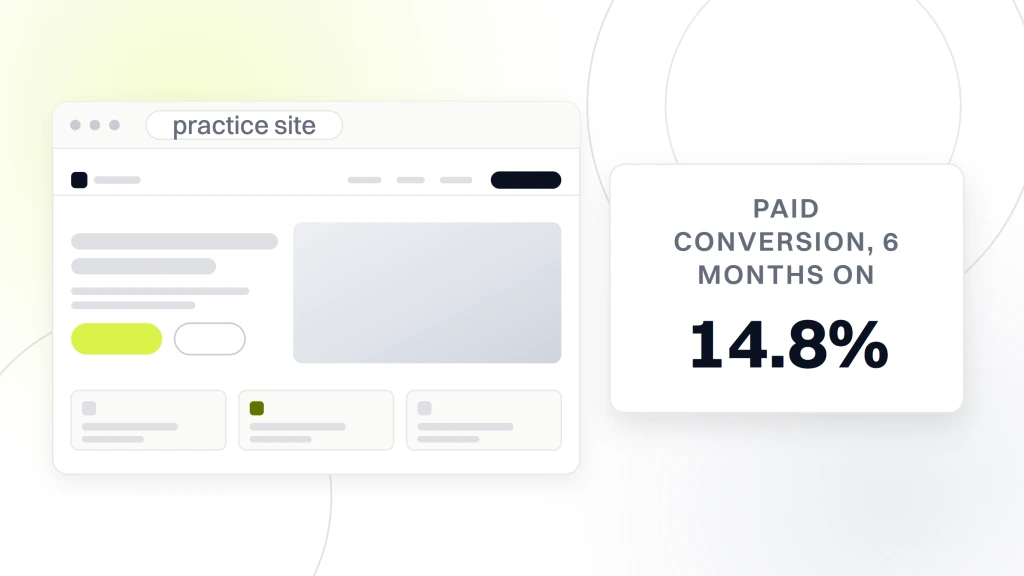
We rebuilt the entire site in 8 weeks on the 7-pattern structure covered above. A new WordPress theme built for optometry with a sticky header, 3-field booking form, 6 service pages, 3 location pages, and a live scheduler embedded on the primary paid landing page. 6 months post-launch, paid conversion climbed to 14.8%. Organic conversion climbed to 7.1%. Booked exams jumped 62% overall. Organic traffic itself climbed 135.9% once Google rewarded improved Core Web Vitals with better rankings. Practice growth measured against the prior 6-month baseline came in at 71%.
The Vision Express numbers
Paid conversion up from 3.2% to 14.8%. Organic conversion up from 1.4% to 7.1%. Organic traffic up 135.9% once Core Web Vitals moved from red to green. Booked exams up 62% overall inside 6 months. Practice growth up 71% measured against the 6-month prior baseline. Every number came from the design rebuild plus the parallel SEO and paid work that ran on top of it. The design was the multiplier. SEO and paid were the volume dials feeding the multiplier.
Lessons from the Vision Express rebuild
Two lessons apply to almost every independent optometry practice reading this. First, most owners think their site is fine once it looks fine on their desktop browser at 5 PM after clinic hours. Test it on a phone during morning commute at 8:14 AM. Time the LCP. Try to book an exam in under 30 seconds. If any of those tests fail, the site loses bookings every single day it stays up. Second, the redesign paid back inside 4 months on booked-exam revenue alone. It was not a marketing expense. It was a revenue investment with a 4-month payback and a 2-year multiplier.
What the best optometrist websites deliberately avoid
Pattern-matching what to skip is as valuable as pattern-matching what to include. Every top-converting optometry site we’ve audited deliberately omits the same handful of design tics that bad sites treat as required. Skip them on your own site and conversion rate climbs before you ever touch the good patterns.
- Autoplaying hero video with sound (kills LCP, annoys mobile visitors)
- Sliding hero carousels with 3 or 4 slides (nobody reads slides 2 through 4)
- Chat widget that opens uninvited inside the first 8 seconds
- Newsletter popup covering the phone number before the visitor has read anything
- Cookie banner that hides the sticky header on mobile until dismissed
- Stock photography of a smiling generic patient in front of a fake exam room
- Rotating testimonial carousel where the first testimonial has no name or date
The stock photo trap
A stock photo of a smiling model wearing new frames signals template site the instant the visitor sees it. The best optometrist websites use real photography of the actual doctor, the actual practice interior, and the actual staff. One 90-minute photo shoot at the practice produces 40 usable images for the site and separates it from every competitor running the same 3 stock library images. The cost of a local photographer runs $400 to $900. The return runs the equivalent of a 4 to 8 point conversion rate gain on trust-driven pages.
The popup trap
A newsletter popup timed to trigger 7 seconds after page load is the single most-hated pattern on the modern web. Optometry visitors arrive with intent. They want to check insurance, glance at reviews, and either book or call. A popup covering the phone number at second 7 kills the second-most-common path (call the office directly). Delete every popup that fires before the visitor has scrolled past the hero. Bookings climb 6 to 12% inside a week from that single deletion.
Tech stack behind the best optometrist websites
Roughly 70% of the top-converting optometry sites run WordPress on managed hosting. 15% run Squarespace for design-forward solo practices. 10% run Webflow for chains that want editorial visuals. 5% run custom builds. No platform is inherently better. Each fits a specific practice size and content workflow. The wrong platform pick shows up in year 2 once the site can’t support the growth pattern the practice is on.
Managed WordPress hosting on Kinsta, WPEngine, or Rocket.net delivers 90+ mobile PageSpeed scores out of the box once the theme is built right. The best optometrist websites we build sit on managed WordPress with a native Gutenberg theme, RankMath for SEO, a scheduler integration (Weave, LocalMed, or 4PatientCare), a review-generation plugin (Birdeye or Podium), and Cloudflare in front of the origin. That stack costs $180 to $360 per month all-in and supports every optometry-site growth pattern we’ve ever seen. Read Google’s page experience guide for the ranking thresholds these builds hit.
Why WordPress wins for most practices
WordPress runs 70% of the top optometry sites since the editor is familiar to office staff, the plugin ecosystem covers every scheduler and PMS (practice management system) integration, and the hire pool for future edits is deep in every city. The best optometrist websites lean on that ecosystem instead of fighting it. Native Gutenberg blocks store content in portable HTML that survives a migration or a theme swap. Sites built on Elementor or Divi lock content into a proprietary format that breaks once the visual builder is removed. Native beats visual builder every time on longevity.
When Squarespace is the right pick
Squarespace is the honest pick for a solo optometrist doing 20 to 40 exams a week who wants a beautiful site and has no plan to publish blog content or run SEO at scale. It costs $23 to $65 per month all-in. Time-to-launch runs 3 to 5 weeks instead of 8 to 12 weeks on WordPress. The scheduler-integration story is thinner than WordPress, which is why chains and growth-mode practices default to WordPress instead. Both platforms produce strong optometry sites for their fit segment. Neither is universally correct.
HIPAA and accessibility on best optometrist websites
Two compliance rails carry legal weight on any healthcare site, and skipping them is expensive. HIPAA covers any form that collects protected health information (PHI) like date of birth, insurance ID, symptoms, or medication history. A generic WordPress contact form plugin is not HIPAA-compliant out of the box. The booking form has to route through a HIPAA-signed processor (Weave, Zocdoc, LuxSci, or a custom BAA (business associate agreement) setup) and the data can’t sit in your WordPress database in plain text.
Accessibility under WCAG 2.1 AA and the ADA covers everyone else. Color contrast on CTA buttons must clear a 4.5 to 1 ratio. Every image needs alt text. Every form field needs a visible label. Every video needs captions. Every color-coded state (error, success) needs a text or icon backup for color-blind visitors. The best optometrist websites treat both rails as design constraints from day one instead of a plugin bolted on 3 months post-launch. Practices that skip either rail get discovery letters from the OCR or ADA lawsuits inside 24 months.
Steal-the-best checklist for your next optometrist website
You don’t need to hire a designer to run this checklist. Every item is a decision you can make and a change your current developer can push live inside a 2-week sprint. Every item is on almost every one of the best optometrist websites we’ve ever audited. Missing any item is a conversion rate drain that costs you real bookings every week.
- Add a sticky header with click-to-call and Book Online
- Move the insurance carrier row above the fold on the homepage
- Reduce the paid landing form to 3 fields
- Embed a live scheduler instead of linking to a third-party page
- Compress the hero image to WebP under 60 KB
- Replace the stock photo carousel with real practice photography
- Delete every popup that fires inside the first 8 seconds
- Pin the Book Online button to the sticky mobile footer
- Set width and height attributes on every image to fix CLS (Cumulative Layout Shift)
- Add real reviewer names, dates, and services to the testimonial carousel
Two-week sprint plan
Week one, push live the sticky header, the 3-field form, the insurance row, and the WebP hero. Week two, push live the review carousel, the location page NAP schema, the mobile sticky footer CTA, and the popup deletions. Track paid conversion rate, organic conversion rate, and mobile-call volume before the sprint and after. Every practice we’ve ever run this sprint on has moved conversion rate 4 to 12 points inside 30 days. The math holds since the patterns hold. Do the work. Watch the calendar fill.
Who to hire for the rebuild
Hire an agency that has built 20 or more optometry sites in the past 24 months. Ask for 3 live URLs. Load each on a phone during morning commute. Time the LCP. Count how many taps it takes to reach the Book button. If any of those 3 sites fails your on-the-phone tests, walk away. For a full engagement across web, SEO, and paid, our Optometrist marketing agency retainer bundles the strategy. For the design-only build, our Web design services covers the full engagement. Pair the build with our SEO services so ranking follows the redesign.
Where to start on your own site
Load your current site on a phone at 8:14 in the morning. Time the LCP with Chrome DevTools Lighthouse. Try to book an eye exam in under 30 seconds. Count taps from home screen to booking confirmation. If LCP runs past 3.5 seconds, if the booking test drags past 45 seconds, or if the click count runs past 6, the site is bleeding bookings every day it stays up. Fix those 3 tests first and every other marketing dollar starts pulling more weight the moment the fix goes live.
Ready to rebuild toward the best optometrist website design in your metro. Our Optometrist website design engagement runs the 8-week rebuild described above. For the PPC that feeds the site after launch, our PPC services target a lower cost per booked exam on Google Ads. For the retainer that maintains the site and layers SEO on top, our Optometrist marketing retainer is the plan. For an outside reference on visual design and readability standards, read the Nielsen Norman homepage design guide.