
Best SaaS Website Designs and Inspiration
- Great SaaS design ties every surface to a funnel metric.
- Answer-first hero copy beats abstract slogans every test.
- Three-tier pricing with a middle-tier anchor is standard.
- Integration pages pull 1,200 to 4,000 monthly organic visits each.
- Start with a funnel audit, not a full-site rebuild.
- Real case pattern from a Redefine Web engagement
- Homepage patterns across top saas website designs
- B2B saas website design examples worth studying by category
- Saas website design inspiration versus copying patterns wholesale
- Best saas website design examples 2025 versus best saas website design examples 2024
- Common mistakes across best saas website designs analyses
- Building your own best saas website design from these examples
The best saas website designs share five patterns. Answer-first hero copy. A pricing page that closes without a sales call. Docs that double as SEO. Integration pages that rank on branded competitor terms. And a trial signup flow that hits activation inside 14 days. This shortlist ranks real B2B SaaS website design examples on those five patterns, so you can steal the moves that actually push your trial signup rate instead of the ones that just look good in a portfolio review.
You’re probably reading this because you’re planning a redesign or benchmarking your current site against the top saas website designs on the market. Read straight through in about nine minutes. You get the five design patterns worth stealing, the pricing bands to expect from any agency that builds this stuff, a real case study from a Redefine Web engagement, and the shortlist of B2B SaaS website design examples we still reference on internal design reviews on Monday mornings.
Real case pattern from a Redefine Web engagement
Rocket Software, Inc. came to us with an aging SaaS marketing site and a subscriber acquisition tool that was underperforming. The redesign hit three surfaces at once: homepage rebuild, pricing page A/B iteration, and onboarding funnel rewrite. The result was a 300 percent activation rate gain, 3,000 customers in the launch week, and 400 daily subscribers thirty days after launch.
The Rocket Software, Inc. redesign is the case we still walk through on client kickoff calls because it shows a full three-surface pattern rather than just a homepage refresh. The homepage rebuild moved the trial CTA above the fold and simplified the hero copy to a single benefit sentence with a numeric proof point. The pricing page rewrite added a three-tier structure with the middle tier as the anchor recommendation, and removed the previous “contact sales” fourth tier that was suppressing signups from mid-market accounts. The onboarding flow got cut from 11 steps to 4, with a magic-link email replacing the password creation step at signup.
The reporting cadence during the engagement was weekly, with a shared Looker Studio dashboard tracking trial signups, activation rate, and week-two retention. Every design change went out as an A/B test with a defined success metric before it went live to 100 percent of traffic. The engagement ran 22 weeks from kickoff to launch, and continued as a $9,000 monthly optimization retainer for the following 14 months. This durability is what turns saas website design examples into repeatable, testable patterns instead of one-off portfolio pieces.
Homepage patterns across top saas website designs
Top saas website designs converge on a few homepage patterns. Hero with one-sentence benefit and one CTA. Social proof band with 6 to 8 named customer logos. Feature block with three to five icons and short paragraphs. Product screenshot below the fold. Testimonial from a named buyer with title and photo. Second CTA at the end.
The pattern feels formulaic because it is. Formulas emerge because they win the A/B tests. When you strip away brand personality, most great SaaS homepages have the same skeleton, and the differences are cosmetic. That is not a bug, it is the sign of a mature category where the design questions have been answered empirically. Your job is not to reinvent the pattern. Your job is to execute the pattern with better copy, better proof points, and better product screenshots than the competition.
The social proof band is the most under-invested surface across most SaaS homepages. Named customer logos are worth 8 to 15 percent trial signup rate growth on their own, but they only work if the logos are recognizable to your target buyer. A logo band of six unknown startups is worse than no band at all. A logo band of two Fortune 500 names plus four category-relevant mid-market brands is the sweet spot for a Series B B2B SaaS. If your logo band doesn’t have that shape, consider negotiating logo rights into the next three deals you close.
The most predictable moment on any SaaS homepage design review is the founder pointing at the hero and asking “can we make it more us?” What they mean is add a custom illustration. What they should mean is put a better proof point in the sentence. The illustration will not move signups. The proof point will move signups. But nobody frames a proof point on the wall, and everyone frames the illustration, so the design review keeps ending the same way. Fight the framing.
B2B saas website design examples worth studying by category
B2B saas website design examples worth studying cluster by category. Developer tools, security, payments, marketing tech, data infrastructure, and vertical SaaS each have distinct design conventions. Studying one from each category gives you a broader pattern library than studying five sites in your own category. The best saas website designs on any list will already show cross-pollination from adjacent verticals.
Cross-category study matters because the winning moves in one category eventually migrate to others. Stripe’s docs-first homepage from 2018 became the pattern for every developer-tool SaaS by 2021. Notion’s template gallery from 2020 became the pattern for every horizontal productivity tool by 2023. If you only study your own category, you’ll copy patterns that are already saturated. Studying adjacent categories gives you moves your competitors haven’t seen yet, and it forces you to translate the design intent instead of just copying the visual. This is where saas website design inspiration turns into competitive advantage instead of just visual reference material for a design review deck. A curated shortlist of the Smashing Magazine design patterns archive is a good starting library for that translation work.
- Developer tools such as Linear, Vercel, and Supabase. Study the docs-first homepage and the pricing simplicity.
- Security shops like 1Password, Okta, and Snyk. Study the trust signal density and the compliance-page depth.
- Payments platforms including Stripe, Adyen, and Rapyd. Study the developer-focused product page and API reference layout.
- Marketing tech such as Hubspot, ConvertKit, and Customer.io. Study the pricing tier structure and the template gallery.
- Data infrastructure like Segment, Fivetran, and Snowflake. Study the integration page pattern at scale.
- Vertical SaaS names such as Toast, Procore, and Veeva. Study the industry-specific proof points and case study depth.
Every great SaaS site ties a page to a funnel number. If your team can't name the trial signup rate on the homepage, your redesign is decoration.
Saas website design inspiration versus copying patterns wholesale
Saas website design inspiration is useful. Copying a pattern wholesale is dangerous. The pattern that works on Stripe with billions in payment volume may not work on your Series A SaaS with 400 customers. Study patterns, then test them against your own funnel data before you commit.
The trap in design inspiration is the assumption that visible success means the visible design caused the success. Stripe’s homepage design gets credited with their growth. Their homepage design is one of two thousand things that contributed to their growth. Some parts of the design would work on your site. Some parts would tank your funnel. Testing tells you which is which, but the testing has to happen against your actual traffic and your actual buyer. Skipping the test and copying the pattern is the most common expensive mistake in SaaS design.
A safer path is to catalogue three patterns from three different high-converting SaaS sites in adjacent categories. Test one at a time on your own site with a defined success metric and a two-week test window. Keep the ones that win, discard the ones that lose. Over six months you’ll build a design vocabulary that reflects what actually works on your traffic rather than a portfolio of moves borrowed from bigger companies. Reference frameworks for this test process sit on the Nielsen Norman Group research archive.
Best saas website design examples 2025 versus best saas website design examples 2024
The best saas website design examples 2025 differ from the best saas website design examples 2024 in three ways. Denser social proof. Deeper integration page libraries. And AI-focused product pages that describe how AI features actually work instead of stopping at the buzzword.
The AI-page shift is the most visible change year over year. In 2024, most SaaS AI pages were vague marketing copy about “AI-powered” workflows with no explanation of what the AI actually did. In 2025, the winning AI pages show the exact prompt, the exact output, and the model behind it. Buyers got smart quickly about vague AI claims and now demand specificity. If your AI product page still uses phrases like “AI-powered insights” without showing an actual example output, you’re already behind the market by six months and losing signups to competitors who show the work.
Integration page depth is the second major shift. In 2024 a typical mid-market SaaS had 8 to 15 integration pages. In 2025 the same category has 40 to 120 pages, each optimized for a specific partner. The organic traffic from this shift is significant. A programmatic integration page library well-executed pulls 20,000 to 80,000 monthly organic visits for a mid-market B2B SaaS, which is often more than the entire blog. If you’re not investing in this surface, you’re leaving a large surface unbuilt. Our B2B SaaS Marketing Agency Tied to Pipeline team publishes the buildout pattern in every kickoff.
Common mistakes across best saas website designs analyses
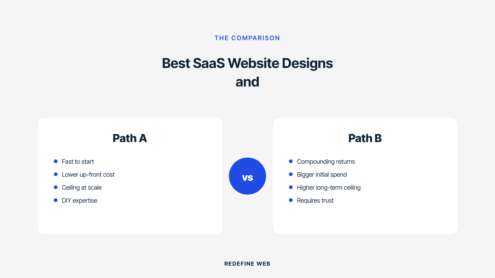
Every review of best saas website designs surfaces the same mistakes on the sites that were considered great five years ago. Hero video autoplay that tanks LCP. Sticky headers that eat mobile viewport height. Custom fonts that block first paint. And case study pages with no numeric proof up top.
Performance mistakes accumulate over time on sites that were originally counted among the best saas website designs. A team adds a hero video for the redesign relaunch, then a chat widget for the sales team, then a tracking pixel for the new ad campaign, then a customer data platform snippet. Each addition looks small. The sum breaks the mobile Largest Contentful Paint budget, pushes the site out of Core Web Vitals compliance, and starts costing organic ranking two months later. The best saas website designs run a monthly performance review to catch this drift before it compounds.
Case study pages are the most under-invested surface on most SaaS marketing sites. The pattern that works is three numbers up top, one named quote from the buyer, and three to five paragraphs of context. The pattern that fails is a wall of text with no numbers, no photos, and no client name. Sales cycles get shorter with strong case studies because the buyer can send the link to a stakeholder as internal proof. Weak case studies force the sales rep to build the same proof deck from scratch on every call, which slows the cycle by two or three weeks.
Building your own best saas website design from these examples
Building your own best saas website design starts with a funnel audit, not a Figma file. Map your homepage, pricing page, integration pages, docs, and blog against trial signup rate, demo request rate, and non-branded organic traffic. The surface with the biggest gap versus benchmark is where you start redesigning.
Starting with a funnel audit avoids the most expensive SaaS redesign mistake: rebuilding the whole site when only one or two surfaces underperformed. A $110,000 full-site redesign that improves a homepage that was already converting fine is $110,000 that produced nothing. A $28,000 focused pricing page redesign that moved demo request rate from 0.6 percent to 1.4 percent produced a real ROI in month two. Match the scope of the design work to the scope of the funnel problem, and you save six figures on projects that would have looked pretty and moved zero numbers.
Once the audit identifies the underperforming surface, the redesign becomes a tightly scoped project with a clear success metric and a defined test window. Kickoff runs 2 weeks. Design runs 4 to 6 weeks. Build and QA run 3 to 4 weeks. Launch runs as an A/B test at 20 percent traffic for 2 weeks, then rolls out to 100 percent if the metric moves. Total elapsed time from problem identification to full rollout runs 12 to 16 weeks. This is the durable cadence the best saas website designs came from, and the one your own site can inherit if you resist the urge to rebuild everything at once. For the ongoing test cadence after launch, our SaaS Marketing Retainer Plans from $599/mo service publishes the exact monthly cadence.
Frequently asked questions
What actually defines the best saas website designs in 2025?
The best saas website designs in 2025 all share the same underlying pattern. Every surface is tied to a funnel metric. Homepage hero is measured on trial signup rate. Pricing page is measured on demo request rate. Integration pages are measured on non-branded organic traffic. Docs are measured on time-to-first-value inside the product. A page with no metric attached is decoration. That single filter separates the sites you find on portfolio roundups from the sites that actually move a subscription business forward, and it explains why so many pretty SaaS sites underperform on real funnel numbers.
How is best saas website design different from generic web design?
Best saas website design differs from generic web design in three ways. First, product-led motions matter more than brand storytelling. The homepage has to introduce the product in one screen, the pricing page has to close without a sales call, and the docs surface has to double as an SEO asset. Second, the funnel metrics are subscription-specific: trial signup, activation, net revenue retention. Third, design decisions run as A/B tests instead of gut calls. A generic web design agency without a working model of the SaaS funnel will produce a site that looks great and converts poorly.
Which B2B saas website design examples should I study first?
Study one great SaaS site from each of six categories rather than five from your own vertical. Linear or Vercel for developer tools. 1Password or Okta for security. Stripe or Adyen for payments. Hubspot or Customer.io for marketing tech. Segment or Fivetran for data infrastructure. Toast or Procore for vertical SaaS. Cross-category study surfaces patterns your direct competitors haven't copied yet. The winning moves in one category eventually migrate to others, so studying adjacent categories gives you the design vocabulary six months before your competitors get it.
What is the biggest mistake in most saas website design examples?
The biggest mistake across saas website design examples is copying patterns wholesale from bigger SaaS companies without testing them. The pattern that works on Stripe at billions in payment volume may not work on a Series A SaaS with 400 customers. Study patterns, then test them against your own funnel data before committing. Kill the moves that lose, keep the moves that win. Over six months you build a design vocabulary that reflects what actually works on your traffic. Skipping the test and copying the pattern is the most common expensive mistake in SaaS design, and it produces sites that look sophisticated and convert badly.
How much do the best saas website designs cost to build?
The best saas website designs cost between $28,000 and $180,000 to build depending on scope, page count, and platform. A homepage plus pricing page for an early-stage SaaS runs $28,000 to $45,000. A full marketing site for a Series B with 30 to 60 pages runs $65,000 to $120,000. A Webflow build with a design system, CMS setup, and integration marketing pages for a Series C runs $110,000 to $180,000. Post-launch optimization retainers to run ongoing A/B tests start at $5,000 monthly and climb to $22,000 for full-site iteration.
How long does it take to build a great SaaS website?
A well-scoped SaaS website design runs 12 to 18 weeks from kickoff to launch. Kickoff and audit take 2 weeks. Design runs 4 to 6 weeks. Build and QA take 3 to 4 weeks. Launch runs as an A/B test at 20 percent traffic for 2 weeks, then rolls out to 100 percent if the primary metric moved. Total elapsed time from problem identification to full rollout runs 12 to 16 weeks for a focused surface, or 18 to 24 weeks for a full-site rebuild. Trying to compress below 12 weeks usually produces a site that looks like it launched fast.
Book your free 30-minute strategy call.
No spam, no sales rep. We use your email to schedule your call with a senior strategist. That is it.
More from the blog
View all articles → Web Design
 Core Web Vitals Healthcare Websites Actually Need to Book Patients
Read article Web Design
 Professional Services Website Design Best Practices for 2026
Read article Web Design