
Responsive vs Adaptive Web Design Which Is Better in 2026
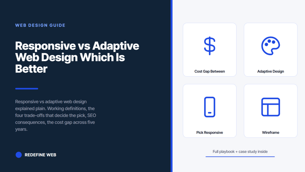
- Responsive scales fluidly across every screen width.
- Adaptive swaps between three to six fixed layouts.
- Google names responsive as the preferred configuration.
- Adaptive costs 30 to 60 percent more at every tier.
- Small business sites almost always pick responsive.
- The cost gap between responsive vs adaptive web design
- When adaptive design actually beats responsive
- Which is better for a small business responsive vs adaptive web design
- The Passion Built story on picking responsive vs adaptive web design
- How to pick responsive vs adaptive web design in your vendor call
- Common picking mistakes on responsive vs adaptive web design
- Responsive vs adaptive web design in one closing answer
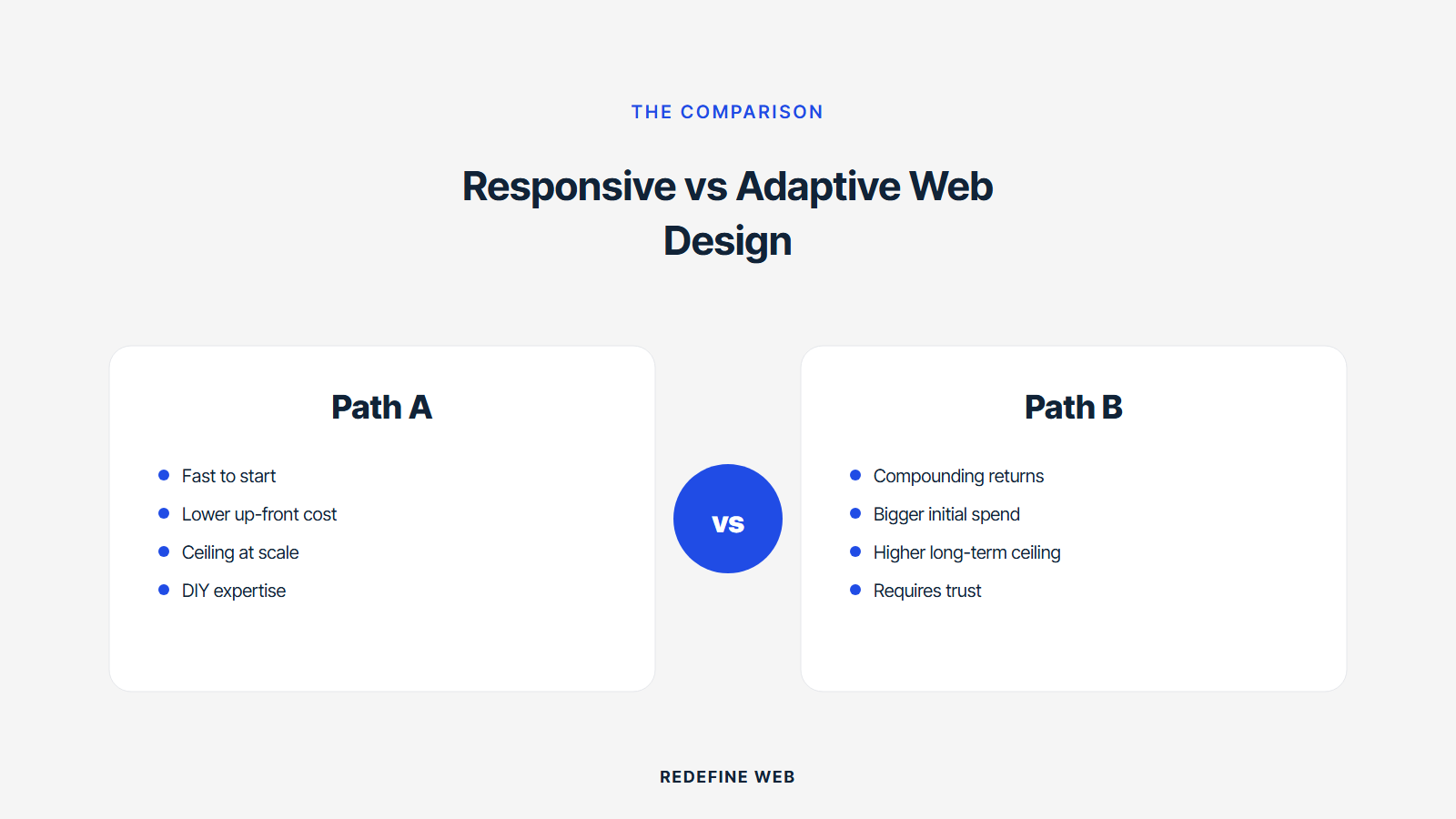
Responsive vs adaptive web design is the picking question every small business owner faces once during the site build and rarely revisits. Responsive uses one flexible codebase that scales fluidly across every screen width. Adaptive uses three to six fixed layouts that swap based on the detected device. Both work. One fits 95 percent of small business sites in 2026. The other fits a narrow set of brand-first marketing microsites and enterprise brand systems.
This guide walks through the working definitions, the four trade-offs that decide the pick, the SEO consequences, the cost gap, and a working case study on a Sydney renovation client who picked responsive and grew organic traffic 100x. Read it in ten minutes and walk into your vendor call knowing whether responsive vs adaptive web design is even a real decision for your business, and which questions to ask the vendor to catch a hybrid build hiding under a responsive label.
The cost gap between responsive vs adaptive web design
The cost gap between responsive vs adaptive web design runs 30 to 60 percent higher for adaptive at every tier. A $4,500 responsive small business site costs $6,500 to $7,500 built adaptive. A $7,500 mid-tier responsive site costs $10,000 to $12,000 built adaptive. The gap widens on custom builds. A $15,000 responsive custom build costs $22,000 to $30,000 built adaptive. The gap covers the extra design work (multiple layouts) and the extra development work (layout selection logic).
Maintenance costs widen the gap further across five years. Responsive maintenance runs $1,500 to $3,500 per year for a small business site. Adaptive maintenance runs $3,000 to $6,500 per year for equivalent scope because every plugin update, content edit, and feature addition touches three to six templates instead of one. Over five years the maintenance gap alone compounds to $7,500 to $15,000 in extra vendor time.
Total cost of ownership across five years lands at $12,000 to $22,000 for a responsive small business site and $22,000 to $45,000 for an equivalent adaptive site. The gap is real, and it compounds. Owners who understand the compounding pick responsive by default and switch to adaptive only when the design polish trade-off carries a specific business reason worth the extra spend. Owners who see responsive as a compromise pay for adaptive polish they never actually needed. See the internal reference on responsive web design services for the current package tiers.
When adaptive design actually beats responsive
Adaptive design wins in three specific cases. Heavy brand systems where the desktop, tablet, and phone experience each require distinct art direction. Marketing microsites launching a specific product where pixel-perfect control at each breakpoint drives the campaign. Enterprise applications where the mobile view needs a different information architecture than the desktop view for user experience reasons.
Heavy brand systems live at brands like Apple, Nike, and Rolex where the visual identity is the product. A responsive site that scales the desktop hero image down to phone width loses the brand impact. An adaptive site that shows a distinct phone-first hero (different photography, different typography, different call-to-action) preserves the brand at every viewport. The cost gap is worth it because the brand is the product, not the copy on the page.
Marketing microsites for specific product launches (Netflix’s launch page for a new show, Nike’s launch page for a new shoe) benefit from adaptive art direction because the campaign has a fixed budget and a fixed window. The extra build cost fits inside the campaign budget. The launch does not need long-term maintenance because the microsite comes down in six months. Adaptive fits the constraint. Responsive would waste effort on maintenance patterns that never get exercised.
Enterprise applications with distinct mobile and desktop information architectures are the third case. A trading platform’s desktop view shows a six-panel dashboard. The mobile view shows a single-focus scroll of the same data. The two views are not the same page at different widths. They are two products. Adaptive handles this cleanly. Responsive would either overwhelm the mobile view or underwhelm the desktop view. For a small business marketing site, none of these three cases apply.
Every web design agency has, at some point, sold a small dental practice on adaptive design because the practice owner mentioned that the competing chiropractor down the street has a really nice website. The chiropractor’s site is a $6,000 responsive Wix template. The dental practice ends up with an $18,000 adaptive build that takes eleven weeks to launch and books three fewer patients per month than the responsive alternative would have. The chiropractor keeps winning.
Which is better for a small business responsive vs adaptive web design
For a small business site, responsive is better than adaptive on every measurable dimension. Cost. SEO. Maintenance. Time to launch. Long-term flexibility. The one dimension adaptive wins (pixel-perfect art direction at each breakpoint) does not carry a business reason worth the extra spend for a business booking customers from a functional site. Pick responsive.
Small business sites need to do three things well. Rank in Google’s mobile SERP. Book customers via a contact form or booking flow. Stay cheap to maintain across three to five years. Responsive does all three by default. Adaptive can do all three but adds cost and complexity for benefits the small business rarely needs. The picking math is not close for 95 percent of small business owners.
The 5 percent case where adaptive fits a small business breaks down as follows. Luxury brands with a distinctive visual identity where the brand is the product (typically over $2M revenue). Marketing microsites launching a specific product with a fixed budget and a short window. Small businesses whose owners have a specific art-direction requirement they can name and justify. If none of those cases apply to your business, pick responsive and move on. The savings across five years fund a second round of paid marketing that grows the business faster than any layout polish ever would.
The Google Search Central guidance on responsive as the preferred mobile configuration puts a bow on the picking. Google names responsive as the recommended approach and lists adaptive as an acceptable alternative with specific configuration requirements. Small business owners are not building specific configurations. They are building small business marketing sites. Responsive is the default for that reason.
Open the vendor's demo in DevTools and drag the width slowly. If it snaps at 3 breakpoints only, it's adaptive dressed up. If it flows, it's responsive.
The Passion Built story on picking responsive vs adaptive web design
Passion Built, a Sydney bathroom and home renovation specialist, is the working example we point to when a small business owner asks whether responsive vs adaptive web design is even a real decision. The team came in running two separate underperforming sites built by two prior agencies at higher price points. One of the prior builds was adaptive. The other was cheap responsive. Both cost more than the winning responsive rebuild and produced worse outcomes.
We consolidated the two sites into one responsive build with mobile-first CSS, srcset image handling, on-page SEO applied uniformly across mobile and desktop, and a rebuilt booking flow. Twelve months after launch, Passion Built ranked for more than 300 competitive keywords, drew more than 800 monthly visitors, and generated over $60,000 in renovation bookings directly from organic search and paid work. The 10 percent conversion rate on new visitors was ten times the baseline. All of that flowed from picking responsive over the adaptive alternative one vendor had quoted.
The adaptive quote Passion Built received was $14,500 all-in for year one. The winning responsive quote was $6,500 all-in for the same year. The $8,000 difference funded the first six months of paid Google Ads that seeded traffic to the new responsive site. The adaptive design polish would have added no measurable revenue for a renovation business booking customers via a contact form. The picking math was decisive and the outcome confirmed the picking. Read the Redefine Web reference on what is responsive web design for the working definition this picking sits inside.
How to pick responsive vs adaptive web design in your vendor call
Picking responsive vs adaptive web design on a vendor call takes five specific questions. Every question is objective. Every answer is verifiable. Vendors who deflect on any of the five are unlikely to deliver on the responsive promise regardless of what the proposal says.
The five questions below map to the four trade-offs plus the SEO configuration risk. Every question has a right answer. Compare answers across three vendors. The vendor whose answers align cleanly with responsive-first practices is the one whose responsive build actually delivers. Vendors who mix responsive and adaptive language without naming which approach they use are hiding a hybrid build that costs adaptive money and delivers responsive polish.
- Does your build use one CSS file with media queries or multiple template files with layout logic? The right answer is one CSS with media queries. That is responsive.
- How do you handle breakpoints? The right answer names three to five specific pixel widths (480, 768, 1024, 1280) or a fluid clamp() approach. Vague answers signal a hybrid.
- Do you use server-side or client-side rendering for mobile? The right answer is neither. Responsive uses the same page rendered by the browser at the visitor’s screen width.
- How do you handle the Vary HTTP header for mobile-first indexing? If the vendor’s answer involves the Vary header, they are building adaptive. Responsive does not need it.
- What is your five-year maintenance cost estimate for this site? The right answer names hosting, care, and one refresh cycle at $1,500 to $3,500 per year. Adaptive maintenance is 2 to 3 times higher.
Common picking mistakes on responsive vs adaptive web design
Small business owners make a handful of picking mistakes on responsive vs adaptive web design during discovery. Each mistake costs real money on the build fee and further money on the five-year total cost of ownership. The four patterns below cover 80 percent of the wrong picks we audit during small business engagement kickoffs.
The first pattern is picking adaptive because a competitor’s site looks nicer at desktop resolution. The competitor’s site is often responsive with strong art direction on the desktop hero. The owner mistakes the polish for adaptive mechanics and asks the vendor to build adaptive to match. The vendor happily quotes adaptive at 30 to 60 percent premium. The finished site does not book more customers, and the owner has spent an extra $6,000 on maintenance patterns the business never exercises. The fix is asking the competitor’s vendor whether the site is responsive or adaptive. In 95 percent of cases the answer is responsive.
The second pattern is picking adaptive because the vendor names it as the premium tier. Some vendors upsell adaptive as a status symbol and quietly deliver worse SEO for higher prices. Small business owners fall for the framing because the vendor named the premium tier “custom” or “bespoke” or “art-directed.” The right response is to ask what specifically the adaptive build delivers that the responsive build cannot, in terms the business measures (bookings, customers, revenue). If the vendor names polish or brand feel, the answer is no. Polish and brand feel are responsive-compatible.
The third pattern is picking a hybrid without knowing it. The vendor calls the build responsive on the proposal, uses adaptive layout selection under the hood for the mobile view, and produces a site that costs adaptive money and delivers responsive polish. The owner never notices until year two when maintenance costs land 2 to 3 times higher than expected. The fix is asking the five questions above on the sales call and getting written commitments in the proposal.
Responsive vs adaptive web design in one closing answer
Responsive vs adaptive web design is a real decision for enterprise brands, luxury goods marketers, and enterprise application teams. For every small business under $1M in annual revenue building a site that ranks in Google and books customers, the picking math is not close. Responsive wins on cost, on SEO, on maintenance, on flexibility, and on time to launch. Adaptive wins on nothing the small business measures.
Pick responsive. Ask the five questions on the vendor call. Get written commitments in the proposal. Sign inside seven days of the final call. The picking is done. The savings across five years fund a second round of paid marketing that grows the business faster than any layout polish ever would. That is the picking rule, and the outcomes on Passion Built and every other small business we have shipped a real responsive build for since 2018 confirm it.
If you want to see what a real responsive build looks like priced, scoped, and delivered on a small business timeline, open the Redefine Web page on web design services for small business or book a discovery call directly through the site. The picking is free. The responsive site that follows earns its cost inside the first year, and the picking rule holds across every vertical from healthcare to home services to professional services.
Frequently asked questions
What is the difference between responsive and adaptive web design?
Responsive uses one codebase whose layout adapts fluidly across every screen width using CSS media queries. Adaptive uses three to six fixed layouts that swap based on the detected device via server-side User-Agent detection or client-side JavaScript. Responsive scales continuously. Adaptive snaps between preset views. Both work. Responsive fits 95 percent of small business sites cleanly. Adaptive fits luxury brand systems, marketing microsites, and enterprise applications where distinct information architectures apply at each viewport.
Which is better for SEO, responsive or adaptive web design?
Responsive wins SEO decisively because the same page renders at every viewport, which passes Google's mobile-first index audit and earns the mobile-friendly signal without configuration. Adaptive can pass both signals but requires the Vary HTTP header, content parity across templates, and a single URL for all views. Any of the three misconfigured drops rankings. Google's own guidance names responsive as the preferred configuration and adaptive as an acceptable alternative for teams that know the setup requirements.
How much more does adaptive web design cost than responsive?
Adaptive costs 30 to 60 percent more than responsive at every small business tier. A $4,500 responsive site costs $6,500 to $7,500 built adaptive. A $7,500 mid-tier responsive site costs $10,000 to $12,000 built adaptive. The gap widens on custom builds and compounds through maintenance because every content edit touches three to six templates instead of one. Five-year total cost of ownership on adaptive runs 60 to 100 percent higher than equivalent responsive scope.
When does adaptive web design actually beat responsive?
Adaptive beats responsive in three specific cases. Heavy brand systems (Apple, Nike, Rolex) where distinct art direction at each viewport preserves brand identity. Marketing microsites for specific product launches with fixed budgets and short windows where the extra polish fits inside the campaign. Enterprise applications with distinct mobile and desktop information architectures (trading platforms, complex dashboards). None of these three cases apply to a small business marketing site, which is why responsive wins the small business picking cleanly.
Can I switch from adaptive to responsive later without losing SEO?
Yes, with careful migration. The URL stays the same. The content stays the same. The internal linking stays the same. The switch replaces multiple template files with one CSS file and media queries. Backlink authority stays consolidated on the same URL. Google re-crawls the site inside 30 days and reads the responsive rendering as the new canonical version. Most small businesses recover 10 to 20 percent of previously lost mobile organic traffic in the first 90 days after the switch.
How do I tell if a vendor is quoting responsive or adaptive under the hood?
Ask five specific questions on the sales call. Does the build use one CSS file with media queries, or multiple template files with layout logic. How does the vendor handle breakpoints. Server-side or client-side rendering for mobile. Does the vendor use the Vary HTTP header for mobile-first indexing. What is the five-year maintenance cost estimate. Responsive answers align cleanly. Adaptive answers name User-Agent detection and the Vary header. Hybrid answers deflect on all five, which signals a vendor hiding the actual approach.
Is mobile-first design the same as responsive web design?
Mobile-first is a CSS pattern that fits inside responsive design. Mobile-first means writing base styles targeting mobile first, then adding desktop overrides via min-width media queries. Responsive is the broader approach: one codebase that adapts across every screen. Mobile-first is the recommended CSS pattern for a responsive build because it produces smaller CSS, faster mobile page speed, and cleaner Cumulative Layout Shift scores. Every modern responsive framework (Tailwind, Bootstrap 5, WordPress themes) enforces mobile-first by default.
Book your free 30-minute strategy call.
No spam, no sales rep. We use your email to schedule your call with a senior strategist. That is it.
More from the blog
View all articles → Web Design
 Core Web Vitals Healthcare Websites Actually Need to Book Patients
Read article Web Design
 Professional Services Website Design Best Practices for 2026
Read article Web Design