Responsive web design techniques decide whether the same codebase loads clean on a 360 pixel Android and a 2560 pixel monitor. Get the techniques right and one build scales the full range. Get them wrong and every launch fights breakpoint bugs. This is the responsive web design techniques and best practices we apply on client sites in 2026, tier by tier, with the reasoning under each rule.
You will read the fluid grid math, the mobile-first CSS pattern, the container query workflow, the image handling stack, the four breakpoints worth defending, the accessibility rules, and the testing tools we run before every launch. Real device coverage. Real numbers. Real trade-offs. No abstraction. For quick smoke tests before every deploy, run the page through a responsive web design checker. Scope a build after this guide and you will scope it against the same techniques we use, priced against the same tools, and tested against the same devices.
Breakpoints tied to content, not device inventory
Breakpoints are the widths where your layout genuinely breaks and needs a new column count or a new component shape. They are not the widths of specific devices. Add a breakpoint when the content forces one. Skip a breakpoint when the fluid grid handles the range. Every responsive web design guidelines list published before 2020 tied breakpoints to iPhone and iPad widths. That advice ages badly the moment Apple releases a new device. Content-driven breakpoints age well.
Our default breakpoint set covers 90 percent of client sites. 480, 768, 1024, 1280, 1600. Five ranges. Mobile below 480. Large mobile and small tablet 480 to 768. Tablet and small laptop 768 to 1024. Standard desktop 1024 to 1280. Wide desktop above 1280. When a project has unusual content like magazine layouts, complex tables, or dashboard panels, we add a sixth breakpoint. When it does not, we go live with five. Both start from content, not from the device store.
| Breakpoint | Width range | Typical target | Layout pattern |
|---|---|---|---|
| Mobile | 360 to 479 pixels | iPhone SE to iPhone 15 | Single column stack |
| Large mobile | 480 to 767 pixels | iPhone Pro Max, small Android | Wider padding, larger fonts |
| Tablet | 768 to 1023 pixels | iPad portrait, small laptop | Two-column card grids |
| Desktop | 1024 to 1279 pixels | Standard laptop | Full nav, sidebar layouts |
| Wide desktop | 1280+ pixels | Monitors, 4K displays | Max-width container, three-column grids |
Content-driven breakpoint decisions
Resize the browser slowly from 320 pixels up. Watch where the layout starts to feel cramped, where cards overlap, where text lines get too long, where whitespace collapses. Those are your breakpoints. Not 375. Not 414. The width where your specific content genuinely needs a new layout. Every site is different. A card-heavy landing page and a text-heavy blog have different breakpoints. Content-driven breakpoints run one to three per page family. Device-driven breakpoints stack six to nine and still miss the edges.
Legacy device coverage that matters
Below 360 pixels lives 1 to 3 percent of traffic on most sites. Older Androids and folded phones. Test the layout at 320 pixels and confirm nothing overflows. Do not build a dedicated 320 pixel breakpoint. The base mobile styles cover it. Above 2560 pixels lives under 1 percent of traffic. Ultra-wide monitors. A max-width on the main container handles it. You never need dedicated CSS for either extreme. Test them both. Support them both. Do not spend build time on them beyond that.
Container queries as the 2026 responsive web design techniques shift
Container queries let a component respond to its container width instead of the viewport width. A product card in a sidebar and the same card in a main column can adapt on their own. Media queries could not do that. Container queries can. Every evergreen browser added support by mid-2023, so the technique is production-safe in 2026. It is the biggest structural change in responsive web design principles since flexbox.
Apply container queries to reusable components. Cards, form groups, media objects, feature blocks. Keep media queries for page-level layout. The main grid, the nav bar, the footer. The two tools work together. When you rebuild a design system in 2026, container queries usually replace 30 to 50 percent of your component-level media queries. The remaining media queries handle the page shell. Cleaner code. Fewer bugs when the layout changes. Component libraries stay portable across projects.
Container query syntax worth memorizing
Set container-type inline-size on the parent. Then write @container (min-width 400px) inside the component CSS. That is the whole syntax. The component now responds to its own container. Drop it in a sidebar and it goes narrow. Drop it in a hero and it goes wide. Same component. Same CSS. Different presentation based on where it lives. That reusability is why container queries earn a permanent spot in every responsive web design techniques library from 2026 forward.
Fallback pattern for older browsers
Older browsers ignore container queries. The component renders at its base styles. On sites with meaningful legacy traffic, typically enterprise and government, wrap container query blocks in @supports (container-type inline-size) checks and provide a media query fallback below the check. The base always works. The upgrade layers on where supported. That is the layered upgrade pattern every responsive web design standards guide has taught since 2011. Nothing changed about the principle. The tools got sharper.
Responsive image handling as a core responsive web design technique
Images are the largest bytes on most pages and the fastest way to lose Core Web Vitals scores (CWV, Google’s LCP, INP, and CLS ranking metrics) if you handle them wrong. The responsive image stack in 2026 has 5 parts. srcset with sizes for resolution switching. picture element for art direction. WebP with AVIF alternates. Explicit width and height attributes to reserve space. Preload on the hero, lazy load below the fold. See web.dev on responsive images for the browser-side patterns every image technique below draws from.
Compress every image before it lands in production. AVIF gets 20 to 40 percent smaller than WebP at the same quality. WebP gets 25 to 35 percent smaller than JPEG. Serve AVIF first through the picture element with WebP as a fallback and JPEG as a last resort. Cap hero images at 200 kilobytes and body images at 100 kilobytes. Anything above that starts costing you in Largest Contentful Paint scores that Google publishes as a ranking factor. Budget for these upgrades up front, since responsive web design and development cost scales with the number of breakpoints and asset optimization steps.
Srcset and sizes for resolution switching
The srcset attribute lists image variants at different widths. The sizes attribute tells the browser how wide the image will render at each breakpoint. The browser picks the smallest variant that satisfies the current viewport and device pixel ratio. A 400 pixel viewport on a 2x device gets an 800 pixel image, not the 1600 pixel desktop version. That single technique saves 50 to 70 percent of image bytes on mobile. Every responsive web design techniques checklist puts srcset near the top for that reason.
Lazy loading below the fold
Add loading equals lazy to every image below the fold. Add fetchpriority equals high to the hero image and any critical above-fold image. Never lazy load the hero. Lazy loading pushes it out of the initial paint and destroys Largest Contentful Paint scores. The pattern is simple. One line per image. The performance win is 300 to 800 milliseconds off the mobile LCP score on a typical content-heavy page. That moves the site from yellow to green in CWV for maybe 2 hours of work across the whole codebase.
Performance techniques inside responsive web design best practices
Performance is not separate from responsive design. It is the same conversation. A responsive layout that loads 3 megabytes of JavaScript on mobile is a slow layout. CWV scores decide ranking. Users bounce when the site stutters. Every responsive web design techniques list worth reading includes performance rules next to layout rules. The two go together. If a technique adds bytes without adding value, you drop it. If a technique cuts bytes without cutting features, you keep it.
Split JavaScript by route so the mobile bundle stays under 200 kilobytes gzipped. Defer non-critical CSS. Preload the primary web font. Use the intrinsic aspect-ratio CSS property on every image to reserve space and stop cumulative layout shift. Cache aggressively with long expiry and file-hash cache-busting. Every one of those is a responsive web design techniques item that pays back in Lighthouse scores and Google rankings inside 30 days of going live.
CWV targets that matter
Largest Contentful Paint under 2.5 seconds. Interaction to Next Paint under 200 milliseconds. Cumulative Layout Shift under 0.1. Those are the 3 Google publishes as ranking signals. Hit all 3 on mobile and desktop and the site clears the technical bar. Miss any one of them and the site fights for rankings against sites that clear it. The techniques above all point at these 3 metrics. Everything else is secondary.
Font loading strategy that avoids layout shift
Preload the primary web font in the document head. Set font-display swap on the font-face declaration so text renders in the fallback font during web font load. Use font-size-adjust to match the fallback font metrics to the web font metrics. That trio keeps the layout from shifting when the web font finishes loading. Skip any of them and you get a visible layout jump that hurts Cumulative Layout Shift and reads as amateur to any user who notices.
Accessibility rules inside responsive web design principles
Accessibility and responsive design overlap more than most teams admit. A small touch target on mobile fails both usability and WCAG. A hover-only interaction fails both desktop mouse users looking for keyboard fallbacks and every touch user. A low-contrast link fails both bright-sunlight mobile reading and color-blind users. Build responsive right and you build accessible right. The two share the same 12 or so rules.
Touch targets at 44 by 44 pixels minimum with 8 pixels of spacing between adjacent targets. Body copy at 16 pixels minimum on mobile. Contrast ratios above 4.5 to 1 for body text and 3 to 1 for large text. Focus states visible on every interactive element. Skip links to main content. Semantic HTML for landmarks. Every one of these lives inside a WCAG 2.1 AA scope and a responsive design scope at once. Apply them once and both audits pass. Skip them and both fail.
Touch target sizing that respects the thumb
Fingers are wider than mouse cursors. A 24 pixel button that works on desktop misses on mobile. 44 pixels is the Apple guideline, 48 pixels is the Material guideline, both work. Adjacent targets need 8 pixels of spacing minimum so users do not miss-click. Every menu item, form field, button, and link on the site respects this rule. Not just the primary CTA. Every one of them. That is the rule responsive web design techniques keep coming back to and the fastest usability audit fix on any project we inherit.
Motion preference queries
The prefers-reduced-motion media query respects user OS-level motion settings. Wrap every animation and every scroll-linked effect in a check. When the user has reduced motion turned on, animations become fades or full disables. Vestibular disorders make aggressive animation genuinely painful for some users. Respecting this setting is a WCAG 2.1 AA requirement, a responsive web design standards item, and the kind of small detail that separates a site built with care from a site pushed out on autopilot.
Testing tools every responsive web design build needs
Emulators catch 80 percent of issues. Real devices catch the last 20 percent. The 20 percent are the bugs that reach production if you skip the step. Testing tools split into 3 tiers. Browser DevTools for daily development. Cloud device farms for coverage. Real devices for pre-launch confirmation. Every serious build runs all 3. The cheap builds skip the cloud farm and the real device pass and go live with bugs the founder finds inside the first hour.
Our default testing stack. Chrome DevTools Device Mode for daily work. BrowserStack for cloud coverage across 200-plus real devices. And a shelf of real devices in the office for pre-launch. iPhone 15, iPhone 12, Pixel 8, Galaxy S23, iPad Pro, iPad Air, a Windows laptop with Edge, a MacBook with Safari, and a Linux desktop with Firefox. Each one gets tested against every breakpoint before launch. Yes it is a lot of devices. It is the difference between a launch that lands clean and a launch that lands with a visible bug.
DevTools workflows worth mastering
Chrome DevTools Device Mode simulates viewport widths, device pixel ratios, and throttled network conditions. Toggle it on every commit. Firefox Responsive Design Mode does the same job with a slightly different UI. Safari Web Inspector adds the iOS simulator that comes with Xcode. Learn the shortcuts. Toggle throttling to Fast 3G to see how the site feels on real mobile networks. Every responsive web design testing tools comparison starts with these 3 and no serious dev workflow skips them.
Real device coverage for launch
A physical iPhone catches Safari-specific rendering bugs that emulators miss. A physical Pixel catches Chrome-on-Android layout quirks. A physical iPad exposes touch behavior that emulator taps do not replicate. The pre-launch pass takes 30 to 60 minutes on a shelf of 5 devices. It catches the last 20 percent of bugs. Every launch that skips this step lands with something the founder finds inside the first day. That is why we own the devices instead of renting cloud time for the final check.
A real responsive web design techniques case study
A recent Redefine Web client came in with two underperforming websites, 6 ranking keywords, and mobile layouts that broke below 480 pixels. We rebuilt the site on a mobile-first codebase with fluid grids, container queries on the service cards, and srcset on every image. Breakpoints came from actual content stress-tests, not device widths. WebP with AVIF fallback on every image. clamp() on typography. Preloaded hero. Deferred everything else.
Inside 12 months the keyword count grew from 6 to over 300. Monthly visitors climbed past 800. The site drove more than $60,000 in booked work directly from mobile organic traffic. Every one of those numbers came from responsive web design techniques applied honestly at build time, not retrofitted at audit time. Responsive web design best practices earn results when you actually apply them, and the numbers hold up quarter after quarter, not just the launch week.
CWV impact on the case
The old site failed all 3 CWV thresholds on mobile. The rebuild hit green on all 3 inside 2 months. That opened up rankings the old site could never earn, since Google prioritizes technical quality on mobile-first indexing. Responsive web design techniques and CWV compound. The techniques earn the scores. The scores earn the rankings. The rankings earn the leads. In short, the mobile score gate is now the SEO gate for most competitive terms.
Conversion rate impact from responsive polish
Conversion rate on mobile climbed after the rebuild. Same offer. Same audience. Different techniques. Bigger touch targets on the booking form. Larger form labels. Fixed sticky CTA in the thumb zone. Removed a heavy hero video that tanked LCP. Every one of those changes came out of responsive design principles. None of them were a redesign. All of them moved the number. That is the pattern to copy on any inherited codebase where mobile is losing revenue to friction.
Responsive web design patterns worth avoiding
Some techniques get repeated across tutorials for years after they stop working. Detecting device by user agent string. Serving a completely different mobile site at m.example.com. Hiding entire feature blocks on mobile with display none. Fixed pixel widths on every container. Each of these was fine in 2013 and each of them fails CWV or user experience in 2026. When you inherit a codebase using them, treat them as tech debt to schedule out.
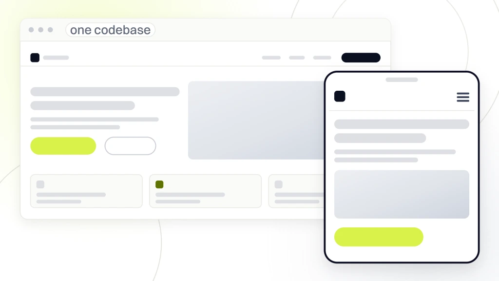
The pattern to keep is responsive as a single codebase with a layered upgrade approach. One HTML tree. One CSS file. One JavaScript bundle split by route. Media queries and container queries for adaptation. Feature detection over browser detection. Server-side rendering when SEO matters, client-side hydration for interactivity. That single-codebase pattern has survived every browser and device generation since 2014 and there is no reason to expect that to change in 2026 or 2027.
Hiding content on mobile as the wrong shortcut
display none removes content from the layout. On many implementations it removes the content from screen readers too. Every mobile-hidden section is a piece of content the mobile user cannot read and the mobile crawler cannot index. Mobile-first indexing means Google reads the mobile version. If your mobile version hides half the content, you are showing search engines half the SEO signal. Adapt content for mobile. Do not hide it. Rewrite the block. Compress the images. Restructure the columns. Never delete it from the mobile DOM.
Separate mobile URLs as the wrong architecture
Serving a separate m.example.com site to mobile users worked in 2010. It splits SEO signals across two URLs. It doubles the maintenance burden. It confuses users who bookmark one and share the other. Responsive web design consolidates everything to a single URL that adapts. Every migration off a separate mobile site pays back inside 6 months in cleaner analytics and better search rankings alone. Any legacy business still running a separate mobile URL in 2026 should schedule the migration this quarter.
CMS and framework choice inside responsive web design techniques
Your CMS or framework decides how much of the responsive web design techniques above you build yourself versus inherit. Modern frameworks like Next.js, Astro, Remix, and Nuxt bake in most of them. WordPress with a well-built custom theme covers the rest. Page builders vary widely. Some responsive out of the box. Others require constant fighting to get clean output. Pick the platform that respects the techniques. Fight the ones that do not, or migrate.
Every project starts with a discovery call. That call includes a CMS review. If the current stack cannot support container queries, srcset, WebP, and mobile-first CSS without a wrestling match, we rebuild on a stack that can. Sometimes that means a custom WordPress theme. Sometimes that means Astro for a marketing site. Sometimes it means Next.js for an app. The techniques do not change. The tools change to fit the project.
WordPress theme approach that respects responsive rules
A custom WordPress theme built for responsive lives in about 3,000 lines of PHP and 2,000 lines of CSS. See our how to develop a WordPress website guide for the theme skeleton. It uses core block patterns for editor experience, custom blocks for reusable components, and a small CSS pipeline like Sass or PostCSS for organization. No page builder plugin bolted on. Zero jQuery. Modern JavaScript modules. Every one of the responsive web design techniques above lands cleanly. Editor experience stays clean for content team handoff.
Static frameworks for content-heavy responsive builds
Astro and Eleventy fit content-heavy marketing sites that need speed above everything else. They send almost no JavaScript by default. Every page loads under 100 kilobytes. CWV scores hit green on the first commit. Both frameworks respect every responsive web design principle above without adding overhead. When SEO and speed are the top 2 goals, a static framework beats WordPress on raw performance. When editorial workflow is the top goal, WordPress still wins. Pick the one that matches the priorities.
Responsive web design techniques checklist before launch
Before every launch we run a 12-point responsive check. Mobile-first CSS confirmed. All breakpoints tested from 320 to 2560 pixels. srcset on every image. WebP or AVIF served. Lazy loading on below-fold images. Preload on hero. clamp() typography. Container queries where components need them. Focus states visible on every interactive element. Touch targets at 44 pixels minimum. prefers-reduced-motion respected. Lighthouse Performance, Accessibility, Best Practices, and SEO all above 95 on mobile.
Any single failure blocks the launch. We fix the issue, re-run the check, and only push live when all 12 pass on mobile. Every one of those checks maps back to a technique above. None of them are optional. Every launch that skipped a check inside the last 2 years produced a bug within the first week. Every launch that ran the full check landed clean. The correlation is 100 percent, since the techniques are the checklist.
Lighthouse targets by category
Performance 97 or above on mobile. Accessibility 100. Best Practices 100. SEO 100. Those are the mandatory targets on every client build. Performance below 97 usually means an image or a font issue you can fix in an hour. Accessibility below 100 blocks ADA compliance. Best Practices below 100 usually means a mixed content warning or a console error. SEO below 100 means a meta tag or a heading issue. Every one of these has a specific fix. None of them are mystery scores.
Post-launch monitoring worth setting up
Set up Real User Monitoring, or RUM, to capture CWV field data. Google Search Console reports the same data on a delay. New Relic, Datadog, or Sentry Performance run continuous checks. Any regression above 10 percent on any CWV triggers an alert. That is the loop. Apply the techniques. Monitor the scores. Fix regressions inside a week. Every site we maintain runs this loop and every one of them stays in green CWV for years after launch, not weeks.
Apply responsive web design techniques to your next build
Start with a Lighthouse run on mobile. Pick the lowest score. Fix the issues one at a time. Re-run. Move to the next lowest score. Go live in 3 passes. Performance first, accessibility second, layout polish third. Every pass takes 1 to 3 days depending on the size of the site. By the end of 2 weeks a legacy site that was failing every check is passing every check. Techniques and best practices earn their value in exactly this loop.
Ready to scope a build that respects every technique above. Our responsive web design services starts at the discovery call and ends with a launched site in the green on every CWV. If the scope is small business, our web design services for small business covers the fixed-price entry. For maintenance after launch, our monthly website maintenance packages keeps scores in the green quarter after quarter. For related reading in this cluster, see our how much does responsive web design cost pricing guide and responsive web design and seo how mobile friendly design impacts rankings. See web.dev on responsive design basics for further pattern reading.