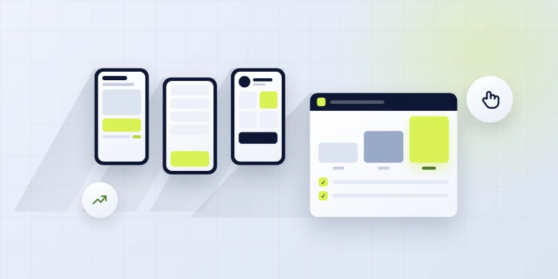
Responsive web design examples work as reference points when you are scoping a new build or auditing an old one. The best of them show techniques that went live in production and survived real traffic. Studying 2 or 3 examples per pattern teaches the technique faster than reading 4 tutorials. This guide is the 2026 shortlist of responsive web design examples worth your time, sorted by pattern, industry, and technique.
You will read the 8-plus sites we cite in client scoping calls, the layout patterns each one uses, the industry each fits best, the gallery sources worth bookmarking, the split between inspiration and copy, the sample code strategy that lets you learn from examples without producing a knockoff, and the real-world case study that shows what studying the right examples earned for a real client. Real sites. Real techniques. Real reasoning behind each pick that made the shortlist.
Common responsive web design layout examples
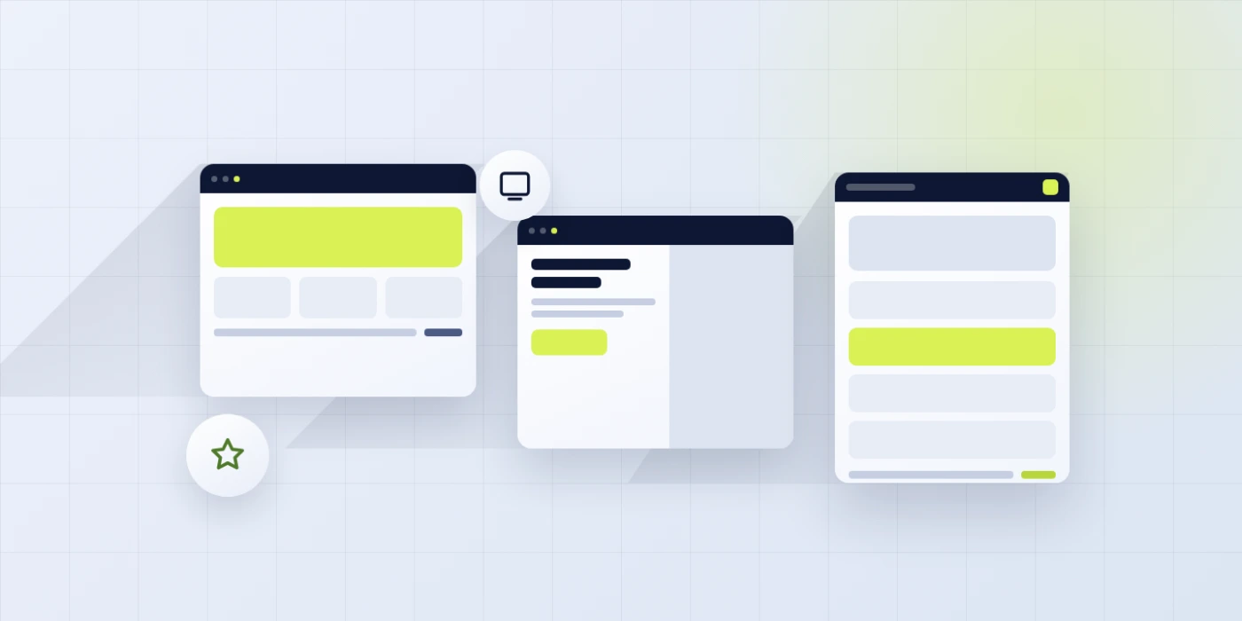
Common responsive layout examples cluster into 6 or 7 patterns that repeat across every industry. Hero-plus-cards. Split-screen hero. Magazine-style article. Dashboard sidebar plus main. Product grid with filter panel. One-page long scroll. Each has its own responsive challenges and its own reasons to pick it for a specific project. Study them side by side and you spot the shared grid logic quickly.
Hero-plus-cards is the workhorse. Full-bleed hero at the top. Card grid below. Full-width CTA strip. Footer with columns. That layout runs 60 percent of the small business marketing sites we build since it converts. Split-screen hero is the SaaS pattern. Value prop left, screenshot right, stacked on mobile. Magazine-style article is the blog pattern with generous typography and a sidebar. Every responsive web design website example above uses some variant of these patterns.
| Layout pattern | Best for | Mobile behavior | Desktop behavior |
|---|---|---|---|
| Hero plus cards | Small business, service | Single-column stack | 3 or 4 columns |
| Split-screen hero | SaaS, product marketing | Stacked vertically | Value prop plus visual |
| Magazine article | Blog, editorial | Single column with pull-quotes | Main column plus sidebar |
| Dashboard shell | App marketing, docs | Bottom nav, main content | Sidebar plus main content |
| Product grid | Ecommerce | 2 columns, filter drawer | 4 columns, filter sidebar |
| Long scroll | Product launch, portfolio | Sequential sections | Anchored nav, wider sections |
Hero-plus-cards pattern details
Full-bleed hero with headline, subhead, primary CTA. Card grid below with 3 to 6 feature cards. Full-width CTA strip mid-page. Footer with 4 columns on desktop, 2 columns on tablet, 1 column on mobile. That is the whole recipe. Every small business marketing site we build uses some variant of this pattern. It works since it puts the value proposition above the fold and lets scannable feature cards close the deal.
Split-screen hero pattern details
Value proposition on the left. Product screenshot or illustration on the right. grid-template-columns 1fr 1fr on desktop, single column on mobile. The screenshot side sometimes rotates through 3 or 4 variations to show product breadth. That pattern reads premium and shares product depth in one scroll. SaaS teams pick it since it converts. Local businesses often skip it. For example, there is no screenshot to show, so the pattern breaks down.
Techniques behind the best responsive web design examples
Every showcase site shares 5 or 6 techniques. Fluid typography with clamp(). Mobile-first CSS. srcset image handling with WebP or AVIF. Container queries on reusable components. Skip-link accessibility. Visible focus states on every interactive element. Studying the same techniques across 3 or 4 examples locks the pattern in memory. That is the point of a curated responsive web design gallery pass.
Open DevTools on a showcase site. Inspect the hero headline. Check the font-size property. Almost every one uses clamp() with a mobile floor around 32 pixels and a desktop ceiling near 72 pixels. That single technique keeps headlines readable at every viewport with no breakpoint-triggered jump. Then check an image. srcset with 4 to 6 variants and sizes with a media query. Next check a card component. Container query on a wrapping element. Every technique visible in seconds.
Fluid typography across the shortlist
clamp(2rem, 1rem + 4vw, 4.5rem) on the H1 scales cleanly from 32 pixels on mobile to 72 pixels on wide desktop. No breakpoint jump. No 24-pixel headline on a 27-inch monitor. Every good showcase site uses this technique on at least the H1 and often on H2, H3, and body copy. It is the highest ROI CSS technique of the last 5 years and every serious site adopted it by 2023.
Image handling in showcase examples
Hero images at 200 kilobytes or less. srcset with 4 to 6 variants. WebP with AVIF alternate through the picture element. width and height attributes set explicitly. fetchpriority=high on the hero. loading=lazy on below-fold. Every showcase-quality site runs this full pattern. Skipping any part of it costs Core Web Vitals. And once field data catches up, the ranking damage compounds fast on competitive queries. Google notices. Users notice. Both audiences reward sites that adopt the full pattern.
Using inspiration without copying the design
Study 3 or 4 reference sites in the same industry. Note the shared layout patterns. Sketch a wireframe of your own that borrows the patterns but not the visual identity. Build the wireframe in your brand voice with your palette, typography, and photography. That approach produces a distinctive site that respects proven patterns without producing a knockoff. Professional designers work this way every day.
The line between inspiration and copy is specific. Layout patterns transfer freely. Color palettes and typography are trademark-adjacent and do not transfer. Copy text is copyrighted and does not transfer. Photography is copyrighted and does not transfer. Motion and interaction patterns transfer with attribution when they are notable enough to be identified with a specific site. When in doubt, ask a designer or a lawyer, not a marketer or a founder in a hurry.
Patterns that transfer between examples
Grid structure. Column counts by breakpoint. Section rhythm. Nav behavior. Card style categories. Footer organization. Form field styling. Motion respect. Accessibility patterns. Every one of these is a pattern that transfers freely between projects. Study each pattern across 3 or 4 reference sites. Note the common ground. Adapt to your project. That is how design skill compounds over years without producing derivative work.
Identity elements to preserve
Color palette. Typography choices. Photography style. Brand voice in copy. Logo treatment. Icon set. Illustration style. These are the identity signals that make a site look like your brand and not like someone else’s. Preserve all of them across projects. Change layout patterns freely. Change identity elements only when the brand genuinely shifts. That single discipline separates a designer who builds coherent brand experiences from one who assembles greatest-hits inspiration boards.
Responsive web design sample code strategy
Responsive web design sample code lives on CodePen, GitHub, and CSS-Tricks. Search for the technique you want to learn (fluid typography, container queries, srcset). Filter by recent (last 12 months). Read 3 or 4 samples. Understand the pattern. Then write your own implementation in your project. That approach produces code you understand and can maintain. Copying sample code produces bugs you cannot debug. If you would rather start from a pre-built base, weigh the tradeoffs in our responsive web design templates vs custom build breakdown.
The best sample code sources for responsive web design in 2026. MDN Web Docs for authoritative reference, web.dev for pattern-focused articles, CSS-Tricks for technique walk-throughs, and CodePen for isolated demos. Avoid Stack Overflow answers older than 2020 since CSS moved fast in 2021 through 2024 and older answers usually reflect legacy patterns that no longer represent best practice. See the MDN CSS Grid reference for the current authoritative pattern set.
CodePen for isolated demonstrations
CodePen isolates a single technique in a single pen. Search for clamp typography, container query grid, srcset picture, or any specific technique. Filter by recent and by picks. Fork the pen to experiment. That workflow teaches faster than reading a full article since you get immediate feedback on the CSS. Every serious designer we know has 20 to 100 pens saved for reference. Building your own collection over a year produces a personal responsive web design gallery of technique demos.
GitHub for production-quality samples
GitHub hosts full projects that run responsive in production. Search for open-source WordPress themes, Astro starters, or Next.js templates. Clone one that matches your target scope. Read the CSS. See how professionals organize responsive stylesheets. That level of context is impossible to get from isolated code snippets. Every serious responsive web design demo library includes at least 1 full open-source starter kit worth studying end to end.
A real responsive web design examples case study
Passion Built, a Sydney bathroom and home-renovation specialist, came in with 2 underperforming websites and no clear brand direction. Before scoping the rebuild, we spent 3 hours across 5 reference sites on Awwwards and Land-book.com in the home services and interiors categories. We identified the shared patterns. Full-bleed photography-led hero, 3-card service overview, testimonial rail, project gallery with lightbox, and simple booking flow.
We wireframed a version of that pattern tuned to Sydney bathrooms. The rebuild went live on custom CSS with mobile-first breakpoints, container queries on the service cards, clamp() typography, and srcset on every project image. Inside 12 months Passion Built secured 300+ keyword rankings, converted 10% of new visitors, and booked $60,000+ in renovation work. Every one of those numbers traces back to a study session that shaped the layout choices at kickoff. The full write-up sits on the Passion Built case study page. Read it end to end when you want the timeline and the specific patterns we borrowed.
Hours spent studying examples
3 hours of gallery study saved 3 days of layout iteration. That is the ROI on gallery study time. Skipping the study session forces the team to invent patterns from scratch. Every invented pattern hits a bug the internet solved 5 years ago. Every studied pattern avoids the same bug. 3 hours up front. 3 days saved on the back end. That math holds across every project we scope, and it maps to the discovery phase in our web design and development process.
Pattern selection from studied examples
For Passion Built we picked photography-led hero from a boutique renovation firm, 3-card service overview from a design studio, testimonial rail from a wellness clinic, and project gallery lightbox from a portfolio site. 4 reference sites contributed 4 patterns. The visual identity came from Passion Built’s brand with no direct copy. The layout logic came from the examples. The result read distinctive and worked on every device.
Industry-specific responsive web design website examples
Every industry produces its own reference sites worth cataloging. Healthcare marketing sites lean toward clean typography and trust-signal-heavy hero sections. Home services sites go for photography-led heroes and prominent phone numbers. Legal sites push authority and accessibility. Ecommerce sites prioritize product grids and filter panels. Studying industry-matched examples produces sharper reference material than studying generic showcase sites. The pattern fit is tighter.
Search Awwwards or SiteInspire by industry filter. For dental sites, look at practice groups with clean booking flows. For SaaS marketing, look at product-led growth companies with tight value propositions. For local business, look at boutique service providers with strong local proof. Each industry has a top tier of reference sites that put out consistently good work. Bookmark 5 per industry you scope regularly and refresh the list once a quarter.
Healthcare industry patterns
Healthcare reference sites lead with trust and clarity. Large body text. Generous whitespace. Prominent booking or contact CTAs. Accessible color contrast well above WCAG minimums. Simple nav with clear service categorization. Every one of these choices addresses a specific audience need. Patients researching a provider under stress want fast answers and easy contact. The design supports that goal or fights it.
SaaS product marketing examples
SaaS reference sites lean on product depth and social proof. Split-screen hero with screenshot. Feature cards below with icons. Customer logos in a rail. Testimonials with photos and titles. Pricing tables with tier comparisons. Case study logos with metrics. Every element earns space by supporting the buying decision. Skip any of them and the conversion rate drops. Every SaaS site converging on these patterns tells you they work.
Measuring showcase responsive web design examples
A site earns showcase status by clearing measurable thresholds. Lighthouse Performance 95 plus on mobile. Accessibility 100. Best Practices 100. SEO 100. Core Web Vitals in the green field data. LCP under 2.5 seconds, INP under 200 ms, CLS under 0.1. Every serious showcase entry clears all 4 Lighthouse categories and the 3 field CWV metrics. Sites that fall short on any of them are not showcase-worthy in 2026.
Test any candidate you find on PageSpeed Insights, or run our full responsive web design checker checklist, before you commit to studying it. Enter the URL. Read the scores. If Performance drops below 90 on mobile field data, the site is not delivering the techniques worth learning from. If Accessibility drops below 95, the site is not meeting current WCAG standards. Both filters cut the awards-list clutter down to the actually-worth-studying subset.
Running the Lighthouse check
Open PageSpeed Insights. Enter the URL of the site you want to study. Wait 20 seconds. Read the scores. Note the Core Web Vitals field data if it exists. Sites with less than 30 days of field data show synthetic-only scores which are less trustworthy. Sites with 90 plus mobile Performance and field CWV in the green are the ones worth 30 minutes of DevTools inspection.
Which metrics matter most for study
Performance and Accessibility carry the most weight. Best Practices and SEO clear easily on modern sites and do not differentiate showcase from average. Core Web Vitals field data matters more than lab data since it reflects real users on real networks. When comparing 3 reference sites, sort by mobile Performance score. The top of the ranked list produces the samples with the most transferable technique.
Where to start with responsive web design inspiration
Start with 3 reference sites in your industry. Bookmark them. Open DevTools on each. Note the layout pattern, the typography scale, the image handling, the nav behavior. Sketch a wireframe of a hybrid pattern that borrows the best of the 3. Build the wireframe in your brand voice. That single workflow produces 80 percent of the design payoff without the risk of copying any single example.
Ready to hire a team that studies great responsive web design examples before every build. Our responsive web design services scope every project against studied references. If your budget fits the small business tier, our web design services for small business gives you a fixed-price version. For related reading in this cluster, see our responsive web design techniques and best practices and responsive web design breakpoints and screen sizes. See the MDN CSS Grid reference for pattern implementation detail.