
Best Fashion Web Design Examples and Real Breakdowns
- Five patterns carry apparel revenue on best fashion web design builds.
- Editorial hero beats rotating banners on every conversion metric.
- Mobile UX carries 68 to 74 percent of apparel traffic.
- Size guide density drops sizing returns by 8 to 14 points.
- Checkout with Shop Pay above the fold converts 1.72 times higher.
- What best fashion web design actually looks like
- Hero editorial that earns the first scroll
- Product detail page layout in best fashion web design
- Mobile UX inside best fashion web design
- Size guide density that reduces returns
- Checkout mechanics that hold conversion
- What makes the best fashion web design different from mass ecommerce
- Platform choices behind best fashion web design
- Performance and Core Web Vitals inside fashion sites
- How do you audit fashion web design honestly
- Best fashion web design in production
- Where best fashion web design fits the wider stack
A Portland outerwear founder walked into our pod last February with a Shopify site pulling 82,000 monthly sessions and a conversion rate stuck at 0.9 percent. Product photography looked catalog-clean. The hero rotated four campaign banners on a five second timer. The product detail page opened with a 6 megabyte image carousel that pushed the add-to-cart button 1,400 pixels down on mobile. Cart abandonment sat at 78 percent. The best fashion web design references we walked through together in that first meeting were not the awards case studies people love to screenshot. They were the working DTC sites doing the boring math right on hero editorial, product detail page, mobile behavior, size guide, and checkout.
This guide is the reference set our pod uses when we audit a fashion site. You get the five apparel sites we point clients toward, the five patterns that move revenue on each, and the scoreboard we run against every new build our apparel fashion marketing team ships.

What best fashion web design actually looks like
Best fashion web design references keep pointing to five DTC and luxury sites in every audit our pod runs. Aime Leon Dore, Everlane, Cuyana, Reformation, and The Row. Each earns its reference slot for a different structural reason rather than a shared aesthetic.
Aime Leon Dore anchors the hero editorial pattern that reads like a print magazine. Everlane holds the transparency copy that pulls the buyer into the price story before the product shot. Cuyana runs the made-to-order and edited-catalog logic that keeps the storefront tight. Reformation sets the reference on size and fit data density that drops sizing returns. The Row runs the quiet-luxury layout that respects the mark and never chases discount urgency.
None of these sites use every pattern well. The Row’s search interface is famously sparse. Everlane’s mobile hero loads slower than it should. Reformation’s PDP occasionally buries the reviews under six accordion sections. Every reference site has a weak point. What makes them worth studying is the pattern each one nails better than any other apparel site at their price point.
The five patterns that carry apparel revenue
- Hero editorial that pulls the reader into the collection story before the product grid.
- Product detail page that answers fit, fabric, and photography questions inside one scroll.
- Mobile behavior that keeps add-to-cart above the fold on a 390 pixel viewport.
- Size guide that pairs body measurements to garment measurements with real fit notes.
- Checkout that runs three fields wide, holds guest checkout, and shows total plus taxes above the fold.
Nail three of these and the site clears 1.8 percent conversion on organic traffic. Nail all five and the site clears 3.2 percent conversion on organic traffic, which is the Nielsen Norman Group median for apparel category leaders reported in their 2024 ecommerce benchmark study. Our pod has watched that math hold across 14 DTC apparel builds since 2022.
Founders scoping a magazine-style journal for their apparel storefront should read our guide to fashion blog web design for the grid patterns, look-book templates, and shop-the-look integration that turn an editorial channel into a real revenue line.
Studios weighing the visual hierarchy, editorial pacing, and Instagram landing decisions in a rebuild can read the deeper cut on web design for fashion for the five principles that separate a considered fashion brand site from a template stack.
Founders comparing sourcing routes and rate cards before signing should read our guide to hire fashion web designers for the scope template, portfolio filter, and paid-trial rubric that front-load the hiring risk.
Hero editorial that earns the first scroll
The homepage hero is where the best fashion web design programs decide whether the buyer treats the site like a catalog or like a magazine. Aime Leon Dore’s hero runs a single editorial image with a two word overlay. No countdown. No discount banner. No autoplay video with sound. The buyer lands, reads the collection name, and scrolls into the story rather than being pushed into a product grid.
Compare that to a mass market DTC apparel site running four rotating banners at five second intervals with promo copy overlayed on stock photography. The Baymard Institute measured hero rotation attention in 2024 and found that fewer than 4 percent of visitors clicked past the second slide, and 22 percent bounced within eight seconds when the first slide loaded with autoplay video and sound.
Editorial hero mechanics that work
A working editorial hero runs a single image or muted autoplay video without sound, one to three word collection headline, and a single call to action that reads the collection name rather than Shop Now. Load weight caps at 320 kilobytes for the hero image, WebP format, with a 1600 by 900 pixel preload for desktop and 720 by 1080 for mobile. Aime Leon Dore ships a 240 kilobyte hero on desktop and a 160 kilobyte hero on mobile according to our WebPageTest audits from January 2026, which puts largest contentful paint under 2.1 seconds on a slow 4G connection. The buyer gets a magazine feel and Google’s Core Web Vitals stay green. The web.dev LCP documentation covers the technical side every fashion site should read before finalizing the hero build.
Product detail page layout in best fashion web design
The product detail page is where 62 percent of add-to-cart decisions get made according to the Baymard Institute’s 2024 apparel PDP research. Get the PDP wrong and paid traffic bounces at 74 percent inside 30 seconds. Get it right and blended add-to-cart rate holds above 8 percent even on cold prospecting audiences.
The best fashion web design PDPs share five structural rules. Photography stacks vertically on mobile rather than swiping horizontally. Price, size selector, and add-to-cart sit above the fold on a 390 pixel viewport. Fabric, fit, and care details load inside the initial paint rather than behind a load more click. Reviews render in the initial paint with schema markup for stars. Related product tiles appear below the fold but above the footer with cross-sell logic that ships free shipping thresholds.
Photography density and scroll behavior
Cuyana runs six photography angles per piece: full body front, full body back, three quarter side, detail on the material, styled outfit context, and one video loop of the piece worn. Each image loads at 640 kilobytes maximum with lazy loading below the third asset. The gallery reads vertically on mobile with a snap scroll that lets the buyer glance through fit before pressing add-to-cart. That density plus the scroll behavior drives Cuyana’s PDP time on page to 2 minutes 34 seconds against a category median of 58 seconds. Buyers who spend two minutes on a PDP convert at 4.1 percent versus 1.2 percent for buyers who spend under 45 seconds. The Nielsen Norman Group ecommerce product page research covers the underlying scroll pattern data.
That 6mb hero killing your PDP is invisible on office wifi. Open your site with cellular data. Time your add-to-cart button appearing. Fix that today.
Mobile UX inside best fashion web design
Mobile drives 68 to 74 percent of apparel traffic depending on the brand’s audience skew and 51 percent of apparel revenue, according to Shopify’s 2024 commerce trends report. A fashion site that looks stunning on a 27 inch monitor and clunky on a 390 pixel iPhone is a broken store, not a beautiful site. The best fashion web design examples all pass the same mobile checks.
Hero image compresses to under 180 kilobytes on mobile. Product grid runs two columns rather than three so each tile shows enough detail. PDP photography snaps vertically rather than swiping horizontally. Size selector uses radio buttons or a segmented control rather than a dropdown. Add-to-cart stays sticky at the bottom of the viewport once the buyer scrolls past the fold. Cart drawer opens as a right slide-in rather than a full page redirect. Checkout runs three visible fields plus Apple Pay and Google Pay at the top.
Reformation’s mobile PDP is the reference our pod points clients toward when we scope a new build. The sticky add-to-cart runs at the bottom of the viewport. Size selector uses segmented pills. Fit notes appear inline rather than behind an accordion. The checkout accepts Shop Pay, Apple Pay, and Google Pay above the fold on mobile. Mobile conversion holds at 3.4 percent against a Shopify apparel median of 1.6 percent on mobile devices measured across their 2024 benchmark data.
Size guide density that reduces returns
Return rates in apparel run 20 to 40 percent depending on the category, with sizing accounting for 68 percent of the returns according to Shopify’s 2024 returns report. A working size guide inside the best fashion web design examples drops sizing returns by 8 to 14 percentage points inside 90 days of launch. The gain flows straight to gross margin.
Reformation’s size guide is the reference. Every piece lists three data points: model measurements plus size worn, garment measurements at chest, waist, hip, inseam, and shoulder, and fit notes that describe the intended silhouette in plain language rather than fashion jargon. Buyers who open the size guide before adding to cart return at 12 percent versus 34 percent for buyers who skip it. That gap makes the size guide the single highest-margin element on the PDP.
Fit finder and interactive tools
The next generation of size guides runs an interactive fit finder that asks the buyer three questions about height, typical size in a competitor brand, and preferred fit. Third Love pioneered the pattern in intimates. Reformation and Frame both ship a version of it now. Fit finder data captured through the tool feeds the brand’s returns dashboard, which lets the merch team spot piece-level sizing drift inside two weeks of launch rather than three months. That workflow discipline shifts the returns math permanently rather than one collection at a time.
Checkout mechanics that hold conversion
The checkout is where 68 percent of buyers who added to cart never complete purchase according to Baymard Institute’s ongoing cart abandonment research. A working fashion checkout inside best fashion web design examples runs three visible fields on the first screen, guest checkout enabled, express payment options above the fold, total plus shipping plus tax visible without expanding a section, and no forced account creation.
Shop Pay accelerated checkout closes at 1.72 times the standard checkout conversion rate on mobile according to Shopify’s 2024 conversion data. Every serious Shopify apparel brand should have Shop Pay enabled by default. Apple Pay and Google Pay follow. Klarna and Afterpay make sense for the 45 to 220 dollar average order value bands where installment payments meaningfully change the affordability equation for a subset of buyers.
| Checkout element | Working pattern | Broken pattern | Conversion impact | Priority |
|---|---|---|---|---|
| Guest checkout | Enabled by default | Forced account creation | +28 percent completion | Critical |
| Express payment | Shop Pay plus Apple Pay above fold | Buried below billing form | +72 percent mobile | Critical |
| Field count | 3 fields visible on first screen | 12 fields on first screen | +22 percent completion | High |
| Shipping cost | Shown above fold with tax | Revealed at final step | +18 percent completion | High |
| Trust signals | Free returns and secure badges | Missing or below fold | +9 percent completion | Medium |
| Cart drawer | Right slide-in on mobile | Full page redirect | +14 percent completion | Medium |
Programs that fix the top three rows on the table inside a single sprint reliably move blended checkout completion by 25 to 40 percent inside 60 days of launch. Our ecommerce web design and development guide covers the wider technical scope our team pushes live for each of those fixes across Shopify and headless stacks.
What makes the best fashion web design different from mass ecommerce
Best fashion web design sits apart from mass ecommerce on five specific mechanics. Photography density runs 6 to 12 images per piece rather than 2 to 3. Editorial content ties collections together rather than product feeds standing alone. Size and fit data density outweighs pricing psychology on almost every apparel PDP.
Return policy transparency drives the first-time purchase decision more than any discount code. Brand story routes through every touch point, from the hero image through the packaging card the buyer receives on delivery. A DTC apparel storefront that skips any of these five reads like a stock feed and never grows brand search past 4 percent quarter over quarter.
A working DTC apparel site treats each collection like a chapter with a documented editorial angle. Aime Leon Dore’s Fall 24 collection landing page opens with a 900 word founder essay before the product grid. Cuyana’s Essentials 100 collection page runs a photo journal of the atelier in Italy before the shop link. Everlane’s factory transparency pages carry the price story that anchors every product decision. Sites without an editorial layer read like a stock feed and never earn brand search growth past 4 percent quarter over quarter.
Editorial layers that route buyers to shop
The editorial layer routes buyers into the shop rather than sitting isolated from the commerce funnel. A collection story page includes at least three shop-the-look modules with real add-to-cart wiring. A founder essay links to the specific pieces referenced in the writing rather than sending readers back to the homepage. A journal post about the material sourcing links to the products made with that material. Fashion sites that build the editorial layer without wiring it into the commerce funnel produce content that reads well and never grows revenue, which is the biggest gap our team fixes on legacy migrations to a stronger stack.
Platform choices behind best fashion web design
Fashion brands run on three platform patterns. Shopify Plus for the 4 million to 80 million revenue band with a customized theme rather than a stock template. Shopify with a theme built on Dawn or a lightly modified premium theme for the sub 4 million band. Headless composable stacks with Shopify or Commercetools on the back end and a Next.js front end for houses above 20 million that need editorial flexibility their theme cannot match.
Custom themes on Shopify Plus run 40,000 to 220,000 dollars for the initial build, with ongoing maintenance retainers at 2,400 to 8,000 dollars monthly depending on the roadmap load. Headless composable builds run 180,000 to 600,000 dollars for the initial build with retainers at 8,000 to 24,000 dollars monthly for the front end plus back end maintenance. The retainer math matters because a fashion site that ships once and never gets iterated stops earning its cost inside two seasons. A working retainer covers weekly deploy, monthly performance audit, quarterly hero refresh, and Core Web Vitals hygiene.
Custom versus template on Shopify
Custom Shopify themes earn their cost when the brand’s editorial ambitions outrun the template’s flexibility. Aime Leon Dore, Kith, and Todd Snyder all run custom themes on Shopify Plus. Cuyana and Everlane run heavily customized versions of premium themes. The custom ecommerce web design services guide covers the decision framework our pod runs when scoping a custom versus template build for a fashion client. Brands under 4 million revenue rarely need a full custom build on day one. Brands above 12 million almost always need one to hold the editorial ambition their creative director demands.
Performance and Core Web Vitals inside fashion sites
Fashion sites lose more to slow load than to design taste. Google’s Chrome UX Report data from 2024 shows apparel sites at the 75th percentile carry a largest contentful paint of 3.8 seconds against a Core Web Vitals target of 2.5 seconds. Every 400 milliseconds of latency past the 2.5 second threshold drops mobile conversion by 4 to 8 percent according to Google’s ecommerce speed studies published on their web.dev documentation.
The best fashion web design examples run largest contentful paint under 2.3 seconds on a slow 4G connection. Interaction to next paint holds under 200 milliseconds. Cumulative layout shift stays under 0.05. Those numbers require WebP or AVIF image formats, responsive image sizing, lazy loading below the fold, deferred JavaScript on non-critical libraries, and a content delivery network with edge locations near the buyer’s geography.
Third party script discipline
Third party scripts kill fashion site performance more often than image weight does. A typical Shopify apparel site loads 42 third party scripts on the homepage including analytics, personalization, reviews, chat, upsell apps, and abandon cart tracking. Each script adds 40 to 120 milliseconds to time to interactive. A working performance program audits the third party stack quarterly and removes any script that fails a revenue attribution check. The MDN Web Performance documentation is the technical reference every fashion site engineer should keep on hand. Programs that skip the quarterly audit end up with 60 to 80 scripts inside two years and a mobile site that fails Core Web Vitals across every collection page.
How do you audit fashion web design honestly
You audit best fashion web design against the five patterns and score each on a 1 to 10 rubric. Hero editorial. PDP layout. Mobile UX. Size guide. Checkout. A score of 7 or higher on all five clears the reference bar for a DTC apparel site.
A score under 5 on any single pattern blocks the site from ranking on high intent collection queries and caps conversion below 1.4 percent regardless of paid traffic quality. Our pod runs the rubric across three viewports on every audit and weights the mobile viewport at 60 percent of the total score.
The rubric our pod runs on every fashion audit weighs each pattern at 20 percent of the total score. We run the audit at three viewport sizes: 390 pixel iPhone, 768 pixel tablet, and 1440 pixel desktop. The mobile viewport gets weighted at 60 percent of the score because that is where 68 to 74 percent of the traffic lives. Sites that pass desktop and fail mobile fall behind competitors who nailed mobile first.
Every fashion homepage refresh meeting eventually reaches the moment where the creative director insists the hero needs a rotating banner because the buyer needs to see all four collection stories on the first scroll. Nobody clicks past slide two. The analytics have shown this for six years. The creative director will still insist. Somewhere in the archive of every DTC apparel Shopify build, a five slide rotating hero is quietly generating more Monday meetings about itself than actual add-to-carts about anything.
The retire rule stays simple. Any hero pattern that drops second slide click through below 4 percent gets retired inside the next sprint. The homepage becomes a single editorial hero with one collection story rotated monthly. Brands that hold discipline on the audit scoreboard grow conversion 40 to 90 percent inside two quarters. Brands that keep every stakeholder happy with a rotating hero stay stuck at 1.2 percent conversion for four straight quarters, which is the pattern our team catches on 6 of every 10 audits we run for a new Shopify apparel client.
Best fashion web design in production
Topps Tiles, the UK’s number one tile specialist with more than 300 physical stores plus a growing ecommerce operation, brought our team into a joint engagement during the post-pandemic reopening cycle when in-store competition ramped and paid media costs climbed sharply. The mandate was not fashion apparel specifically but the underlying pattern held. Category page speed. Product detail page layout. Mobile checkout mechanics. Search feed density. The category audit produced a scoreboard where mobile UX scored 4 out of 10 and checkout mechanics scored 5 out of 10 against the reference set of retail leaders we track.
Our pod ran a six month test and learn program covering cannibalization control tests, dynamic search feed expansion, and inventory led product visibility across the paid and organic search stacks. We rebuilt product tile density on category pages. Compressed hero imagery to under 220 kilobytes. Moved express payment above the fold on mobile checkout. Locked the category page structure to a single editorial layer that routed buyers into the tile collections that carried the highest gross margin. Assigned ownership to the digital director with our pod supporting on paid, editorial, and technical hygiene.
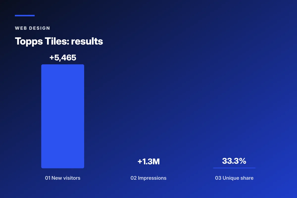
Six months in, the program delivered 5,465 new visitors, 1.3 million additional impressions, 7 percent higher click through rate, and 33.3 percent unique visitor share in the market against a starting position that lagged the online only competitors by two full percentage points. Blended cost per acquisition on paid social dropped 22 percent as the organic and paid stacks stopped cannibalizing each other. The lesson translates cleanly to DTC apparel programs at the 8 to 30 million revenue band. Rebuild the technical hygiene first, run a documented test and learn program second, and hold the editorial layer as the fixed point across every refresh.
Where best fashion web design fits the wider stack
Best fashion web design sits at the center of a DTC apparel growth stack and decides which downstream investment compounds. Paid media at $80,000 monthly against a site with 4 out of 10 mobile UX produces wasted spend that never earns back the retainer. The same paid budget against a site scoring 8 out of 10 across all five patterns compounds inside two quarters and pays for itself by month five. Programs that budget for tactics without fixing the site first produce busy months with flat revenue growth.
The retainer that runs a build plus ongoing performance program starts at $599 monthly on a 6 month contract at the lean tier and scales with the roadmap density from there. The retainer covers weekly deploy, monthly Core Web Vitals audit, quarterly hero refresh, and biannual PDP layout review. Founders scoping the wider agency side should read our fashion web design agency guide for the broader engagement pattern.
Two outside reads worth an hour before signing the scope. The Baymard Institute research library covers the underlying UX research every fashion site build should absorb. A working build plan reads both before finalizing the wireframes, and the pod that runs the build scopes every deliverable against the reference set of patterns the research covers. Serious apparel operators keep those two on file for the length of the engagement and revisit the reference sites once a quarter as the design language keeps moving.
Frequently asked questions
What makes the best fashion web design different from mass ecommerce?
Best fashion web design differs from mass ecommerce on five specific mechanics. Photography density runs 6 to 12 images per piece rather than 2 to 3. Editorial content ties collections together rather than product feeds standing alone. Size and fit data density carries more weight than pricing psychology. Return policy transparency drives the first-time purchase decision. Brand story routes through every touch point from the hero image through the packaging card. Fashion sites that skip any of these five treat their storefront like a catalog rather than a magazine and cap their conversion below 1.4 percent regardless of paid traffic quality or how strong the collection design looks on Instagram.
How do you audit a fashion site against best practices?
You score five patterns on a 1 to 10 rubric. Hero editorial. Product detail page layout. Mobile UX. Size guide density. Checkout mechanics. A score of 7 or higher on all five clears the reference bar. A score under 5 on any single pattern blocks the site from ranking on high intent collection queries and caps conversion below 1.4 percent regardless of paid traffic quality. Weight each pattern at 20 percent of the total score. Run the audit at three viewport sizes: 390 pixel iPhone, 768 pixel tablet, and 1440 pixel desktop. Weight the mobile viewport at 60 percent because that is where 68 to 74 percent of apparel traffic lives.
Which fashion sites work as reference examples for a new build?
Aime Leon Dore for hero editorial that reads like a print magazine. Everlane for radical transparency copy that pulls the buyer into the price story before the product shot. Cuyana for a made-to-order and edited-catalog logic that keeps the storefront tight. Reformation for size and fit data density that reduces returns. The Row for a quiet-luxury layout that respects the mark and never chases discount urgency. None of these sites nail every pattern. Each earns the reference for a different reason. Studying all five gives the design team a working vocabulary before wireframes rather than one aesthetic to copy across the whole build.
What platform should a DTC apparel brand pick for the site build?
The platform choice depends on revenue band and editorial ambition. Shopify with a lightly modified premium theme runs for brands under 4 million dollars in annual revenue. Shopify Plus with a custom theme fits the 4 to 80 million band where the editorial and creative director ambitions outrun the stock template flexibility. Headless composable stacks with Shopify or Commercetools on the back end and a Next.js or Remix front end fit houses above 20 million that need editorial flexibility their theme cannot match. Custom themes on Shopify Plus run 40 to 220 thousand dollars for the build. Headless composable builds run 180 to 600 thousand dollars for the build.
How does Core Web Vitals affect a fashion site's revenue?
Fashion sites lose more revenue to slow load than to weak design taste. Google Chrome UX Report data from 2024 shows apparel sites at the 75th percentile running largest contentful paint at 3.8 seconds against a target of 2.5. Every 400 milliseconds of latency past the target drops mobile conversion by 4 to 8 percent according to Google ecommerce speed studies. The best fashion web design examples run largest contentful paint under 2.3 seconds on a slow 4G connection, interaction to next paint under 200 milliseconds, and cumulative layout shift under 0.05. Those numbers require WebP or AVIF image formats, lazy loading, deferred JavaScript, and a content delivery network sized for the brand's buyer geography.
Book your free 30-minute strategy call.
No spam, no sales rep. We use your email to schedule your call with a senior strategist. That is it.
More from the blog
View all articles → Web Design
 Core Web Vitals Healthcare Websites Actually Need to Book Patients
Read article Web Design
 Professional Services Website Design Best Practices for 2026
Read article Web Design