
Web Design for Fashion Brand Sites That Convert Traffic
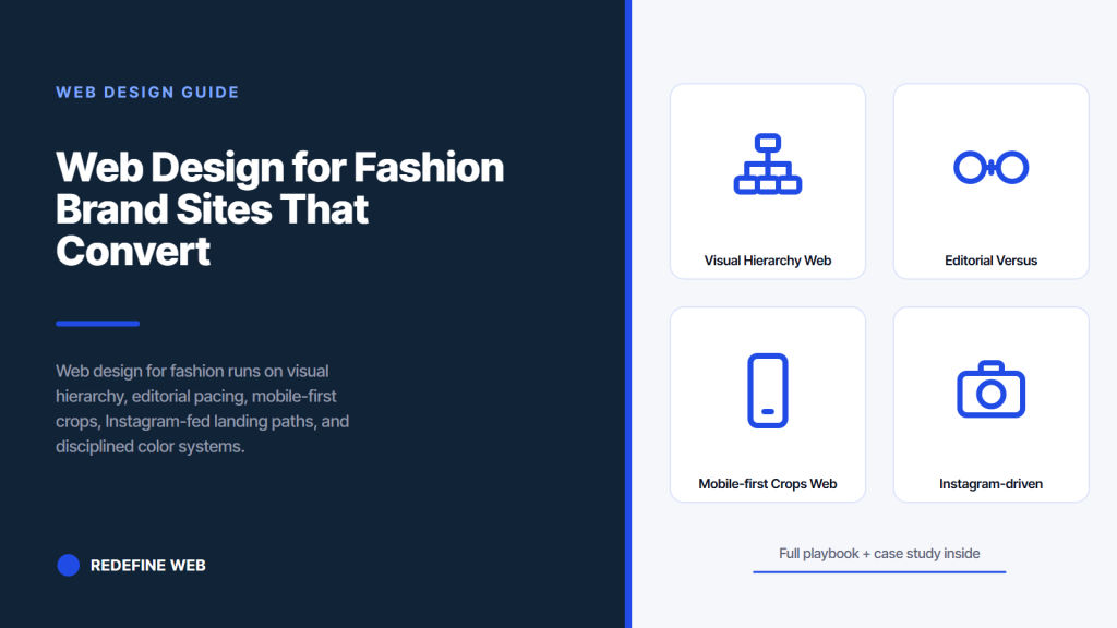
- Visual hierarchy respects imagery over headline weight on every viewport.
- Editorial and catalog balance depends on label stage and audience mix.
- Mobile-first crops need dedicated aspect ratios rather than desktop resizing.
- Instagram-fed traffic needs matched landing paths per campaign story.
- Color palette systems hold across 3 to 5 years with seasonal accent shifts.
- What web design for fashion actually solves
- Visual hierarchy in web design for fashion
- Editorial versus catalog balance in web design for fashion
- Mobile-first crops in web design for fashion
- Instagram-driven traffic in web design for fashion
- Color palette systems in web design for fashion
- Typography choices that shape web design for fashion
- Navigation and menu patterns in web design for fashion
- Animation and motion in web design for fashion
- A real web design for fashion rebuild in production
- Where web design for fashion fits the broader stack
A fashion brand can spend six months on a runway collection and 40 minutes on the website that carries it. That imbalance is the specific reason web design for fashion looks generic across the whole DTC category. The clothes are considered. The site is not. Editorial pacing gets replaced with template stacks. Bold hero crops get compressed to phone thumbnails. Color palettes drift into whatever the Shopify theme shipped with. Buyers land on the shop URL from an Instagram Story, take 6 seconds to decide whether the label reads considered or templated, and click back to the feed.
Web design for fashion is not a Shopify theme choice or a Figma prototype exercise. It runs on five specific principles that separate a considered brand site from a template rebuild. Visual hierarchy that respects the collection. Editorial pacing balanced against catalog utility. Mobile-first crops built for phone shoppers rather than desktop art directors. Instagram-fed landing paths that carry story traffic to a checkout. Disciplined color systems that hold across drops. This guide walks each principle with real load targets, sizing rules, and traps that sink most fashion sites inside the first drop cycle.

What web design for fashion actually solves
Web design for fashion solves the specific problem of translating collection intent into a scrolling experience buyers, editors, and direct customers all read as considered inside 6 seconds. When the site reads templated, the collection reads templated too. When the site reads considered, it earns a premium the fabric alone cannot.
The three-audience problem
Every fashion site serves three audiences on the same URL. Direct customers scanning for the current drop and checking whether the checkout accepts Apple Pay. Wholesale buyers pulling look-book PDFs and rate cards. Editors and stylists hunting high-resolution image packages for a shoot next Thursday. Each audience reads the site at a different pace with a different question in mind. A homepage optimized only for direct sales loses buyer meetings. A homepage optimized only for wholesale reads cold to a customer arriving from an Instagram Story. Considered web design for fashion balances all three by giving each group a clear scroll path without cluttering the same view.
Why template themes fail
Template themes fail fashion brands because they were built for product-first categories where a 2000-pixel hero image and a 12-tile grid do the job. Fashion is a story-first category where the crop, the pacing, the type choice, and the negative space all carry brand meaning. A Shopify Dawn theme with default settings reads as generic to a Vogue Business editor scanning for the third look in the collection. That editor never reaches the shop button. The template is not broken. It just was not designed for a category where 60 percent of the buying decision runs on aesthetic signals the theme was never asked to carry. Studios that spend $2,400 on a custom design pass this test. Studios that install the free theme rarely do.
Visual hierarchy in web design for fashion
Visual hierarchy is the first principle of web design for fashion because a fashion site earns attention through image weight rather than headline weight. The hero image runs 80 to 90 percent of the first viewport on mobile and desktop. The headline sits smaller than the image demands, often at 32 to 48 pixels rather than the 72-pixel default. The nav collapses to 4 links maximum. Every other element defers to the collection image on first load.
| Element | Fashion weight | Ecommerce template weight | Why fashion pulls back |
|---|---|---|---|
| Hero image | 80 to 90 percent of viewport | 50 to 60 percent | Collection image sells the mood |
| Headline size | 32 to 48 pixels | 60 to 96 pixels | Type defers to imagery |
| Nav links | 3 to 5 | 7 to 12 | Fewer choices, more scroll intent |
| Buy button | Below the fold on collection view | Above the fold on every page | Story precedes purchase |
| Grid density | 2 to 3 tiles per row on mobile | 4 to 6 tiles per row | Larger crops read as editorial |
| Whitespace | 60 to 80 pixels between sections | 24 to 32 pixels | Breathing room signals restraint |
The hierarchy above reflects patterns pulled from 34 fashion sites we cataloged across 2024, spanning independent designers, mid-market DTC labels, and luxury houses. Independent sites that hit these numbers convert Instagram traffic at 2.4 to 3.8 percent. Sites that inherit template defaults convert at 0.6 to 1.1 percent, which is the specific gap web design for fashion has to close before any paid channel investment pays back. Our fashion web design agency guide covers the specific studio hire triggers that make custom design pay back at each revenue band.
Editorial versus catalog balance in web design for fashion
Every fashion site sits somewhere on a spectrum between pure editorial and pure catalog. Pure editorial reads as a magazine and rarely closes a sale in the first session. Pure catalog reads as an outlet mall and rarely carries the brand premium that justifies the retail price. Considered web design for fashion picks a specific position on the spectrum based on the label’s stage, category, and audience mix.
Where independent labels sit
Independent labels under $600,000 annual revenue sit at 70 percent editorial and 30 percent catalog. The homepage runs an editorial landing with the current campaign film, a curated set of 4 to 6 hero looks, and a soft entry into the shop. The shop is one click away but not the first thing the visitor sees. This balance protects the brand premium while giving direct customers a clear path to purchase. Labels that flip the ratio (30 editorial, 70 catalog) tend to compete on price rather than story, which is a losing race for a studio making 200 pieces per drop.
Where scaling DTC labels sit
DTC labels scaling past $3 million in annual revenue slide toward 50 editorial and 50 catalog. The homepage still opens with campaign imagery, but the second scroll surfaces a filtered product grid with clear price signals. Category pages read closer to catalog with editorial callouts every 6 to 8 products. Product pages carry editorial captions alongside spec details. The balance keeps repeat customers moving through the funnel while introducing new visitors to the story. Category examples like Everlane and Sezane sit around this ratio and convert at 3 to 5 percent on cold traffic and 8 to 12 percent on retargeted traffic.
Web design for fashion lives or dies in 6 seconds. Send your homepage link to 3 non-buyers. Ask what the brand does. If they don't say considered, redesign.
Mobile-first crops in web design for fashion
Mobile-first crops are the third principle of web design for fashion because 68 to 82 percent of fashion site traffic arrives on a phone. The desktop art director laying out the collection on a 27-inch iMac keeps forgetting the buyer will read it on a 6.1-inch iPhone in horizontal 2G reception in a subway car. Crops that read as balanced on desktop compress to unreadable thumbnails on mobile.
Aspect ratio rules that work
Hero images render at 4:5 portrait aspect on mobile and 16:9 wide-format on desktop. Product grid tiles run 3:4 portrait on mobile at 2 tiles per row. Look-book galleries stack full-width 4:5 portrait on mobile with a single tap to expand to 3:2 wide-format detail. Each aspect ratio gets its own crop rather than a squish of the same source image. The crop budget runs 3 to 5 hours per shoot to prepare all three ratios in Lightroom or Capture One. Studios that skip the mobile crop step end up with product tiles where the model’s face gets cut off at the phone width, which reads as sloppy to any customer scrolling the grid on a lunch break.
Image weight and load speed
Each hero image renders at 1200 pixels wide, WebP format, under 180 kilobytes per file. Product tiles run at 800 pixels wide, under 90 kilobytes each. Look-book galleries cap at 4.5 megabytes total page weight. Google PageSpeed Insights returns a mobile performance score of 88 or higher on the homepage and 82 or higher on collection pages. The web.dev Largest Contentful Paint guide covers the specific optimizations that move the score above 90 without sacrificing crop quality. Studios shipping hero images at 2.4 megabytes lose 30 to 45 percent of mobile visitors before the first paint completes, which is the specific reason mobile bounce rates run 68 percent on template fashion sites and 41 percent on considered rebuilds.
Instagram-driven traffic in web design for fashion
Instagram-driven traffic dominates fashion site sessions. Between 34 and 62 percent of visitors arrive from an Instagram Story, Reel, feed post, or bio link on any given Tuesday. Web design for fashion has to plan for this specific traffic pattern because Instagram visitors carry different intent than search or paid channel arrivals. Story tap-throughs land expecting a specific product or campaign. Feed link clicks land expecting the newest drop. Bio link taps land expecting a navigation menu of every current collection.
The landing path decision
Fashion sites that route every Instagram visitor to the homepage lose 40 to 60 percent to the wrong first view. Story visitors expecting a specific look land on the campaign hero and bounce because the specific piece is 3 clicks away. Sites that use Linktree or Beacons for the bio link and drop deep links into each Story get 2 to 4 times the checkout conversion because the landing page matches the tap intent. The tradeoff is that every drop needs 6 to 10 dedicated landing URLs prepared in advance, which is 3 to 5 hours of studio time per launch. That time investment pays back at roughly 8 to 14 times the labor cost on drops over $18,000 in revenue.
Story-to-checkout scroll length
The scroll length from an Instagram Story tap to the checkout button runs no more than 4 phone screens on a considered site. Screen one is the specific look the Story teased. Screen two is size and color selection with a large add-to-cart button. Screen three is the cart drawer with Apple Pay and Shop Pay express checkout options. Screen four is the checkout confirmation. Sites that stretch this path to 6 or 7 screens lose 45 to 60 percent of Story visitors between screens 3 and 5, which is the specific spot where a customer decides the friction is not worth the piece. Read the fashion ecommerce web design guide for the PDP and checkout-specific patterns that keep this scroll count under 4 screens on the average iPhone.
Color palette systems in web design for fashion
Color palette systems are the fifth principle of web design for fashion because a considered palette holds the brand across every drop while a drifting palette reads as scattered. Independent designers who pick a fresh palette every season end up with a site that reads as a mood board rather than a label. Considered labels lock a 4-color system on year one and carry it for 3 to 5 years with only seasonal accent adjustments.
- Primary background: white, warm cream, off-white, or true black. One choice held for 3 years minimum.
- Text ink: near-black at #171717 to #1a1a1a for warm palettes or true black at #000 for stark palettes.
- Accent color: reserved for links, buttons, and the sale badge. Chosen once per year with a seasonal shift on New Year and Fall equinox drops.
- Muted secondary: for form field borders, subtle dividers, and the footer background. Usually a 5 to 15 percent tint of the accent color.
- Photo backdrop matching: the color system extends into the shoot styling so campaign backdrops match the site palette. Studios that skip this step end up with campaign imagery that clashes with the header.
- Contrast discipline: text against background clears the WCAG AA 4.5:1 ratio at every scale. Grey-on-grey type reads as amateur even when it looks minimal.
The list above reflects palette systems we lock in every fashion rebuild we run. Palettes above 5 colors read as busy and pull attention from the campaign imagery. Palettes under 3 colors read as flat and give the eye nowhere to rest. The 4-color system is the specific balance that reads as considered without becoming precious. Nielsen Norman Group’s typography beginner’s guide covers the type side of the palette question for studios building this layer without a designer on staff.
Typography choices that shape web design for fashion
Typography choices carry brand meaning in web design for fashion at a weight that few other categories match. A buyer who reads type all day at Vogue Business or Business of Fashion detects amateur choices instantly. A serif that reads as considered on desktop can compress to unreadable at 11 pixel mobile body text. A display sans that reads as bold at 96 pixels reads as generic at 48 pixels. Type choices survive scrutiny only when they hold across every viewport.
Face licensing and budget
Licensed typefaces from Grilli Type, Klim, Colophon, ABC Dinamo, or Commercial Type read as considered because they are the faces the trade uses. Google Fonts defaults like Playfair Display, Montserrat, and Poppins read as template because they are the faces the trade avoids. Studios budgeting under $400 for typography license a single high-quality face from Future Fonts or FontStand and use it for both display and body. Studios with $800 to $2,000 typography budgets license a pair (a display serif or condensed sans for headings, a workhorse sans for body) that carries the brand for the full 3 to 5 year palette cycle.
Size and rhythm across viewports
Body text runs at 16 to 17 pixels on mobile and 17 to 19 pixels on desktop. Line-height runs at 1.5 to 1.6 for optimal readability. Headings scale on a modular scale of 1.25 or 1.333 rather than the default 1.5 that most Shopify themes ship with. That smaller ratio keeps the type rhythm tighter and reads as considered rather than blaring. Studios that skip the modular scale end up with H1 headings at 96 pixels and H2 headings at 64 pixels, a jump that reads as loud even when the type choice is otherwise good. Smashing Magazine’s CSS techniques for legibility covers the specific line-height and letter-spacing rules that hold across the fashion site type stack.
Navigation and menu patterns in web design for fashion
Navigation in web design for fashion runs 3 to 5 links at the top level. Shop. Look-book or Campaign. About or Journal. Cart. Every additional link dilutes the scan and pushes the campaign imagery down the fold. Considered fashion sites keep the header sparse and let the imagery carry the browsing weight. Template sites cram 8 to 12 links across the header, which reads as busy and reduces click-through on any single link.
Mega menu versus flat menu
Sites with more than 40 SKUs benefit from a mega menu on Shop hover that reveals collections, categories, and current drops in a single reveal. Sites under 40 SKUs work better with a flat menu that opens Shop directly to a grid because the mega menu adds a click that offers no organizational benefit at low SKU counts. The specific SKU threshold shifts by category. Accessories brands with 200 SKUs still work with flat menus because customers browse by material rather than category. Ready-to-wear brands with 60 SKUs need mega menus because customers browse by silhouette. The decision runs on shopping behavior data pulled from the previous 90 days of session recordings in Hotjar or Microsoft Clarity.
Cart drawer versus cart page
Cart drawers that slide over the current page read as modern and keep the shopper on the collection view. Cart pages that reload as a separate URL read as legacy and pull the shopper out of browsing flow. Studios rebuilding the cart layer during a redesign default to cart drawers on both mobile and desktop. The drawer includes Apple Pay, Shop Pay, and Google Pay express checkout buttons at the top of the drawer before the itemized cart contents. Express checkout usage runs 32 to 48 percent of mobile checkouts on considered fashion sites, which is the specific reason drawer prominence matters. Read best fashion web design examples for reference sites that get this navigation and cart layer right.
Every fashion founder eventually opens their site on a friend’s Android phone at a cafe in Copenhagen and watches the hero image spin for 34 seconds before settling into a 2.4-megabyte crop with the model’s face cropped out at the phone width. The friend politely says the collection looks lovely. The founder smiles and takes the phone back and knows, in the quiet way one knows a truth one has been putting off for 8 months, that the Fall drop launching Thursday is going to underperform the media plan the studio bought. Somewhere in every studio there is a screenshot of a hero image with a beheaded model on a Pixel 6, still emailed to the developer with the subject line fix asap, still uncorrected on the live site three drops later.
Animation and motion in web design for fashion
Animation and motion in web design for fashion run at restraint level. A single fade-in on the hero image as the page loads. Subtle scroll-triggered image reveals on the campaign film section. Cursor-following mask reveals on look-book thumbnails. Nothing else. Sites that layer 12 different animations on every scroll event read as flashy and pull attention from the collection imagery. Considered sites use motion sparingly and let the crops do the work.
When motion earns its weight
Motion earns its weight when it supports the browsing rather than announcing itself. A gentle parallax on the hero as the visitor scrolls. A smooth image swap on product tile hover. A soft slide-up on cart drawer open. Each of these takes 200 to 400 milliseconds and uses cubic-bezier easing curves that read as natural. Motion that runs at 800 milliseconds or longer feels sluggish. Motion under 150 milliseconds reads as jittery. The middle window is the specific range that holds the brand feel without becoming a distraction. GSAP or Framer Motion handle the timing layer on custom builds. Shopify sections with built-in motion (like the Impact theme) usually run motion at 600 to 900 milliseconds by default, which is slower than the modern eye expects.
Video autoplay policy
Autoplaying campaign video on the homepage works when the video is a 6 to 12 second loop under 2 megabytes with the audio muted and captions available. Autoplaying a 3-minute campaign film adds 18 to 34 megabytes to first paint and gets blocked on 20 percent of mobile browsers regardless. Studios that want to feature a longer campaign film run it as a click-to-play tile below the hero with a still frame as the placeholder image. The tile clicks through to a dedicated video page or opens a modal player. This pattern respects the mobile bandwidth constraint while giving the film its own moment when the viewer chooses to watch.
A real web design for fashion rebuild in production
Boogie Board came to us with a considered product line, a growing wholesale channel, and a Shopify site running Dawn theme defaults. The hero image weighed 3.1 megabytes. The product grid ran 4 tiles per row on mobile which compressed each tile to unreadable at typical iPhone widths. Instagram Story traffic bounced at 71 percent because Story taps landed on the homepage rather than the specific product. The type stack ran Playfair Display and Montserrat, both Google Fonts defaults that reduced the brand’s premium feel against direct competitors.
Our team rebuilt the site across an 8-week engagement as a custom Shopify 2.0 theme with restrained motion and a locked 4-color palette. Hero images recompressed to 168 kilobytes each in WebP with 4:5 mobile and 16:9 desktop crops. Product grid dropped to 2 tiles per row on mobile at 3:4 portrait aspect. Typography migrated to a licensed sans from Colophon Foundry paired with a display serif from Grilli Type. Instagram bio link replaced with a Linktree carrying deep links to each active campaign landing page. Cart drawer added with Apple Pay and Shop Pay express checkout at the top of the drawer.
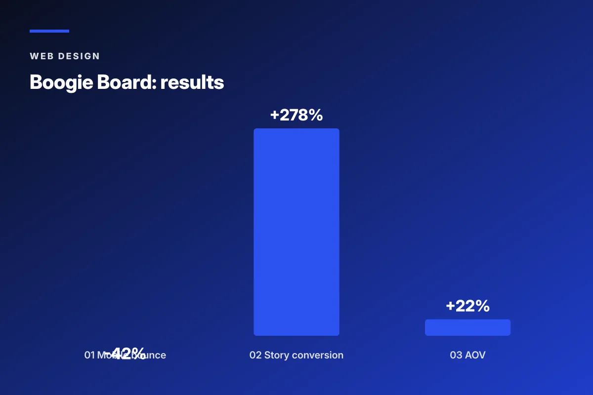
Over the following two drops, mobile bounce rate on the homepage dropped from 68 percent to 39 percent. Instagram Story tap-to-checkout conversion climbed from 0.9 percent to 3.4 percent. Wholesale look-book downloads doubled inside 6 weeks as the press wall started ranking on the buyer’s shortlist. Direct customer average order value climbed 22 percent because the site now reads as premium rather than templated. The rebuild did not change the products or the taste. It removed the design friction that was hiding the collection from the audiences already trying to find it. Our fashion web design retainer covers the ongoing quarterly refresh cadence that keeps rebuilds like this current across each new drop.
Where web design for fashion fits the broader stack
Web design for fashion sits at the center of the DTC marketing stack. Instagram, TikTok, wholesale showroom appointments, email newsletters, and paid channel spend all point to the site as the conversion asset. When the site reads considered, every marketing dollar upstream compounds. When the site reads templated, the same spend produces flat returns because the visitor leaves before the brand story lands.
Two outside references every fashion founder should study before rebriefing a design partner. The web.dev Largest Contentful Paint guide covers the load-speed side of the mobile crop question. Nielsen Norman Group’s typography beginner’s guide covers the type side of the palette question. Both are free and both raise the founder’s fluency enough to give feedback on mockups that pushes the build up two levels of finish that a generic brief would never elicit. Founders who study these references before the first mockup review consistently produce sharper design feedback and shorter revision cycles across the whole rebuild.
Every rebuild we run starts with the five principles as the skeleton and layers the label’s specific taste on top through crops, palette, type, and micro-copy choices. Skeletons without taste read as templated. Taste without a skeleton reads as scattered. The two work together at every stage of the build for the site to serve the three audiences the label depends on across a drop cycle. That balance is what separates a fashion site that converts Instagram traffic from a fashion site that only looks nice on the founder’s phone during a private review.
Redefine Web builds custom fashion sites for independent and scaling DTC labels at $599 monthly starter retainers on 6-month contracts. Scope covers a Shopify 2.0 custom theme, a licensed typography pair, a 4-color palette system, quarterly campaign landing pages, and drop cycle updates as new collections release. Read the apparel fashion marketing hub for the broader channel mix that feeds a considered fashion site across the drop calendar and the retainer scope that wraps design, front-end development, and content updates into one flat monthly fee.
Frequently asked questions
What are the five principles of web design for fashion?
Web design for fashion runs on five specific principles. Visual hierarchy that gives the collection image 80 to 90 percent of the first viewport and pulls headline weight back to 32 to 48 pixels. Editorial and catalog balance calibrated to the label's stage (70 editorial for indie labels, 50 editorial for scaling DTC). Mobile-first crops with dedicated 4:5 portrait aspects rather than desktop resizing. Instagram-fed landing paths with 6 to 10 dedicated URLs per drop rather than routing every visitor to the homepage. Disciplined color palette systems locked at 4 colors for 3 to 5 years with only seasonal accent adjustments. Each principle carries a specific numeric target rather than a stylistic preference.
How does web design for fashion differ from generic ecommerce web design?
Web design for fashion differs from generic ecommerce web design in image weight, editorial pacing, and audience mix. Generic ecommerce templates give the product tile grid 60 percent of the viewport and load 4 to 6 tiles per mobile row. Fashion sites give the hero image 80 to 90 percent and load 2 to 3 tiles per mobile row. Ecommerce templates use headline sizes at 60 to 96 pixels. Fashion sites pull headlines to 32 to 48 pixels so type defers to imagery. Ecommerce sites serve buyers with one intent. Fashion sites serve direct customers, wholesale buyers, and editors on the same URL. Template themes fail fashion brands because they were built for product-first categories where crop and pacing carry less brand meaning.
How should mobile crops work in web design for fashion?
Mobile crops in web design for fashion follow dedicated aspect ratios rather than desktop resizing. Hero images render at 4:5 portrait on mobile and 16:9 wide-format on desktop. Product grid tiles run 3:4 portrait on mobile at 2 tiles per row. Look-book galleries stack full-width 4:5 portrait on mobile with a tap-to-expand to 3:2 wide-format detail. Each aspect ratio gets its own crop rather than a squish of the same source image. The crop budget runs 3 to 5 hours per shoot to prepare all three ratios in Lightroom or Capture One. Studios that skip the mobile crop step end up with product tiles where the model's face gets cut off at the phone width, which reads as sloppy to any customer scrolling the grid.
How should a fashion site handle Instagram traffic?
A fashion site handles Instagram traffic through dedicated landing paths matched to each Story or feed campaign. Sites that route every Instagram visitor to the homepage lose 40 to 60 percent to the wrong first view. Sites that use Linktree or Beacons for the bio link and drop deep links into each Story get 2 to 4 times the checkout conversion because the landing page matches the tap intent. Every drop needs 6 to 10 dedicated landing URLs prepared in advance, which runs 3 to 5 hours of studio time per launch. The scroll length from a Story tap to checkout runs no more than 4 phone screens on a considered site. Sites that stretch this path to 6 or 7 screens lose 45 to 60 percent of Story visitors between screens 3 and 5.
What color palette system works for web design for fashion?
The color palette system for web design for fashion runs 4 colors held across 3 to 5 years with only seasonal accent adjustments. Primary background is white, warm cream, off-white, or true black. Text ink runs near-black at hex 171717 to 1a1a1a for warm palettes or true black for stark palettes. Accent color reserved for links, buttons, and sale badges, chosen once per year with a seasonal shift on the New Year and Fall equinox drops. Muted secondary handles form borders and dividers, usually a 5 to 15 percent tint of the accent. Photo backdrop styling extends the palette into the shoot so campaign imagery matches the header. Contrast clears WCAG AA 4.5:1 at every scale. Palettes above 5 colors read as busy. Palettes under 3 read as flat.
Book your free 30-minute strategy call.
No spam, no sales rep. We use your email to schedule your call with a senior strategist. That is it.
More from the blog
View all articles → Web Design
 Core Web Vitals Healthcare Websites Actually Need to Book Patients
Read article Web Design
 Professional Services Website Design Best Practices for 2026
Read article Web Design