
Best Healthcare Website Design and What Best Actually Means
- Best healthcare website design earns the label on four working outcomes.
- Award jury taste and patient booking rate rarely agree.
- Core Web Vitals and WCAG 2.1 AA are floors, not ceilings.
- Copy first, wireframe second, design third, development fourth.
- Analytics live at launch or the site cannot iterate.
- What Best Healthcare Website Design Actually Means
- Healthcare Website Design Tips That Actually Move Bookings
- Healthcare Website Design Fundamentals That Never Go Out of Style
- What Best Healthcare Website Designs Have in Common
- Award Winning Healthcare Websites Versus Booking Winners
- Healthcare Website Design That Earns Trust From First Scroll
- Best Healthcare Website Design Case Study From a Real Client
- Speed, Vitals, and Best Healthcare Website Design
- Accessibility and Best Healthcare Website Design
- How to Achieve Best Healthcare Website Design at Your Practice
Best healthcare website design is a phrase that gets used a lot and defined almost never. Design awards give the trophy to sites with beautiful animation and moody photography. Patients give the appointment to sites that answer five questions inside eight seconds. Those two verdicts pull in different directions, and if you are running a real practice, you already know which one pays for the front desk. This guide walks through what best actually means when a healthcare website has to earn trust, clear compliance, load on a 4G phone at the coffee shop, and turn a nervous first-time visitor into a booked appointment before they hit the back button. Beauty is welcome. It just does not get to make the decision alone. The rest of the piece works through the outcomes that grade the site, the fundamentals that show up in every best-in-class layout, the trade-offs between design juries and patient behavior, and the sequence that gets a practice from an outdated site to a working booking engine without burning six months of budget on the wrong stage of the project.
What Best Healthcare Website Design Actually Means
Best healthcare website design means the site performs on four measurable outcomes at once. Booked appointments per session. Compliance clearance on ADA and HIPAA. Core Web Vitals on mobile. Organic search visibility for the conditions the practice actually treats. If a site wins on visual polish and fails on any of those four, it is not best-in-class.
A site that fails any of the four outcomes is a portfolio piece for the agency that built it, not a working tool for the practice that pays for the front desk. The four-outcome scorecard is the honest test.
The four-outcome scorecard
A practice can grade any candidate site against the four outcomes in one afternoon. Pull the analytics, pull the accessibility audit, pull the PageSpeed report, and pull the Search Console impressions. If any of the four numbers are red, the site is not best-in-class, no matter what the About page trophies say. The scorecard is boring, and boring is the point. Best is measurable or it is opinion.
Why award-winning healthcare websites often underperform
Award-winning healthcare websites tend to lean on hero video, parallax scrolling, and slow-loading brand storytelling. Design juries love those techniques. Patients on cellular data hate them. The same features that earn trophies at industry shows are the ones that push LCP over three seconds and drive the mobile bounce rate above 60 percent. A practice can chase the trophy or chase the appointment. Best-in-class picks the appointment.
Best is a floor before it is a ceiling
Every best-healthcare-website-design conversation should start with a floor, not a ceiling. The floor is passing Core Web Vitals on mobile, hitting WCAG 2.1 AA on every page, running a HIPAA-compliant form stack, and shipping a booking flow the patient can complete in under 90 seconds. Anything below the floor disqualifies the site regardless of how beautiful it looks. Anything above the floor is where the interesting design conversations start.

Healthcare Website Design Tips That Actually Move Bookings
Healthcare website design tips travel widely and mostly repeat the same abstract advice. Show empathy. Use trust signals. Optimize for mobile. All true, all useless in isolation. The tips that actually move bookings are more specific and more boring. They rearrange the homepage hero, tighten the booking flow, restructure service pages, and get rid of the design decisions patients ignore. Here are the tips that hold up after every audit we run.
Put the booking button where the thumb sits
On mobile, the booking call to action belongs in the lower third of the screen where the thumb naturally rests, not in the top-right corner where it looks tidy on desktop. Sticky bottom bars that carry the booking button and a tap-to-call chip through every scroll depth outperform static headers on nearly every healthcare site we test. The change takes an hour. The gain in booking rate typically shows up in the first week.
Cut the hero video
Hero video looks great in the mockup and costs about 400 milliseconds on mobile LCP. It also fails autoplay accessibility rules if it has sound and produces motion sickness for patients with vestibular disorders if it does not have a pause control. Best healthcare website design uses a static hero image with descriptive alt text, keeps LCP under 2.5 seconds, and puts the story in the copy rather than the motion.
Rewrite headlines in patient language
Patients search for symptoms and conditions, not for clinical service names. A best-in-class site rewrites the top hero and the top service pages using the exact language patients type into search bars. “Pediatric urgent care in South Charlotte” beats “Full-service pediatric wellness solutions” every time, on rankings and on booking rate. The rewrite is a copy job, not a design job, but the design has to give it room to breathe.
Healthcare Website Design Fundamentals That Never Go Out of Style
Healthcare website design has trends that come and go, and it has fundamentals that never leave. The fundamentals are what separate best from good year after year. They also do not care whether it is 2019 or 2026. The specifics update. The core does not. Any practice building a new site should insist on the following ten items appearing in the wireframe before a single pixel is designed.
- Hero with plain-language service phrase, location, primary call to action, and phone.
- Trust bar with insurance logos and review count from Google.
- Provider bios with real photos, credentials, and per-provider booking calendars.
- Service pages with plain-language descriptions, insurance notes, and outcome expectations.
- Location pages with unique NAP data, hours, driving directions, and photos of the office.
- Booking module with fewer than five steps, mobile-first layout, and clear error states.
- Insurance and pricing page with the top payers listed and a transparent cash option.
- Accessibility features baked in from wireframe stage, not patched at QA.
- Analytics tracking that does not capture protected health information anywhere.
- Blog and education content structured around real patient questions, not sales pitches.
Why the ten items are non-negotiable
Every one of the ten items maps to at least one of the four outcomes on the scorecard. Skip an item and one of the outcomes takes a hit. Skip three items and the site drops out of the best-in-class conversation. Skip the accessibility item and the practice picks up a legal risk that costs more than the entire redesign. The ten items are a working checklist we run against every healthcare site we audit, and the pattern is remarkably consistent.
What each item quietly protects against
The hero protects against the eight-second bounce. The trust bar protects against nervous first-time patients. Provider bios protect against the search for a referring physician’s name. Service pages protect against the local SEO gap that eats organic. Location pages protect against Google Business Profile confusion. The booking module protects against the third of visitors who will not call. Every item earns its position.
Pull PageSpeed, Search Console impressions, accessibility audit, and booked appointments per session. If any is red, no design award matters.
What Best Healthcare Website Designs Have in Common
Best healthcare website designs across specialties and practice sizes share a small number of design patterns that show up whether you are looking at a solo pediatrician in Vermont or a 40-location dermatology group in Texas. The vocabulary changes. The shapes do not. Here is what the shortlist has in common when we audit best-in-class healthcare sites for benchmarks.
Calm hierarchy over noisy hero
Best-in-class healthcare sites read calm on the first scroll. One dominant headline, one clear call to action, one supporting image, and enough white space that a nervous patient can breathe. Noisy heroes with three carousel slides, five buttons, and stock imagery of laughing families read as untrustworthy to the patient’s subconscious even when nothing specific is wrong.
Consistent trust surfaces across pages
Best sites repeat the same trust surface pattern on every template. Testimonial ratio, insurance strip, provider credentials, and review counts show up in the same relative positions on the homepage, service pages, and provider bios. That consistency lowers the cognitive load on the patient. They stop having to re-orient at every scroll.
Booking is the same one-click affordance everywhere
Best healthcare sites treat the booking module as a single global affordance. Same button color. Same button copy. Same behavior regardless of which page the patient is on. That consistency matters because patients often decide to book while scrolling a service page or a provider bio, not while sitting on the homepage.
Award Winning Healthcare Websites Versus Booking Winners
Award winning healthcare websites and booking-winning healthcare websites are two overlapping but distinct categories. Some sites win both. Most win one. The design decisions that push a site toward one column or the other are usually visible in the first ten seconds of the audit. Here is the tension laid out honestly.
| Design choice | Award jury reaction | Patient behavior | Best-in-class verdict |
|---|---|---|---|
| Full-screen hero video | Loves it | Slower load, higher bounce | Skip on mobile |
| Split-hero with clear CTA | Neutral | Higher booking rate | Ship it |
| Custom illustration set | Loves it | Neutral if fast | Ship if under 60 KB each |
| Parallax scrolling | Loves it | Motion sickness risk | Skip or provide toggle |
| Sticky booking bar mobile | Ignores | Higher booking rate | Non-negotiable |
| Full-bleed brand photography | Loves it | Neutral if provider is real | Ship real, skip stock |
| Deep testimonial video | Loves it | Rarely watched | Skip in favor of quote plus photo |
How to read the table
The verdict column is what a best-in-class healthcare site actually ships. When a design choice moves the appointment number, keep it. When it wins juries but harms patients, cut it. The table is deliberately blunt because the tension is real. Design agencies pitching healthcare practices routinely lean on the trophy-winning choices because they photograph well in the case study, and practices routinely accept them because they trust the agency taste. Both sides pay for that trust in month three when the booking numbers fail to move. The healthier conversation puts the four-outcome scorecard on the table at the start of the engagement and grades every design decision against it before it ships. Beauty and booking rate can agree. They just have to be graded together.
Healthcare Website Design That Earns Trust From First Scroll
Trust is the design output that matters most in healthcare. A patient will pick a plainer site over a beautiful site if the plainer site feels more credible. That means every design decision should be graded on whether it earns trust or spends it. Nine specific patterns earn trust reliably on healthcare sites, and they show up in almost every best-in-class site we audit.
Real photos of the actual providers and office
Stock photography is the single biggest trust killer on healthcare sites. Patients spot it in a glance. Best-in-class sites shoot the real providers, in the real office, wearing the real coats. The photos do not need to be perfect. They need to be true. Authentic imperfection outperforms polished fake on every conversion test we have run.
Reviews with names, dates, and specifics
A generic five-star quote does not build trust. A quote with a first name, a date within the last six months, and a specific detail about the treatment or the visit does. Best sites pull three to five reviews per page and rotate them regularly. They also show the aggregate rating from Google as a direct link the patient can verify.
Credentials without vanity
Board certifications, years in practice, and hospital affiliations belong on provider bios. Awards nobody outside the industry recognizes do not. Patients trust the credentials that are legible to them. Anything that reads as internal marketing collateral gets ignored or, worse, read as compensation for a lack of actual credentials.
Best Healthcare Website Design Case Study From a Real Client
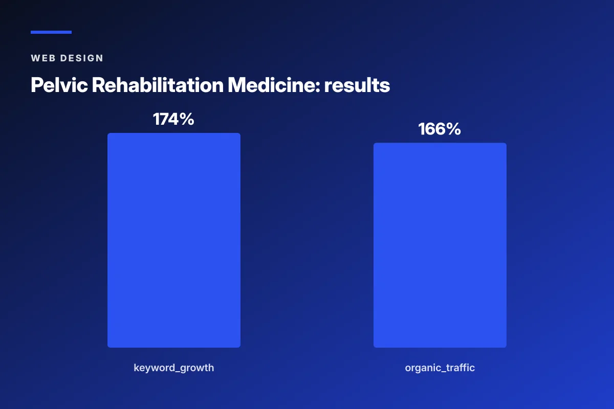
Pelvic Rehabilitation Medicine, a specialty medical group with 14 locations, worked with Redefine Web on a redesign that pushed the site into the best-in-class conversation for their category. The starting point was a fragmented content presence and a site that could not scale across the location footprint. The redesign restructured service architecture around specific pelvic-pain conditions, built provider bios with real photos and credential-first copy, launched a dedicated patient community platform, and cleaned up the analytics stack. Over the 2023 to 2024 engagement, organic keyword rankings expanded 174 percent year over year and organic traffic grew 166 percent.
Why the redesign moved the numbers
The keyword growth was not driven by adding word count. It was driven by giving each condition its own service page with plain-language descriptions patients actually search for. Search engines finally indexed the depth of expertise, and patients landed on pages that matched their exact symptom rather than a generic services list. The design supported the copy instead of competing with it.
What best-in-class looks like in this specialty
For a chronic-condition specialty like pelvic pain, best-in-class design includes a community and education platform that gives patients a reason to return outside of booking. That is not standard for a generalist medical site. It works for this specialty because the patient journey lasts years, not weeks. The design lesson every specialty practice can copy is to give patients a reason to return that is not a call to book.
Speed, Vitals, and Best Healthcare Website Design
Speed is not a design tie-breaker in healthcare. It is a floor requirement. Best healthcare website design ships a site that clears Core Web Vitals on mobile in the 75th percentile for the account’s region. Sites that fail Vitals get quietly deprioritized in mobile search results, which means the beautiful redesign that won the trophy also lost the organic traffic that funded the practice. The math is punishing and it does not care about visual awards. For deeper reference, see our related Core Web Vitals walkthrough.
The three vitals numbers to hit
LCP under 2.5 seconds. Interaction to Next Paint under 200 milliseconds. Cumulative Layout Shift under 0.1. On mobile, at the 75th percentile of your traffic. If any of the three is red, the site is not best-in-class regardless of what the desktop score says. Google measures at the 75th percentile of real user data, which means the average is not good enough.
The three biggest culprits
Uncompressed images. Blocking third-party scripts. Custom fonts loaded without a fallback stack. Any healthcare site with all three failing on the mobile Vitals report can usually claw back 60 percent of the gap in one week of focused engineering work. The redesign does not have to happen first. The fixes happen first, then the redesign becomes visible.
The one Vitals joke every design agency tells wrong
Nobody at the practice will admire the LCP score. They will admire the drop in the mobile bounce rate three weeks later and forget where it came from. That is fine. Best-in-class work is often invisible. The visible work is usually the last mile.
Accessibility and Best Healthcare Website Design
Accessibility is not a garnish. It is a floor requirement for any healthcare site that wants to call itself best-in-class. WCAG 2.1 AA is the baseline. ADA lawsuits against healthcare sites have become common enough that a practice can go from a nice redesign to a legal exposure inside a month if the accessibility work is skipped. See our related Accessibility (ADA/WCAG) reference for the full checklist.
The four accessibility items that catch every audit
Color contrast on body text that fails 4.5 to 1. Form fields without visible labels. Images without alt text. Videos without captions. Every one of these shows up in nearly every healthcare site audit we run. They are also every one of them fixable in a working sprint if the practice actually decides to prioritize it. Best-in-class sites treat accessibility as part of the design system, not as post-launch cleanup. For the wider view of how these choices sit in a full engagement, see our Healthcare Website Design Services reference.
Why keyboard navigation is a design decision
Keyboard navigation reveals every design shortcut. Custom dropdowns that trap focus. Sliders with no arrow-key controls. Booking modules that skip visible focus states. Any patient using assistive technology hits these in the first ten seconds. Best-in-class design accounts for keyboard-first navigation at the wireframe stage.
Screen readers and semantic HTML
Semantic HTML is not a design deliverable, but the design decisions dictate whether it is possible. Heading orders. Landmark regions. Proper form associations. Best-in-class designers hand the developer wireframes that make semantic HTML the natural implementation, not the one the developer has to fight the design to produce.
How to Achieve Best Healthcare Website Design at Your Practice
Achieving best healthcare website design is a project management problem more than a taste problem. The four outcomes are known. The ten fundamentals are known. What varies is whether the practice sequences the work in a way that survives the first month of decision-making.
Here is the sequence we run at Redefine Web when we own the end-to-end. Copy, wireframe, visual, development, QA, launch, iterate. Every stage constrains the next.
- Week 1. Audit the current site against the four outcomes and the ten fundamentals.
- Week 2. Prioritize fixes by impact on booking and organic traffic.
- Weeks 3 to 5. Write the copy for every hero, service, provider, and location page before drawing wireframes.
- Weeks 5 to 7. Wireframe with the copy in place and the accessibility checklist next to the wireframe.
- Weeks 7 to 10. Visual design, staying inside the wireframe skeleton so nothing bloats.
- Weeks 10 to 14. Development with performance budgets locked from day one.
- Weeks 14 to 16. QA with real accessibility testing, real device testing, and real user testing.
- Week 16. Launch with analytics live and Vitals monitoring in place.
- Weeks 17 to 20. Post-launch iteration on the highest-friction pages in the booking flow.
Why the sequence matters
Copy first. Wireframe second. Visual third. Development fourth. Skipping the copy-first step is the single biggest reason healthcare redesigns fail. Design without copy becomes decoration, and decoration cannot carry a booking flow. Sequence matters because each stage constrains the next in a way that keeps the site focused on the four outcomes.
What the practice has to bring
The practice brings the actual patient story, the real credentials, the insurance list, the current booking mechanics, and honest access to the analytics. Agencies that build without that input are guessing, and the guess shows up in the appointment number. Best-in-class outcomes require best-in-class input from the practice, and that input is time-expensive but not budget-expensive.
The most common mistake at launch
Launching without the analytics stack fully wired, without the booking flow instrumented, and without a Vitals monitoring dashboard live is the most common launch mistake. The site looks great on day one and stops improving on day two because nobody can see what to iterate. Best-in-class launches wire analytics before they polish visuals. For the deeper design framework this checklist sits inside, see our Healthcare Web Design (Pillar) reference.
Best healthcare website design earns the label through measurable outcomes, not through visual awards. For deeper reading on the technical floor, see the Google Core Web Vitals documentation, the W3C WCAG 2.1 quick reference, and the ADA web accessibility guidance. If you want an honest scorecard on where your current site sits against best-in-class, our team runs a paid diagnostic engagement that ends with a fix priority list ranked by impact on booked appointments.
Frequently asked questions
What makes a healthcare website design best-in-class?
A healthcare website design earns the best-in-class label when it performs on four measurable outcomes at the same time. Booked appointments per session, compliance clearance on ADA and HIPAA, Core Web Vitals on mobile at the 75th percentile, and organic search visibility for the conditions the practice actually treats. If a site wins on visual polish and fails on any of those four, it is a portfolio piece, not a best-in-class working site. Practices can grade any candidate against those four numbers in an afternoon.
Are award-winning healthcare websites better for patients?
Not usually. Award-winning healthcare websites tend to lean on hero video, parallax scrolling, and heavy brand storytelling techniques that design juries reward and mobile users bounce off. The same features that earn trophies at industry shows often push LCP over three seconds and raise mobile bounce above 60 percent. Best-in-class healthcare sites can also win awards, but the practice should never optimize for the trophy at the expense of the booking rate. Patient behavior is the honest verdict on any design choice.
What are the best healthcare website design tips that actually work?
Put the booking call to action in the lower third of the mobile screen where the thumb rests. Cut hero video that adds hundreds of milliseconds to LCP. Rewrite hero headlines in the exact language patients search, not clinical service names. Ship real photos of the actual providers and office instead of stock imagery. Structure service pages around specific conditions patients search rather than generic categories. Instrument the booking flow with analytics before launch so the team can iterate on friction the moment the site goes live.
How do I know if my current healthcare website is best-in-class?
Run the four-outcome scorecard. Pull the last 90 days of booking analytics and check the booking rate per session on mobile. Run an accessibility scan and count WCAG 2.1 AA violations. Check PageSpeed at the 75th percentile of your traffic for LCP, INP, and CLS. Pull Search Console to see impressions for the conditions and services the practice treats. If any of those numbers is red, the site is not best-in-class. If all four are green, the site is doing the working job even if it does not photograph well.
Do the best healthcare websites use custom designs or templates?
Both categories can produce best-in-class results and both categories can produce poor results. The design origin is not the deciding factor. What matters is whether the site clears the four outcomes and the ten fundamentals. A well-executed template with a rewritten hero, restructured service pages, and a tight booking flow can outperform a bad custom design. A custom design that ignores accessibility and Core Web Vitals underperforms a solid template. The verdict lives in the working metrics, not in the origin story of the design.
How long does it take to build a best-in-class healthcare website?
The full sequence at a mid-size practice runs about 16 to 20 weeks from kickoff to launch, including four weeks of copy, three weeks of wireframing, four weeks of visual design, four weeks of development, and two weeks of QA. Larger multi-location practices take longer because location pages and provider bios scale linearly with the footprint. Timelines under 12 weeks are usually skipping copy, accessibility QA, or performance work. Timelines over 24 weeks without staged deliverables usually indicate scope drift. Best-in-class sites launch in phases so early pages start earning appointments before the full site goes live.
Book your free 30-minute strategy call.
No spam, no sales rep. We use your email to schedule your call with a senior strategist. That is it.
More from the blog
View all articles → Web Design
 Core Web Vitals Healthcare Websites Actually Need to Book Patients
Read article Web Design
 Professional Services Website Design Best Practices for 2026
Read article Web Design