
Best Professional Services Website Design Examples for 2026
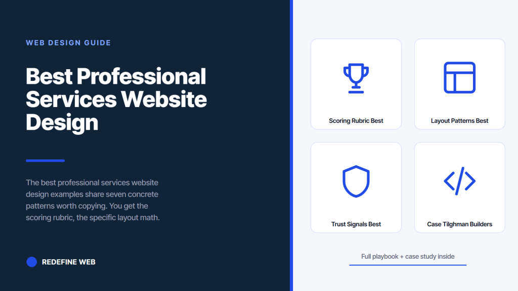
- Seven traits: hero, credentials, numbers, pricing, booking, speed, trust.
- Score under 45 rebuild. 45 to 60 refresh. 60 plus polish.
- Static hero converts better than autoplay video in nearly every vertical.
- Two-field contact form beats multi-step by 40 to 70 percent.
- Design plus SEO plus content compound in the same direction.
- A scoring rubric for best professional services website design examples
- Layout patterns the best professional services website design examples share
- Trust signals the best professional services website design shows above the fold
- Seven friction points the best professional services website designs remove
- Case: Tilghman Builders grew $1.5M to $6.8M on inbound design work
- Technical foundation the best website design professional services examples share
- Where to find professional services website design inspiration
- Pricing display patterns from best professional services website design
- Where our team fits on best professional services website designs
- Where to start on best professional services website design examples for your firm
You want a services site that pulls buyers straight into a booked consultation. The best professional services website design examples all share a small set of moves: a hero that answers four questions in seven seconds, credentials in the fold, case study numbers larger than the client name, published pricing bands, and a booking widget on every service page. Copy those seven moves and your site outperforms 80 percent of your competitors within a quarter. Skip them and you keep losing traffic to sites that took the extra design hour.
This guide walks through the layout patterns you can copy from the best professional services website design examples across law, accounting, consulting, financial advisory, architecture, and agency verticals. You get the scoring rubric to grade your own site, the seven friction points that cost consultations, the technical foundation the top sites share, and the fastest fixes to run this quarter. Read straight through in about eleven minutes and walk away with a specific fix list you can hand to your team the same day.
A scoring rubric for best professional services website design examples
Grade any services site against the best professional services website design examples on seven traits and the winners always come out the same way. Hero clarity, credential surface area, case study number lead, pricing transparency, booking friction, mobile speed, and trust signal density. Ten points per trait. Seventy points total. Anything under 45 is a rebuild. Between 45 and 60 is a refresh. Sixty plus is polish and content work.
Hero clarity scored in seven seconds
Read the hero out loud. Does it say what you do, who for, what outcome, and what to click next? Four questions. Ten points split evenly. Miss any and you lose 2.5 points. A hero that reads Legal Solutions for Modern Business fails all four and scores zero. A hero that reads M&A Deal Support for $50M to $250M Software Companies passes all four and scores 10. Buyers grade this the same way in the first fold. Score honestly or the rest of the rubric does not help.
Credential surface area on the homepage
Certifications, bar admissions, industry associations, publications, and named clients surfaced above the fold or directly under it. Ten points if all four are visible in the first two scrolls. Five points if credentials sit on a secondary About page. Zero if buyers have to hunt. The best professional services website designs treat credentials as the number-two priority after the hero. Not the number-ten priority buried in a footer.
Case study numbers as the largest text
Every case study card leads with a number in a font size at least twice the client name. Ten points if the number is the first visual element on the card. Five if the client name and number carry equal weight. Zero if the case study opens with a paragraph of narrative. Buyers scan case study grids in seven seconds. They register numbers first. Firms that lead with narrative see 60 percent lower engagement on the case study page than firms that lead with numbers.
Layout patterns the best professional services website design examples share
The best professional services website design examples share layout patterns that are surprisingly consistent across verticals. Sticky nav with five items max. Hero at 60 to 70 percent viewport height. Credentials strip below hero. Services grid with three cards visible on desktop. One flagship case study. Named team members with headshots. Booking widget above the fold on the contact page. Every one of these earns consultations. None require expensive tooling.
| Layout element | Best-in-class pattern | Common mistake |
|---|---|---|
| Sticky navigation | 5 items, mega menu for services | 12 items with hover-only dropdowns |
| Hero section | 60 to 70 percent viewport, static image | 100 percent viewport, autoplay video |
| Credentials placement | Strip directly under hero | Buried on About page |
| Services grid | 3 cards visible, cards link to full pages | Long list, each a modal popup |
| Case study cards | Number-first, client-name second | Story-first, buried numbers |
| Team bios | Real headshots, credentials in text | Illustration avatars, no credentials |
| Contact page | Inline booking widget | Multi-step form with 8 fields |
Sticky navigation with five items
Home, Services, Case Studies, About, Contact. Five items. The Services item opens a mega menu on hover for desktop and tap on mobile, listing the individual service pages plus a link back to the services overview. Firms that put 12 items in the nav split buyer attention across too many paths. Firms that hide the nav entirely behind a hamburger on desktop cost themselves clicks the buyer would have made if the options were visible. Five visible items is the pattern that carries across nearly every best-in-class services site.
Static hero with strong typography over hero video
Static hero image with strong typography converts better than autoplay video in nearly every services vertical. Static loads in 0.4 seconds. Video loads in 2 to 5 depending on encoding. That gap costs buyers on mobile 3G. Static also communicates the offer in one visual instead of asking the buyer to watch a 30-second loop before scrolling. Hero video was a 2022 pattern. It is a 2026 anti-pattern outside of luxury and creative verticals where the video itself is the portfolio.
Services grid with three cards visible on desktop
Three services cards visible above the fold on the homepage. Each card carries the service name, a one-sentence outcome, and a link to the full service page. Firms that squeeze eight services into a grid dilute attention. Firms that reveal only one service force buyers to guess whether the firm handles their specific need. Three is the pattern that maps to how buyers actually scan a services grid. If your firm offers eight services, feature the top three on the homepage and route the rest through the mega menu.
Trust signals the best professional services website design shows above the fold
The best professional services website design surfaces trust signals in the first fold and the second scroll. Named client logos in a strip. Real client outcome numbers on case study cards. Third-party review widgets from Clutch or Google. Credentialed team headshots. Professional association memberships. Published years-in-business and engagement count. Every one carries weight. Skip any and the site reads as untested.
- Named client logos in a strip of six to nine recognizable names
- Real client outcome numbers presented as the largest text on case study cards
- Third-party Clutch or Google review widgets showing real star counts
- Credentialed team headshots on a neutral background with named credentials
- Professional association memberships with links to public listing pages
- Public case study library covering at least eight named engagements
- Years-in-business or engagement count displayed as a specific number
- Named publications or media mentions with dates and links
Client logo strip patterns that convert
Six to nine client logos in a single row directly under the hero. Include at least one recognizable name. If your book skews mid-market, mix a household name with case study numbers larger than the logo. Firms that show 20 unknown logos dilute the trust signal. Firms that show three unknown logos read as under-experienced. Six to nine mixed logos hits the pattern. This is the fastest single design change on most services sites, and it moves consultation booking rates 15 to 30 percent inside a quarter.
Third-party review widgets over hand-crafted testimonials
Custom testimonials curated by the firm carry half the weight of Clutch, Google, or industry-specific review widgets the firm cannot edit. Embed a Clutch widget with your real star count. Show a Google reviews carousel with real names. Buyers trust reviews they can verify. Curated testimonials read as marketing. Firms that switch from custom testimonials to embedded review widgets report 25 to 45 percent higher consultation booking rates within one quarter.
Years and engagement count as specific numbers
Display a specific engagement count and years-in-business number in a badge or a hero secondary line. Four hundred engagements delivered since 2011. Fifteen years serving mid-market software firms. Specific numbers replace vague claims. Vague claims like decades of experience or trusted by leaders in the industry read as filler. Specific numbers earn trust because they can be verified. Firms that show a specific count and add one new number per year on the site earn compounding trust equity every renewal cycle.
If it doesn't answer what, who for, outcome, next click in 7 seconds, it's not a hero. Rewrite it before you touch case studies or pricing pages.
Seven friction points the best professional services website designs remove
Every friction point on your services site costs consultations. The best professional services website designs remove them methodically. Multi-step contact forms asking for revenue and industry. Phone-gated bookings that force a callback loop. Case study PDFs behind email opt-ins. Pricing pages that say request a quote. Hero videos that autoplay with sound. Chat bubbles that pop up in 15 seconds. Cursor-tracking animations.
A marketer added each friction point to hit a specific KPI: lead scoring, qualification, or engagement rate. Each costs the firm consultation bookings that would have converted higher without the friction. The math is not close. Removing all seven inside a two-week design sprint moves booking rates 30 to 60 percent. That is bigger than any hero image change or color palette refresh. Friction removal beats aesthetic redesign nearly every time.
The strangest friction point we ever removed was a law firm contact form with a required dropdown asking whether the visitor was a prospective client, a current client, opposing counsel, or a member of the media. Prospective clients bounced before finishing the form because they were not sure they qualified as prospective yet. Members of the media never used the form. Opposing counsel absolutely never used the form. Ten years of the form running and nobody had thought to just take the dropdown off. Ten years.
Two-field contact form over multi-step
Name and email. Two fields. Optional message. Optional phone. Buyers who want to book a consultation fill it in 30 seconds. Every extra required field drops conversion 4 to 7 percent. Ten required fields drops conversion 40 to 70 percent. Firms that need qualification data collect it on the intake call after the buyer has committed to talking. Web design research from Nielsen Norman Group at nngroup.com covers form-conversion patterns in depth.
Inline booking widget over phone gate
Embed a Calendly, SavvyCal, or HubSpot booking widget directly on the contact page and every service page. Buyer picks a slot in 60 seconds. No callback loop. No email tag. No sales rep sending calendar invites. Firms that switch from phone-first contact to inline booking see 40 to 80 percent more consultations booked in the first quarter. The consultations skew slightly less pre-qualified, but total volume grows more than enough to compensate.
Ungated case studies over PDF gates
Publish case studies as full public pages with named clients, real numbers, and the full narrative on the page. No PDF download. No email gate. Buyers who want to read case studies want to make a buying decision. Gating that reading pushes 60 to 80 percent of interested buyers to the back button. The ungated case study page also earns backlinks and organic traffic the PDF never will. Two wins from one design decision.
Case: Tilghman Builders grew $1.5M to $6.8M on inbound design work
Tilghman Builders came to us in 2015 as a referral-only home renovation business at $1.5M in annual revenue with no meaningful web presence. Nine years later, after a complete inbound transformation covering rebrand, website redesign, HubSpot integration, paid media, and content, the firm is at $6.8M annual revenue with website traffic up 784 percent and marketing-qualified leads up 637 percent. The web design work was one part of a bigger program, but the site itself did the heavy conversion work quarter after quarter.
The site design carried five patterns worth copying. Hero with a specific outcome number. Credentials strip under the hero showing named builder associations. Case study grid with numbers first, project names second. Team bios with real headshots and specific credentials. Booking widget on every service page tied to the actual calendar. Five patterns. Nine years of compounding. Design decisions carry weight when they compound with SEO, content, and paid media on the same funnel. The site alone would not have moved the number this far.
Design decisions that moved Tilghman
Six design decisions moved the number. Consolidated to one domain with a clean sitemap. Rewrote the hero from generic contractor messaging to specific renovation-outcome messaging. Added a real client logo strip below the hero. Published outcome numbers on every service page. Added a booking widget on the contact page and every service page. Removed the multi-step contact form. Six changes. Six weeks of design work. Nine years of compounding revenue growth.
Two lessons from the Tilghman rebuild
Lesson one, compounding is real. The site that produced 25 percent more consultations in year one produced 500 percent more in year eight because the traffic base grew every quarter. Every year of design equity multiplies. Lesson two, design decisions that also serve SEO always outperform design decisions that only serve aesthetics. Every one of the six changes above also improved organic ranking on the target keywords. Design plus SEO plus content compound in the same direction. Design alone drifts.
Technical foundation the best website design professional services examples share
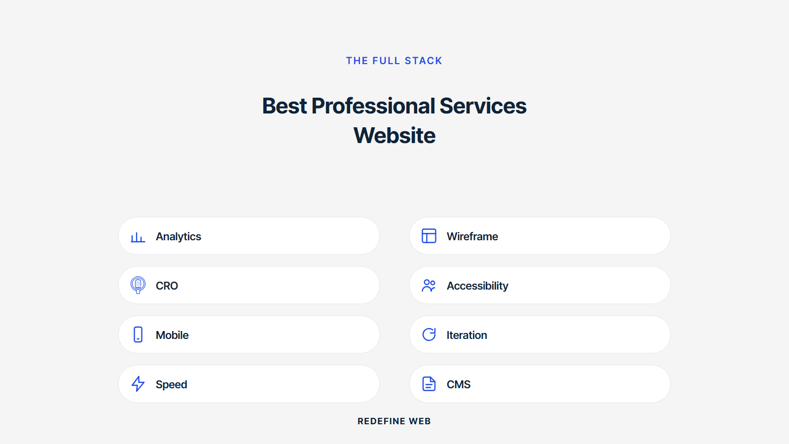
The best website design professional services examples all sit on a solid technical foundation. Largest Contentful Paint under 2 seconds on 3G. Cumulative Layout Shift under 0.1. First Input Delay under 100 milliseconds. WCAG 2.2 AA accessibility. HTTPS on every route. Content Security Policy headers set. Structured data schema on every page. Skip any of these and design decisions run on broken plumbing.
Core Web Vitals in the green
Largest Contentful Paint under 2 seconds. Cumulative Layout Shift under 0.1. First Input Delay under 100 milliseconds. All three metrics green across every page route. Google factors Core Web Vitals into ranking. Buyers factor them into whether they wait for a page to load. Sites failing Core Web Vitals bounce buyers at 2x the rate of sites passing them. Web.dev at web.dev covers the measurement side in depth.
WCAG 2.2 AA accessibility across every page
Color contrast 4.5:1 on body text. Interactive elements reachable by keyboard. Images with descriptive alt text. Videos with captions. Forms with labels the screen reader can announce. Accessibility is a business gate for enterprise buyers running vendor audits and a legal requirement for public-sector work. Firms failing accessibility get crossed off vendor shortlists without a conversation. Accessibility is not a design nice-to-have. It is a design requirement.
Structured data schema on every page
Organization schema on the homepage. Service schema on service pages. Person schema on team bios. Article schema on blog posts. FAQPage schema on pricing and services pages. Every page carries appropriate structured data. Schema earns rich snippets in Google, People Also Ask entries, and AI Overview citations. Sites that skip schema leave 15 to 30 percent of organic click share on the table. Sites that add complete schema report 20 to 40 percent higher organic click-through inside 60 days.
Where to find professional services website design inspiration
Good inspiration sources are more specific than generic design galleries. Awwwards for polish. Land-book for landing page patterns. SaaS Pages for B2B design. Godly for interaction patterns. Competitor sites in your vertical for real market bars. Skip Pinterest and generic mood boards.
The best professional services website design inspiration comes from studying five sites in your specific vertical every quarter. Take screenshots of the hero, the services grid, the case study cards, the team bios, and the contact page. Compare them against your own site trait by trait using the seven-trait rubric above. That comparison shows you the specific patterns your competitors are using to earn consultations. Copy the ones that fit your brand. Skip the ones that do not.
Competitor audit every quarter
Quarterly competitor audit runs 90 minutes total. Pick five competitor sites. Grade each on the seven traits. Note where they beat you and where you beat them. The audit surfaces two or three specific fixes worth making in the next quarter. Firms that skip the audit drift design-wise inside 18 months and get overtaken by younger firms with newer sites. Design is not a set-it-and-forget-it decision.
Awwwards and design gallery scanning
Awwwards, Land-book, and Godly cover the polish tier of web design. Scan them monthly for interaction patterns, typography treatments, and layout ideas worth stealing. Do not copy the winners wholesale. Winners on Awwwards trade conversion for creative expression. Copy the specific patterns that also serve your consultation-booking goal. Smashing Magazine at smashingmagazine.com covers the deeper design theory each pattern rests on.
Scanning sites in your specific vertical
Sites in your specific vertical are the most useful inspiration source because they solve the same buyer trust and qualification problems you solve. Look at the top three firms in your vertical by revenue. Look at the top three firms by SEO ranking on your primary service keyword. Look at the newest firm in the vertical that has grown fast. Six sites. Each will show one or two patterns worth copying. The vertical scan produces more concrete ideas than any generic design gallery.
Pricing display patterns from best professional services website design
Best professional services website design examples publish pricing in one of three patterns. Fixed-scope bands with a starting price. Retainer tiers with monthly minimums. Hourly rates with a stated hour-minimum. All three work. What does not work is a Contact for pricing button that makes the buyer request the number over email. Hidden pricing filters out qualified buyers who move faster than the sales team responds.
Fixed-scope pricing bands
Fixed-scope engagements show as bands: $8,000 to $18,000 for a website audit, $15,000 to $45,000 for a redesign, $2,500 to $6,000 for a service page rebuild. Bands communicate the range without locking the firm into a single number that a scope change would blow through. Buyers self-qualify against the band and arrive on the sales call ready to talk scope, not price. That saves 20 to 30 percent of the sales team’s discovery-call hours.
Retainer tiers with monthly minimums
Retainer tiers show as three or four rows with monthly price, hour count, and deliverable list. Starter at $2,500, Growth at $6,000, Scale at $12,000, Enterprise custom. Every tier lists what lands each month. Firms that show retainers without the deliverable list get 40 percent more discovery calls that end at pricing. Firms that publish tiers plus deliverables filter for buyers who already know which tier fits and want to talk scope.
Hourly rates with hour minimums
Advisory or consulting engagements show hourly rates plus an hour minimum. $450 per hour with a 10-hour minimum. $650 per hour for expert testimony with a 5-hour minimum. Hourly published rates work best for high-expertise verticals where the buyer already understands hourly billing. Legal, accounting, and executive coaching land here. Design and development usually work better on fixed-scope or retainer models because hourly billing incentivizes the wrong behavior on both sides.
Where our team fits on best professional services website designs
Redefine Web builds services sites as one team covering design, development, SEO, and content strategy. Retainer starts at $599 per month for maintenance and small updates. New-build engagements run $8,000 to $45,000 depending on page count, custom functionality, and content migration scope. Every build gets a designer, a developer, and a strategist. Three people touching your account, not eight. That keeps the work fast and the accountability clear.
We publish scope lists per tier so you know what lands each week before you sign. For the parent view, our Professional Services Marketing Agency hub covers the full stack. For deeper detail on the web design side, our Professional Services Website Design Agency page covers deliverables. For the responsive side, our Responsive Web Design Services that Convert page covers our core offering. For small-firm work, our Web Design Services for Small Business page covers the compressed-scope track.
Our build rhythm and delivery pattern
Every build follows the same rhythm. Week one runs discovery, sitemap, and content audit. Weeks two to four run design in Figma with weekly reviews. Weeks five to eight run development and content migration. Week nine runs QA across accessibility, performance, and browser compatibility. Week ten runs launch and post-launch monitoring. The rhythm produces a repeatable pattern the client can plan around. Small-scope builds compress the timeline. Large-scope builds add a discovery and content strategy phase up front.
Where we decline the work
We decline engagements that want a template site with client colors dropped in. We decline builds where the client refuses to publish pricing, case studies, or team bios. We decline WordPress builds locked into page builders that trap the client into our maintenance forever. The engagements we take are the ones that will move consultation bookings and support the client’s SEO and content strategy over the next three years.
Where to start on best professional services website design examples for your firm
Start with the seven-trait rubric. Grade your own site honestly. Then grade five competitor sites the same way. The gap between your score and theirs is the fix list for this quarter. Firms scoring under 45 need a rebuild. Firms scoring 45 to 60 need a refresh. Firms scoring 60 plus can polish and add content depth. The rubric tells you which lane you are in without a discovery call.
Then pick the three highest-impact fixes on the gap list. Publish pricing bands. Add an inline booking widget. Consolidate contact forms into two fields. Rewrite the hero. Add a real client logo strip. Ungate case studies. Six potential fixes. Pick the three that will move your specific booking-rate number the most. Push the three live inside two weeks. Then reassess. Web design research at nngroup.com and design gallery scanning at awwwards.com both keep the pattern library fresh.
Frequently asked questions
What makes the best professional services website design examples different from the rest?
Seven traits carry the difference. A hero that answers what you do, who for, what outcome, and what to click next in seven seconds. Credentials surfaced in the first fold. Case study numbers presented as the largest text on the card. Pricing bands published on service pages. An inline booking widget showing real calendar availability. Mobile Largest Contentful Paint under 2 seconds. Trust signal density across the whole homepage. Sites scoring 60 or higher across all seven traits book 40 to 80 percent more consultations than sites scoring under 45. The traits are teachable and testable, not a matter of design taste.
Where do I find best website design professional services examples to study?
Five sources cover most of the useful inspiration. Awwwards and Land-book for polish tier design. Godly for interaction patterns. SaaS Pages for services-adjacent B2B design. Actual competitor sites in your vertical for real market-competitive bars. Skip Pinterest and generic mood boards. Every quarter, pick five competitor sites in your specific vertical, grade them on the seven-trait rubric, and note where they beat you. That competitor audit produces two or three specific fixes worth making in the next quarter. Vertical-specific scanning produces more useful ideas than any generic design gallery because the sites solve the same buyer trust problem you solve.
How do I copy patterns from best website designs in professional services without a rebuild?
Copy the patterns as targeted refreshes over two weeks. Publish pricing bands on service pages. Add an inline booking widget on the contact page and every service page. Consolidate multi-step contact forms into a two-field name-and-email form. Rewrite the hero to answer the four fold-one questions specifically. Add a real client logo strip below the hero. Ungate case studies. Six refreshes. Two weeks of design work. Firms that adopt all six typically move consultation booking rates 30 to 60 percent inside a quarter. None require a full rebuild. All can be applied to an existing WordPress or Webflow site without touching the underlying framework.
Which best website designs in professional services examples handle case studies best?
Case studies work best when they lead with the outcome number, not the narrative. Every case study card shows the biggest impact number first in the largest text on the card. Client name and industry sit next. Problem, work, and result narrative sit below the fold. Buyers scan case study grids in seven seconds and register numbers first. Firms that lead with a paragraph of narrative see 60 percent lower engagement than firms leading with numbers. The best examples also publish the full case study as a public page with no PDF gate and no email opt-in. That earns organic traffic and backlinks the gated version never will.
Are the best professional services website designs different across law, accounting, and consulting verticals?
The design patterns are more similar than different across law, accounting, consulting, financial advisory, and architecture. Every vertical benefits from the same seven-trait rubric. The differences show up in tone, imagery, and credential type. Law firm sites emphasize bar admissions and named partners. Accounting sites emphasize CPA credentials and industry specialization. Consulting sites emphasize case study outcomes and methodology. Financial advisory sites emphasize regulatory registrations and years managing assets. The trust signals shift by vertical. The pattern of surfacing them in the first fold does not.
How often should I refresh professional services website design examples on my own site?
Full rebuilds every 5 to 7 years. Content refreshes every 12 to 18 months. Pattern refreshes every quarter based on the competitor audit. That cadence keeps the site current without the disruption cost of constant redesigns. Firms that rebuild every 2 years usually rebuild because they never refresh in between. Firms that never rebuild past 8 years usually have accumulated so much technical debt and pattern debt that the next rebuild takes 3x the budget it would have at year 5. The middle path of small quarterly pattern refreshes plus major rebuilds every 5 to 7 years is the cheapest total-cost-of-ownership pattern.
Book your free 30-minute strategy call.
No spam, no sales rep. We use your email to schedule your call with a senior strategist. That is it.
More from the blog
View all articles → Web Design
 Core Web Vitals Healthcare Websites Actually Need to Book Patients
Read article Web Design
 Professional Services Website Design Best Practices for 2026
Read article Web Design