
Mobile responsive web design decides your conversion rate in 2026, since more than 60% of your traffic hits the site on a phone first. Design for that reality or lose the sale before the visitor sees your value proposition. This guide covers 6 mobile-first patterns, the data behind each, and the client case that grew booking conversion 92% in a 6-week rebuild. Budget planning starts with our responsive web design cost tiers.
Why mobile-first sites decide conversion now
Phones dominate the first click. Google indexes the mobile URL first. The map pack, ads, and organic snippets all render on a phone before a desktop visit ever happens. If your mobile layout stalls, misfires on touch, or hides the primary CTA behind a widget, you lose the sale in the first 3 seconds. A desktop rebuild does not close that gap now.
The upside is real too. Our client work shows 15% to 40% conversion gains on the mobile flow once the 6 patterns below go live together. That is a stylesheet, a form layout, and a CTA rule set applied with discipline, not a rebrand.
Six mobile responsive web design patterns worth adopting
The 6 patterns below appear on every build we deliver in 2026. Every one earned its place through client conversion data. Every one starts as mobile-first CSS. Adopt any 5 of the 6 and you close most of the conversion gap between your mobile and desktop experience inside a quarter.
- Single-column stack. One column on phone. Two on tablet. Three on desktop.
- Sticky bottom CTA. Primary action reachable without scroll on every page.
- Drawer nav with disclosure. Hamburger only when every primary link cannot fit inline.
- Thumb-zone form fields. Every input placed inside the 350 to 700 pixel vertical zone.
- Fluid typography. clamp() on H1 and body text scales cleanly at every viewport.
- Optimized image loading. srcset with WebP, fetchpriority high on hero, lazy elsewhere.
Single-column stack as the default
Single-column stack keeps the reading order simple on a phone. No scanning across columns. No double-taps between adjacent cards. No horizontal scroll. Every block sits full-width. It adapts to 2 or 3 columns on wider viewports through simple grid-template-columns changes and appears on 80% of the projects we build.
Sticky bottom CTA that stays reachable
A sticky bottom CTA sits fixed at the bottom of the viewport on scroll. The primary conversion action stays reachable with the thumb. The pattern grows mobile conversion 15% to 30% on service pages, ecommerce product pages, and lead-gen landers. Above 900 pixels tall, the CTA can float or fade out.
Drawer nav with disclosure over hamburger-only
Hamburger nav hides every menu item behind one touch. Users skip it. Drawer nav with disclosure keeps 2 or 3 primary links visible in the header bar and hides the rest behind a menu button. The hybrid reads clearer and preserves discoverability for the top actions, since Book Now, Call Now, and Get a Quote deserve visible header placement.
Thumb-zone form field placement
The thumb zone on a phone spans roughly 350 to 700 pixels of vertical space from the bottom edge. Users hold the phone with one hand and reach naturally into that band. Place the first input and the submit button inside the zone. That single discipline grows form completion 10% to 25% on service leads.
If your primary CTA sits above the fold on desktop but disappears above the thumb zone on mobile, fix the mobile placement first. That move often grows form fills 20% inside 2 weeks.
Typography choices that make mobile sites readable
Typography on a mobile build has 3 rules. Body text at 16 pixels minimum. Line height at 1.5 minimum. Fluid H1 with clamp() from 32 pixels floor to 72 pixels ceiling. Break any one and reading fatigue climbs, bounce rate follows, conversion drops.
clamp(2rem, 1rem + 4vw, 4.5rem) on the H1 reads at 32 pixels on a 375-pixel iPhone and 72 pixels on a 1440-pixel monitor. Body text at clamp(1rem, 0.9rem + 0.3vw, 1.125rem) scales the same way. That single technique closed the reading-fatigue conversion gap more than any other CSS change in the last 5 years.
Body text at 16 pixels minimum
16 pixels is the floor. 17 or 18 pixels reads better on most phones. Below 16 pixels triggers automatic zoom on iOS Safari when a form field is focused, which yanks the layout around. Grow body text to 17 or 18 pixels on long-form templates.
Line height at 1.5 for body copy
Line height at 1.5 for body copy respects WCAG 2.1 AAA readability. Below 1.4 the text feels dense on a phone. Above 1.7 the paragraph structure blurs into loose lines. Use 1.5 to 1.6 as the body default and drop to 1.2 to 1.3 on headings. That contrast produces clean rhythm without extra CSS work.
Touch target rules for mobile responsive web design
Touch targets need to clear 44 by 44 CSS pixels minimum. Apple Human Interface Guidelines and WCAG 2.5.5 both codify the rule. Every button, link, form control, and interactive icon must clear the threshold. Missing by 4 or 5 pixels causes users to misfire, back out, and bounce. Every launch we do checks touch targets on the top 20 interactive elements.
Beyond the 44-pixel minimum, spacing between adjacent touch targets matters. Google recommends 8 pixels minimum between adjacent interactive elements. That gap prevents accidental double-taps and adjacent-target errors. Nearly every inherited site fails this check, since prior vendors packed nav items or form controls too tightly. See web.dev touch targets reference for the audit criteria Lighthouse uses.
CTA button sizing on mobile
CTA buttons deserve larger touch targets than the 44-pixel floor. 56 to 64 pixels tall looks confident and catches thumbs reliably. Every service business site we build uses 56 pixels minimum on primary CTAs and 44 to 48 on secondary. That size difference doubles as visual hierarchy at a glance.
Nav link touch targets in the drawer
Nav links inside a mobile drawer need at least 48 pixels of vertical space per row. Users scroll the drawer with their thumb. Tighter rows cause adjacent-touch errors. Use 48-pixel rows minimum and 56 pixels on primary conversion links. That spacing pays back in accurate first-touch navigation.
If your touch targets sit under 44 by 44 pixels or under 8 pixels apart, fix that before you touch copy or design. Misfires cost more conversion than a weak headline ever will.
Performance targets on mobile builds
Performance is a ranking factor and a conversion factor. Google rewards field-data Core Web Vitals in the green threshold. LCP under 2.5 seconds. INP under 200 milliseconds. CLS under 0.1. Every launch we do targets green on all 3 and typically hits it on real users inside 30 days of go-live.
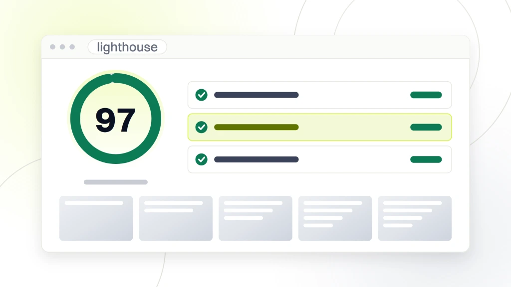
Beyond CWV, PageSpeed Insights mobile lab data should read 97 plus on Performance, 100 on Accessibility, 100 on Best Practices, and 100 on SEO. See web.dev Core Web Vitals reference for the current threshold values.
| Metric | Mobile target | Impact when missed |
|---|---|---|
| LCP (field data) | Under 2.5s | Lower ranking and higher bounce |
| INP (field data) | Under 200ms | Sluggish taps and conversion loss |
| CLS (field data) | Under 0.1 | Layout shifts and misfires |
| Lighthouse Performance | 97+ | Signals a build quality issue |
| Accessibility | 100 | ADA exposure |
| Best Practices | 100 | Console errors and security gaps |
| SEO | 100 | Missing structured data and meta |
LCP under 2.5 seconds requires hero images at 200 kilobytes or less, fetchpriority high on the LCP element, preconnect for critical origins, and no render-blocking JavaScript above the fold. Apply all 4 on the hero and you hit LCP under 2 seconds on field data inside 30 days. INP under 200 milliseconds needs main-thread work under 50 milliseconds per touch. Heavy third-party JavaScript is the main INP offender. Deferring analytics, chat widgets, and A/B testing scripts drops INP into green on most sites.
H&R Block case study on mobile-first rebuild
H&R Block runs nearly 500 tax preparation offices across Australia and processes 700,000 plus returns per year. When we scoped the refresh, customer journeys were cumbersome, location pages were hard to navigate, and the conversion funnel lacked clarity. Locator traffic split heavily toward mobile, yet bookings skewed to desktop, which pointed at a mobile-side conversion problem. Peak tax season was 6 weeks away.
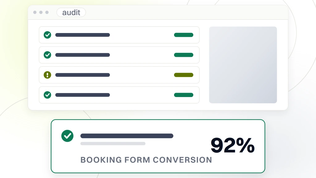
We rebuilt with a mobile-first stylesheet, single-column stack, sticky bottom CTA, and drawer nav with disclosure. Fluid typography went on H1 and body. srcset went on every image. The booking flow got redesigned as a 3-step vertical stack instead of a horizontal wizard. Custom location pages went live for every office. The site launched inside 6 weeks. Bookings grew 147%. Booking-form conversion hit 92%. Office-locator traffic grew 123%. Every number traces back to the 6 patterns above.
One well-scoped rebuild grew bookings 147% for H&R Block in 6 weeks. Small pattern changes stacked together drive outsized outcomes.
Mobile-first approach as a workflow
The mobile-first approach is a workflow call as much as a technical one. Designers sketch phone views first. Developers write mobile CSS first. Product owners review phone builds first. Every sign-off starts on a phone screenshot or phone build URL. That order rewires the team around the audience that shows up first. Desktop follows as an enhancement.
Mobile-first workflow produces smaller stylesheets and simpler responsive breakpoints. Mobile CSS lives in the base file (see our HTML5 and CSS responsive tutorial for the full build walk-through). Tablet and desktop rules layer on through min-width media queries. Desktop-first CSS with max-width overrides produces roughly 20% to 30% more compiled bytes for the same design.
Testing before launch
Testing takes more than DevTools Device Mode. You need a real iOS device, a real Android device, PageSpeed Insights mobile lab data, axe DevTools accessibility scan, and one round of keyboard-only tab navigation. Every launch we do runs all 4 checks, and each catches at least one bug the emulator missed. For a full breakdown, see our responsive web design testing tools and checklist.
Live user reactions matter. Ask 3 people from your team to open the site on their phones. Watch their thumbs. Watch where they misfire. Watch which CTA they touch first. Every build gets this informal test in the last week before launch. Every one caught something QA missed.
Start your mobile-first rebuild this sprint
Start with mobile-first CSS on your next landing page. Rewrite the stylesheet with mobile defaults and min-width media queries for tablet and desktop. Adopt 3 of the 6 patterns above on the first project. Measure conversion on the before-and-after baseline.
Pick one landing page. Not the homepage, not the whole site. Pick the page that already earns the most mobile traffic. Rewrite it with the mobile-first CSS approach, the single-column stack, and a sticky bottom CTA. Push the change live in one sprint. Measure conversion for 2 weeks before and 2 weeks after on the same audience. That before-and-after gives your team a real number to justify the wider rollout.
Ready to work with a team that treats mobile responsive web design as the base layer on every build? Our responsive web design services team delivers every project mobile-first with all 6 patterns applied. For related reading in this cluster, see our responsive web design techniques and best practices, our responsive web design breakpoints and screen sizes, and the foundational what is responsive web design. For SEO impact, read our responsive web design and SEO.