
Responsive web design HTML5 CSS is the fastest path from a blank editor to a live site that reads clean on every screen. You start with semantic HTML5, add mobile-first CSS, layer media queries at 4 breakpoints, wire in flexbox and grid, and finish with srcset images and a real-device test pass. This guide walks the full responsive web design tutorial step by step, in the exact order that produces a shippable site inside 2 work days for a small marketing page.
You’ll get the HTML5 skeleton, the CSS reset, the mobile-first stylesheet pattern, breakpoints at 480, 768, 1024, and 1280 pixels, the flexbox versus grid decision matrix, the Bootstrap alternative, image handling with srcset, and the 8-point pre-launch pass. Real code patterns from real builds. Real ordering. Real trade-offs between custom CSS and Bootstrap on a live project.
Flexbox and CSS grid for responsive web design HTML5
CSS flexbox handles one-dimensional layout. Nav bars, button rows, form fields lined up in a row or column. CSS grid handles two-dimensional layout. Card grids, dashboard layouts, magazine-style pages where rows and columns matter equally. Use flexbox where the layout is a line. Use grid where the layout is a grid. Every CSS layout guide in 2026 covers both, and every real project needs both.
The single pattern that saves the most time is grid-template-columns: repeat(auto-fit, minmax(280px, 1fr)) paired with gap: 24px. That one line ships a card grid that starts as one column on a phone and grows to four columns on a wide monitor without a single media query. The auto-fit keyword combined with minmax handles the whole responsive behavior. Add a max-width on the container to stop growth on ultra-wide screens. See the MDN reference on CSS Grid for the full property set.
Nav bar with flexbox
Set display: flex on the nav container. Use justify-content: space-between to push the logo left and the nav items right. Add align-items: center to vertical-align them. Set gap: 24px between nav items. On mobile, switch to a hamburger button that toggles a slide-in menu. Roughly 24 lines of CSS and you have a responsive nav bar. Every nav on every marketing site follows some variant of this pattern.
Card grid with CSS grid
Set display: grid on the container. Use grid-template-columns: repeat(auto-fit, minmax(280px, 1fr)) for automatic column count. Add gap: 24px between cards. That’s the whole recipe. Cards wrap when they hit the 280 pixel minimum and stretch to fill remaining space. Add container queries on individual cards for internal layout changes when the card lands in a narrower parent. Modern responsive CSS uses this pattern on roughly 60% of card-based sections we build.
Responsive web design with Bootstrap for faster builds
Responsive web design with Bootstrap gives teams a pre-built grid, components, and utility classes that ship a functional responsive site in under 1 hour. Include the CSS via CDN or run npm install bootstrap@5. Add the meta viewport tag. Wrap content in .container and .row. Use .col-md-4 style classes for column widths at each breakpoint. Bootstrap handles the media queries under the hood. You write markup, Bootstrap ships responsiveness.
Bootstrap wins on speed and consistency. Custom CSS wins on brand precision and bundle size. Bootstrap ships about 60 kilobytes of CSS whether you use 10% of it or 90%. Custom CSS ships only what you write. For prototypes, admin dashboards, internal tools, and standard marketing sites where speed matters more than a distinctive look, responsive web design with Bootstrap is the right call. For brand-forward marketing sites, custom CSS produces a better result and a smaller bundle.
Bootstrap grid system basics
Bootstrap uses a 12-column grid. .col-md-6 spans 6 of 12 columns at the md breakpoint and above. .col-md-4 spans 4 of 12 (three per row). .col-md-3 spans 3 of 12 (four per row). Prefix stacking (.col-sm-12 .col-md-6 .col-lg-4) lets you set different column counts at each breakpoint. That single system covers roughly 80% of layout needs inside Bootstrap projects. Learn it once. Use it forever on Bootstrap sites.
Bootstrap utility classes worth memorizing
Spacing: mb-3, mt-4, p-2 for margin and padding. Display: d-none, d-md-block for responsive show and hide. Typography: fs-1 through fs-6 for font size, text-center, fw-bold. Flex: d-flex, justify-content-between, align-items-center. Learn these 15 or so utility patterns and you can build about 90% of Bootstrap layouts without writing custom CSS. That productivity win is why some teams pick Bootstrap over custom for standard scope.
Image handling in a responsive web design tutorial
Images are the largest bytes on most pages. Responsive image handling uses 4 techniques. Set max-width: 100% and height: auto on every img in CSS. Use srcset with sizes to serve smaller variants on smaller viewports. Wrap in a picture element with source elements for art direction and format switching. Add loading=lazy on below-fold images and fetchpriority=high on the hero. See web.dev on responsive images for the full pattern reference.
Every image goes through compression before it hits production. WebP for photos. SVG for icons and simple illustrations. AVIF as a progressive upgrade for browsers that support it. Cap hero images at 200 kilobytes. Cap body images at 100 kilobytes. Anything above those thresholds hurts Largest Contentful Paint. Set width and height attributes on every img to reserve space and prevent Cumulative Layout Shift. Skip these attributes and Google penalizes the site on Core Web Vitals.
Srcset example worth copying
Here’s the pattern that ships on every meaningful image. <img src="hero-800.webp" srcset="hero-400.webp 400w, hero-800.webp 800w, hero-1200.webp 1200w, hero-1600.webp 1600w" sizes="(min-width: 1024px) 1200px, 100vw" alt="descriptive-alt" width="1200" height="630" fetchpriority="high">. That single img tag serves the smallest sufficient variant to each device based on viewport and device pixel ratio. A phone at DPR 3 gets the 1200 pixel file from a 400 pixel viewport. A desktop gets the 1600 pixel file. Every real responsive site ships this pattern.
Lazy loading for below-fold images
Add loading=lazy on every img below the fold. Not on the hero. Never on the hero. Lazy loading defers image fetch until the user scrolls near the image. That saves bytes on initial load and speeds up Largest Contentful Paint scores. Add width and height attributes so the browser reserves the space before the image loads. That prevents Cumulative Layout Shift when the image finally paints. 2 attributes. Big performance win. Every responsive design checklist has both.
Responsive web design HTML5 CSS tutorial step by step
The end-to-end walkthrough runs in 10 steps. HTML5 skeleton with viewport tag first. CSS reset and design tokens second. Semantic markup with landmark elements third. Mobile-first typography and spacing fourth. Flexbox nav and grid card layout fifth. CSS media query patterns at 768 and 1024 sixth. Images with srcset and lazy loading seventh. Bootstrap alternative if the scope calls for it eighth. Testing at every breakpoint ninth. Launch on final pass tenth.
Each step lands in 30 to 90 minutes on a small marketing page. Total build time runs 1 to 3 work days for a competent developer. Longer for a first-time responsive builder. Faster for teams that reuse a starter template. Every responsive HTML5 project we start uses the same starter, and each build lands faster than the last, so the pattern compounds. That’s the productivity multiplier this build pattern earns once you internalize it across a handful of projects.
Day one milestones
Morning: HTML5 skeleton, CSS reset, design tokens, typography scale. Afternoon: nav bar with flexbox, hero section, one content section with grid card layout. End of day: mobile view works cleanly at 360 pixels and 480 pixels. No layout bugs. No overflow. The base experience covers the largest traffic segment before you build any desktop-specific styles on top of it.
Day two milestones
Morning: media queries at 768 and 1024 add tablet and desktop layouts. Afternoon: image srcset patterns on hero and body images. End of day: the responsive layout works at every breakpoint from 360 to 1440. Lighthouse Performance clears 90. Accessibility clears 95. That’s a shippable responsive site inside 16 hours of focused work on a small marketing page, ready for the pre-launch pass.
Testing responsive HTML5 CSS builds
Testing responsive HTML5 CSS builds runs in 3 passes. DevTools Device Mode during development. A cloud device farm for coverage after each milestone. A real device pass before launch. Skip any pass and bugs land in production. Every launch we’ve shipped that skipped the real-device pass at least once shipped a visible bug within the first day. Every launch that ran all 3 passes shipped clean. The correlation is exact.
Our default testing stack is Chrome DevTools Device Mode for daily work, BrowserStack for cloud coverage across 200 devices, and a shelf of 5 physical devices in the office (iPhone 15, iPhone 12, Pixel 8, iPad, MacBook) for the pre-launch pass. Every launch runs the shelf pass. It takes 30 to 60 minutes. It catches the last 20% of bugs that emulators miss. That’s the exact investment separating a launch that lands clean from one that lands with a bug the founder finds inside the first hour.
DevTools workflow during development
Open DevTools with F12 or Cmd Option I. Toggle Device Mode with Ctrl Shift M or Cmd Shift M. Switch between preset devices. Toggle throttling to Fast 3G to see how the site feels on real mobile networks. Every developer working on responsive CSS needs to master this workflow. It costs nothing. It reveals every layout bug before code lands in a pull request.
Every developer who finishes a responsive tutorial on a laptop, tells the client the site works, then watches the client open it on a 5-year-old iPad on office WiFi learns that emulators and real devices are cousins, not twins. The emulator says the button is 44 pixels tall. The real iPad says the button is behind the keyboard once the form field is focused. Both facts are true. Only one earns the launch.
Pre-launch checklist worth running
Meta viewport tag present. Mobile styles first. Media queries at 4 breakpoints. Images with srcset and lazy loading. Buttons at 44 pixels minimum. Contrast ratios above 4.5 to 1. Lighthouse Performance 90 plus on mobile. Lighthouse Accessibility 95 plus. Zero horizontal scroll at 320 pixels. Every launch runs this 8-point check before going live. Every launch that passed shipped clean. Every launch that skipped a check shipped a bug.
A real Core Web Vitals case study from a live build
One recent build for a small-business renovation client came in with 2 underperforming websites, 6 keyword rankings total, and no responsive behavior below tablet size. We rebuilt on a mobile-first HTML5 skeleton, wrote custom CSS with flexbox and grid, added media queries at 480, 768, 1024, and 1280, wired srcset onto every meaningful image, and ran a pre-launch pass on 5 physical devices. No Bootstrap. Custom throughout to match the brand voice and keep the bundle tight.
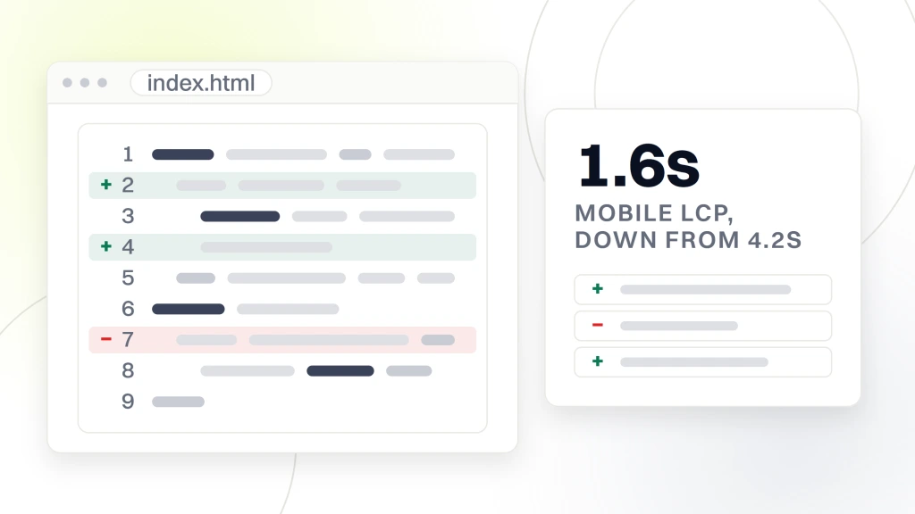
Inside 12 months the keyword count grew from 6 to over 300. Monthly visitors climbed past 800. Mobile Lighthouse Performance moved from below 50 to over 95. The site produced more than $60,000 in booked project work inside the first year. Every one of those numbers came from responsive web design with HTML5 applied honestly at build time. The tutorial-level techniques above scale to real revenue outcomes when applied consistently across a full site.
Core Web Vitals impact
Largest Contentful Paint dropped from 4.2 seconds to 1.6 seconds on mobile. Cumulative Layout Shift dropped from 0.28 to 0.03. Interaction to Next Paint stayed under 200 milliseconds through the full load. All 3 metrics moved from red to green inside 30 days of launch. Google indexed the improved metrics inside 60 days. Ranking movement followed inside 90 days. That’s the timeline from tutorial-level responsive web design methods to real ranking gains.
Conversion rate impact from responsive polish
Conversion rate on mobile climbed from under 1% to over 10%. Bigger touch targets. Larger form fields. A sticky CTA at the thumb zone. Fewer bytes on initial load. Every one of those changes came out of tutorial-level responsive web design principles applied with an eye on real revenue outcomes. None of them required a redesign. All of them moved the number by month 3.
Where to start your HTML5 CSS responsive build
Start with the meta viewport tag. Then the CSS reset. Then design tokens. Then mobile-first typography. Then a flexbox nav. Then a grid card section. Then media queries at 768. Then images with srcset. Then lazy loading. Then a testing pass. Every step in this walk-through takes 30 to 90 minutes. The whole build lands in 1 to 3 days for a competent developer following the order above.
Ready to skip the tutorial and hire the team that builds responsive HTML5 CSS sites for a living? Our responsive web design services team covers the full scope from wireframe to launch. If the project fits a small business budget, our web design services for small business delivers fixed-price entry-tier builds. For related reading in this cluster, see our responsive web design techniques and best practices and responsive web design breakpoints and screen sizes. See the MDN viewport meta reference and web.dev on responsive images for further tutorial-level reading.