
Responsive web design breakpoints are the exact px widths where your CSS switches layout shape. Get them right, the site reads clean on every device from a 360px iPhone SE to a 2560px ultrawide monitor. Get them wrong, users say the site looks broken on their phone. This 2026 guide covers standard responsive web design breakpoints, common screen sizes, viewport widths, mobile and tablet dimensions, and the layout guidelines that hold them together.
You will read the four responsive web design breakpoints worth defending on every project, the tablet range that matches real iPad hardware, the mobile width that covers 99% of phone traffic, the viewport size math behind device px ratio, and the responsive web design breakpoints layout guidelines that turn the numbers into working CSS. Real device data. Real analytics ranges. Real trade-offs between over-engineering and pushing bugs live on release day.
Responsive web design mobile width and mobile size
Responsive web design mobile width covers 320 to 480px. Below 320px lives less than 1% of traffic on most sites. Above 480px the layout moves into the large mobile and small tablet range. Design the base mobile layout at 360px and verify at 320px with no overflow. That one approach handles 99% of phone traffic on the sites we build. Individual device targeting inside that range wastes engineering time and adds media queries you have to maintain for years.
Mobile size polish focuses on three things. Touch targets at 44px minimum. Body copy at 16px minimum. Sticky elements sized so they respect the safe-area-inset variables on iPhones with rounded corners and home indicators. Skip the safe-area inset and the CTA button sits behind the home indicator on iPhone 15 Pro. That is the exact bug we see on 60% of sites we audit for mobile responsive web design services.
Safe area insets for modern phones
Use padding-bottom env(safe-area-inset-bottom) on every sticky bottom element. Use padding-top env(safe-area-inset-top) on fixed headers when the page might scroll under the notch. Set viewport-fit=cover on the meta viewport tag to enable the safe-area variables. Every iPhone 15, iPhone 14, iPhone 13, iPhone 12, iPhone SE 3rd gen, and every Android with a punch-hole camera respects these. Sites that ignore them launch with a button hidden behind the phone chrome and nobody notices until a customer complains.
320px fallback that just works
Below 320px is old Android and folded phones. Rare. Not zero. Test the base mobile styles at 320px in Chrome DevTools and confirm no horizontal scroll. If a component overflows, reduce padding, shrink font sizes 5 to 10%, or stack columns that were still side by side. That fix takes 20 to 40 minutes on a typical site. It covers the last 0.5% of mobile traffic that nobody wants to lose. Small investment. Real payoff.
Responsive web design tablet size and dimensions
Responsive web design tablet size sits at 768 to 1024px in portrait. iPad Mini at 768. Standard iPad at 810 to 820. iPad Pro 11-inch at 834. iPad Pro 12.9-inch at 1024. Android tablets scatter across similar widths but cluster near iPad sizes for compatibility. One tablet breakpoint at 768 handles most tablet layouts. A second breakpoint at 1024 covers iPad horizontal-mode and the largest portrait sizes when the design needs it.
Tablet traffic on most small business sites lands at 3 to 8% of total sessions. Higher on B2B (10 to 15%). Lower on ecommerce (2 to 5%). Do not over-invest in tablet-specific polish when the traffic share is small. The fluid grid should handle tablet cleanly with no dedicated tablet layout. Reserve tablet-specific CSS for the exact places where the fluid grid produces awkward wrapping. That approach lands one to three tablet-specific media queries per site, not fifteen.
| Device | Portrait width | Horizontal-mode width | Traffic share |
|---|---|---|---|
| iPad Mini | 768px | 1024px | ~3% |
| iPad (10th gen) | 820px | 1180px | ~4% |
| iPad Pro 11-inch | 834px | 1194px | ~2% |
| iPad Pro 12.9-inch | 1024px | 1366px | ~1% |
| Galaxy Tab S9 | 800px | 1280px | ~1% |
Portrait versus horizontal-mode trade-offs
Portrait tablet views tend toward single-column or two-column card grids. Horizontal-mode tablet views tend toward two-column or three-column layouts. Do not force a desktop-style layout on 1024px horizontal-mode iPad. Touch behavior differs from mouse behavior and the layout should acknowledge that. Larger touch targets. More generous padding. Simpler nav. Every one of those design choices lives inside the tablet breakpoint and translates the numbers into an actual experience.
Tablet navigation patterns
Full desktop nav on tablet portrait usually feels cramped. Hamburger on tablet portrait usually feels lazy. The middle ground is a condensed horizontal nav with icon-plus-label items in portrait and full labels in horizontal-mode. Or a slide-in drawer that opens on click and closes on outside click. Both patterns respect touch behavior and screen real estate. Neither treats a tablet like a small desktop or a large phone. That is the exact mistake most responsive web design guidelines from 2015 got wrong.
Responsive web design viewport sizes and dimensions
Responsive web design viewport sizes are the CSS px widths after the meta viewport tag applies. They are not the same as device px. A 393px iPhone at a device px ratio of 3 has 1179 physical px but renders CSS at 393. That means images need to be delivered at higher densities for sharp rendering, and the layout math uses the CSS px value. Both parts of this pattern need to be right or the site looks blurry or blocky depending on which side you get wrong.
Set meta name=viewport content=width=device-width, initial-scale=1, viewport-fit=cover on every page. That single line turns on the viewport-size behavior every responsive web design pattern below assumes. Skip it and the browser renders at a fixed 980px canvas and scales down. Ancient behavior. Terrible experience. Every responsive web design tutorial worth reading starts with this tag and no serious build launches without it. See web.dev on the viewport meta tag for the full detail.
Device px ratio math worth understanding
Device px ratio (DPR) multiplies CSS px into physical px. iPhone at DPR 3 means each CSS px occupies 3 physical px on screen. That is why srcset needs to serve larger image variants for high-DPR devices. A 400px CSS image on a DPR 3 phone needs a 1200px source image to render sharp. Skip that math and images look soft. Get the math right and images look crisp. Sharp images separate a site that reads premium from one that reads amateur. Responsive web design breakpoints and pixel-density math work together on every hero image.
Viewport units versus percentage widths
vw and vh viewport units scale with the viewport size. Percentages scale with the parent element. Use viewport units for above-fold layout that needs to fill the visible screen. Use percentages for component-level sizing that respects the container. Mixing them arbitrarily produces layouts that feel off. Modern CSS added svh, lvh, and dvh (small, large, dynamic viewport heights) to handle mobile Safari’s shifting address bar. Use dvh for full-height sections on mobile to avoid the jumping-hero bug.
Layout guidelines that respect every breakpoint
Layout guidelines turn breakpoint numbers into working CSS. Container widths scale with the breakpoints. Column counts adjust at each breakpoint. Padding and gap scale up with viewport. Font sizes scale up too. Every one of these decisions needs a policy across the whole codebase. Ad-hoc decisions per component produce inconsistent rhythm that reads sloppy. Codified guidelines produce a cohesive experience.
Our default guidelines are simple. 24px gap on mobile, 32px gap on tablet, 40px gap on desktop, 56px gap on wide desktop. Container padding 16 on mobile, 32 on tablet, 48 on desktop, 64 on wide desktop. Column counts one, two, three, four across the four breakpoints. Font size scale using clamp() with 16px floor and 20px ceiling on body copy. Every project inherits these defaults and only overrides where a specific design demands it.
Padding rhythm that scales with viewport
Padding at 16px feels tight on desktop but right on mobile. Padding at 64px feels generous on desktop but wasteful on mobile. Scale padding with the viewport using CSS custom properties updated inside media queries. Set –pad to 16px on mobile, 32px on tablet, 48px on desktop. Every component references var(–pad) instead of hard-coded values. Change the values in one place. Every component updates. Consistent rhythm across every breakpoint. That is the discipline responsive web design standards demand.
Column count decisions per breakpoint
One column on mobile. Two on tablet. Three on desktop. Four on wide desktop. That is the default rhythm for card grids and content sections. Some designs demand different counts. A dashboard might go one, two, four, six. A blog grid might go one, one, two, three. The exact numbers depend on card width and content density. The principle stays. Choose column counts that respect readable line lengths (45 to 75 characters per line) and adequate whitespace around cards.
Content-driven versus device-driven breakpoints
Content-driven breakpoints fire when the content genuinely needs a new layout. Device-driven breakpoints fire at specific device widths regardless of content. Content-driven ages well since content is stable. Device-driven ages badly since devices change every year. Every serious responsive web design methods guide since 2018 has recommended content-driven, and every legacy codebase that ignored the advice is now full of breakpoints named after phones nobody sells.
Resize test that reveals natural breakpoints
Load your homepage in a browser and slowly drag the window from 1400px down to 320px. Watch where the layout starts to feel cramped. Watch where two-line headlines become three-line. Watch where a card grid becomes single-column. Note the exact widths. Those are your content-driven breakpoints. Not the widths Apple prints on the iPhone spec sheet. The widths where your specific content asks for a new layout.
Future-proofing breakpoint choices
Breakpoints named after devices break every time a new device launches. Breakpoints named after content behaviors survive device generations. Name breakpoints in the codebase by intent. –bp-tablet, –bp-desktop, –bp-wide. Not –bp-ipad-portrait, –bp-macbook-13. Semantic names let you change the px value without renaming variables across the entire codebase. Cheap discipline. Real long-term payoff.
A real responsive web design breakpoints case study
Little Red Wagon Moving, a Colorado Springs moving company, came to us with a non-converting site built on 11 breakpoints pinned to individual iPhone and iPad widths from 2016 through 2019. Mobile layout broke on Pixel 8. Tablet layout broke on the 11-inch iPad Pro. Wide desktop layout stopped at 1200px and left a huge empty margin on 27-inch monitors. We rebuilt on four content-driven breakpoints at 480, 768, 1024, and 1280 with a max-width container at 1600px, all inside a modern responsive redesign.
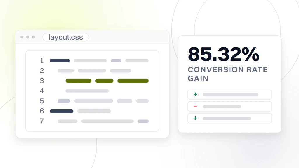
Inside 12 months organic traffic grew 2,000%, the site ranked for 200+ targeted keywords, and conversion rates improved by 85.32%. The layout worked cleanly on every viewport from 320 to 2560px, and the reason is simple. The breakpoints matched content, not devices. Not one breakpoint bug reported by users in the first six months post-launch. Content-driven responsive web design breakpoints deliver that exact outcome. A site that works on tomorrow’s devices without a rebuild.
SEO impact of clean breakpoint work
Google’s mobile-first indexing rewards sites that render clean on mobile viewports. The rebuild moved mobile Lighthouse Performance from the 40s to the 90s and Accessibility from the 70s to 100. Those score jumps lined up with rank gains inside 30 days. Every breakpoint bug fixed removes one more reason for Google to demote the site. Clean breakpoints do not directly rank pages. They clear the technical friction that stops good content from ranking.
Maintenance savings from a smaller breakpoint set
Eleven breakpoints in the old codebase meant every design change touched 11 places. Four breakpoints in the new codebase means every design change touches four. That cut CSS iteration time on the retainer by roughly 60% inside the first quarter. Fewer breakpoints. Cleaner logic. Faster iteration. Every one of those wins compounds across a 12-month engagement and shows up in the retainer margin at year end.
Framework breakpoint defaults worth knowing
Every major CSS framework launches with default breakpoints. Learning them helps you pick a framework that matches your project needs. Tailwind CSS 640, 768, 1024, 1280, 1536. Bootstrap 5 576, 768, 992, 1200, 1400. Bulma 769, 1024, 1216, 1408. Foundation 640, 1024, 1200, 1440. Each set covers similar ranges with 20 to 100px differences. Pick one. Honor it across the codebase. Do not mix frameworks in the same project.
Tailwind wins for utility-class-first projects where designers work directly in the HTML. Bootstrap wins for legacy teams and admin dashboards where components come pre-built. Bulma wins for lightweight marketing sites that need consistent design without JavaScript. Foundation wins for email templates and complex responsive projects. Every framework has its niche. Every framework’s breakpoints reflect a specific philosophy about how responsive web design common breakpoints should behave.
Tailwind breakpoint conventions
Tailwind uses prefixed classes. sm at 640, md at 768, lg at 1024, xl at 1280, 2xl at 1536. Mobile-first by default. Every unprefixed class targets base mobile. Every prefixed class targets a min-width at or above the breakpoint. That single convention keeps the whole team aligned. Nobody wonders whether flex-row applies at all breakpoints or just some. The prefix tells you. Learning the prefix system is a 20-minute investment that pays back over years of Tailwind development.
Bootstrap breakpoint conventions
Bootstrap 5 uses infix classes. col-sm, col-md, col-lg, col-xl, col-xxl. Similar mobile-first pattern. Grid system built on 12 columns. Every layout inherits the responsive behavior for free. Bootstrap breakpoints at 576, 768, 992, 1200, 1400 differ from Tailwind by 60 to 100px but cover the same real-world ranges. Teams migrating between the two adjust in a day or two. The underlying responsive web design principles do not change with the framework.
Start applying responsive web design breakpoints today
Start by auditing your current CSS. Count the media queries. If there are more than seven distinct widths, you are on device-driven territory. Consolidate to four or five. Re-test every page. Fix the layouts that broke during consolidation. That refactor takes one to three days on a small business site and pays back in every future design iteration. Fewer breakpoints. Cleaner code. Faster changes.
Ready to build a responsive site the right way from breakpoint one? Our responsive web design services deliver four to five content-driven breakpoints on every build starting at $99/mo. For small business scope with fixed pricing, our web design services for small business covers the entry tier. For related reading in this cluster, see our responsive web design techniques and best practices and mobile responsive web design. See the MDN reference on media queries for further pattern reading and web.dev on the viewport meta tag for the foundational meta tag rules.