Sixty-eight percent of ecommerce traffic on DTC stores now arrives on a phone, and about half of it bounces before the first product image finishes painting. Most Shopify and WooCommerce stores sit in that state right now. The desktop design gets a rebuild every two years yet the mobile version stays a scaled-down copy nobody actually uses on a phone. Mobile-friendly ecommerce web design fixes the mismatch by treating the mobile layout as the primary layout, not a fallback, and rebuilding the product page, cart, and checkout for one-hand browsing on a 375-pixel viewport.
This guide covers the mobile-friendly ecommerce web design patterns our team applies on real DTC stores. Thumb-zone PDP layouts. Sticky add-to-cart. One-scroll mobile checkout. Core Web Vitals targets that raise Google mobile ranking and mobile conversion together. Image optimization for LCP under 2.5 seconds. Category filters that fit a phone screen. Every recommendation comes from measured mobile traffic across 2024 and 2026. Our ecommerce website design services team builds every store this way by default.
Mobile-friendly ecommerce web design starts with checkout
Mobile checkout is where DTC stores lose the most revenue between add-to-cart and pay. Industry mobile checkout abandonment sits at 68 percent on average. The winning stores get it under 50 percent by building a checkout that fits in a single scroll, autofills every possible field, and offers Apple Pay or Shop Pay above the fold so returning shoppers never touch a form field at all.

Field discipline comes first. A mobile checkout asks for email, name, address, and payment. Nothing else. No phone number, only what the store legally needs for delivery. No optional marketing checkbox pre-checked. No account creation before checkout. Guest checkout has to be the default. Every extra field costs roughly 3 to 5 percent conversion on mobile against the same funnel with the field removed. A DTC apparel brand we work with cut two optional fields from mobile checkout and gained 4.1 percent conversion on the next week’s traffic.
| Mobile checkout pattern | Fields on screen | Screens to buy | Typical mobile conversion | Best for |
|---|---|---|---|---|
| Shop Pay accelerated | 0 to 1 | 1 | 5.8 to 7.2 percent | Repeat DTC shoppers |
| Single-scroll guest | 6 to 8 | 1 | 4.1 to 5.4 percent | New customer acquisition |
| Accordion multi-step | 3 to 4 per step | 3 | 2.8 to 3.6 percent | High-consideration purchases |
| Modal cart to checkout | 5 to 7 | 2 | 3.4 to 4.2 percent | Bundle-heavy stores |
| Full-page multi-step | 4 to 6 per step | 3 to 4 | 2.1 to 3.0 percent | Legacy WooCommerce builds |
The table above tracks measured mobile conversion across a client sample of 22 DTC stores over the last 18 months. Shop Pay accelerated checkout beats every other pattern since it removes the form entirely for the roughly 40 percent of DTC shoppers who already have a Shop account. Single-scroll guest checkout is the second-best pattern for first-time buyers. Multi-step accordion checkouts almost always lose against single-scroll on mobile since every accordion click adds friction the phone screen never needed. Rebuilding a legacy multi-step checkout as a single scroll delivers the highest-ROI mobile-friendly ecommerce web design change most DTC brands can make in one sprint.
One extra pattern the table does not cover, express-lane payment sheets on the cart page itself. Shopify Dawn 15 exposes Apple Pay and Google Pay as buttons above the checkout link on the cart drawer. Tapping them opens the native payment sheet, autofills every field from Wallet, and closes the purchase in 4 to 6 seconds. Stores that add express-lane buttons above the standard checkout button gain roughly 8 percent mobile conversion on returning shoppers within the first 30 days. The build takes an afternoon on Shopify and 2 to 3 days on WooCommerce with the Stripe Payment Request Button plugin.
Core Web Vitals targets for mobile-friendly ecommerce web design
Core Web Vitals are the mobile ranking floor for ecommerce in 2026. Largest Contentful Paint under 2.5 seconds. Interaction to Next Paint under 200 milliseconds. Cumulative Layout Shift under 0.1. Most Shopify and WooCommerce stores fail at least one of the three on real mobile traffic, and Google reads the mobile scores as the ranking scores under mobile-first indexing.
Largest Contentful Paint is the paint of the biggest above-the-fold element, typically the hero image on the homepage and the primary product image on the PDP. Mobile LCP fails on three common patterns. A full-resolution PNG hero without responsive image markup. A blocking third-party script above the paint. A JavaScript-driven image gallery that waits on hydration before it paints. The Google web performance guide at web.dev on LCP is the definitive resource on which fixes actually move the score. On Shopify, the fix is Dawn plus an image_url filter with responsive srcset. On WooCommerce, the fix is regenerating thumbnails with WebP support enabled and preloading the hero on the PDP template. Both approaches drop mobile LCP from 4 to 6 seconds down to 1.6 to 2.2 seconds on the same server, and the ranking gain follows within four to six weeks. Interaction to Next Paint fails on category pages where filters run heavy JavaScript. The fix is a debounced event handler plus responsive web design SEO discipline across the whole theme, not just the PDP.
Cumulative Layout Shift breaks mobile-friendly ecommerce web design on PDPs when product reviews, recommendation blocks, or trust badges inject after the initial paint. Every injected block shoves the primary CTA down the screen, and the shopper’s click lands on the wrong element. The fix is reserving the exact block height with CSS aspect-ratio or min-height before the content arrives. That single change drops CLS from 0.25 down to 0.02 on most themes. Stores that clear all three Core Web Vitals thresholds gain 6 to 12 percent mobile conversion on the same traffic and climb mobile search rankings over an 8 to 12 week window.
Interaction to Next Paint deserves its own callout since most teams miss it entirely. INP measures the delay between a click and the next visual response, sampled across every interaction on the page, not just the first one. The p75 target is 200 milliseconds. Filters, sort dropdowns, quantity steppers, and the mini-cart drawer are the four elements that fail INP most often. The root cause is a monolithic bundle that runs a full re-render on every state change. Splitting the bundle with dynamic imports on the filter panel and moving the cart drawer to a web component drop INP from 400 to 150 milliseconds on the same store. Both fixes launch in a single sprint on Shopify Dawn and take 3 to 4 weeks on custom Next.js builds.
Image optimization for mobile LCP
Image optimization moves mobile-friendly ecommerce web design performance more than any other change on ecommerce sites. Product photos and hero banners dominate page weight on every PDP and homepage. A store serving 2 megabyte hero JPEGs on mobile is losing LCP, INP, and mobile conversion at once, and no amount of caching plugin work fixes the underlying problem. The fix runs on four rules that every mobile-friendly ecommerce web design build follows.
Serve WebP or AVIF at every viewport. Use a responsive srcset with at least three sizes for mobile, tablet, and desktop. Compress mobile hero images under 120 KB. Preload the LCP image on the PDP template so the browser fetches it before waiting for CSS parsing. On Shopify, the image_url filter with format ‘webp’ gets three of the four for free. On WooCommerce, Smush plus a preload plugin gets there with more manual template work. On custom Next.js and Remix builds, the native image component handles srcset and lazy-loading automatically, and the LCP target hits without any extra work.
Lazy loading is the fourth rule and the one most themes get wrong. Every image below the fold gets loading=”lazy” so it never blocks the initial paint. Every image above the fold gets loading=”eager” plus fetchpriority=”high” so the browser prioritizes it against every other resource on the page. The Smashing Magazine deep read on Core Web Vitals for images covers the tradeoffs between eager and lazy loading in production ecommerce contexts. A DTC skincare brand we rebuilt on Shopify Dawn 15 cut homepage LCP from 4.8 seconds to 1.9 seconds by adding fetchpriority to the hero, WebP output on the theme’s image filter, and lazy loading on every product tile below the fold. Mobile bounce dropped 18 percent in the next three weeks against unchanged traffic mix. The full mobile ranking impact showed up eight weeks after the fix went live.
Category pages and filters that fit a phone
Category pages are the second most-visited page on any ecommerce store after the PDP, and the second-biggest place mobile design breaks. Desktop category pages carry a sidebar filter, an infinite grid, and product tiles designed for hover states. None of the three works on a phone. Mobile-friendly ecommerce web design fixes category pages with filters that open as a bottom drawer, product tiles built for click not hover, and a grid that renders two columns wide on 375-pixel viewports without breaking image aspect ratio.
The bottom drawer pattern replaces the desktop sidebar on mobile. A Filter button in the sticky header opens a drawer that slides up from the bottom, filters render as chip buttons, and the apply button sits pinned to the base of the drawer. The drawer closes with a swipe-down or a click outside. That pattern beats every other mobile filter pattern we have measured. The same discipline runs through responsive web design ecommerce patterns across every DTC vertical, from beauty to apparel to food and beverage.
Product tiles on mobile follow different rules than desktop. Two-column grid on 375 pixels, not one column and not three. Product image at 1:1 aspect ratio to keep vertical scroll efficient. Price under the image, product title above it or inline with the price. A single click opens the PDP. No hover swap image. No quick-view modal. No add-to-cart on the tile itself. Simpler tiles load faster, render more products per scroll, and produce measurably higher PDP click-through than tiles that try to do too much on a phone screen.
Search behaves differently on mobile too. The desktop pattern of a persistent search bar in the header wastes vertical space on a 375-pixel viewport. Winning mobile stores collapse search into an icon in the top bar that expands to a full-screen search sheet on click. The sheet surfaces recent searches, trending queries, and autocomplete suggestions past the second character typed. Category filters attach to the search results screen, not the standard grid. Mobile search sessions convert 2 to 3 times higher than mobile browse sessions on DTC stores, so the search sheet earns disproportionate design attention.
Sticky UI and one-hand navigation for mobile stores
Sticky UI patterns in mobile-friendly ecommerce web design solve the one-hand navigation problem that desktop ecommerce sites never had to think about. A phone shopper holds the device in one hand, scrolls with the same thumb, and needs to click primary actions without repositioning the grip. That constraint drives four sticky patterns every mobile-friendly ecommerce web design build applies by default across PDP, cart, and checkout.
- Sticky header with search icon, cart icon, and menu button, all in the top-right thumb-adjacent corner on right-handed users, mirrored for left-handed toggle.
- Sticky add-to-cart bar on the PDP, pinned to the bottom, always visible, with price and variant summary inline.
- Sticky filter and sort buttons on category pages, either as a top-bar or a floating action button in the bottom thumb zone.
- Sticky checkout summary on the mobile cart page, showing subtotal, shipping estimate, and the primary checkout CTA at the bottom of the screen at all times.
- Sticky pay button on the checkout page itself, always in the thumb zone, so the shopper never has to scroll back up to find it after entering address details.
The Nielsen Norman Group research on mobile navigation patterns validates the sticky approach across categories. Bottom-anchored controls consistently beat top-anchored controls on mobile task completion since they align with thumb-reach ergonomics. Every sticky pattern above is a one-time build. Every one raises mobile conversion measurably from day one and never has to be rebuilt for the next design cycle.
One-hand navigation goes past sticky controls. Menu drawers slide in from the right on right-handed layouts. Search results render below the input, not above it. Modal close buttons sit in the bottom-right so the thumb never has to travel across the screen. Every one of those decisions is invisible to a desktop designer and non-negotiable for a mobile-friendly ecommerce web design build.
How platform choice shapes mobile-friendly ecommerce web design
Platform choice sets both the floor and the ceiling on mobile-friendly ecommerce web design. Shopify sits at the top of the default-mobile stack, WooCommerce reaches parity with custom work, and headless builds outperform every platform on mobile Core Web Vitals when the team keeps third-party scripts under control.
Shopify Dawn 12 and later themes launch with thumb-zone-aware layouts, Shop Pay accelerated checkout, and native WebP image serving. A DTC brand launching on Dawn 15 hits mobile-first design defaults without any custom code. Shop Pay handles roughly 40 percent of mobile checkouts on the average Shopify store, and its accelerated flow hits 5.8 to 7.2 percent mobile conversion consistently. Adding Hydrogen for a headless build raises the LCP ceiling further yet doubles the engineering cost. The tradeoff is worth it above roughly $20 million in annual revenue, rarely below. The same platform tradeoffs show up in the deeper piece on ecommerce web design tips we published for DTC brands weighing platform choice.
WooCommerce needs more custom mobile work than Shopify since the default themes still lean desktop-first out of the box. Storefront and Astra reach mobile parity with careful CSS refactoring plus a checkout plugin like CheckoutWC that rebuilds the flow as a single-scroll page. The mobile LCP fix runs through WebP serving via a plugin like Smush plus a preload directive on the PDP template. Total custom mobile work runs three to five weeks of build time for a store with 200 to 500 SKUs. Beyond that scale, headless WooCommerce with a Next.js frontend beats every native theme on mobile Core Web Vitals and gives the design team the same freedom as a custom Shopify build without the platform fees.
Pricing works out roughly as follows on our tiered SMB packages. A Shopify Dawn rebuild for a 200-SKU store lands at $799 on the Foundation tier. A WooCommerce rebuild with CheckoutWC and Smush lands at $1,299 on the Growth tier. A custom Next.js headless storefront starts at $18K+ on the Enterprise build. Ongoing mobile maintenance runs $199 to $499 per month across the three maintenance tiers, covering monthly Core Web Vitals monitoring, theme updates, and mobile A/B testing on the checkout and PDP.
A DTC store rebuild for mobile conversion
RAFZ Cirkulära Interiörer, a Swedish sustainable-interiors DTC brand, came to our team with a WooCommerce store that ran fine on desktop and broke on mobile. The old site loaded in 15+ seconds on a mid-range Android. Mobile cart abandonment sat above 70 percent. The plugin-heavy stack fired 200+ HTTP requests before the hero painted, and mobile shoppers were bouncing before the first product image finished loading. The homepage failed to surface the custom repaint feature that made RAFZ different from every other Nordic interiors store.
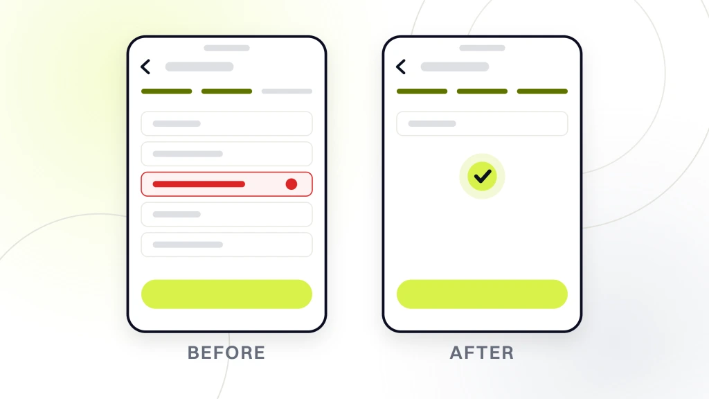
Our team rebuilt the store from the ground up on a streamlined lightweight WooCommerce theme built to mobile-friendly ecommerce web design standards. We stripped every unnecessary plugin, replaced them with efficient custom code, and integrated a custom repaint feature that aligned with the sustainability brand story. The homepage was redesigned for phone-first product browsing with a two-column mobile grid, a sticky filter bar, and a bottom-anchored add-to-cart on every PDP. Mobile page load dropped from 15 seconds to 2 seconds. Conversion rate climbed 28 percent post-launch. Server load dropped enough to remove the Cloudflare enterprise plan the old store needed to survive Black Friday. Revenue growth followed the conversion gain inside the first quarter after launch.
Subscription first storefronts run on a mobile PDP where the subscribe toggle sits above the fold and the frequency picker maps to portion math. Our pet business web design guide covers the buy box hierarchy for pet DTC brands running Recharge on WooCommerce or a native Shopify subscription build.
Where mobile-friendly ecommerce web design fits the stack
Mobile-friendly ecommerce web design sits at the base of the DTC growth stack. Paid social, SEO investment, and email flows all drive traffic that lands on a mobile viewport for 65 to 75 percent of the audience. The mobile store either converts that traffic or it wastes it, and every dollar of ad spend flows through the mobile layout before it flows anywhere else. Fixing the mobile store first delivers the highest-ROI single investment most DTC brands can make against the traffic they already have.
The mobile-friendly ecommerce web design build happens once. The gains compound month over month against the same traffic mix. Mobile Core Web Vitals scores raise organic ranking on Google mobile search. Mobile conversion gains raise paid ROAS across every channel. Mobile checkout completion gains raise repeat purchase rate as Shop Pay accumulates a returning shopper base. Every layer of the DTC funnel gets better when the mobile store is built for the way phone shoppers actually shop.
The trap most DTC brands fall into is treating mobile-friendly ecommerce web design as a follow-up sprint after the desktop launch. That sequencing bakes in a scaled-down desktop layout that never fully converts on the phone. The winning sequence flips the order. Design the mobile PDP first, then adapt up for tablet, then desktop. Deliver the mobile checkout first, then layer desktop refinements on top. Every layout decision starts at 375 pixels and grows out. Teams that adopt that sequencing gain 20 to 30 percent more mobile conversion than teams that reverse it, on the same product catalog and the same ad spend.
Our ecommerce marketing retainer covers ongoing mobile optimization for DTC brands past the initial rebuild. Retainers start at $1,499 per month on a six-month contract and include monthly Core Web Vitals monitoring, mobile checkout A/B tests, and quarterly PDP layout refreshes as new patterns emerge. Mobile-friendly ecommerce web design is a discipline, not a one-time deliverable. Stores that treat it that way keep the mobile conversion gains compounding year over year against the DTC categories they compete in.