Most top ecommerce web design examples get treated like a Pinterest board of pretty homepages, and that framing is why most stores stay stuck at a 1.6 percent conversion rate. Your product page has 3 carousel arrows a shopper never uses. Your cart drawer opens on top of a sticky add-to-cart button. Your mobile navigation menu ate the search bar. None of that is a taste problem. It’s a friction problem, and friction is where DTC revenue quietly dies. The stores you envy did not out-design you. They out-audited you.
This guide is the ecommerce web design tips list your team can pressure-test in a week. Navigation patterns that actually help shoppers find product. PLP and PDP layouts that grow add-to-cart without a rebuild. Cart and checkout tweaks that clear the top 5 bounce reasons. Mobile speed fixes that move Core Web Vitals into the green. Trust badges and social proof placed where they read as evidence, not decoration. Every recommendation runs against real DTC brands, including work our ecommerce marketing agency team has walked through.
What ecommerce web design tips actually cover in 2026
Ecommerce web design tips in 2026 cover 6 surfaces. The homepage, the category or PLP grid, the product page, the cart and checkout, the mobile viewport, and the site-wide speed budget. Every store you compete with in the DTC space is running quiet A/B tests on those 6 surfaces, and the winners share more patterns than they hide.
For a deeper breakdown of thumb-zone PDP layouts and mobile checkout patterns, read our guide on mobile-friendly ecommerce web design.
The six-surface audit frame
Every serious audit walks the 6 surfaces in that order. Homepage, PLP, PDP, cart and checkout, mobile viewport, and speed. You capture a 60-second Loom on each surface with a real shopper task in mind. Find a specific SKU, add 2 items, apply a discount, check delivery. Then you write down every point where the shopper hesitated, tapped the wrong element, or backtracked. That list becomes your ecommerce web design tips backlog for the quarter. Founders who skip the walk usually redesign the homepage twice a year and wonder why the store conversion rate does not budge. The homepage is the smallest of the 6 surfaces by revenue impact.
Why founders skip the frame
Most DTC founders skip the six-surface audit because Shopify makes the homepage feel like the whole store. A drag-and-drop theme builder rewards big hero videos and animated announcement bars, and founders spend 3 weekends adjusting them. Meanwhile the PLP grid still shows one product per row on mobile, the PDP still hides the size selector behind an accordion, and the cart drawer still does not surface free-delivery progress. Real ecommerce web design tips read the theme builder and then ignore it. The 6 surfaces each get their own audit, backlog, and test cadence. Pretty homepages and stores that convert are not the same project.
Best ecommerce web design tips start with navigation that finds product
Navigation is the surface with the highest revenue impact on any store over 50 SKUs, and the surface most founders under-invest in. The winning pattern in ecommerce web design tips keeps the top nav short (5 to 7 top-level links), pushes deep category structure into a mega-menu that opens on hover, and puts the search bar in the header at full width above the fold on mobile.
Header nav rules that hold up
- 5 to 7 top-level items. Any more and the shopper skips the nav entirely.
- Shop by category as one item, Shop by collection as another. Never mix them under a single dropdown.
- A visible search icon that expands to a full-width input on click, not a hover-only affordance.
- Cart icon at the far right with the item count as a numeric badge, not a dot.
- A single announcement bar above the header, one message at a time. Rotating banners cut engagement.
- Sticky header on scroll on desktop, sticky bottom nav on mobile with cart plus search plus account.
Mega-menu depth without the clutter
Mega-menus win when they treat each column as a merchandising slot, not a link dump. Column one lists categories with visual thumbnails. Column two lists collections (new arrivals, best sellers, sale) with a small product image next to each. Column three is a promo card (free delivery over $75, a bundle deal, a lookbook) with a real product photo. This structure pushes shoppers into a real product listing page in one click instead of 2 menu levels deep. The Baymard Institute has consistently shown that mega-menu structure directly moves discovery metrics, and their research pool is the closest thing DTC has to peer-reviewed UX data.
Web design for ecommerce PLPs that move shoppers to the PDP
The category or collection page is the highest-traffic non-home page on almost every store, and the page where most stores lose the sale before it starts. Real ecommerce web design tips for PLPs surface filters, sort, price, and quick-add without making the shopper scroll through a hero image that repeats the collection name.
Grid density and quick-add
Grid density on desktop lands at 3 or 4 products per row. On mobile it lands at 2 products per row. Single-column mobile PLPs cost you scroll depth and stall the conversion rate. Every product tile shows the primary photo, a hover-swap secondary photo on desktop, the product name, the price with any strikethrough for sale, and a compact color-swatch strip. The quick-add button surfaces on hover on desktop and always on mobile as a small plus icon. Quick-add on the PLP is worth 8 to 14 percent add-to-cart growth on catalogs where size or variant is not required, and worth zero on apparel where size selection is the block.
Filters that shoppers actually use
Filter placement is a mobile problem more than a desktop one. Desktop keeps filters in a left rail with the top 3 (price, size, color) always visible. Mobile puts filters behind a Filter button in a sticky top bar with the current filter chips visible. Never hide filters in a hamburger menu on mobile. Sort options run separately from filters and default to Best Sellers, not to New. Empty filter states (no products match) render a clear empty-state message plus a Reset Filters button, not a blank grid. Shopify Plus data across their DTC merchant base shows PLPs with sticky mobile filter bars run 12 to 22 percent higher PLP-to-PDP click-through than PLPs where filters live below the fold.
Ecommerce web design best practices for PDPs that close the sale
The product detail page is where add-to-cart lives or dies. Ecommerce web design tips for PDPs treat every element above the fold as a job. Show the product, price, variant selectors, and add-to-cart in the first viewport on desktop and on mobile. Everything else earns its scroll depth by answering the next question the shopper has.
Above the fold, in order
- Product name at H1 with a compressed weight so it does not eat the viewport.
- Price with the discount rendered as a strikethrough plus current, not a percent-off badge that hides the current price.
- Star rating with review count as a clickable anchor that jumps to reviews below.
- Color swatches with the selected variant name visible as a text label under the swatches.
- Size selector as a dropdown on mobile, as an inline button group on desktop. Include a size-guide link that opens a modal, not a new page.
- Add-to-cart button in a brand color at 48 pixel minimum touch height. Never orange for the sake of orange.
- Delivery copy under the button (Free delivery over $75, arrives Wednesday) as one line, not two.
Below the fold, in order of shopper questions
Below the fold, the PDP answers questions in the order the shopper thinks them. Does it fit or work for my case? Show a size chart or use-case block. What is it made of and how do I care for it? Show material and care in a two-column block, not a paragraph. How does it look on someone? Show lifestyle imagery with real humans, not floating flat-lay shots. What do other buyers think? Show 3 high-signal reviews with photos, then a link to the full review section. What if I don’t like it? Show the returns policy in one sentence, not a legal paragraph. This ordering closes almost every buying question before the shopper needs to leave the page.
Conversion-focused ecommerce web design fixes the cart drawer first
The cart drawer is the smallest UI surface on the store and the one that decides whether the shopper starts checkout or bounces to compare prices somewhere else. Conversion-focused ecommerce web design tips treat the cart drawer as a mini landing page. Show progress toward free delivery, offer one relevant upsell, keep the checkout button visible on scroll, and never open the drawer on top of the sticky add-to-cart button on mobile.
| Cart element | Weak pattern | Strong pattern | Impact on conversion |
|---|---|---|---|
| Free-delivery progress | No indicator | Progress bar with $ to go | +7 to 12% AOV |
| Upsell placement | Modal after add-to-cart | One in-drawer suggestion | +3 to 6% AOV |
| Checkout button | Bottom of drawer, scrolls off | Sticky bottom, always visible | +4 to 9% CVR |
| Discount code field | Visible on cart page | Hidden until checkout step 2 | +8 to 14% CVR |
| Trust icons | Row of 6 payment logos | Two logos plus security line | Neutral to +2% |
Why hiding the discount field wins
The discount code field is the single most costly element on the cart page. A visible field trains shoppers to leave the tab and search Google for a code. Some come back, most don’t. Hiding the field until checkout step 2, and offering discounts through email capture or automatic tier logic instead, is worth 8 to 14 percent on the store conversion rate on almost every catalog we’ve tested. The pushback (some shoppers expect a field) is real but small. The tradeoff heavily favors the hide pattern for DTC brands running a strong email flow. If your discount strategy is coupon-heavy and always-on, you are not the target for this pattern anyway.
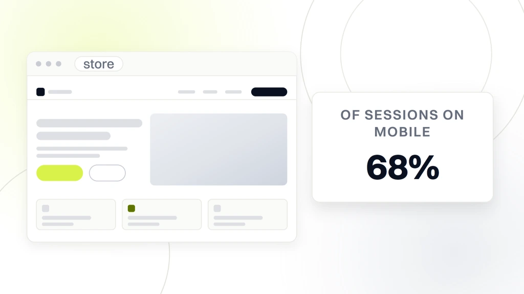
Mobile web design for ecommerce stores where 68 percent of sessions live
Mobile ecommerce web design tips run the surface with the widest gap between the best stores and the average. DTC store analytics show 65 to 72 percent of sessions land on mobile, and roughly 55 percent of orders close on mobile. If your mobile CVR sits under two-thirds of your desktop CVR, the store has a mobile design problem, not a traffic problem.
Touch targets and thumb zones
Every interactive element on mobile gets a 44 pixel minimum touch height and enough padding around it that a thumb click does not misfire onto the neighbor. The Nielsen Norman Group covers touch target sizing evidence in depth, and the numbers hold up across every DTC A/B test we’ve run. Primary calls to action live in the bottom third of the viewport, where the thumb naturally rests. Cart, search, and menu icons live at the bottom nav on mobile, not the top. Header space is precious on mobile, so most stores over-fill it with logo, search, cart, hamburger, wishlist, and account. Cut it to logo plus search on top, cart plus menu plus account at bottom nav.
The mobile PDP scroll pattern
Mobile PDPs win when they use a sticky add-to-cart bar that reveals on scroll past the fold. The shopper reads the reviews, opens the size guide, checks the delivery copy, and the add-to-cart button follows down the page. Without it, every scroll past the fold is a fresh chance to bounce. Sticky add-to-cart on mobile is worth 10 to 18 percent on mobile CVR against the same PDP without it. The one design rule is that the sticky bar collapses on the reviews section so the review scroll does not fight the button. Small detail, real impact. Our deeper piece on mobile-friendly ecommerce web design covers the theme-level structural changes if the sticky bar alone is not enough.
Site speed inside ecommerce web design tips (Core Web Vitals in the green)
Speed is not a nice-to-have. Google’s own studies published on web.dev peg every additional second of LCP against a 7 to 12 percent drop in conversion. Ecommerce web design tips that ignore speed skip the surface with the highest per-hour ROI in the audit backlog.
Green Core Web Vitals targets
- LCP under 2.5 seconds on mobile (Largest Contentful Paint, the hero product image render).
- INP under 200 milliseconds (Interaction to Next Paint, the click response on add-to-cart).
- CLS under 0.1 (Cumulative Layout Shift, the wiggle when late-loading elements arrive).
- TTFB under 800 milliseconds (Time to First Byte, the server response floor).
- Total page weight under 1.5 MB on the PDP, under 2 MB on the homepage.
- Third-party script count under 20 on any page. Every script above 20 costs 40 to 80 ms of INP.
The 5 wins that move the numbers
Five fixes cover 80 percent of the speed backlog on almost every Shopify or WooCommerce store. Preload the LCP image with fetchpriority high. Convert every product photo to WebP with AVIF fallback via picture tag. Defer non-critical JavaScript (chat, reviews widget, upsell app) until first interaction. Remove any font stack over 3 weight variations (each Google Font weight costs 30 to 60 KB). Trim third-party pixel scripts to the 2 or 3 you actually attribute against. That is the 5-item list. Everything else is fine-tuning.
Trust signals in ecommerce web design that read as evidence
Trust signals are the ecommerce web design tips category most brands over-engineer. A row of 6 payment logos in the footer does nothing. A grid of 20 press mentions does less than one specific review quote next to the product photo. Real trust signals earn their pixels by answering an unspoken question.
Every DTC store eventually adds a footer badge that reads As Seen In Vogue, right next to a badge that reads Featured in Forbes, right next to the ISO 9001 icon nobody has ever verified. Somewhere on the internet, right now, a founder is spending Sunday afternoon designing a new As Seen In row for a homepage nobody scrolls that far down.
The 5 trust signals that work
Five signals do real work. Verified review count with average star rating in the header (Trustpilot, Judge.me, Okendo) as a small badge. Three review quotes with photos on the PDP above the fold. A single sentence returns policy under the add-to-cart button. A delivery guarantee (arrives by Wednesday or we refund the delivery fee) in the cart drawer. A visible customer support channel (chat, phone, email response time) in the footer plus header. These beat every logo grid and every celebrity endorsement panel we have tested. Shopify’s own research on trust signal placement pairs well with what Cloudways published on the levers that raise store conversion.
Testing ecommerce web design tips before you roll them site-wide
Every ecommerce web design tips backlog needs a test cadence, not a redesign sprint. Roll one change onto one surface, measure for 2 to 4 weeks, and keep or revert based on data. Founders who redesign the whole store on a hunch spend 6 months and $40k finding out one thing the four-week test would have told them for $0.
What to measure per surface
Each surface gets a specific metric. Homepage tests measure homepage-to-PLP click rate and bounce. PLP tests measure PLP-to-PDP click rate and time on PLP. PDP tests measure add-to-cart rate and PDP scroll depth. Cart tests measure cart-to-checkout rate and AOV. Checkout tests measure checkout completion. Mobile-specific tests split the same metrics by device. Speed tests measure LCP and INP against conversion rate. A test cadence of 2 changes per surface per quarter, run for 4 weeks each, is enough to move any DTC store 20 to 40 percent on conversion inside a year without a rebuild. Redesign is the enemy of testing.
A sample 4-week test slate
Week one, roll out a sticky mobile add-to-cart on the top 20 PDPs. Measure mobile CVR against the previous 4 weeks. Week two, hide the discount code field on the cart page and replace it with a captured-email discount tier. Measure cart-to-checkout rate. Week three, add a free-delivery progress bar to the cart drawer. Measure AOV. Week four, cut third-party scripts from 27 to 18 by pausing the wishlist app and the abandoned-cart popup that overlap the primary email flow. Measure LCP and mobile CVR. Four changes across 4 surfaces. Every one either passes and stays or fails and rolls back. Nothing moves by taste, everything moves by number.
A real DTC store that applied these ecommerce web design tips
Boogie Board, a US-based ecommerce brand selling reusable digital writing tablets, came to us with a Google Ads program that ran hot on spend and cold on close rate. The ad targeting was loose, the landing pages were slow, and the funnel had no nurture path for shoppers who added to cart but did not check out. Ecommerce revenue was flat against a growing category. Every ecommerce web design tips lever we ran the audit against showed room to grow. That store fit the profile our ecommerce web design company breakdown covers in more depth on the agency-selection side.
Our team ran the six-surface audit and prioritized 8 changes. Landing page hero rebuilt above the fold with product, price, and CTA in the first viewport. Google Ads targeting tightened around intent-heavy keyword clusters. Cart drawer added a free-delivery progress bar and a single upsell slot. Sticky mobile add-to-cart on the top-selling SKUs. Discount code field hidden until checkout step 2. LCP image preloaded and Third-party script count trimmed. Sitewide switch from PNG hero images to WebP with AVIF fallback. A retargeting flow that caught the shoppers who bounced from the PDP.
Over the following year, Boogie Board boosted conversion rate by over 11 percent, drove cost per sale down to $31, and did it against $650,000 in managed ad spend. The design work did not do all of it alone. What it did was stop the store from wasting the traffic the ads were paying for. Design tests are cumulative. Every quarter compounds on the last one, and a store that lands 2 winning tests per surface per quarter looks like a different business inside 18 months. The full walk-through of Boogie Board’s numbers lives on our Boogie Board case study.
Where these ecommerce web design tips fit the wider growth stack
Design tests sit under the marketing stack, not next to it. Paid ads, SEO, email, and content all rely on a store that converts the traffic they send. Founders who fix the funnel first make every marketing dollar work 20 to 40 percent harder. Founders who skip the funnel keep paying the same CAC for a shrinking conversion rate and blame the ad platform.
If the store is over 50 SKUs and the mobile CVR sits under 1.5 percent, the audit backlog is where you start. If the store is under 50 SKUs and traffic is under 5,000 sessions per month, marketing comes first before design work pays back. Fixing the store first is what pays back the paid media budget you were about to spend against the same conversion rate. Our ecommerce website design services page shows the retainer scope we run against DTC stores in the $500k to $20M annual revenue range, if you want the six-surface audit run against your store by a team who has walked hundreds of them. SMB web design packages start at $2,500 / $4,500 / $7,500 for a hand-built launch, custom builds price from $18K+ for larger catalogs, and ongoing maintenance runs $199 / $299 / $499 per month based on catalog size and update cadence.
The rest of the growth stack sits alongside. Paid media pointed at a converting store. SEO on category pages that treats them as landing pages, not thin lists. Email flows that catch the shopper who bounced from the cart. Reviews collection that populates the trust signals section. Every tactic gets easier when the store design is not fighting it. The ecommerce web design tips in this piece are the audit backlog you can run this quarter against a store you already own, without a rebuild, without a rebrand, and without a six-month agency engagement. Reference the Smashing Magazine work on designing better mobile checkout when you get to the checkout-specific slate. Founders scoping a bundled build should read our piece on ecommerce web design and development for the timeline and pricing detail.