
Responsive web design services live or die on one number. What percent of your booked leads came in on a phone. If under half your form fills originate from mobile, your current site is either slow, cramped, or hiding the CTA below 3 folds of hero copy. That is a service problem, not a design taste problem, and you buy the right scope from the right agency to make it go away.
This guide is the buyer view. What sits inside the scope of work. What the pricing tiers look like and what scope each one buys. How long the build takes when the shop is honest with dates. The 12 pointed questions to ask any vendor before you sign. Where the Redefine Web build differs from a template flip. Read straight through in 10 minutes. Then pull your last 90 days of GA4 and start the vendor conversation.
Mobile-first build order for responsive web design services
Mobile-first is where the pitch gets abused most. Every agency claims it. Almost none of them build that way in practice. Mobile-first means the designer draws the phone layout first, the developer writes the phone CSS first, and the QA tester opens the phone view first on every page. Desktop styles get layered on after. If the agency opens Figma at 1440px and squeezes the layout down, you are not buying mobile-first. You are buying a desktop file with a hamburger menu bolted on.
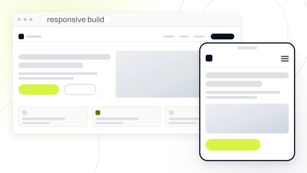
The other tell is how the agency handles the desktop-to-mobile handoff during design review. Real mobile-first shops walk through the phone frames first in every review. They demo interactions on a phone in your hand, not on their laptop. They set expectations that the desktop layout comes second and the copy might get trimmed to fit the phone screen. Vendors who do mobile-first as a checkbox flip the order. They present desktop, then say “and here is how it looks on mobile” as an afterthought. That reversal tells you they built desktop-first and squeezed it down.
Ask the agency for one file. Their most recent mobile Figma frame. If the answer is a screenshot of a desktop file resized in a browser, that is your answer. Real mobile-first shops build every prototype at 375px first. They test touch targets at 44px minimum. They set the primary CTA above the phone fold. They collapse 3-column desktop grids into single-column mobile flows with a clear scroll order. They use system fonts or a variable font that loads under 30KB per weight.
Touch targets, thumb zones, and the 44px rule
Every button, link and form field on a mobile view needs at least a 44px by 44px touch target. WCAG 2.2 requires 24px minimum. Apple recommends 44. Google recommends 48. Redefine Web builds at 48px because thumb reach on a 6.7 inch phone is a real ergonomics problem, not a design opinion. Primary CTAs sit in the bottom thumb zone. Secondary links live in the top nav. Content sits in the middle. That vertical order matches how your prospect physically holds the phone at 8 pm on a Tuesday when they are shopping vendors.
Forms that convert on mobile
The form is where most mobile visitors get lost. Long forms on desktop convert at 4 to 6%. The same form on mobile converts at 1 to 2% because scrolling through 12 fields on a phone kills the momentum. Cut mobile forms to 3 or 4 fields. Use the right input types so the phone keyboard shows numbers on the phone field and email on the email field. Use inline validation. Auto-fill the state and city from the ZIP. Every one of those changes pulls another 15 to 30% of would-be abandoners across the line.
The other form killer on mobile is a poorly placed submit button. If the CTA sits above the last field, the visitor has to scroll back up after filling. That kills the momentum. Place the submit button directly under the last field. Make it 48px tall. Make it the highest-contrast color on the screen. Add loading state so the visitor knows the click registered. Confirm success on the same screen, not on a redirect that costs 1.5 seconds of trust.
Page speed budgets responsive web design services actually hit
Page speed is not a nice-to-have. It is the second-strongest ranking signal in local search and it correlates directly with mobile conversion. Google’s own research shows every 1 second added to mobile load time drops conversions 12 to 20%. You do not need to hit a 100 Lighthouse score. You do need to hit LCP under 2.5 seconds, INP under 200ms and CLS under 0.1 on 4G mobile in production.
Real teams hit those numbers by budgeting the site before they build it. Total page weight under 1MB. Hero image under 100KB in WebP. Fonts under 60KB total. JavaScript under 150KB gzipped on the homepage. Above-the-fold CSS inlined. Below-the-fold CSS loaded async. Third-party scripts audited quarterly. Every image lazy-loaded except the hero. See web.dev Core Web Vitals for the current thresholds Google measures against.
LCP budget on 4G mobile
Largest Contentful Paint is your hero image or hero H1. Under 2.5 seconds on 4G is the Google threshold. Under 1.8 seconds is the Redefine Web internal target. Get there by preloading the hero, serving WebP with a proper srcset, using fetchpriority=”high” on the hero image tag, and inlining above-the-fold CSS. That single set of 4 changes usually cuts 800ms to 1.4s off the LCP number on a typical WordPress site. Test in production, not local. Local always lies.
CLS and INP the underrated metrics
Third-party JavaScript is where most sites blow the budget. Chat widgets. Analytics tags. Marketing pixels. A/B testing tools. Every one of these ships 50KB to 300KB of JavaScript and runs on the main thread. Audit them quarterly. Cut the ones that show 0 measurable value. Load the survivors async or defer. Move any that can run server-side to server-side. The page weight drops. The INP score drops. The bounce rate drops with it.
Cumulative Layout Shift measures how much your page jumps around while loading. INP measures how fast the page responds when a user clicks anything. CLS above 0.1 tanks trust in the first 3 seconds because buttons move under the reader’s thumb. INP above 200ms makes the site feel broken on a 3-year-old phone. Repair CLS by setting width and height on every image, reserving space for ad slots, and loading fonts with font-display swap. Repair INP by cutting third-party JavaScript and deferring anything not needed above the fold.
The third piece of the puzzle is server response time. Time to First Byte under 600ms is the target on shared hosting. Under 300ms is the target on managed WordPress hosting. If TTFB is over 1 second, no amount of front-end work will save the LCP number. That is a hosting problem, not a design problem, and the vendor should call it out in the audit before the design phase even starts. Redefine Web moves clients off shared hosting during the build phase, not after.
Accessibility and on-page SEO inside responsive web design services
Accessibility is not a nice thing you tack on at the end. It is a legal and revenue line item. ADA lawsuits filed against inaccessible websites topped 4,000 in 2024. Every settlement runs between $10K and $75K plus the cost of the remediation you were going to have to do anyway. Buying accessibility inside the build costs less than 1 settlement.
WCAG 2.2 AA is the reasonable floor. That covers color contrast 4.5:1 for body text, keyboard-navigable everything, focus-visible outlines on interactive elements, real alt text on all informative images, proper heading order, form labels for every input, and error messages linked to the field via aria-describedby. Redefine Web tests accessibility using both automated tools (axe, Lighthouse, Wave) and manual keyboard walkthroughs. Automated tools catch 40 to 60% of issues. Human testing catches the rest.
Why accessibility overlays fail
The most common accessibility mistake is around color contrast in interactive states. Buttons look great in default state but drop below 4.5:1 contrast when hovered or focused. That fails WCAG and creates real friction for low-vision users. Every button gets tested in default, hover, focus, active, and disabled states before launch. Same for form inputs. Same for links. That is 5 states per interactive element checked manually by a real tester. Automated tools miss most of these.
Accessibility overlays are the $50/mo widgets that promise instant WCAG compliance. They do not work. Every major ADA case in the last 3 years has ruled against sites using overlays as the sole remediation. Screen reader users disable them. Keyboard-only users find them worse than the raw site. The Department of Justice has stated plainly that overlays alone do not meet WCAG. Buy real remediation inside the build.
On-page SEO baked in at build time
SEO belongs inside scope, not layered on 6 months later by a different vendor. The top 30 URLs of the new site should launch with focus keywords set, meta descriptions written, H1s tuned, internal linking mapped, image alts filled, and JSON-LD schema live. LocalBusiness schema goes on the Contact page and the homepage. Service schema goes on every service page. Organization schema goes on the homepage. Article schema goes on every blog post. FAQPage schema goes on any page with a real FAQ section. Every schema type gets tested against Google’s Rich Results Test before launch and re-tested quarterly.
Internal linking is the other build-time SEO item most vendors skip. Google reads your site the way a new reader does. Homepage links to top service pages. Service pages link to related industry pages. Industry pages link to relevant blog posts. Blog posts link back to service pages using anchor text that matches the target keyword. That hub-and-spoke structure passes link equity, teaches Google what each page is about, and moves booked-lead pages up the SERP faster than any external link campaign will. Build it once during launch. Maintain it during retainer.
Image alt text is the third build-time SEO item that pays back for years. Every image needs alt text that describes the image and includes a secondary keyword where it fits naturally. Not the primary focus keyword on every image. That reads as spam. Vary the alt text across images so Google understands the page covers multiple related terms. Decorative images get empty alt attributes so screen readers skip them. Informative images get real descriptive text. Product images get the product name.
Tilghman Builders results after buying responsive web design services
Tilghman Builders came to Redefine Web in 2015 with a referral-only book and $1.5M in annual revenue. Their site was a 5-page brochure built on a stock theme. Mobile was cramped. Load time was 5.8 seconds on 4G. The contact form asked for 12 fields. Booked leads from the site averaged 3 per month. Nine years later, Tilghman Builders runs at $6.8M annual revenue with a 784% traffic gain and a 637% gain in marketing-qualified leads.
The scope covered a full rebuild on a custom WordPress theme with a mobile-first layout, a 4-field form, WCAG 2.2 AA remediation, LCP under 2.1 seconds on 4G, 30 URLs of on-page SEO, and full LocalBusiness plus Service schema. Every item sat inside the initial scope. The rest of the growth came from ongoing content and paid media on top of the foundation. But the site build is what allowed it. A slow, cramped, form-heavy site would have capped the growth at 30 to 40% no matter how much Tilghman spent on ads.
What went live at launch
Tilghman also standardized on a single call-tracking number tied to the new site. That number ran in CallRail with dynamic number insertion so every ad campaign got its own tracked call flow. Within 60 days of launch, the team could attribute booked jobs to specific service pages and specific ad groups. That attribution enabled the paid media scale-up in year 2 because every dollar spent had a traceable return. The build made the tracking possible. The tracking made the scale possible.
The 4-field form doubled conversion rate within 30 days. The LCP drop from 5.8s to 2.1s pulled the site into the top 3 organic results for 2 of the 3 primary service terms inside 90 days. The LocalBusiness schema triggered rich results in Google Search that boosted branded CTR by 22%. The internal linking structure gave Google a clear map, and organic traffic climbed 42% in the first 6 months before the content and paid layers kicked in. Every win came from build-time decisions, not from post-launch optimization.
Vetting a responsive web design services vendor before you sign
The vetting call is where you separate the 5-week template flips from real build teams. Book a 45-minute call. Send the 12 questions below in advance. Take notes. If the vendor cannot answer 10 of the 12 without checking with a developer, walk. The sales team of a real agency has already run this conversation 400 times. They answer without hesitation.
- What is your typical LCP number on 4G mobile for a launched site
- Which accessibility standard do you test to and how do you test
- How many rounds of design revisions are in scope
- Who writes the copy and how are the top 30 URLs SEO’d
- Which schema types go live at build time by default
- What is your handoff for CMS training
- What does post-launch monitoring cover and how long
- Which analytics and call tracking are configured at launch
- What is your refund or guarantee policy if you miss the timeline
- Can I speak to 2 current clients from the same industry
- How do you handle change requests during the build
- Who is my day-to-day contact and what is their response SLA
How to run the vetting call itself
Book a 45-minute Zoom, not a 15-minute intro call. Ask the vendor to screen share throughout. Ask to see a live launched client site during the call, not case study PDFs. Ask them to run PageSpeed Insights on that client site live. Watch how they react to a low score. A good vendor will explain the score and walk you through what they would do about it. A bad vendor will blame the client or blame Google. Both reactions tell you everything about how they will handle your build when things get hard.
Follow the call with a written recap. If the vendor cannot send you a scope document with dated milestones and priced deliverables inside 48 hours of the call, that timeline is a preview of how they will treat your project. Real agencies have scope templates ready. They fill in your specifics and send. Slow scope docs mean slow project management. Fast scope docs mean the shop knows exactly what they do and how much it costs.
Red flags to walk from
Walk if the sales rep will not put an LCP number in the SOW. Walk if they cannot name the WCAG version they build to. Walk if the timeline is under 5 weeks for a custom SMB build. Walk if the reference clients are all from the last 60 days. Walk if the response to “which schema types” is a blank stare. Walk if they need to check with the developer to answer basic technical questions.
Green flags to lean into
A live PageSpeed report for a launched client site pulled up during the call. A screen share of a mobile Figma frame with real 44px touch targets and a bottom-thumb CTA. A named lead designer, lead developer and lead project manager introduced by name during vetting. A written SOW with dated milestones and payment tied to milestones, not calendar time. A refund clause tied to timeline miss. References who answer the phone. Case studies with real numbers, not stock testimonials.
Timeline, pricing tiers, and post-launch scope for responsive web design services
A real custom SMB build takes 6 to 12 weeks. Anything under 5 weeks is a template flip with a new logo. Anything over 16 weeks is scope drift or a vendor that has too many clients. The honest cadence looks like this. Week 1 covers discovery and content audit. Weeks 2 to 4 cover wireframes and content writing. Weeks 4 to 6 cover visual design and revisions. Weeks 6 to 9 cover front-end and back-end build. Weeks 9 to 11 cover QA and accessibility remediation. Week 12 covers launch and 30-day monitoring.
Redefine Web publishes its web design tiers on the web design services page, with the scope each one covers. Enterprise starts at $25,000 for custom scope. Maintenance runs $199, $299, or $499 per month after launch.
Payment milestones that protect both sides
Payment should land in 4 tranches tied to milestones, not to calendar dates. Twenty percent at kickoff. Thirty percent at wireframe approval. Thirty percent at visual design approval. Twenty percent at launch. That structure protects you if the agency slips and protects the agency if you go dark on approvals for 2 weeks. Never pay 100% upfront. Never pay 100% at launch either. Both extremes create bad incentives that hurt the final product.
Contract length and ongoing scope
The build contract runs the length of the project plus a 30-day post-launch monitoring window. After that, ongoing scope splits into 2 options. A maintenance retainer at $199, $299, or $499 per month keeps the site secure, backed up, and updated. A growth retainer at $999 or more per month adds new pages, blog content, and ongoing SEO. Most Redefine Web clients start with maintenance for 3 months, then upgrade to growth once the baseline analytics are in.
The typical Redefine Web engagement runs 6 months minimum for a growth retainer, quarterly minimum for maintenance. That gives both sides enough time to see the numbers move and adjust scope. Shorter contracts create bad incentives on both sides. The agency rushes work to hit the exit date. The client cannot see meaningful results in 30 days. Six months is the honest floor for a growth relationship, and every retainer is priced accordingly.
Post-launch monitoring built into the scope
Post-launch is where cheap builds fall apart. A real scope includes a 30-day monitoring window at no extra cost. Uptime alerts through UptimeRobot firing at 99.9% SLA. Core Web Vitals tracked daily in PageSpeed Insights. Form submissions logged in the CMS with weekly review. 404 monitoring through Google Search Console. Backup verification weekly. Any regression gets a repair inside 3 business days at no extra cost. After the 30-day window closes, ongoing coverage rolls into a maintenance retainer.
Analytics live on day one is the other post-launch requirement. GA4, Search Console, and a call tracker like CallRail or WhatConverts should be live on the site the hour it launches. Conversion events should fire correctly on form submission, phone click, and any other primary conversion. Test them in Real-time reports before the DNS cuts over. If the tracking is not confirmed live on day one, you lose the baseline data that tells you whether the site is working 3 months later. See the MDN Web Security reference for the security baseline every launch also needs.
Where to start on responsive web design services this week
Start with your current numbers. Open GA4. Pull the last 90 days. Note 4 metrics. Total sessions. Mobile session share. Mobile bounce rate. Mobile form conversion rate. If mobile session share is over 55% and mobile conversion rate is under 2%, you have a mobile-first problem, not a copy problem or an ads problem.
Compare total cost of ownership over 3 years, not just the build fee. A $4,500 growth-tier build with a $299/mo maintenance retainer runs $15,264 over 3 years. A $200/mo Squarespace subscription runs $7,200 over the same window. But the Squarespace site converts at half the rate on mobile, ranks for a fraction of the keywords, and forces a full rebuild in year 4 when you outgrow it. Real ROI runs the math on booked leads, not on invoice size. Almost every service business over $500K revenue wins by paying more upfront for the site that ranks and books.
The second step is content inventory. List every page on your current site. Note which pages get organic traffic in the last 90 days. Note which pages get 0 traffic. Traffic pages migrate. Zero-traffic pages get archived or merged. That inventory pass usually cuts the new site down from 40 pages to 15 pages, and the trimmed site ranks better because Google understands the topic focus. A trimmed site is faster to build, cheaper to maintain, and easier to keep sharp over time.
The third step is the vendor shortlist. Pull 5 candidates. Check their Clutch profiles for recent reviews. Look for reviews in the last 90 days from clients in your revenue band and industry. Skip vendors whose reviews are all 5-star with generic praise. Real reviews mention specific numbers, specific problems, and specific resolutions. Book 3 vetting calls. Send the 12 questions in advance. Take notes. The vendor who answers 10 of 12 without hesitation is your shortlist winner.
Run PageSpeed Insights on your homepage and top 3 service pages. Note the LCP, INP and CLS numbers on mobile. If LCP is over 3.5 seconds, the site needs a real speed rebuild before any other layer will pay back. Open the site on your phone and try to book a lead. Count the clicks from homepage to submitted form. If it takes more than 5, the flow needs a redesign. Those 3 data points together tell you whether a quick-repair rebuild solves the problem or whether a full rebuild is the real answer. When you are ready to run the build with a team that hits Core Web Vitals, WCAG 2.2 AA and on-page SEO inside the SOW, our Responsive web design services page covers the full stack, retainer starts at $999/mo. For the local ranking side that pairs with the build, our Mobile responsive web design writeup covers the conversion math. For the how-to on breakpoints, our Responsive web design breakpoints guide walks through screen-size targets. For the pricing side, our Responsive web design cost guide breaks down every tier. Reference the MDN Responsive Design guide for the technical foundation.