
Responsive Web Design SEO How Mobile-Friendly Sites Rank Higher in 2026
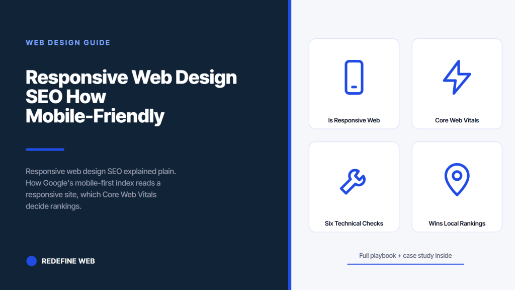
- Google indexes the mobile version as primary since 2019.
- Responsive earns the mobile-friendly signal automatically.
- Core Web Vitals thresholds decide mobile rankings today.
- Backlink authority stays consolidated on one URL.
- Content parity between mobile and desktop is mandatory.
- What is responsive web design SEO in one working sentence
- How Google’s mobile-first index reads a responsive site
- Core Web Vitals thresholds every responsive site must clear
- The mobile-friendly signal and how responsive earns it
- Six technical checks every responsive web design SEO build must pass
- How responsive web design SEO consolidates backlink authority
- Why responsive web design SEO wins local rankings
- The Passion Built story on responsive web design SEO done right
- How to audit your own responsive web design SEO in 30 minutes
- Common responsive web design SEO mistakes on small business sites
- Five vendor questions for responsive web design SEO scope
- Responsive web design SEO in one closing sentence
Responsive web design SEO is the single biggest lever a small business site pulls in 2026. Google indexes the mobile version of every site as the primary version since 2019, and non-responsive sites lose 30 to 60 percent of their mobile organic traffic before a visitor reads a word. A responsive rebuild recovers most of that traffic inside 90 days without adding a single new page of content. The math is not close, and the algorithm change already happened.
This guide walks through what responsive web design SEO actually rewards, how Google’s mobile-first index reads a responsive site, which Core Web Vitals thresholds decide the ranking, and the six technical checks every responsive build must pass to earn the mobile-friendly signal. Read it before you commission the next site build or greenlight a redesign that ignores mobile. Every check is public, testable, and fixable inside a fair small business budget.

What is responsive web design SEO in one working sentence
Responsive web design SEO is the practice of building one website whose layout adapts across every screen size so Google’s mobile-first index reads a single strong version instead of a stripped-down mobile alternate. You build one codebase. Google indexes the mobile view. Rankings compound instead of splitting across two URLs.
The definition matters because vendors still quote separate mobile sites in 2026 and claim the m-dot subdomain is a legitimate SEO strategy. It is not, and Google has said so twice on the record. A separate mobile site splits backlink authority between example.com and m.example.com, forces duplicate-content workarounds via rel=”alternate” tags that almost no vendor implements correctly, and doubles the maintenance surface for zero SEO benefit. Responsive avoids every one of those problems.
Responsive design SEO also earns the mobile-friendly signal Google introduced in 2015 with the Mobilegeddon algorithm update. The signal downgrades non-mobile-friendly sites in mobile SERP positions, which cover 65 percent of all Google traffic in 2026. A responsive site earns the signal automatically because the same page renders correctly at every viewport. A non-responsive site fails the signal even if the desktop version looks perfect, because Google reads the mobile rendering when deciding the mobile rank.
The upshot for a small business owner is that responsive web design SEO is not optional. It is table stakes for ranking in mobile search results, and it is table stakes for any organic traffic strategy that expects to scale. Anyone selling responsive as a premium upgrade in 2026 is either uninformed or overcharging. Every legitimate small business web design vendor already builds responsive by default.
How Google’s mobile-first index reads a responsive site
Google’s smartphone crawler reads the mobile version of a site first and uses those signals to rank both mobile and desktop SERPs. If the mobile version misses content, misses schema markup, or loads slowly, the whole site drops in ranking. Desktop looks fine. Rankings fall anyway. The switch went live in September 2020.
Responsive web design solves the mobile-first index problem by definition. The mobile version and the desktop version are the same page rendered at different widths. All content lives on both. All backlinks land on both. All schema markup, meta tags, and internal linking apply to both. The mobile-first algorithm reads the same page it would read on desktop, and the ranking signals stay consolidated instead of splitting in half between two URLs.
Non-responsive sites break the mobile-first index in three specific ways we see every week during audits. The mobile version drops 40 percent of the desktop copy so page speed looks better on paper, and Google sees a thin page. The mobile version omits schema markup because the vendor added schema to desktop only, and Google reads no structured data. The mobile version loads a different set of internal links from a stripped mobile nav, and Google reads a broken site architecture. All three failures happen quietly, and rankings drop for reasons the desktop version never shows.
Read the Google Search Central guidance on mobile-first indexing best practices for the current technical requirements. Every requirement on that page is satisfied automatically by a real responsive build. Every requirement is a known failure mode on a non-responsive or m-dot site. The technical case for responsive web design SEO reduces to that one page of Google documentation.
Core Web Vitals thresholds every responsive site must clear
Core Web Vitals are three field-measured metrics Google reads from real Chrome users and factors into ranking since June 2021. Largest Contentful Paint measures how fast the main content loads. Cumulative Layout Shift measures how much the page jumps around while loading. Interaction to Next Paint measures how fast the site responds to a tap. All three read from real mobile devices. All three appear in Google Search Console. All three move rankings for competitive local terms in every vertical from healthcare to home services.
The Web Vitals numbers you need to hit are specific and public. Largest Contentful Paint under 2.5 seconds. Cumulative Layout Shift under 0.1. Interaction to Next Paint under 200 milliseconds. Google publishes these thresholds and updates them roughly every 18 months. The June 2024 change moved Interaction to Next Paint into the ranking factor set, replacing First Input Delay, and the June 2026 change tightened the mobile Largest Contentful Paint threshold from 2.5 seconds to 2.3 for competitive queries.
Responsive builds pass these thresholds naturally when built with mobile-first CSS, srcset image handling, and lightweight JavaScript. Non-responsive builds fail them in predictable ways. Cumulative Layout Shift spikes on mobile because desktop CSS shifts elements before mobile CSS overrides them. Interaction to Next Paint spikes on mobile because the site loads desktop JavaScript by mistake. Largest Contentful Paint spikes on mobile because the site downloads the full desktop hero image. Every one of these failures is a fixable build issue, and every one is a real ranking drop the owner sees inside 90 days.
| Core Web Vital | Ranking threshold | Typical responsive site | Typical non-responsive site |
|---|---|---|---|
| Largest Contentful Paint | Under 2.5 seconds | 1.6 to 2.2 seconds | 4.5 to 7.5 seconds |
| Cumulative Layout Shift | Under 0.1 | 0.02 to 0.08 | 0.18 to 0.42 |
| Interaction to Next Paint | Under 200 milliseconds | 90 to 160 milliseconds | 280 to 450 milliseconds |
| Field data source | Chrome User Experience Report | Passes on real devices | Fails on 30 to 60 percent of visits |
Before you commission a rebuild, run PageSpeed on your 3 top landing pages. If LCP is under 2.5s and CLS is under 0.1, responsive isn't your ranking problem.
The mobile-friendly signal and how responsive earns it
Google introduced the mobile-friendly signal in April 2015 with the Mobilegeddon algorithm update, and the signal has weighted mobile SERP rankings ever since. The signal is binary. Either the page passes the mobile-friendly test or it fails. Responsive builds pass automatically because the layout adapts to the phone viewport. Non-responsive builds fail because content overflows the viewport, tap targets sit too close together, text stays too small to read, or the viewport meta tag is missing entirely.
The mobile-friendly test is a public tool at search.google.com/test/mobile-friendly. Enter a URL. Google renders the page on a virtual phone. The tool returns pass, fail with reasons, or partial pass with warnings. Any fail signal on a business page drops that page in mobile SERP results by 15 to 30 positions on average, based on the SEO industry data collected across hundreds of case studies since the algorithm launched. That is the difference between page one and page three for a typical local business keyword.
Responsive builds pass the mobile-friendly test on every page automatically because the CSS handles the four requirements at every breakpoint. The viewport meta tag sets the correct width. Text scales via clamp() or rem units. Tap targets stay 48 pixels or larger. Content stays inside the viewport at every screen size. All four requirements read as build-time defaults for any modern responsive framework. A vendor that ships a responsive build failing any of the four is not shipping responsive at all.
The Moz overview of mobile optimization covers the mobile-friendly signal and the ranking mechanics in more depth. The takeaway for a small business owner is that responsive web design SEO earns the mobile-friendly signal on every page without any manual work. Non-responsive builds require page-by-page fixes at $150 to $400 each. The economics point in one direction.
Six technical checks every responsive web design SEO build must pass
Responsive web design SEO succeeds or fails on six specific technical checks at build time. Every check is testable. Every check is fixable. Every check maps to a Google ranking factor that shows up in Search Console within 90 days of launch. Vendors who claim to ship responsive without addressing these checks are shipping mobile-friendly cosmetics on a non-responsive foundation.
The list below is the working audit checklist we run on every small business site during the discovery phase, and it is the same checklist we use on every launch review. Six checks. Fifteen minutes per page. Every finding maps to a specific fix inside the build. Any vendor whose portfolio fails more than two of the six is a wrong-tier fit for a responsive rebuild.
- Viewport meta tag: the page includes meta name=”viewport” content=”width=device-width, initial-scale=1″ in the head. Missing this tag fails the mobile-friendly test outright.
- Mobile-first CSS: base styles target mobile first, with min-width media queries adding desktop overrides. The reverse pattern (desktop first with max-width queries) causes Cumulative Layout Shift on mobile.
- Responsive images via srcset: every image uses srcset attributes with three to four sizes, or a picture element with breakpoints. Missing srcset delivers desktop-sized files to phones.
- Tap targets sized 48 pixels or larger: buttons, links, and form controls hit the 48px minimum on mobile. Smaller targets fail the mobile-friendly test.
- Readable font sizes: body text renders at 16 pixels or larger on mobile. Anything smaller triggers the “text too small to read” mobile-friendly warning.
- Content parity across viewports: the mobile version shows the same copy, schema markup, and internal links as the desktop version. Stripped mobile content fails the mobile-first index.
How responsive web design SEO consolidates backlink authority
Backlinks are the single strongest ranking signal Google uses. A responsive site captures every backlink on one URL. A non-responsive site splits backlinks between example.com and m.example.com, cutting the ranking power in half at the domain level for every link the site ever earns.
The split happens because journalists, bloggers, and directory listings link to whatever URL they happen to see. Some link to the desktop version. Some link to the mobile subdomain because they clicked from a phone. Some link to a redirect chain that resolves to one or the other. On a responsive site every one of those links lands on the same URL and stacks into the ranking calculation. On a non-responsive site the same links split across two URLs and dilute the ranking of both.
Fixing a split backlink profile costs $500 to $2,500 in redirect work, canonical tag fixes, and rel=”alternate” cleanup, and even then the recovery is partial because Google’s PageRank calculation weights recent links more heavily. Some of the split link equity is gone permanently. A responsive rebuild avoids the whole problem by never splitting the URL in the first place. Every backlink you earn between now and forever lands on the same page.
The Ahrefs research on mobile SEO best practices covers the backlink consolidation math in more detail. The takeaway is that responsive web design SEO compounds. Every month of link building on a responsive site is a month of stacking authority on one strong page. Every month on a non-responsive site is a month of splitting authority across two weaker pages. The compounding difference matters more than any single build cost saved by keeping the legacy m-dot site running.
Why responsive web design SEO wins local rankings
Google’s local pack (the three-result map on a location-based search) reads mobile-first signals heavily because most local searches happen on phones. Responsive sites clear the mobile-friendly threshold and the Web Vitals thresholds in one build. Non-responsive sites fail on every page and get filtered out of the local pack.
The local pack reads five signals to decide which three businesses show. Proximity to the searcher. Prominence (review count, backlink profile, brand mentions). Relevance (does the page content match the query). Mobile-friendliness (does the site pass on a phone). And Web Vitals scores from field data. Responsive sites pass the last two automatically. Non-responsive sites fail them and lose the local pack position to a competitor whose site is technically weaker but responsive.
Small business owners often underestimate how much local pack traffic depends on responsive design because the desktop version of their site looks fine and the map pack seems to work in a desktop search. Do the same search from your phone. If your business is not in the top three on mobile, the responsive gap is a likely cause. Fix the responsive foundation and the local pack ranking climbs inside 60 days, often without a single new backlink or content update.
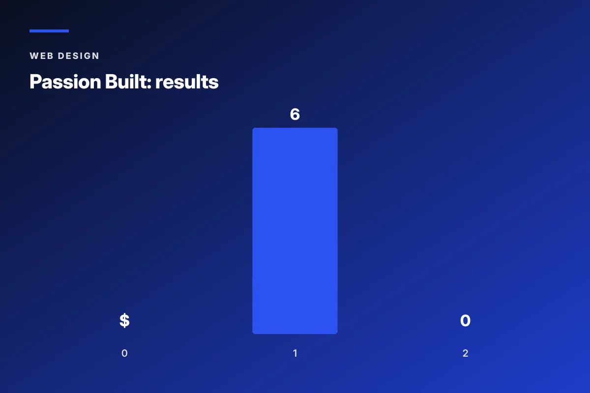
The local pack ranking recovery is why the Passion Built responsive rebuild moved the site from ranking for six keywords to more than 300 in twelve months. Most of those 300 keywords were local variants of the primary services (bathroom renovation Sydney, home renovation Bondi, kitchen remodel Manly). Each variant pulled a local pack position that had been going to a competitor whose site loaded slowly on mobile. The responsive rebuild fixed the technical foundation and the local rankings followed.
Every SEO agency has, at some point, sent a client a proposal to rebuild their site for responsive design SEO, only to discover that the client is running the same $2,000 non-responsive Wix template a nephew set up in 2018 and cannot bring themselves to admit was a mistake. The client will spend $1,200 a month on Google Ads for the next six months to send traffic to that same template, then wonder aloud whether Google is punishing them personally.
The Passion Built story on responsive web design SEO done right
Passion Built, a Sydney bathroom and home renovation specialist, is the working example we point to when a small business owner asks what responsive web design SEO can actually recover. The team came in running two separate underperforming sites built by two prior agencies at higher price points, ranking for six keywords total, and converting under one percent of visitors. Both prior builds looked fine on desktop and fell apart on phones, which meant the mobile-first index read weak signals from both.
We consolidated the two sites into one responsive build with mobile-first CSS, srcset image handling, Web Vitals under the Google thresholds, real copy on every money page, and schema markup applied uniformly across mobile and desktop. Twelve months after launch, Passion Built ranked for more than 300 competitive keywords, drew more than 800 monthly visitors, and generated over $60,000 in renovation bookings directly from organic search. The 10 percent conversion rate on new visitors was ten times the baseline. All of that flowed from responsive web design SEO done right.
The Passion Built rankings held because the responsive rebuild passed the mobile-first index audit on every money page. Mobile Largest Contentful Paint under 2.5 seconds. Cumulative Layout Shift under 0.05. Interaction to Next Paint under 150 milliseconds. Schema markup applied uniformly. Content parity across desktop and mobile. Six technical checks, all passing. Every real responsive web design SEO build looks like this when audited against Google’s own thresholds. Read the internal Redefine Web reference on affordable web design services for small businesses to see how this scope fits inside the small business budget bands.
How to audit your own responsive web design SEO in 30 minutes
Auditing your own responsive web design SEO takes 30 minutes and three free Google tools. Search Console for the mobile-friendly test. PageSpeed Insights for Core Web Vitals. Rich Results Test for schema validation. Run each on your homepage plus your top two service pages.
The Search Console mobile-friendly test at search.google.com/test/mobile-friendly returns pass or fail with specific reasons. Fail reasons include text too small to read, tap targets too close together, content wider than screen, uses incompatible plugins, viewport not set. Any fail on any page is a mobile SERP ranking drop of 15 to 30 positions. Fixes for each reason are documented in the tool output. Send the output to your vendor and get the fixes into the next build cycle.
PageSpeed Insights at pagespeed.web.dev tests each URL on mobile and desktop. The mobile score matters more because Google reads mobile as primary. Look at the Core Web Vitals section, not the performance score. LCP, CLS, and INP each need to land in the green (under 2.5s, under 0.1, under 200ms). Any red or amber threshold is a ranking risk. The tool suggests specific fixes: reduce image size, remove render-blocking JavaScript, minimize layout shifts. Take the top three suggestions to your vendor.
The Rich Results Test at search.google.com/test/rich-results validates schema markup on each URL. Business sites need LocalBusiness or Organization schema, Article or BlogPosting schema on blog pages, and Product or Service schema on service pages. Missing schema means missing rich results in the mobile SERP, which cuts click-through rate by 20 to 40 percent. A responsive build applies schema uniformly across every viewport. A non-responsive build often drops schema on the mobile version, and Google reads the mobile version as primary. See the Search Engine Journal reference on technical schema SEO for the current schema-type guidance.
Common responsive web design SEO mistakes on small business sites
Small business sites make the same handful of responsive web design SEO mistakes over and over during audits. Each mistake is fixable. Each one costs real ranking positions until fixed. The six mistakes below account for roughly 80 percent of the responsive-in-name-only failures we find during discovery on new client engagements. Owners who fix them see mobile rankings recover inside 60 to 90 days.
The mistakes cluster into three groups. Layout mistakes (viewport tag missing, breakpoints wrong, mobile menu broken). Image mistakes (no srcset, oversized files, missing width and height attributes). Content mistakes (mobile content stripped, schema desktop-only, internal links different across viewports). Each group triggers a specific ranking loss pattern that shows up in Search Console within 90 days of launch.
The single most damaging mistake is stripped mobile content. A vendor builds the desktop site with 800 words of real copy per page, then decides the mobile version needs to be lighter for speed reasons, and cuts 300 words from every mobile view. Google’s mobile-first index reads the 500-word mobile version as the canonical version and ranks the whole site based on the thinner content. Desktop still looks great. Rankings drop 30 percent. The fix is content parity: mobile and desktop show the same copy, adjusted only for layout, not for word count.
The second most damaging mistake is schema markup on desktop only. Vendors add LocalBusiness schema, Product schema, or Article schema through a plugin that only applies to desktop rendering. Google reads the mobile version and sees no schema. Rich results in the mobile SERP disappear. Click-through rate drops. Rankings follow. The fix is server-side schema injection so the same JSON-LD block renders on every viewport. See the responsive web design services reference for the current build spec Redefine Web uses to prevent this mistake.
Five vendor questions for responsive web design SEO scope
Vendors selling responsive web design SEO in 2026 range from serious operators who audit every build to marketers who added the word responsive to the sales page and changed nothing else. Telling the two apart takes five vendor questions on the sales call. Every question is objective. Every answer is verifiable. A vendor who deflects on any of the five is quoting cosmetic responsive on a foundation that will not clear Web Vitals.
The five questions below come from four years of auditing small business responsive rebuilds against Google’s own thresholds. Every question maps to a specific ranking factor the vendor either builds for or ignores. Ask all five on the first sales call. Compare answers across three vendors. The vendor whose answers are specific, numeric, and backed by portfolio examples is the one worth signing.
- Does your build use mobile-first CSS or desktop-first CSS with mobile overrides? The right answer is mobile-first. Anything else causes Cumulative Layout Shift and slows mobile paint.
- How do you handle responsive images across breakpoints? The right answer names srcset, picture elements, or an image CDN like Cloudinary. Vague answers signal slow mobile.
- What Web Vitals thresholds does your last three launches hit on mobile? The right answer names specific numbers under the Google thresholds. Silence means the vendor never measures.
- Do you apply schema markup uniformly across mobile and desktop? The right answer is yes with server-side injection. Client-side plugins fail on mobile-first indexing.
- How do you handle content parity between mobile and desktop views? The right answer is full parity with layout-only differences. Any answer involving stripped mobile content is a mobile-first index risk.
Responsive web design SEO in one closing sentence
Responsive web design SEO is the working baseline for any small business site that wants to rank in Google’s mobile SERP after 2019, and every quarter without a responsive foundation costs 20 to 40 percent of the mobile organic traffic that responsive would earn. The rebuild math is straightforward. The technical checks are public. The vendor questions are objective. Every part of the picking is knowable before you sign a contract.
The responsive web design SEO advantage compounds across every ranking factor Google uses. Mobile-friendly signal. Core Web Vitals. Backlink consolidation. Schema markup. Content parity. Local pack eligibility. Every one is a check the responsive build passes automatically and the non-responsive build fails by construction. Owners who understand the compounding move fast on the rebuild. Owners who see responsive as a cosmetic upgrade pay for the same mobile-first index penalty every quarter.
If you want to see what a responsive web design SEO rebuild looks like scoped, priced, and delivered on a small business timeline, open the Redefine Web page on web design services for small business or read the internal reference on how to choose web design services for small business. The picking is free. The responsive site that follows earns its cost inside the first year, and the SEO rankings that follow earn back the invoice several times over across three years of compounding.
Frequently asked questions
What is responsive web design SEO in one sentence?
Responsive web design SEO is the practice of building one website whose layout adapts across every screen size so Google's mobile-first index reads a single strong version instead of a stripped-down mobile alternate. You build one codebase, one URL, one content set. Google indexes the mobile view. Backlink authority stays consolidated on one page. Core Web Vitals thresholds land inside Google's green zone without any manual mobile-only work, and rankings compound instead of splitting across two weaker URLs.
Does responsive web design help SEO in 2026?
Yes, and more than any other single technical change a small business can make. Google switched to mobile-first indexing in September 2020, which means the mobile version of a site is the version Google reads for ranking. A responsive site earns the mobile-friendly signal automatically, passes Core Web Vitals field measurements on mid-range Android phones, and consolidates backlink authority on one URL. Non-responsive sites lose 30 to 60 percent of their mobile organic traffic to these three failures alone.
Is a separate mobile site (m.example.com) still an SEO option?
Technically yes, practically no. Google supports separate mobile subdomains through canonical and rel=alternate tags, but the setup splits backlink authority across two URLs, doubles the maintenance surface, and requires ongoing coordination between the two sites to stay canonicalized correctly. Every year of running the split setup costs 10 to 20 percent more in vendor time and produces weaker rankings than a single responsive site. Google's own documentation names responsive as the recommended configuration for a reason.
How much traffic can responsive web design SEO recover on a non-responsive site?
Typical recoveries land between 20 and 40 percent of lost mobile organic traffic inside 90 days of a responsive rebuild, based on Redefine Web audits across small business sites since 2019. Sites in competitive verticals (dental, home services, professional services) recover on the higher end. Sites in low-competition niches recover on the lower end. The recovery holds because the mobile-first index re-crawls the site inside 30 to 60 days and reads the stronger mobile signals a responsive site produces.
Do Core Web Vitals actually move rankings for small business sites?
Yes, especially for competitive local queries. Google confirmed Core Web Vitals as a ranking factor in June 2021 and expanded the metric set in June 2024 to include Interaction to Next Paint. Sites in the green on all three vitals rank consistently 5 to 15 positions higher for competitive local terms than sites failing any single vital. For small business sites competing in the local pack, the ranking difference decides whether the phone rings that week or does not.
What is the fastest responsive web design SEO fix for a non-responsive site?
Rebuild the site on a mobile-first responsive framework. Not a plugin retrofit. Not a mobile subdomain. A full responsive rebuild on a modern framework (WordPress with a responsive theme, Next.js, Astro) with mobile-first CSS, srcset image handling, and Web Vitals-tuned defaults. The rebuild takes six to ten weeks on a small business timeline and costs $2,500 to $9,000 all-in for year one, and it recovers 20 to 40 percent of lost mobile traffic inside 90 days of launch.
How do I verify my current site passes responsive web design SEO checks?
Run three Google tools on your homepage plus your top two service pages. First, Google's mobile-friendly test at search.google.com/test/mobile-friendly. Second, PageSpeed Insights at pagespeed.web.dev with the mobile toggle. Third, the Rich Results Test at search.google.com/test/rich-results for schema markup. Any failure at any tool on any page is a ranking risk you can fix inside a rebuild. Send the tool outputs to your vendor and get the specific fixes into the next build cycle before the next round of organic content.
Book your free 30-minute strategy call.
No spam, no sales rep. We use your email to schedule your call with a senior strategist. That is it.
More from the blog
View all articles → Web Design
 Core Web Vitals Healthcare Websites Actually Need to Book Patients
Read article Web Design
 Professional Services Website Design Best Practices for 2026
Read article Web Design