
Responsive Web Design Law Firm Playbook for Attorney Sites
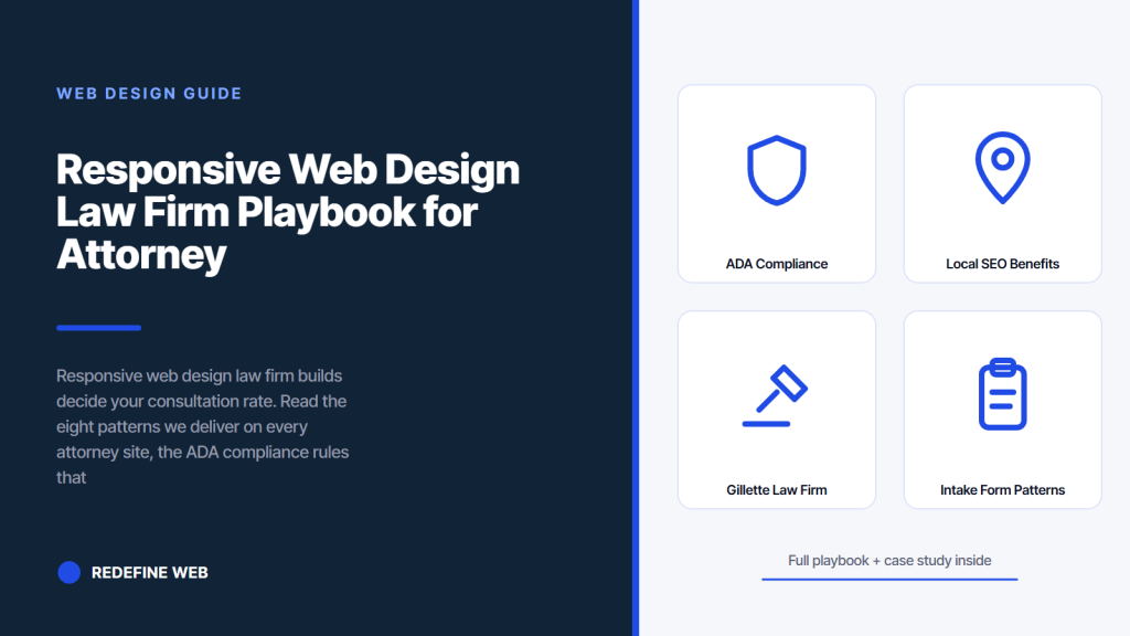
- Sticky header with visible phone number grows call volume.
- Sticky bottom Call Now bar keeps action in the thumb zone.
- Three-field intake forms grow personal injury completion.
- ADA compliance is not optional for law firm websites.
- Gillette Law Firm grew from 6 to 2,900 monthly visitors.
- ADA compliance in responsive web design for lawyers
- Local SEO benefits of responsive web design for law firms
- Gillette Law Firm case study on responsive web design law firm work
- Intake form patterns on responsive web design for law firms
- Performance targets on responsive web design law firm builds
- Where to start with a responsive web design law firm rebuild
Responsive web design law firm builds decide whether your practice books the consultation or watches the caller land on a competitor’s site. More than 70 percent of legal search now happens on mobile. A caller in a car after an accident opens Google, taps the first result, and needs to reach your intake team in three taps or less. This guide is the eight responsive web design patterns we deliver on every attorney site we build, and the numbers each pattern moves.
You will read why responsive web design for law firms outperforms desktop-only builds, the eight patterns worth adopting in the next sprint, how personal injury sites differ from family law and business law templates, the ADA compliance rules that keep attorney sites out of demand letters, the local SEO benefits that compound on mobile-first legal queries, the intake form patterns that grow completion, and the real firm where these patterns grew organic visitors from 6 to 2,900 per month.
ADA compliance in responsive web design for lawyers
ADA compliance is not optional for law firm websites. Attorney sites are a preferred target for ADA demand letters because plaintiff firms know the target audience includes ADA-compliance-aware readers. Every responsive web design law firm build we deliver clears Lighthouse Accessibility at 100, axe DevTools at zero issues, and manual keyboard-only navigation on every conversion flow. Any miss is a fix pass before signoff.
Beyond the automated audits, ADA compliance for legal sites requires alt text on every image, semantic HTML for every heading and list, keyboard-accessible custom widgets, visible focus indicators, contrast ratios above WCAG 2.1 AA, and skip links to the main content. Every one of these gets built into the responsive design system, not bolted on after launch. See the W3C WCAG 2.1 quick reference for the current standard.
Lighthouse Accessibility at 100
Every launch we do on a legal site targets Lighthouse Accessibility 100 on mobile and desktop audits. Missing the target signals a real issue worth fixing before launch. Alt text, semantic markup, contrast ratios, keyboard focus, and form labels all get audited in the Lighthouse pass. Every issue reported gets fixed inside 24 hours. That discipline keeps the firm out of the ADA demand letter queue that increasingly targets small and mid-sized legal practices.
Keyboard-only navigation pass
Every launch pass includes a keyboard-only navigation test on the primary conversion flow. Disconnect the mouse. Tab through the header, hero, intake form, and footer. Every focus indicator visible. Every tab order following reading order. Every skip link functional. Every form fillable and submittable with keyboard only. That test takes 10 minutes per landing page and catches the ADA issues that plaintiff firms cite in demand letters. Cheap insurance on real legal exposure.
Local SEO benefits of responsive web design for law firms
Local SEO benefits of responsive web design for law firms compound across every practice area page and every location page. Google indexes mobile first on local queries. Legal queries like personal injury lawyer near me, family law attorney Denver, criminal defense Los Angeles all skew heavily mobile. A well-built responsive site outranks a desktop-first site on the same query set because mobile-first indexing rewards the mobile render.
Beyond mobile-first indexing, LocalBusiness schema markup, click-to-call links, and consistent NAP data across the site all feed the local pack. Every responsive web design law firm build we deliver includes JSON-LD LocalBusiness schema on the homepage and every location page. Attorney schema markup on bio pages produces knowledge panel appearances on branded searches. See Google Search Central LocalBusiness schema reference.
| Local SEO signal | Impact on legal search rankings |
|---|---|
| Mobile-first indexing alignment | Consistent rankings across mobile queries |
| Core Web Vitals field data green | Ranking bump on high-intent legal queries |
| LocalBusiness schema on every location | Local pack appearance and knowledge panel |
| Click-to-call tel: links | Reduced friction from search to consult |
| Consistent NAP across the site | Google Business Profile match confidence |
| Attorney schema on bio pages | Individual knowledge panels on name searches |
LocalBusiness schema on every location page
Every location page on a multi-office responsive web design law firm build carries LocalBusiness JSON-LD schema with the office address, phone, business hours, and geo coordinates. That schema feeds Google Maps and the local pack. Firms with three or more offices see 20 to 40 percent higher local pack impressions on branded searches after adopting per-location schema. Every one of our multi-office legal builds ships with this pattern applied.
Click-to-call tel: links throughout the site
Every phone number on a responsive web design law firm build is a tel: link on mobile. Tapping opens the dialer with the number prefilled. That reduces the friction from search result to booked consult from four steps to two. Every attorney site we launch includes tel: links in the header, footer, hero, sticky Call Now bar, and every practice-area page. Call tracking numbers rotate through CallRail or similar so paid channel attribution stays clean.
Gillette Law Firm case study on responsive web design law firm work
Gillette Law Firm is a personal injury and truck accident litigation practice based in Colorado. When they came to us, the existing site was ranking outside the top 100 for their primary practice-area queries and driving 6 organic visitors per month. The design was desktop-first, with a hamburger nav on mobile that hid the phone number, an intake form that ran seven fields, and no LocalBusiness schema anywhere on the site.
We rebuilt the site with mobile-first responsive CSS and every one of the eight responsive web design law firm patterns above. Sticky header with visible phone. Sticky bottom Call Now bar. Three-field intake form on personal injury landing pages. Practice-area cards single-column on mobile. LocalBusiness and Attorney schema markup on the homepage and every attorney bio. Inside 30 months the site grew from 6 to 2,900 monthly organic visitors, ranked in the top three for 15-plus target keywords, and booked a steady flow of truck-accident cases through the intake form. Every number traces back to the responsive rebuild plus the SEO and content work that followed.
Every solo attorney who has ever cheerfully approved a desktop mockup at a Tuesday review eventually gets a phone call on Friday afternoon from their own paralegal, holding a phone, saying the intake form has thirteen fields and none of them fit on the screen. That moment is why mobile-first exists on legal sites. It is also why every senior designer we know sketches the phone view first, gets attorney signoff on the mobile version, and only then draws the desktop layout.
Patterns applied on the Gillette build
Sticky header with visible phone across every viewport. Sticky bottom Call Now bar on mobile with 56-pixel tap target. Three-field intake form above the fold on primary landing pages. Practice-area cards in a single-column stack on phones. Case results carousel with touch swipe. Fluid clamp() typography on H1 and body. Attorney bios with click-to-call links. LocalBusiness and Attorney schema on homepage and location page. Every pattern applied. Every pattern contributed to the growth from 6 to 2,900 monthly visitors.
Post-launch metrics on the Gillette build
2,900 monthly organic visitors versus 6 at baseline. 1,300 keywords ranked. Top-three placement on 15-plus practice-area queries. Steady intake through the three-field form. Every metric traces back to the responsive rebuild plus ongoing SEO content work. The responsive web design law firm pattern set produces predictable outcomes when combined with practice-area-specific SEO content over 24 to 36 months.
Personal injury callers reach for the phone icon in the first 3 seconds. If your top nav hides the number in a hamburger, you're losing the call before the hero even loads.
Intake form patterns on responsive web design for law firms
Intake form patterns on responsive web design for law firms follow the same rules across practice areas. Fewer fields grow completion. Full-width fields on mobile grow completion. Submit button 56 pixels tall grows completion. Inline validation grows completion. Progress indicator on multi-step forms grows completion. Every one of these patterns is well-documented in UX research and reproduces across every legal vertical we build in.
Beyond the pattern rules, the specific fields differ by practice area. Personal injury needs name, phone, one-sentence case description. Family law adds practice-area dropdown and preferred contact time. Criminal defense adds urgency indicator (in custody now, need attorney soon). Estate planning adds asset scope. Every intake form we build reflects the caller’s typical urgency and information tolerance on that first contact. Every one adjusts through 90 days of live data after launch.
Personal injury intake form fields
Personal injury intake forms use three fields. Name, phone, one-sentence case description. Nothing else. Every additional field costs 5 to 10 percent of completion. The intake team gathers the rest on the follow-up call, which happens within 15 minutes of form submission for firms that operate a 24/7 intake desk. Every personal injury site we build sees 3 to 6 percent form completion rate on paid traffic within 30 days of launch.
Family law intake form fields
Family law intake forms use five fields. Name, phone, email, practice area (divorce, custody, adoption, mediation), and preferred contact time. Email lets the intake team send a preliminary questionnaire. Practice area routes the follow-up to the right attorney. Preferred contact time respects the caller’s need to talk privately, since family law calls often need to happen away from a spouse or partner. Every family law site we build uses this pattern.
Performance targets on responsive web design law firm builds
Performance targets on responsive web design law firm builds track the same Core Web Vitals thresholds as any other site. LCP under 2.5 seconds, INP under 200 milliseconds, CLS under 0.1 on mobile field data. Legal sites often lag on LCP because attorney photos, courthouse photography, and city skyline heroes ship at desktop resolution. Every launch we do compresses hero images to WebP or AVIF at 200 kilobytes maximum and sets fetchpriority high.
Beyond CWV, Lighthouse Performance 97 plus, Accessibility 100, Best Practices 100, and SEO 100 on mobile. Every legal site we launch clears all four. Missing any of them signals a specific fix worth taking before signoff. See the web.dev Core Web Vitals reference for current threshold values and MDN Web Docs accessibility path for the ADA-relevant patterns.
Hero image optimization for legal sites
Attorney photos, courthouse photography, and city skyline heroes drive LCP on most legal responsive web design projects. Every hero image should ship at 200 kilobytes maximum, WebP or AVIF format, srcset with 4 to 6 variants, fetchpriority high on the primary hero. That treatment drops LCP under 2 seconds on real user field data within 30 days of launch. Every responsive web design law firm build we deliver applies this treatment on every hero image.
Third-party script audit on legal sites
Legal sites often carry CallRail, chat widgets, GA4, HubSpot tracking, Facebook Pixel, LinkedIn Insight Tag, and multiple retargeting pixels. Every one adds JavaScript to the main thread. Every one costs INP milliseconds. Every launch we do audits third-party scripts against INP contribution and defers or replaces the ones that add more than 30 milliseconds. That discipline keeps INP under 200 milliseconds on real user field data.
Where to start with a responsive web design law firm rebuild
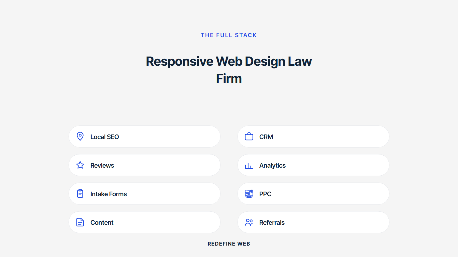
Start with your primary landing page. That page carries the highest consultation weight per visitor. Adopt the sticky header with visible phone, sticky bottom Call Now bar, and three-field intake form on that page first. Measure call volume and form completions for two weeks before and two weeks after on the same audience. That before-and-after produces the number that justifies rolling the pattern set across the full site.
Once the primary landing page earns the conversion win, roll the pattern set to your top three practice-area pages. Same measurement window. Same before-and-after. Every pattern that produced a win on the primary page typically repeats on practice-area pages. Every pattern that did not move the metric drops from the priority list. That order of rollout produces measurable outcomes at every step instead of a big-bang rebuild.
Beyond the first three pages, the responsive rebuild should extend to attorney bio pages, location pages, and long-form practice-area content. Bio pages need optimized attorney photos, click-to-call links, and Attorney schema markup. Location pages need LocalBusiness schema, tel: links, and driving directions. Long-form practice-area content needs proper heading hierarchy, alt text, and keyboard-accessible interactive elements. Every one of these pages compounds SEO authority and reduces intake friction on the practice.
Ready to hire a team that specializes in responsive web design law firm work across personal injury, family law, criminal defense, and business law. Our responsive web design services delivers every legal project mobile-first with the eight patterns applied. For related reading in this cluster, see our responsive web design techniques and best practices, our mobile responsive web design guide, and our responsive web design and SEO.
Frequently asked questions
What is responsive web design law firm work in practice?
Responsive web design law firm work is a full attorney website build where every page adapts fluidly from a 320-pixel phone to a 2560-pixel monitor. Not just the homepage. Every practice-area page, every attorney bio, every intake form, and every contact page renders responsive from the base template. That completeness separates a real responsive legal site from a desktop-first build with a mobile skin. Every serious personal injury, family law, criminal defense, and business law site built after 2020 uses this approach because mobile now drives 70 to 80 percent of legal search.
Why does responsive web design for law firms matter for consults?
Responsive web design for law firms decides your consultation rate because 70 to 80 percent of legal search now happens on mobile. A caller in a car after an accident, a family in crisis on a weekend, a driver pulled over on Sunday night: every one of them opens Google on their phone. The site that renders well on that phone books the consult. Desktop-first legal sites hide the phone number, force scrolls to the intake form, and lose consultations to competitors whose sites work on a 375-pixel viewport. Every attorney site we build addresses this reality first.
How is responsive web design for attorneys different from other verticals?
Responsive web design for attorneys weighs consultation urgency higher than other verticals. Personal injury needs Call Now above every other CTA. Family law balances warmth and credentials in the same visual scan. Criminal defense reads urgency plus discretion. Business law reads authority plus depth. Every practice area has a specific responsive design language that separates it from ecommerce, SaaS, or healthcare responsive design. The patterns are similar but the tone, visual hierarchy, and CTA placement differ across legal practice areas.
Do law firm sites need special ADA compliance work?
Yes. Attorney sites are a preferred target for ADA demand letters because plaintiff firms know the target audience includes ADA-compliance-aware readers. Every responsive web design law firm build we deliver clears Lighthouse Accessibility at 100, axe DevTools at zero issues, and manual keyboard-only navigation on every conversion flow. Any miss is a fix pass before signoff. Alt text, semantic HTML, keyboard focus, contrast ratios above WCAG 2.1 AA, and skip links all get built into the responsive design system instead of bolted on after launch.
How does responsive web design for family lawyer sites handle sensitive topics?
Responsive web design for family lawyer sites balances urgency with warmth. Palettes lean warm neutrals with a strong navy or forest-green accent. Photography features attorneys in professional but not stiff poses. Copy addresses the reader directly with second-person voice. Intake forms include a preferred contact time field because family law calls often need to happen away from a spouse or partner. Every family law site we deliver reads like the practice cares about the person on the other end of the call. That warmth compounds trust and grows consult conversion.
What SEO benefits does responsive web design for lawyers earn?
Responsive web design for lawyers earns mobile-first indexing alignment, Core Web Vitals ranking bumps on high-intent legal queries, single URL per practice area for consolidated backlink authority, and better local pack visibility on near-me queries. LocalBusiness schema markup, Attorney schema on bio pages, click-to-call tel: links, and consistent NAP across the site all feed the local search algorithm. Every responsive web design law firm build we deliver ships with these signals on the homepage, every location page, and every attorney bio. The compound effect drives ranking growth over 12 to 24 months.
Book your free 30-minute strategy call.
No spam, no sales rep. We use your email to schedule your call with a senior strategist. That is it.
More from the blog
View all articles → Web Design
 Core Web Vitals Healthcare Websites Actually Need to Book Patients
Read article Web Design
 Professional Services Website Design Best Practices for 2026
Read article Web Design