
Website design for chiropractors is a project that goes sideways when nobody writes down the site map on day one. Everyone starts arguing about hero images and color palettes. Six weeks in, the site has three about pages, no condition pages, a blog nobody updates, and a contact form that emails a Gmail address the front desk forgot to check. The design was fine. The plan was missing. That is why most chiropractic website projects run two months late and book fewer patients than the site they replaced.
This guide gives you the site map, the page-by-page brief, the writer’s spec, and the pre-launch checklist for a chiropractor practice website that books new patients from day one. It covers the six mistakes that break real chiropractic sites in month two, and the Pain Cure Clinic story that grew patient appointments 205% on the back of a proper website plan. Read straight through in about 13 minutes.
The site map decides your chiropractor website before design starts
The site map decides everything downstream in website design for chiropractors. Get it right and design flows naturally. Get it wrong and every design decision fights the missing pages that should have been on the plan. Write it in a Google Doc on day one, before anyone opens Figma.
You already know your practice. You know the top 3 conditions patients call about. You know which techniques you actually run. You know the insurance plans you accept. Write those down. That is the seed for the site map. Website design for chiropractors always starts here, with the practice-specific details a template site never captures. Every chiropractor practice website needs the same core pages plus the specifics that make your practice unique. Below is the tested pattern that covers 95% of what real chiropractic practices need.
Core pages every chiropractor practice website needs
Website design for chiropractors starts with 8 core page types before you add vertical-specific pages. Homepage. About. Conditions treated (with individual pages for each). Techniques (with individual pages for each). New Patients. Insurance and Pricing. Contact. Blog. Skip any one of these and you leave rankings and bookings on the table. Add pages beyond these only when you have a specific reason. A page called Wellness Blog with 3 posts from 2019 signals abandonment. A page called Careers with no open roles signals confusion. Prune aggressively.
Vertical-specific pages for your practice
Add 3 to 5 vertical-specific pages that match your practice model. Auto accident chiropractic if you take PI cases. Sports chiropractic if you serve local athletes. Prenatal chiropractic if you focus on pregnancy care. Pediatric chiropractic if kids are a real share of your patient mix. Each of these gets its own condition-style page with 800 to 1,200 words, a technique overview, a doctor photo, insurance notes, and a booking CTA. Practices with 6 well-written vertical pages book roughly 3 times the specialized traffic of practices with a single general services page.
Page-by-page brief for the writer on your chiropractor website
Every page needs a written brief before the writer starts. Working website design for chiropractors runs on the same brief format for every page. Focus keyword. Secondary keywords. Target word count. Primary call to action. Trust elements required. Related pages to link to. Photos or images needed. That single template keeps writers on track and prevents the month-six discovery that half the site pages ranked for the wrong keyword when nobody wrote it down.
- Focus keyword and secondary keywords (from your keyword research or a tool like Google Keyword Planner)
- Target word count (homepage 600-900, condition pages 800-1200, about page 600-900)
- Primary call to action (booking form, phone, or content download)
- Trust elements required (photo of doctor, patient testimonial, review widget)
- Related pages to link to (3 to 5 internal links per page)
- Photos or images needed (from photographer or stock alternative if approved)
- Schema markup type (Chiropractic, MedicalProcedure, FAQPage, LocalBusiness)
- Meta title and description (50-60 chars and 145-160 chars respectively)
Homepage brief example for a website for chiropractor practices
The homepage brief for a website for chiropractor practices covers a focus keyword like chiropractor plus your city name. The homepage sits at the top of every search funnel. Secondary keywords cover the top 3 conditions you treat. Target 700 words above the fold blocks. Primary CTA is the booking form or click-to-call. Required trust elements include doctor headshot, live Google review widget with real recent reviews, 3 insurance logos, and a 20-plus years-in-practice credibility marker. Internal links go to the top 3 condition pages, about page, and contact. That is the whole brief. Writer starts, designer designs, done in 5 days instead of 5 weeks.
Condition page brief that ranks
The brief for a condition page like lower back pain chiropractor plus city runs a fixed template. Target 900 to 1,100 words. H1 uses the condition and the city. Sub-head names outcome and time frame. First 100 words include the focus keyword and open with the patient’s symptom. Body covers what causes the condition, how you treat it, what a first visit looks like, insurance notes, and a booking CTA. FAQ block covers 5 common patient questions. Doctor headshot near the top. 2 internal links to related techniques or conditions. That template holds up across every condition you run and outranks generic services pages by 3 to 5 times.
The new patient offer that top chiropractor websites lead with
The single conversion move that separates the top-ranking website design for chiropractors work from the rest is a specific new patient offer visible on every page. Look at 10 chiropractic sites winning organic traffic and 9 of them lead with a price. $47 New Patient Special. $57 Consultation and Adjustment. $97 First Visit Package. The offer removes the biggest booking blocker for a nervous first-timer. Cost uncertainty. Pair a specific dollar figure with the phrase “New Patient Special” and put it in the top bar, the hero, and again mid-page. Every site that does this books more first visits than the site that hides pricing behind an insurance form.
Set the offer between $47 and $97. Under $47 signals a discount practice. Over $100 loses the price-sensitive patient the offer was built for. The chiropractor practice website that stays in this range books first visits at a rate 30 to 60% higher than the same site without a visible offer. Pull the offer back after 6 months and bookings drop within 2 weeks. This is not a coincidence. The offer is what turns a curious visitor into a booked patient today instead of one who will “think about it” and never call.
Floating review badge and chat widget
Two small conversion features carry outsized weight on a chiropractor business website that runs full website design for chiropractors best practices. A floating 5-star review badge pinned to the corner that shows your Google rating and review count. A text-us chat bubble that lets a visitor ask “do you take my insurance” without picking up the phone. Both stay pinned as the visitor scrolls, so social proof and a live path to action are never more than a glance away. Practices that add both features book 15 to 25% more first visits from the same organic traffic, per our own reads across 20-plus chiropractic sites we operate.
Design phase for website design for chiropractors
The design phase for website design for chiropractors moves fast when the site map and briefs are locked. 2 rounds of design review. Mobile mockup first. Desktop second. Never in the other order. First round covers the homepage and one representative condition page. Second round covers the remaining templates and any vertical-specific layouts. 2 weeks total if the practice owner shows up to both review calls. 4 weeks if the owner cannot get on a call twice a week. That is the schedule risk right there.
Design review for website design for chiropractors should focus on 3 questions per screen. Does this element move a hesitant new patient closer to booking a visit. Does this element load fast on mobile. Does this element pass a WCAG 2.1 AA accessibility scan. Every element that fails one of those 3 gets cut or reworked. Every element that passes all 3 moves to development. That single filter shortens design rounds and keeps the site focused on what actually books patients. Owners who bring their spouse to the design review to talk about color preferences add 2 weeks to the schedule and lose the plot.
Mobile mockup first, always
78% of chiropractor website traffic arrives on a phone, so mobile-first website design for chiropractors is not optional. The mobile mockup is the site. If your designer shows you the desktop mockup first, ask for the mobile version. The desktop mockup rarely translates cleanly downward. The mobile mockup usually scales cleanly upward. Same content, different order of operations, dramatically different booking rates. Practices that review the mobile mockup first catch design problems before they turn into development rework. 2-week schedule saved, right there, on one review sequence decision.
Desktop adaptation without wasting space
The desktop adaptation of a mobile-first design should not become the mobile design stretched to 1440 pixels wide. That looks amateur. Desktop should use the wider viewport for genuine content upgrades. 2 columns where mobile stacked. A wider hero with real photography that would not fit on mobile. A footer that shows more link options than the mobile hamburger. Every desktop upgrade earns its place against the same booking-first filter. Design that respects both viewports converts on both. Design that assumes desktop is the priority loses on the phone that carries most of the traffic.
Development phase for a chiropractor business website
The development phase for a chiropractor business website converts approved mockups from your website design for chiropractors plan into working WordPress code. 3 to 4 weeks for a semi-custom build. 4 to 6 weeks for a fully custom build. The developer builds the theme, integrates the booking flow, wires the analytics, adds schema markup, and runs the accessibility audit. Practices whose owner keeps changing content during development add 2 weeks to the schedule. Lock content on approval. Change orders after that get priced separately and go on the change log for future reference.
Development milestones for a chiropractor business website hit in a predictable order. Week one, theme scaffolding and homepage. Week two, condition page templates. Week three, remaining templates and content entry. Week four, integrations (booking, analytics, schema, forms). Week five, QA, accessibility audit, mobile speed tuning. Week six, staging review and pre-launch checklist. Every milestone gets a demo call. Every demo call surfaces the issues that would otherwise show up in month two. Skip the demos and the issues stay hidden until the launched site is already booking patients wrong.
Integrations that matter for a chiropractic practice
Real integrations for a chiropractor practice website cover 4 systems on any serious website design for chiropractors build. Practice management software (ChiroTouch, Jane, PayDC) for the booking calendar. Email marketing (Mailchimp, ActiveCampaign, ConvertKit) for the patient newsletter. Call tracking (CallRail, CallTrackingMetrics) for real phone-call attribution. Review generation (Podium, Birdeye, RepuGen) for the Google review flow. Each of these gets scoped during development, not bolted on later. Practices that skip real integrations end up with a beautiful site that does not talk to any of their operations tooling. Beautiful but useless in month three.
Analytics setup you can actually read
Analytics setup for a website design for chiropractors project has to answer 3 questions. How many visitors book. Which pages drove the bookings. Where the traffic came from. Google Analytics 4 with real event tracking answers all 3. Fire an event on booking form submission, click-to-call, calendar booking, and phone widget open. Tag the source. Track it in a monthly dashboard. Practices that skip this setup fly blind for years and cannot answer why the site is or is not booking patients. See the Google Analytics 4 event documentation for the reference.
Pre-launch checklist for your website for a chiropractor
The pre-launch checklist is where responsible website design for chiropractors teams separate themselves from the vendors who miss the small stuff. 20 items get checked before the site goes live. Every item takes 30 seconds to verify. Missing any one of them turns into a bug report from the front desk in month two. Do the checklist. Sign off on the checklist. Keep the signed checklist in the project folder. That single artifact prevents 80% of the launched-site drama.
- Every page on the website design for chiropractors loads on mobile in under 3 seconds
- Phone number is tappable on every page header
- Booking form submits and creates a real notification
- Contact form submits and creates a real notification
- Google Analytics 4 fires events on all conversion actions
- Google Search Console verified and sitemap submitted
- Schema markup validates in the Schema.org validator
- 301 redirects mapped from old URLs to new URLs
- Robots.txt allows crawling and points to sitemap
- Favicon appears in browser tab
- SSL certificate active and no mixed-content warnings
- All images have real alt text (WAVE scan zero errors)
- NAP data consistent across every page footer and contact
- Google Business Profile linked and consistent NAP
- Insurance logos display and match accepted plans
- Doctor headshot appears on homepage and about
- Live Google review widget loads without errors
- Footer includes copyright, privacy, terms links
- Backup taken and stored off-server
- Uptime monitoring configured to alert real inbox
Redirect map from old URLs
Redirect mapping is the single most-missed step in launched website design for chiropractors work. The old site had URLs. The new site has different URLs. Without 301 redirects from old to new, Google sees dead pages and drops rankings. Practices lose 30 to 60% of organic traffic in the first month after launch when nobody set up the redirects. The fix takes 2 hours. Export every old URL from Google Search Console. Match each to the closest new URL. Write the redirects in the .htaccess file or a redirect plugin. Test 5 random URLs after launch. Skip this and the launch is a ranking disaster hiding behind a pretty design.
Schema validation before launch
Schema markup that looks correct in code but fails validation in the Schema.org validator is worse than no schema. Google ignores it silently. Practices assume the markup is working. Rankings stall for no visible reason. 10 minutes running every page template through the validator before launch catches every schema error the developer wrote. This is not a nice-to-have. It is a launch-blocker. Any chiropractor website design team that treats schema validation as optional is one that will hand you a site that ignores the markup you paid to include.
Content migration for a chiropractor practice website
Content migration for a chiropractor practice website is where most website design for chiropractors rebuilds lose their SEO. The old site had blog posts. The new site should keep them or redirect them. The old site had reviews on the homepage. The new site should carry them or link to them. The old site had insurance information. The new site should match it. Every content element gets an explicit decision. Keep. Redirect. Retire. Rewrite. Any element without an explicit decision defaults to Retire and quietly loses the SEO equity that took the practice 5 years to build.
The content audit that precedes migration takes 2 to 4 hours for a mid-sized chiropractor practice. Export every URL from Search Console. Sort by traffic. Any URL with meaningful traffic gets a decision. High-traffic content worth keeping gets rewritten and redirected to the new URL. Medium-traffic content gets redirected to the closest new page. Low-traffic content gets retired with a 410 status. That single audit protects the practice from the ranking cliff most rebuilt sites walk off in month one. Skip it and the launch traffic drop is measured in tens of thousands of dollars in lost bookings.
Blog migration or fresh start
Blog migration is a decision, not a default. Practices with 20-plus quality blog posts and real organic traffic should migrate every post to the new site with the same URL structure. Practices with 5 posts from 2019 that nobody has updated should retire them and start fresh. The middle case, 10 to 15 posts of mixed quality, is where judgment matters. Any post with meaningful search traffic gets rewritten and migrated. Any post with zero traffic and outdated content gets retired. The rebuild is the rare moment when this cleanup is easy to justify. Skip it and the drag continues for another 5 years.
Review widget migration without losing count
Google reviews live on the Google Business Profile, not the website. Migration preserves them by default. What you might lose is a testimonial widget from a review platform like RepuGen or Podium if the account or embed code changes. Grab the embed code before you cancel the old account. Test the widget on staging. Practices that switch review platforms during a rebuild without exporting the reviews first lose 2 to 3 years of accumulated testimonials. Small operational detail with a large trust cost when it goes wrong.
Chiropractor practice website case study on planned growth
Pain Cure Clinic is a chiropractic and wellness healthcare provider that partnered with us for a full digital marketing engagement across website design for chiropractors, condition SEO, content marketing, PPC, local SEO, and automation. Same pattern most chiropractic practices face. Solid clinical work, weak digital front door, no plan for how the marketing pieces would connect. The rebuild had to solve site design, search visibility, and the paid ads all at once. The plan mattered more than any single tactic. Design followed the plan.
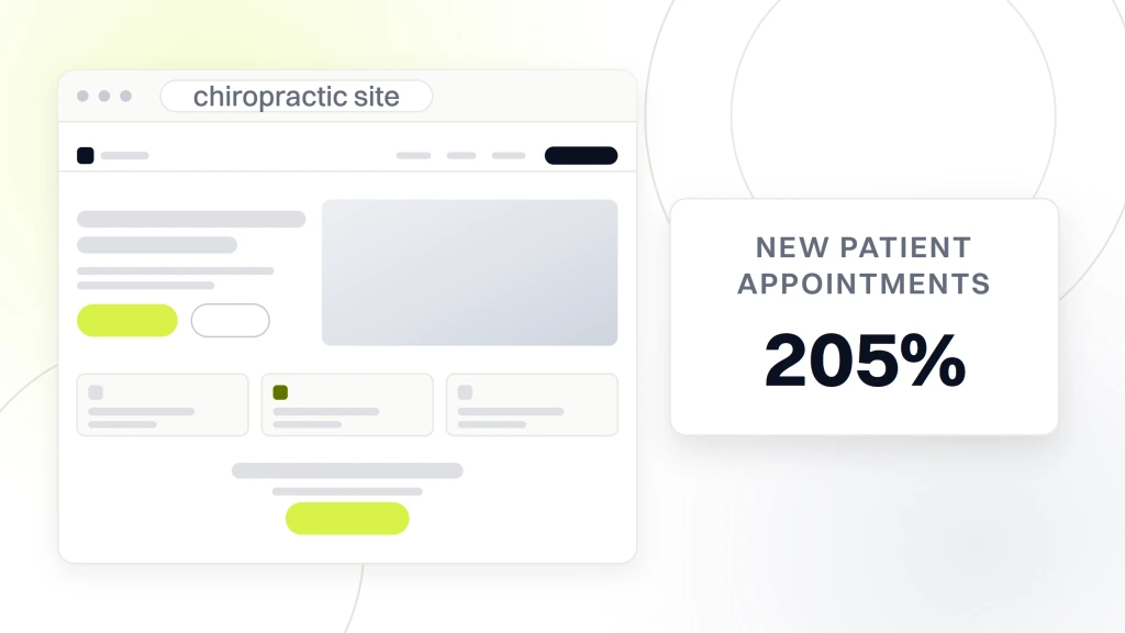
The engagement covered a full website redesign built around condition-specific content, an educational hub with infographics and videos, a Google Business Profile push, high-intent PPC and Facebook ads, online booking, and segmented email automation. New patient appointments grew 205%, from 40 monthly to 122 monthly. Organic traffic climbed 289%. Reviews grew 162% and lifted the Google rating from 4.3 to 4.9 stars. Every number came from a website design for chiropractors that treated the site as one part of the operational plan, not a standalone project.
Outcome measured across the engagement
Patient appointments 205%. Organic traffic 289%. Review count 162% with the star average climbing from 4.3 to 4.9. Compounding effect is what matters. A rebuilt site converted the traffic. Condition SEO increased the traffic. Video content on treatment pages added trust. Paid ads on the same site earned better cost per booked patient. Every piece supported every other piece since the design followed the plan. A cheaper standalone website rebuild would have gained maybe 30 to 50% on the same practice. The plan behind the rebuild multiplied the return several times over.
Lessons for a chiropractic practice
Three lessons from the Pain Cure rebuild carry over directly. First, treat the website as one part of a plan, not a standalone project. The site converts what the SEO and paid ads bring in. Design decisions that ignore how patients arrive at the site under-perform. Second, condition-specific pages beat a generic services page 3 to 5 times over in search traffic. Third, video content on treatment pages punches above its weight. A 60-second video of the doctor explaining what happens during a first visit outperforms the same page without the video by 20 to 35% in booking rate. Video budget of $1,500 to $3,000 for a small production shoot pays back in one month.
Launch day for a chiropractor website
Launch day for a chiropractor website design project should feel boring. If launch day feels exciting, something is wrong. The pre-launch checklist did not catch the issues. Point the DNS in the morning. Let it propagate for 4 hours. Verify every checklist item on the live site. Announce to the front desk. Send an email to the patient list. Post on Facebook. That is the whole ceremony. Practices that treat launch as a big-bang event with no rehearsal end up spending launch afternoon fixing broken redirects and missing schema. Rehearsal is what turns launch day boring.
Launch week for website design for chiropractors has a defined rhythm. Day one, DNS switch, checklist verification, front-desk announcement. Day two, Google Search Console URL inspection and reindexing request. Day three, verify Google Analytics event tracking on real conversions. Day four, review the first 48 hours of traffic and check for any 404 patterns. Day five, publish the launch blog post and share on social. Day six and seven, monitor for issues and answer questions from the front desk. That is the whole launch rhythm. Anything more complicated is a warning sign.
Post-launch monitoring for chiropractor practice website
Post-launch monitoring for a chiropractor practice website runs on a scoped rhythm after the website design for chiropractors goes live. Weekly checks in the first month. Bi-weekly checks in month two and three. Monthly checks after that. Look at 3 metrics on every check. Booking rate on new users. Google Search Console coverage. Uptime and speed. Any drop of 10% or more triggers an investigation. Practices that skip this monitoring notice the site is under-performing in month six when the calendar starts looking empty and by then the causes are 3 months stale.
Real post-launch maintenance for a website design for chiropractors project covers 5 things every month. Weekly backups tested for actual restore. Monthly plugin and WordPress core updates on staging before production. Security patching within 48 hours of disclosure. Uptime monitoring with real inbox alerts. A scoped block of hours for small edits, one new blog post, and one condition page update. Retainers that cover this stack run $199 to $499 per month. Our website maintenance for chiropractors guide covers what the full stack looks like.
First 90 days of monitoring
The first 90 days of a launched website design for chiropractors project tell you whether the design decisions actually worked. Booking rate typically settles 15 to 30% higher than the old site if the rebuild was any good. Organic traffic typically dips 10 to 20% for 2 to 4 weeks as Google reindexes, then recovers and grows. Cost per booked patient from paid ads drops 20 to 40% as landing pages convert better. Any deviation from these ranges deserves investigation. Ranges outside these mean either the rebuild was better than expected or the redirects broke something important. Both cases need someone paying attention.
Six-month review with the vendor
Book a six-month review with your website design for chiropractors vendor on the day the site launches. Put it on the calendar. Show up to it. Review the 3 metrics. Look at Search Console for keyword movement. Look at Google Analytics 4 for booking rate movement. Look at the Google Business Profile for review growth. Talk about what worked, what did not, and what to change in the next quarter. Practices that skip the six-month review coast on the launch honeymoon and miss the drift that would have been easy to fix at month six. The review is a 2-hour investment that protects 2 years of returns.
Six mistakes that break website design for chiropractors
Website design for chiropractors breaks the same 6 ways in almost every rebuild. Every one is preventable with a checklist. Every one shows up when nobody wrote the plan down on day one. If any of these sound familiar from a previous rebuild, the plan is the fix, not another design refresh.
| Mistake | Symptom in month two | Prevention on day one |
|---|---|---|
| No site map written down | Missing condition pages, three about pages | Google Doc site map before any design |
| No redirect map from old URLs | Organic traffic drops 30-60% and stays down | Search Console URL export and mapping |
| Booking form emails abandoned inbox | New patients not showing up on schedule | Test booking form on launch checklist |
| Phone number not tappable on mobile | Call volume drops after launch | Mobile mockup review before dev |
| Missing schema markup | Rich results disappear, rankings drop | Schema validator run before launch |
| No monitoring after launch | Issues surface in month six | Weekly checks in first month |
Scope written as hours, not features
A scope defined as 80 hours of development work is a scope you will argue about in week six. A scope defined as one custom homepage, 5 condition pages, one new patient page, one contact page with a booking flow, one blog template, one WAVE accessibility audit, and one launch-day checklist walkthrough is a scope both sides can hold each other to. Fixed feature list beats fixed hour count every time. Any chiropractor website design vendor who resists a written feature list intends to bill twice for the same feature. Walk. Better vendors exist.
Owner unavailable during discovery
The single biggest schedule risk on a website design for chiropractors rebuild is the practice owner going quiet during discovery. Vendor sends the brief. Owner does not respond for 6 days. Vendor sends the design mockup. Owner does not respond for 8 days. Six weeks later the project is 3 weeks late and the owner is annoyed at the vendor. Owner availability of two hour-long calls per week during discovery keeps the project on schedule. Below that the schedule slips. Ownership availability is a project deliverable, not an optional convenience.
Where to start with your own website design for chiropractors
Start with the site map. Website design for chiropractors starts with a Google Doc. Write down 8 core page types. Add 3 to 5 vertical-specific pages that match your practice. Add the top 10 blog topics your patients ask about. That single document is worth more than any design mockup. It anchors every downstream decision. Bring it to the first vendor call. Any vendor who does not want to work from your site map is a vendor whose default plan will replace what you actually need. Walk.
When you are ready to compare vendors, look at 3 specific things. Two live chiropractor sites they built in the last 18 months. The mobile PageSpeed score of those sites. And a written scope with a fixed feature list. That filters half the market in an afternoon.
For deeper reading, our chiropractor website design pillar guide covers the full engagement, our websites for chiropractors guide covers must-have pages, our website CRO writeup covers post-launch improvements, our website maintenance guide covers post-launch retainer, our SEO for chiropractors guide covers the search baseline, and our marketing plan guide covers the operational plan the site should support. Ready to scope a rebuild, our chiropractor marketing services page covers what a full partnership looks like.