A sales funnel landing page is the single page that carries a visitor from an ad click, an email link, or a search result to one conversion action. One offer. One CTA. Zero distractions. When the page fights that focus with top navigation, footer link farms, and competing calls, conversion drops 20 to 40%. When the page respects the focus, conversion holds or climbs. Sales funnel landing page design is the discipline of cutting everything that doesn’t help the visitor take the next step.
This guide covers the block order, copy structure, testing plan, and web design rules that separate sales funnel landing pages that convert from ones that drift. Sales funnel landing page examples, sales funnel website design patterns, and sales funnel website builder options each get their own section. By the end, you have a working structure you can drop on any offer, industry, or traffic source and start testing.
Sales Funnel Landing Page Basics You Can’t Skip
A sales funnel landing page has one job. One offer. One CTA. Everything else on the page either supports that action or gets cut. That single constraint is what separates a landing page from a home page or a blog post, both of which serve multiple audiences and multiple goals. The single-purpose build is why sales funnel landing pages convert 3 to 10 times higher than a home page on paid traffic.
One offer keeps the message tight
The page promotes one thing. A free guide. A demo. A consultation. A product. Pages that try to sell two products or two service tiers dilute the message. Visitors who could have converted on either offer end up picking neither, since the choice adds friction. Split the offers across two landing pages. Each one converts better than the combined page.
One CTA repeats down the page
The CTA button reads the same every time it appears. “Book my consultation.” “Get the free guide.” “Start my trial.” Not “Learn more” in the hero and “Sign up now” at the bottom. Consistent CTA copy compounds recognition and pulls a 5 to 15% conversion gain in most tests. That’s the easiest win on the page.
Zero navigation, minimal footer
Strip the top nav. The footer keeps a privacy policy link, a terms link, and copyright text. Every other link exits the visitor from the funnel. Landing pages that keep the full nav and footer consistently convert worse than the same page with nav removed. Test it once and you never put nav back.
Match the ad to the sales funnel landing page
The landing page headline mirrors the ad promise. A search ad for “invisalign consultation dentist” needs a page that opens with “Book your Invisalign consultation.” A visitor who clicks an ad about Invisalign and lands on a generic dental home page bounces inside 8 seconds. Message match is the single highest-impact lever in any paid-media landing page build.
Sales Funnel Landing Page Examples by Traffic Source
Sales funnel landing page examples flex by traffic source, not just industry. A page for cold paid social reads different from a page for warm retargeting. A page for organic search reads different from a page for direct-mail traffic. The eight-block skeleton holds. The copy inside each block flexes to match how warm the visitor is when they land.
Cold paid social pages open with the problem
Cold paid social visitors weren’t searching for the offer. They were scrolling. The page opens with a hook that names the problem fast. Hero copy shifts from a benefit statement to a problem statement. “Your ads are burning cash because your landing page loads in 6 seconds.” That grabs attention faster than a generic benefit hook and keeps the scroll going.
Warm retargeting pages lead with the offer
Retargeting visitors have already touched the brand. The page skips the problem framing and leads with a specific offer. “Book your free 30-minute funnel audit.” No hook needed. They already know what you do. They need a reason to act now, and a specific, dated offer gives them one.
Search traffic pages match the query intent
Search traffic sales funnel landing pages mirror the query word for word. A search for “best CRM for small business” needs a page titled “Best CRM for Small Business.” The message match earns the click and the scroll. Pages that use generic titles on specific searches drop conversion 40 to 60% because the visitor bounces looking for the exact answer they typed.
Direct mail pages carry a shortcode
Direct mail landing pages include a shortcode or QR code from the physical piece. Hero copy names the mailer directly. “Welcome from the postcard.” This continuity confirms the visitor is in the right place. Direct-mail landing pages often live on vanity URLs (yourbrand.com/mailer) that match the printed piece and stick in the reader’s head.
Sales Funnel Website Design Principles
Sales funnel website design reaches past the landing page. The whole site becomes an intentional funnel from top to bottom. The home page filters visitors into segments. Category pages carry them deeper. Product pages convert. Content assets feed the top of the funnel. Design decisions at every layer either help or hurt conversion. A sales funnel website isn’t a pile of pages loosely tied together, it’s a single system.
Home page as segment filter
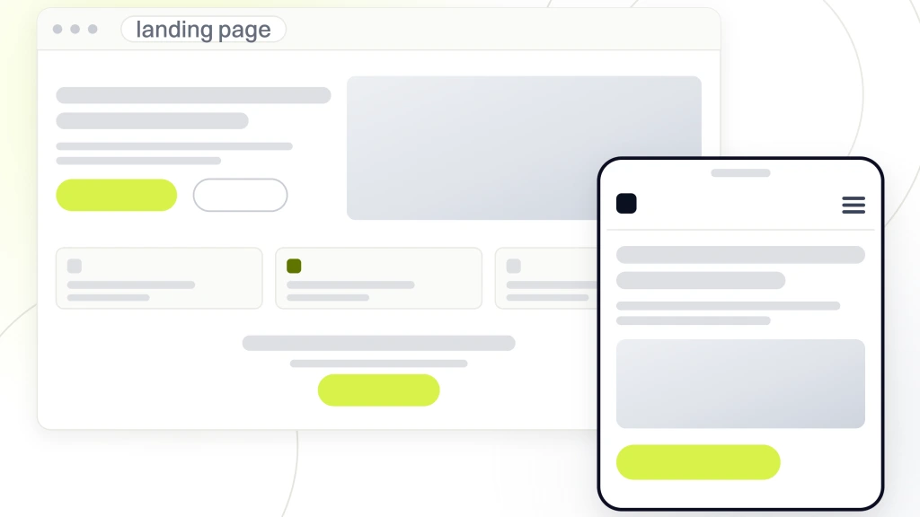
The home page in a sales funnel website design holds a clear value proposition, one social proof band, three category cards, one lead magnet CTA, and a footer. That’s it. Any more and the visitor gets lost. Any less and the home page fails to segment traffic. Named category cards move each visitor to the right sub-funnel in one click.
Nav that supports the flow, not the org chart
Nav often gets ignored in sales funnel website design. That’s a mistake. Nav that maps to the internal org chart (“Services,” “About,” “Team,” “Blog”) doesn’t help buyers. Nav that maps to the buyer journey (“For Small Business,” “For Enterprise,” “Pricing,” “Case Studies”) does. Rewrite the nav for the buyer, not for the founder.
Category pages act as tour guides
Category pages hold service or product lists with a short blurb per item. Each item links to a landing page or product page. The category page tours the visitor through the options and hands them off to the right next step. Skimmable design (cards, icons, short copy) beats long-form category pages for conversion every time.
Contact pages that book directly
Contact pages include a form with three fields or fewer, a phone number, and a calendar embed for direct booking. 30 to 45% of buyers skip the form and book straight to a calendar when they’re given the choice. Sites that only offer a form miss those bookings entirely. The calendar embed is a 5-minute integration that pays for itself the first week.
Sales Funnel Website Builder Options
Sales funnel website builder options split into three camps. Dedicated funnel platforms. General website builders with funnel add-ons. Custom builds. Every camp has a place. Picking the right one depends on team skill, budget, and how tightly the funnel has to tie into the rest of the marketing stack.
Dedicated funnel platforms handle end-to-end
ClickFunnels, Kartra, Systeme.io, and GoHighLevel handle the full funnel. Landing pages, forms, email, payments. Fast to launch. You’re locked into the platform for the long haul. Great for info product sellers and coaches. Frustrating for teams that need a full content site or a heavy blog under the same roof.
General website builders with funnel plugins
WordPress with Elementor, Divi, or Beaver Builder handles content sites and sales funnel landing pages under one CMS. Squarespace, Webflow, and Wix cover simpler builds. The trade-off is stitching together the email and payment stack yourself. The payoff is a full site plus funnels, all under one roof for content and landing pages.
Custom builds for high-scale funnels
High-scale funnels running $500K+ per month in paid media often move to custom builds on Next.js, React, or headless CMS setups. Page speed, personalization, and analytics integration go deeper than any builder allows. Plan for 2 to 5 engineers minimum. Not the right call for teams under $50K a month in paid spend, since the maintenance load quickly outruns the gain.
Which builder wins for which use case
Info product sellers pick a dedicated funnel platform. Service businesses and small B2B pick WordPress plus a landing page plugin. Enterprise teams pick Webflow or custom. Ecommerce brands pick Shopify plus PageFly or Shogun for landing pages. The pattern holds across industries since the underlying decision is about complexity, budget, and long-term flexibility, not vertical.
Landing Page vs Sales Funnel Distinction
A sales funnel landing page and a full sales funnel are related, but they aren’t the same thing. The table below breaks down the practical differences between the two, so buyers don’t confuse the tools they need or the deliverables they should expect from an agency or a builder.
| Dimension | Sales funnel landing page | Full sales funnel |
|---|---|---|
| Scope | One page | Sequence of pages, emails, calls, checkout |
| Time to build | 4 to 20 hours | 2 to 12 weeks |
| Primary metric | Conversion rate on the page | Cost per acquisition, LTV, ROAS |
| Time to convert | Under 60 seconds | 7 to 90 days |
| Tools needed | Landing page builder | Builder plus email, CRM, checkout, analytics |
| Team roles | Copywriter, designer | Copywriter, designer, marketer, sales, engineer |
A landing page is one page. A sales funnel is a sequence of pages, emails, and touchpoints. A sales funnel landing page can be the entry point to a full funnel. A sales funnel is not one landing page. Vendors often blur the terms in marketing copy, and that confuses buyers who then buy a landing page tool expecting a full funnel, and vice versa. For the full picture on the sequence side, see our primer on what is a sales funnel.
Landing pages own the moment
A landing page is a single conversion event. Opt-in, demo request, purchase. Focus is tight. Design is minimal. The page exists to move the visitor from a click to an action inside 60 seconds. Every block above the fold earns its place or gets cut in the next test round.
Sales funnels own the journey
A sales funnel is the sequence that runs after that first conversion. Welcome email, education emails, offer emails, sales calls, contracts, checkout. Weeks or months of touch points. The landing page is stage one of the funnel, not the funnel itself. Teams that grasp that split spend money on the right layer instead of over-investing in one page.
Why the confusion costs teams money
Teams that treat their landing page as their whole funnel see conversion rates of 3 to 6% and think they’re done. Teams that build the full funnel behind the landing page see the same 3 to 6% first-page conversion turn into 15 to 30% of leads becoming paying customers over 30 to 90 days. The landing page is the door. The funnel is the house. If you’re mapping the sequence for the first time, our walkthrough on how to create a sales funnel lays out the steps.
A Sales Funnel Landing Page in Practice at Rocket Software
Rocket Software, a SaaS product with short runway and weak drip campaigns, needed a landing page that pulled its own weight fast. Signups were healthy on paper, yet only 7% of users installed the product within 30 minutes. Most never reached the “wow” moment, and early churn ate the growth. Pricing was unoptimized, the acquisition funnel had gaps at every stage, and the product page was the biggest one. We rebuilt the funnel for activation, starting with the sales funnel landing page, and shipped the fix inside a launch window measured in weeks, not quarters.
Landing page tuned for one activation event
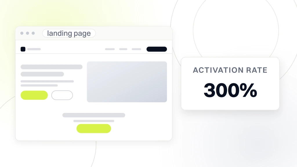
The rebuilt sales funnel landing page carried one CTA. Install the product. Above the fold, the copy named the activation payoff in one sentence. Below the fold, a single tutorial walkthrough removed the friction between install and first use. The rest of the site kept its content, but the acquisition page held its focus.
Automated drip tied to the landing page
Automated drip campaigns picked up every visitor who converted on the page. Video walkthroughs, tutorial guides, and a tiered pricing prompt kept new users moving. Pre-launch awareness fed cold traffic. Paid ads and influencer partnerships kept the pipeline full. The landing page was the door. The drip was the hallway.
Results in the launch window
Rocket hit a 300% activation rate, 3,000 customers in week one, and 400+ daily subscribers after launch. The landing page carried the top of that funnel, and the follow-on drip carried the middle. Sales funnel web design decisions on the front page were the anchor decisions that made the rest of the marketing math work.
Testing and Iteration on Sales Funnel Landing Pages
Sales funnel landing page testing splits pages that converge on high conversion from pages that drift. Every high-performing page goes through 6 to 20 rounds of tests before it peaks, per Unbounce’s Conversion Benchmark Report. Teams that skip testing accept whatever the first draft delivered. Teams that test compound learnings across pages, so every new page starts higher than the last one.
- Test the headline first. Biggest single lever on the page. Try problem-led vs benefit-led vs question-led.
- Test the primary CTA button copy. “Book” vs “Get” vs “Start.” Each verb pulls different conversion.
- Test the hero image. Product screenshot vs founder photo vs abstract illustration.
- Test the social proof position. Above the fold vs below the hero fold.
- Test form length. Three fields vs five fields. Every added field drops conversion 5 to 10%.
- Test the mobile experience. Bottom-anchored CTA vs inline CTA on mobile.
- Test the offer wording. “Free consultation” vs “Free 15-minute strategy call.”
Run one test at a time
Two changes at once means you can’t tell which one caused the gain. Run one variable at a time. Give it enough traffic to reach statistical significance (500 to 2,000 conversions per variant depending on baseline rate). Then move to the next test. Overlapping tests read as noise inside a week and reset the calendar.
Kill losing pages fast
Landing pages that convert under 1% for cold paid traffic almost never recover. Kill them fast. Redesign from scratch. Don’t iterate incrementally on a broken page. Fresh page, fresh angle, fresh test. Sunk-cost thinking on landing pages is expensive, since the ad dollars keep burning as you tweak the button color.
Save winning variants as templates
Winning sales funnel landing page variants become templates for the next page. Winning headlines become headline patterns. Winning CTAs become CTA patterns. The team compounds learnings across the whole landing page portfolio instead of starting each new page from zero. For a starting library, our library of sales funnel templates gives you a first cut you can adapt.
Common Sales Funnel Landing Page Mistakes
Sales funnel landing page mistakes repeat across industries. Almost every low-performing page fails at one of the same six issues. Fixing any one of them typically grows conversion 10 to 30%. Fixing all six takes conversion from below-average to top of the industry. The tests aren’t clever, they’re overdue.
Vague hero headlines
Hero headlines like “Welcome to Our Product” or “Marketing That Works” mean nothing. Specific headlines like “Book more patient consultations with a website built for dental practices” say who the offer is for and what they get. Specificity converts. Generic hero copy loses the click before the visitor scrolls a single pixel.
Too many form fields
Every form field drops conversion 5 to 10%. A 10-field form converts 40 to 60% worse than a 3-field form. If the sales team needs more info, capture the basics on the page and get the rest on the follow-up call. Progressive profiling beats front-loading every form field into a wall of inputs.
Weak or no social proof
Landing pages without customer logos, star ratings, or testimonials rely on the copy alone to build trust. That’s a losing bet against visitors trained to check reviews before every purchase. Add real social proof or watch conversion stay stuck below 2% forever. One named logo band lifts trust faster than three paragraphs of copy.
Broken message match with the ad
An ad that promises “free consultation” and a page that opens with “book a demo” breaks message match. Visitors bounce in 8 seconds. Rebuild the page hero to mirror the ad promise word for word. The fix takes 15 minutes and typically doubles conversion on the same traffic.
Slow mobile page speed
Mobile page loads over 4 seconds lose 20 to 40% of visitors to bounce. Every extra second of load time costs conversions. Optimize images, cut unused scripts, and keep the page under 3 seconds on 4G. This one fix often outperforms every copy test combined.
Top nav still on the landing page
Every link in the top nav is a potential exit. Landing pages with the full nav convert worse than the same pages with nav removed. Strip the nav. Keep only the logo linking to the home page for brand recognition. Nothing else. That single edit is the top 5-minute fix on the page.
Make Your Sales Funnel Landing Page Work Harder
Sales funnel landing page design turns paid traffic into revenue when the page respects the visitor’s attention and cuts everything that doesn’t help them convert. Pick one offer, write one CTA, strip the nav, and test the headline first. That first pass gets most pages from 1 to 2% conversion up to a healthy 4 to 8% inside a month, and the follow-on tests carry the number from there.
If you want a partner to design the page, build the site, and instrument the tests, our team at sales funnel and automation covers the full funnel from landing page through checkout. Retainer plans start at $1,499 a month. Every engagement kicks off with a page audit, a competitor teardown, and a 30-day test roadmap, so you know exactly which lever gets pulled first and what result to expect from it. Related reads on the tool side and the theory side. Our comparison of the best sales funnel software lines up the platforms against each other on price and features.