
Chiropractor Web Design Best Practices for Conversions
- Chiropractor web design decides booking rate more than any other channel decision.
- Sticky header with tappable phone and booking CTA raises bookings 15-30%.
- Mobile speed budgets are design decisions the developer makes on day one.
- Five-field booking form beats a mortgage-application intake by 30-45%.
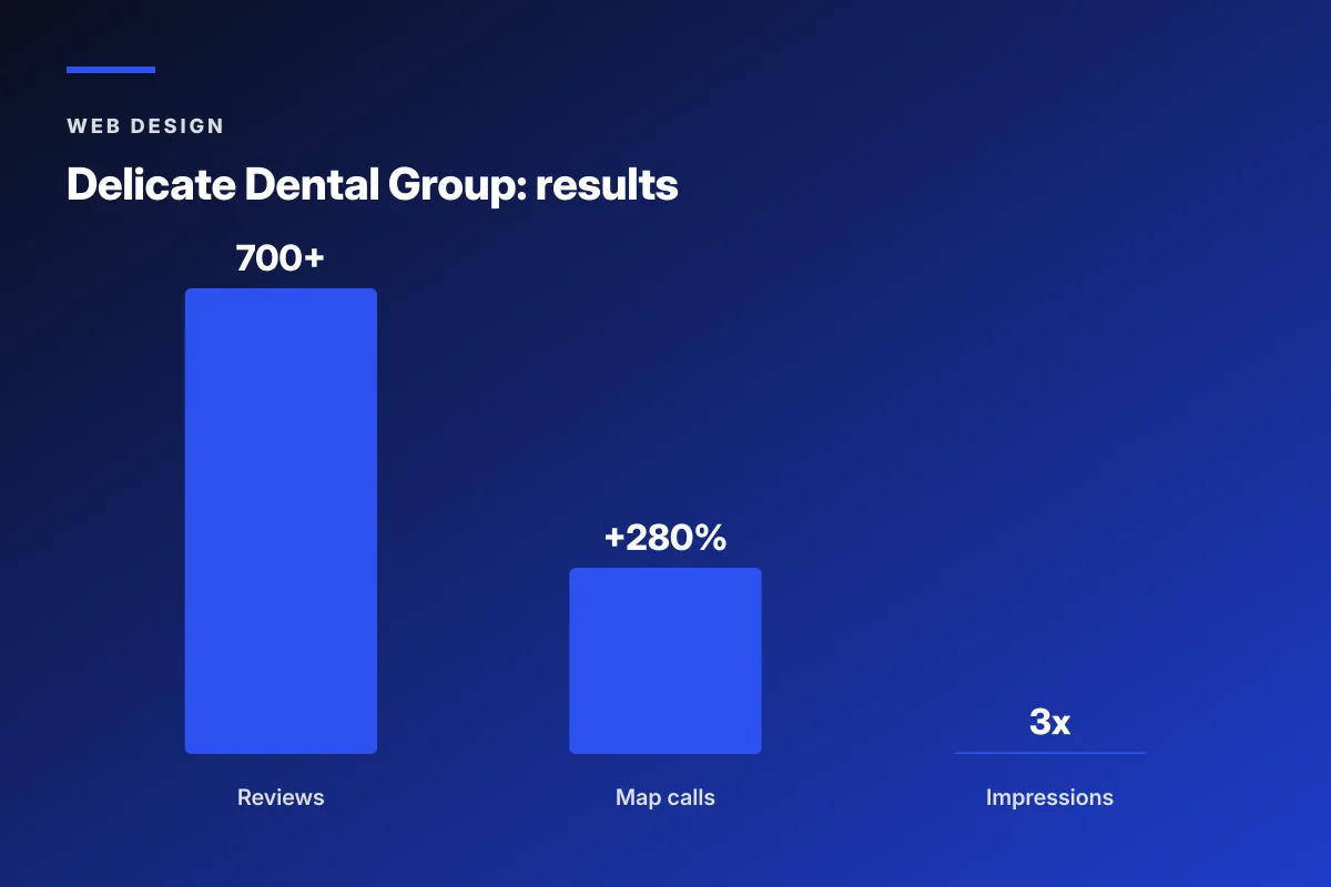
- Delicate Dental hit 700+ reviews and 280% more Map Pack calls in one phase.
- Chiropractor web design starts with conversion, not aesthetics
- Hero section patterns that book new patients
- Navigation patterns for chiropractor web design services
- Trust elements every chiropractor web design agency should ship
- Mobile speed as a chiropractor web design decision
- SEO structure baked into the web design for chiropractors
- Chiropractor web design case study on scratch-practice growth
- Booking flow patterns from a chiropractor web design company
- Accessibility as a chiropractor web design best practice
- Copy patterns that convert on chiropractor web design
- How to choose a chiropractor web design company
- Where to start with your own chiropractor web design refresh
Chiropractor web design lives or dies on how it converts a new patient in the first six seconds. Not on the animation. Not on the color palette. Not on the awards page. On whether a person with lower back pain, scrolling on a phone at 9pm on a Tuesday, can figure out whether you treat what they have and how to book. Most chiropractor sites fail that test, which is why the practice with the ugliest site in town often books more new patients than the one with the design award.
This guide covers chiropractor web design best practices that hold up in 2026. Layout patterns that convert. Trust elements that survive skepticism. Booking flow that respects a patient’s time. Mobile speed targets Google now measures. Copy patterns that outperform the wellness clichés. And a real Delicate Dental case study that turned scratch-practice zero digital footprint into 700 reviews and 280 percent more Map Pack calls. Read straight through in about twelve minutes.

Chiropractor web design starts with conversion, not aesthetics
Chiropractor web design should start with the booking question, not the color palette. Every design choice earns its place against a single metric. Does this element move a hesitant new patient closer to booking a visit. If yes, keep it. If no, cut it. Everything else is noise the practice pays for.
You have watched this play out. A designer sends over three mockups. The prettiest one has a full-width video hero of a doctor smiling with soft-focus lighting. It looks great on a MacBook. On a phone it takes seven seconds to load and the patient bounces before the doctor’s face even appears. The ugly-but-fast mockup with a real photo, a real headline, and a tappable phone number would have booked that patient in three seconds. Web design for chiropractors that ignores the mobile reality loses money on every visitor.
The three metrics that matter
Three metrics decide whether your chiropractor web design earns its keep. Booking rate is the number of visitors who submit a form or call the practice divided by total visits. Cost per booked patient is your monthly ad spend divided by booked visits from paid channels. Time to booking is the seconds between first landing on the site and hitting submit. Track these three in Google Analytics 4 with real event tracking, not vanity page-view metrics. Every design change should move at least one of these three numbers in the right direction, or it does not ship to production.
The mobile reality most designers miss
Seventy-eight percent of new-patient traffic to a chiropractor website hits on a phone in 2026. That is not a nice-to-have. That is the site. If your designer is showing you desktop mockups first, you are already off track. Ask for the mobile mockup on the first design review. Ask what the LCP number is on a mid-range Android. Ask how the booking button behaves in the sticky header when the user scrolls. Web design for chiropractors that starts with the desktop mockup and adapts down to mobile always loses to design that starts on mobile and scales up. Same content, different order of operations, different booking rate.
Hero section patterns that book new patients
The hero section is the single most important part of chiropractor web design. Get this right and the rest of the site has room to be imperfect. Get it wrong and no amount of pretty photography on the about page will save the booking rate. Every working chiropractor hero section carries the same four elements. Problem-first headline. Trust signal or credibility marker. Booking CTA that opens a real booking flow. Tappable phone number for the caller who wants a human voice.
- Problem-first H1 naming the top condition and the city
- Sub-head with time frame or outcome promise (Back to work in three weeks)
- Real photo of the doctor or the treatment room, not stock
- Primary CTA button opening a real booking flow, not a contact form
- Secondary tappable phone number for callers who prefer human contact
- Insurance or credibility strip (Aetna, Blue Cross, 20+ years serving Austin)
Headline patterns that outperform wellness clichés
Generic wellness headlines like Optimal Health for the Whole Family test poorly against problem-first headlines like Lower Back Pain Relief in North Austin. The generic headline feels safe to a marketing committee and irrelevant to a patient in pain. The specific headline feels risky in a boardroom and accurate in a bedroom. Patients pick accuracy every time when their body hurts. Test three headline variations for two months and pick the one with the highest booking rate. Small copy change, real booking gain, most practices never bother.
Hero image choices that build trust
Three hero image choices work for chiropractor web design. A real photo of the doctor smiling at a patient. A real photo of the treatment room with soft natural light. A short video loop of the practice interior with the doctor greeting a patient. What does not work is stock photos of spines, generic silhouettes doing yoga, or 3D renders of glowing skeletons. Patients read stock as inauthentic in the first half-second and the trust erodes before they read the headline. Real photos by a real photographer cost $600 to $1,500 for a half-day shoot and pay back inside two months.
Navigation patterns for chiropractor web design services
Navigation on a chiropractor website should let a first-time patient find the answer to their question in one tap. Not two. Not three. One. If a patient with sciatica lands on your homepage and has to open a mega-menu, hover over Services, scroll through eight sub-items to find sciatica, they left the site three seconds ago. Chiropractor web design services that ignore this pattern build navigation for the practice’s org chart instead of the patient’s search intent. Wrong audience.
The working navigation for a chiropractor website has five top-level links. About. Conditions. Techniques. New Patients. Contact. Conditions and Techniques expand into short dropdowns with the top five items each, not fifteen. Blog lives in the footer, not the main nav. Any dropdown longer than seven items is a sign the practice has too many services in the site architecture. Prune ruthlessly. Every extra menu item costs a small amount of clarity on every session across every visitor for the whole life of the site. Small tax, real total cost.
Sticky header with phone and booking button
Every scroll depth on a chiropractor website should show two things pinned to the top. The phone number as a tappable link. The primary booking CTA as a button. That sticky header adds 15 to 30 percent to booking rate on average across the chiropractor sites we have measured. The developer complains it costs a few pixels of vertical space. The pixel cost is real. The booking rate gain is larger. Ship it and stop debating the pixel budget with the person who is not paying the ad bill.
Footer as a utility, not a graveyard
The footer on a chiropractor website should carry NAP data, an embedded map, hours, insurance logos, a smaller booking CTA, and links to the blog and privacy pages. It should not carry another navigation copy. It should not carry the mission statement. It should not carry a Twitter feed nobody updates. Every element in the footer either supports SEO through consistent NAP data or supports booking through a visible CTA. Everything else is decoration and drops off. This one design decision alone tightens the whole site.
The award-winning video hero costs you patients at 9pm on a phone. Ask the designer for a real-photo, tap-first version too. Split test 2 weeks.
Trust elements every chiropractor web design agency should ship
Trust elements are the details that turn a scrolling visitor into a booking. Every chiropractor web design agency worth the money hands over the same short list. Google review count with a live star embed. Two or three video testimonials from real patients. A doctor headshot and short bio with credentials. Insurance logos for the plans you actually accept. Years-in-practice number as a credibility marker. NAP consistency across every page. Each element does a small job. Combined, they close the trust gap between stranger and booked patient.
| Trust element | Location on site | Booking rate impact | Common mistake |
|---|---|---|---|
| Live Google review count | Hero and footer | +18 to 28% | Static screenshot instead of live embed |
| Video patient testimonial | Homepage above fold | +12 to 22% | Text quotes with no video |
| Doctor headshot and bio | About and hero | +8 to 15% | Stock headshot from paid photo library |
| Insurance logos | Hero, contact, footer | +6 to 12% | Missing or outdated logos |
| Real practice photos | Throughout site | +15 to 25% | Generic stock photos of spines |
Live Google review widget
A live Google review widget pulling the five most recent reviews from your Business Profile raises booking rate more than almost any other trust element. Practices with fewer than 30 Google reviews should focus on getting more before worrying about design polish, because the widget goes from asset to liability under 30 reviews. The tools worth using include RepuGen, Podium, or Birdeye for the widget and review generation flow. The chiropractor web design agency you hire should install and configure this on day one.
Real video patient testimonial
One 60-second video of a real patient explaining what they came in for and how it went outperforms twenty text quotes on the same page. The patient does not need to be polished. They need to be real. First names on the caption, city, condition treated, what happened. Practices with three or more real patient videos convert 20 to 35 percent higher than practices with only text testimonials. Filming costs $300 to $800 per patient with a small production crew. The math pays back in a single month of higher booked visits from a modestly-visited site.
Mobile speed as a chiropractor web design decision
Mobile speed is a chiropractor web design decision made on day one, not fixed in month six. The designer picks the fonts. The developer picks the hosting. The photographer delivers the images. Each of those choices adds or subtracts from the mobile speed budget. A site that starts fast stays fast. A site that starts slow gets worse over time as plugins pile on and unused code accumulates. Google now uses Core Web Vitals as a real ranking factor per the Google Search Central page experience docs. Slow sites rank lower and book fewer patients.
The mobile speed budget for a working chiropractor website in 2026 runs like this. First Contentful Paint under 1.8 seconds. Largest Contentful Paint under 2.5 seconds. Interaction to Next Paint under 200 milliseconds. Cumulative Layout Shift under 0.1. Time to First Byte under 800 milliseconds. Every one of these is achievable on modest managed WordPress hosting with a lightweight theme. None are achievable on a cheap shared host with a bloated multipurpose theme and thirty plugins. Pick the stack that hits the budget or the site fights uphill for its whole life.
Managed WordPress hosting worth the money
A shared host at $8 a month is where chiropractor websites go to die slowly. TTFB runs 1,200 to 2,400 milliseconds. Every page-speed metric downstream inherits that latency. Move to managed WordPress hosting at $30 to $70 a month (WP Engine, Kinsta, Cloudways) and TTFB drops under 400 milliseconds. Every downstream metric improves without changing the theme or the plugins. That single hosting decision moves the mobile score 10 to 20 points on most sites. Cheapest lever with the highest impact. Almost nobody makes this decision on day one.
Lightweight theme vs multipurpose theme
The theme decision determines two-thirds of the mobile speed budget for a chiropractor website. A bloated multipurpose theme like Divi or Avada loads 400 KB of CSS and 800 KB of JavaScript your site never uses. A lightweight theme like GeneratePress, Kadence, or Astra loads under 20 KB of core CSS and lazy-loads everything else. Same design possibilities. Ten times faster load. Any chiropractor web design company defaulting to a bloated multipurpose theme in 2026 is optimizing for their build speed at the cost of your site’s performance for years.
SEO structure baked into the web design for chiropractors
SEO is a design pattern, not a plugin. Web design for chiropractors that bakes SEO into the site architecture on day one outranks and outbooks sites that bolt it on later. Clean information architecture. Semantic HTML. Schema markup on every page. NAP consistency. City-name usage in H1s. Internal linking connecting the homepage to condition pages to blog posts. Every one of these is a design decision, not an SEO add-on retainer. See Google’s SEO starter guide for the baseline reference every designer should already know.
Schema markup for a chiropractic practice covers Chiropractic on the homepage, LocalBusiness on contact, MedicalProcedure on technique pages, FAQPage on new-patient pages, and Review on testimonials. RankMath or Yoast SEO configure most of this automatically if the developer sets them up correctly on install. NAP consistency means the exact same name, address, and phone in the same format on every page footer, the contact page, the schema block, and the Google Business Profile. Small design details, real ranking impact. For the SEO baseline, our SEO for chiropractors guide covers the full stack.
Page structure that helps ranking
Every page on a chiropractor website should follow the same skeleton for SEO to work. One H1 with the focus keyword. Three to six H2s with related keywords. Short paragraphs of 40 to 80 words. Bullet lists where they help scanability. One table where the content justifies it. An FAQ section for long-tail question capture. Real internal links to related pages. RankMath’s built-in SEO analysis flags most gaps if the writer follows this pattern. Skip the pattern and pages rank inconsistently based on how much luck the specific keyword had that week.
Local ranking signals in the design
Local ranking signals for chiropractic practices show up in specific design elements. City name in the H1 of the homepage. City name in the H2 of every condition page. Embedded Google map on contact with the actual practice location. Hours displayed in structured format. Insurance logos matching the local carrier mix. A photo of the practice exterior recognizable from the street. Each of these is a small signal to Google that this is a real local business in a specific city. Skip them and you look like every generic template site to a search algorithm designed to reward local specificity.
Chiropractor web design case study on scratch-practice growth
Delicate Dental Group, led by Dr. Monica Ponce, opened as a scratch practice in 2020 with over 27 years of dentistry experience and zero digital footprint. The same challenge every chiropractor faces when they open a new location or take over a struggling practice. Great clinical work, no reviews, no rankings, no website that reflects the quality of care. In a highly competitive region, they needed to build credibility and awareness from day one. The design decisions and the review strategy had to work together.
We ran a full digital rebuild focused on Google Business Profile optimization, systematic review generation, listings management, and design that funneled every visitor into the review flow. The practice hit 700-plus Google reviews inside the first phase. Map Pack calls climbed 280 percent. Maps impressions tripled. Every one of those numbers came from web design and marketing decisions that treated the site and the profile as one connected system, not two separate projects handled by different vendors who never talked to each other. Same playbook adapts cleanly to a new-location chiropractic practice starting from zero.
The outcome measured after the first phase
Seven-hundred-plus Google reviews. Map Pack calls up 280 percent. Maps impressions tripled. The compounding effect is what matters. A high review count feeds the Map Pack algorithm. A higher Map Pack position feeds impressions. Higher impressions feed more calls. A modest starting position compounds inside eighteen months into a dominant local search presence. Every one of those numbers came from treating the design, the review flow, and the local SEO structure get built as one system instead of three separate agency projects.
Lessons for a chiropractic practice
Two lessons from the Delicate Dental rebuild carry over directly to chiropractic. First, the website and the Google Business Profile are one system, not two. Design the site to funnel patients into the review flow. Design the review flow to feed the profile. Design the profile to feed the site with credibility. Second, review generation is a design decision as much as a marketing one. The confirmation email after a booking should ask for a review. The follow-up SMS should ask for a review. Practices that skip this loop stay at 30 reviews forever while the competition passes 300.

Booking flow patterns from a chiropractor web design company
Any chiropractor web design company that builds real conversion knows the booking flow is where most sites break down. A patient decides to book, taps the CTA, lands on a form asking for date of birth, insurance provider, chief complaint, referring physician, and preferred payment method. They are gone. The right flow asks for five fields. Name, phone, email, preferred day range, reason for visit. Everything else moves to the confirmation step or the callback. That single change adds 30 to 45 percent to completed bookings.
Two flows work for chiropractors. The short-form flow with a two-hour front-desk callback. The real online calendar tied into ChiroTouch, Jane, or a similar practice management system. Pick one and design the whole site around it. Practices trying to run both flows in parallel confuse visitors and split conversions. Pick the flow that matches your front-desk capacity. If the front desk answers every call inside two hours, short form wins. If the front desk misses calls and prefers the calendar to manage itself, online booking wins. Match the design to the operations.
Click-to-call as a first-class citizen
Sixty-two percent of new-patient conversions on well-designed chiropractor sites happen through the phone, not a form. Design the site around that reality. Sticky header phone number. Click-to-call from every hero. Call tracking number for real attribution so you know which pages drive calls. Practices that treat the phone as second-class in the design give up half their bookings without noticing. First-time patients want to hear a human voice before entrusting their body to a stranger. Respect that reality in the design.
Confirmation flow that captures the missing data
The confirmation step after a five-field booking is where the long intake data goes. Booking confirmed. Email sent with the visit details. Email includes a link to a longer intake form to complete before the visit. Now the front desk has everything they need on day one. The patient did not abandon the booking because the initial form felt like a mortgage application. Two-step design pattern, one small technical change, real gain in completed bookings. Any chiropractor web design agency that pushes back on this pattern is optimizing for their build simplicity, not your conversion rate.
The classic first call with the wrong chiropractor web design vendor goes like this. You describe the practice for ten minutes. They nod. They say patient-centric three times. They pull up their portfolio. Every site on the portfolio is a yoga studio. You are a chiropractor. They tell you the process is really flexible. You ask what the price is. They tell you it depends. Ninety minutes later you leave with a coffee mug and no proposal. The mug is fine. The proposal arrives four weeks late with the wrong practice name at the top.
Accessibility as a chiropractor web design best practice
Accessibility on a chiropractor website is both a legal requirement under the ADA and a booking-rate gain most practices ignore. Older patients with vision or mobility issues make up a real share of the chiropractic patient base. A site that fails WCAG 2.1 AA loses those patients quietly, every day, forever. The fix is not exotic. Real alt text on every image. Sufficient color contrast on every text element. Focus states visible on every interactive element. Keyboard navigation working end to end. Skip the overlay accessibility widgets that promise magic and fail every audit.
The WAVE tool from WebAIM catches most of the common accessibility gaps in a scan that takes under two minutes per page. Axe DevTools does the same thing inside Chrome. Practices that fix the top ten issues found by either tool typically clear WCAG 2.1 AA compliance for the site as a whole. That protects against the demand letters that hit chiropractic practices at a rising rate every year. It also raises booking rate a small amount because more people can actually use the site. Both wins from one modest engineering effort.
Contrast and typography for aging patients
Chiropractor patient demographics skew older than most B2C markets. Aging vision changes affect a real share of your traffic. Body copy at 16 pixels minimum, 18 preferred, with line-height around 1.6 for readability. Contrast ratio of 4.5:1 minimum against the background. High-contrast dark text on light backgrounds outperforms trendy low-contrast grey-on-grey by 20 to 30 percent in booking rate for older demographics. Small typography decisions add up to real booking rate differences across the whole life of the site.
Legal baseline for ADA compliance
ADA compliance for healthcare websites is a real legal exposure, not a suggestion. Serial plaintiffs run automated scans on healthcare sites and file complaints against sites that fail WCAG 2.1 AA. Settlement costs run $8,000 to $25,000 per complaint before legal fees. A chiropractor web design agency that hands over work without an accessibility audit is exposing you to that risk. Ask for a WAVE or axe report on the launched site before final payment. This one deliverable at final launch protects the practice from a settlement letter later.
Copy patterns that convert on chiropractor web design
Copy on a chiropractor website is where design meets patient psychology. Headlines should name the problem and promise a specific outcome. Body copy should read like the doctor talking to a patient, not marketing polish. Every page needs a clear next step and only one next step. Practices that write copy this way book more visitors on the same traffic. Practices that write from the practice’s perspective lose bookings to practices whose copy reads like a person. Design gives copy the room to breathe. Copy gives design a reason to exist.
The working copy pattern for chiropractor homepages runs in this order. H1 names the problem and the city. Sub-head promises the outcome and time frame. First paragraph names the doctor and the years in practice. Second paragraph names the top three conditions and links to condition pages. Trust signals come next. Then the booking CTA and the phone number. That is the whole above-the-fold flow. Sites that follow this pattern book 40 percent more visitors than sites that lead with a mission statement or an award badge.
CTA copy that outperforms Book Now
Book Now is the default CTA on 90 percent of chiropractor websites. It underperforms almost every alternative. Book My First Visit. See Available Times. Get Relief This Week. Talk to Dr. Patel. Each of these outperforms Book Now by 8 to 22 percent on click-through. Specific is better than generic. First person is better than second. A time promise is better than an action verb alone. Test three CTA variations on the homepage for two months and pick the winner. Small copy change, real booking gain.
Answering the six objections in body copy
Every new patient walks into your site with the same six objections. What will it cost. Do you take my insurance. Is it going to hurt. How long is the first visit. Do I need a referral. What if it does not work. Body copy that answers those six in plain language books 30 to 45 percent more first visits than copy that skirts them. Practices that treat objections as legal risk instead of conversion opportunities let the objections fester unaddressed. Answer them directly and watch the booking rate move. Simple pattern, real impact.
How to choose a chiropractor web design company
Every business owner burns the first vendor call on the wrong questions. Price. Timeline. Portfolio. All three matter but none decide whether the vendor can actually build a chiropractor web design that books new patients. Ask instead about live chiropractor sites, mobile PageSpeed scores, and code repo ownership.
Ask about the three chiropractic sites they built in the last 18 months, with the mobile PageSpeed scores you can verify yourself. Ask what their default theme is and why. Ask whether the code repo lives in your GitHub or theirs at project end. Three questions filter half the market inside ten minutes.
- Two live chiropractor sites built in the last 18 months with mobile PageSpeed scores you can verify
- Default theme name and why (should be a lightweight theme, not a bloated multipurpose theme)
- Code repository ownership (should be your GitHub or Bitbucket org, not the vendor’s)
- Post-launch retainer terms with written response-time commitments
- Accessibility audit deliverable at launch (WAVE or axe report)
- Booking flow track record with practice management software integrations
Scoring the vendor’s portfolio
Ten minutes with a vendor’s portfolio and a phone tells you whether the vendor can actually build for chiropractic. Load two of their chiropractor sites on your phone. Check the mobile score. Look for problem-first headlines. Test whether the phone number is tappable. Check whether the booking button lands on a real booking flow or a generic contact form. Vendors who have built three or more chiropractor sites where these details are right have solved most of your problems already. Vendors whose showcases fumble the basics will fumble the basics on your project too.
Scope written as a fixed feature list
A scope defined as 80 hours of development work is a scope you will argue about in week six. A scope defined as one custom homepage, five condition pages, one new patient page, one contact page with a booking flow, one blog template, and a WAVE accessibility audit is a scope both sides can hold each other to. Fixed feature list beats fixed hour count every time. Vendors who resist writing a fixed feature list intend to bill twice for the same feature. Walk. There are better vendors and this is not a nice-to-have.
Where to start with your own chiropractor web design refresh
Load your current chiropractor website on your phone. Time how long it takes to fully render. Look at the hero section. Ask whether a patient in pain would know within six seconds that you treat what they have and how to book. Run the site through PageSpeed Insights on mobile. Note the score. If it is under 70, or the booking button is not obvious on the homepage, or the phone number is not tappable in the header, you have a candidate for a real refresh. The rebuild pays back inside two to four months on any mid-volume practice.
When you are ready to compare vendors, look at the three specific things above. For deeper reading, our chiropractor website design pillar guide covers the full engagement, our website CRO writeup covers post-launch improvements, our websites for chiropractors guide covers the page list, our best websites examples collection shows what good looks like, and our website maintenance guide covers the post-launch retainer that keeps the site earning. Ready to scope a rebuild, our chiropractor marketing services covers the full partnership.
Frequently asked questions
What does chiropractor web design actually cost in 2026?
A serious chiropractor web design engagement runs $6,000 to $22,000 depending on scope. Semi-custom rebuilds with a template base, custom homepage, five condition pages, real photography, and SEO structure land in the $6,000 to $9,000 band and ship in 6 to 9 weeks. Fully custom rebuilds with bespoke design, ten condition pages, video hero, practice management integration, WAVE accessibility audit, and full analytics setup land in $12,000 to $22,000 and ship in 8 to 14 weeks. Under $3,000 gets you a template with your logo dropped in and no real conversion work. Above $22,000 pays for brand strategy overhead most practices do not need. Match the spend to your patient volume. Practices booking more than 20 new patients monthly see the rebuild pay back inside two to four months in higher booking rates.
Which theme is best for chiropractor web design?
A lightweight theme like GeneratePress, Kadence, or Astra beats bloated multipurpose themes like Divi or Avada on every metric that matters for chiropractic. Core CSS under 20 KB. Native block editor compatibility. Fast mobile speed on modest hosting. Accessibility fundamentals baked in. Multipurpose themes ship with 400 KB of CSS and 800 KB of JavaScript your chiropractor site never uses, which tanks mobile PageSpeed and drops booking rate. The theme choice determines two-thirds of the mobile speed budget for the whole life of the site. Any chiropractor web design company defaulting to Divi or Avada in 2026 is optimizing for their own build speed at the cost of your years of ongoing performance. Ask which theme the vendor uses and why. If the answer is a multipurpose theme, ask about the mobile scores on their portfolio sites.
How long does a chiropractor web design project take?
A serious chiropractor web design project runs 6 to 12 weeks from kickoff to launch. Discovery, content planning, and photography scheduling take two weeks. Wireframes and design mockups take two to three weeks with two rounds of revisions. Development, content entry, and integrations take three to four weeks. QA, accessibility audit, content migration, and launch take one to two weeks. Practices whose owner cannot get on a call twice a week during discovery stretch the timeline to 16 weeks or more. The single biggest schedule risk is the practice side, not the vendor side. Book the discovery calls in advance and hit the target launch. Sprint rebuilds with locked brand assets and existing copy compress to 5 to 6 weeks. Full custom builds with new brand identity, video production, and practice management integration stretch to 14 weeks.
What should a chiropractor web design agency include in the scope?
A working scope from a chiropractor web design agency lists specific deliverables, not vague hours. Custom homepage with hero, trust signals, symptom map, and booking CTA. Five condition pages (back pain, neck pain, sciatica, headaches, sports injuries) each 800 to 1,200 words with real photography. Two technique pages for your top techniques. New patient page answering the six standard first-visit objections. Insurance and pricing page with honest answers. Contact page with embedded map, hours, phone, and booking form. Blog template for ongoing content. Schema markup on every page (Chiropractic, LocalBusiness, MedicalProcedure, FAQPage, Review). Mobile speed targets met at launch. WAVE or axe accessibility audit at final launch. Code repository transferred to your GitHub or Bitbucket on final payment. Fixed feature list beats fixed hour count every time.
Does chiropractor web design need to be ADA compliant?
Yes. ADA compliance for healthcare websites is a real legal exposure. Serial plaintiffs run automated scans on healthcare sites and file complaints against practices whose sites fail WCAG 2.1 AA. Settlement costs run $8,000 to $25,000 per complaint before legal fees. The fix is not exotic. Real alt text on every image. Contrast ratio of 4.5:1 minimum. Focus states visible on interactive elements. Keyboard navigation working end to end. Semantic HTML markup. Skip the overlay accessibility widgets that promise magic and fail every real audit. Run a WAVE scan (free from WebAIM) or axe DevTools inside Chrome and fix the top 10 issues before launch. Practices that ship this baseline typically clear WCAG 2.1 AA. Ask any chiropractor web design agency for an accessibility audit deliverable at launch. The audit costs the vendor two hours and protects the practice from a settlement letter later.
What is the difference between a chiropractor web design agency and a freelancer?
A senior WordPress freelancer covers design and development in one head, sometimes with a subcontracted photographer or copywriter. Freelancer builds run $6,000 to $14,000 and ship in 6 to 10 weeks. Works well when your brand assets are locked, your copy is written, and the scope is a semi-custom site under 15 pages. A chiropractor web design agency splits work across a designer, developer, SEO lead, copywriter, and project manager. Agency builds run $12,000 to $25,000 and ship in 8 to 14 weeks. You pay more because you get five disciplines instead of one, plus someone answering the phone when the freelancer takes an unexpected two-week trip in month three. Pick the freelancer when your team is senior enough to run the strategy in-house. Pick the agency when you need brand, SEO, copy, and development coordinated as one program.
How do I measure whether my chiropractor web design is working?
Track three metrics in Google Analytics 4 with real event tracking. Booking rate is the number of visitors who submit a booking form or click-to-call divided by total visits. A working chiropractor site books between 4 and 9 percent of mobile visitors. Under 1 percent is a rebuild candidate. Cost per booked patient is your monthly ad spend divided by booked visits from paid channels. Serious chiropractic practices land at $60 to $180 per booked patient in most markets. Time to booking is the seconds between first landing on the site and hitting submit. Under 90 seconds is healthy. Over 180 seconds signals design friction. Every design change should move at least one of these three numbers in the right direction. Vanity metrics like page views, bounce rate, and session duration do not tell you whether the site is booking patients. The three above do.
Book your free 30-minute strategy call.
No spam, no sales rep. We use your email to schedule your call with a senior strategist. That is it.
More from the blog
View all articles → Web Design
 Core Web Vitals Healthcare Websites Actually Need to Book Patients
Read article Web Design
 Professional Services Website Design Best Practices for 2026
Read article Web Design