
Chiropractor Website Conversion Rate Optimization That Books Patients
- Booking rate moves from 1 to 2 percent to 5 to 9 percent.
- Speed and hero copy do more than button colors ever will.
- CRO sprint costs less than one month of wasted ad spend.
- Run CRO before you fund more ad traffic.
- Rebuild only if the current platform blocks CRO gains.
- What Is Chiropractor Website Conversion Rate Optimization
- Seven Fixes That Move Chiropractor Website Conversion Rate Optimization
- Chiropractor Website Conversion Rate Optimization Metrics That Actually Matter
- How Much Does Chiropractor Website Conversion Rate Optimization Cost
- Real Numbers From a Chiropractor Website Conversion Rate Optimization Project
- Mistakes That Kill Chiropractor Website Conversion Rate Optimization
- Chiropractor Website Conversion Rate Optimization vs Lead Generation Marketing
- Tools That Help Chiropractor Website Conversion Rate Optimization
- Chiropractor Website Conversion Rate Optimization 90-Day Plan
- Chiropractor Website Conversion Rate Optimization vs a Full Redesign
Chiropractor website conversion rate optimization is not a mystical craft. It’s a short stack of decisions about speed, offer, proof, and booking flow that most practice sites get wrong in the same predictable ways. This guide walks the seven changes that move booking rates from 1 to 2 percent to 5 to 9 percent inside one quarter, without a full redesign and without a rebrand. You’ll leave with a specific list of fixes ranked by impact, plus the numbers to expect from each one when you apply the change on your current site.
The short version. Chiropractor website conversion rate optimization works when you fix speed first, then hero, then proof, then booking flow, then service pages. Every step compounds. Practices that run this order see booked appointments rise by 2 to 4x from the same ad budget inside 90 days. Practices that skip the order and hire a designer to make it “look modern” usually end up back where they started with a nicer-looking flat line. Read straight through in twelve minutes.

What Is Chiropractor Website Conversion Rate Optimization
Chiropractor website conversion rate optimization moves more of your existing visitors into booked appointments without spending more on ads. If your Google Ads campaign sends 400 visitors a month and 6 book, that’s 1.5 percent. If the same 400 visitors book 32, that’s 8 percent. Same traffic, five times the patients.
Booking rate is the metric that pays
Pageviews, time on page, and bounce rate are diagnostic. Booking rate is what pays the practice. A page that ranks well and looks good but books nothing is worse than a page that ranks average and books consistently. Anchor every design decision to the question, “does this move booking rate,” and half the debates on the redesign committee end early. See Nielsen Norman Group’s overview of conversion rate patterns for the research behind why this focus works.
Where most practices sit today
The average independent chiropractic website converts paid traffic at 1 to 2 percent. Strong sites hit 5 to 9 percent. The gap is worth roughly three to five times the ad budget in booked patients. On a $2,400 monthly Google Ads spend, that’s the difference between eight new patients and thirty. Same money, different site. That gap is what the rest of this guide walks through, fix by fix, in the order that produces the fastest results on a working chiropractic practice site.
Seven Fixes That Move Chiropractor Website Conversion Rate Optimization
Here’s the ranked list of chiropractor website conversion rate optimization fixes. Run them in this order because each one changes the impact math on the next. Skipping the first two and starting with the last three is the most common mistake we see, and it produces flat results even when the individual changes look good in isolation.
- Cut mobile load speed under 2.5 seconds on Lighthouse.
- Rewrite the hero to name one patient type and one problem.
- Put Google reviews above the fold with star rating and count.
- Add a sticky mobile booking button on scroll.
- Move the phone number to the header with tap-to-call.
- Split the services mega-page into one page per condition.
- Add real practice photos and retire the stock library.
Speed sets the ceiling for every other fix
Google’s Core Web Vitals research shows 32 percent of mobile visitors bounce past the three-second mark. If your page loads at five seconds, a third of your traffic never sees the hero rewrite you just paid for. Fix speed first. See Google’s Core Web Vitals guide for the current thresholds and how to measure them.
Hero rewrite is worth an afternoon
The hero headline is the single most valuable sentence on the site. Name one patient type and one problem in ten words or fewer. “Back on the field, not on the bench” for a sports practice. “Drive-in prenatal care Denver moms recommend” for prenatal. Practices that make this change alone see booking rate move 20 to 40 percent inside two weeks of live traffic.
Chiropractor Website Conversion Rate Optimization Metrics That Actually Matter
Most CRO dashboards show fifteen metrics and force you to guess which two matter for chiropractic. The answer is booking rate and cost per booked appointment. Everything else is diagnostic and should support one of those two numbers.
| Metric | Weak site range | Strong site range | How to move it |
|---|---|---|---|
| Booking rate (paid) | 1 to 2 percent | 5 to 9 percent | Fix hero, speed, sticky booking |
| Booking rate (organic) | 0.8 to 1.5 percent | 3 to 6 percent | Split service pages, add reviews |
| Cost per booked patient | $180 to $340 | $45 to $110 | Improve booking rate first |
| Mobile bounce rate | 62 to 78 percent | 32 to 48 percent | Speed under 2.5 seconds |
| Form completion rate | 14 to 22 percent | 38 to 55 percent | Cut fields, add trust marks |
| Call rate from mobile | 2 to 4 percent | 7 to 12 percent | Header tap-to-call number |
Track the whole booking, not just the click
A click on the booking button is not a booked patient. Set up call tracking, form tracking, and a tie-in to your practice management software. Most CRO projects fail because they optimized for form submissions and never noticed that half the submissions were bots or the wrong specialty. Real chiropractor website conversion rate optimization needs the whole funnel wired up before you touch the page.
Baseline before you change anything
Give yourself a clean baseline for 14 days before the first optimization. That baseline is what tells you which change moved the number. Practices that skip the baseline usually credit the wrong fix and repeat the same mistake on the next round. Two weeks of restraint saves six months of guessing later.
Run your homepage through PageSpeed Insights right now. If mobile LCP is above 3 seconds, that's your first fix, not the hero image or the color palette.
How Much Does Chiropractor Website Conversion Rate Optimization Cost
Chiropractor website conversion rate optimization runs $1,800 to $6,500 for a 90-day sprint. Solo consultants sit at the low end. Boutique agencies with a chiropractic focus run $4,000 to $6,500 for a full seven-fix sprint. Practices with an in-house marketing lead often run the same sprint for $600 to $1,200 in tools and one photo session.
What sits inside a $4,000 sprint
Baseline analytics setup, speed audit and cleanup, hero rewrite and design, Google reviews widget above the fold, sticky mobile booking button, header tap-to-call, service page split from one page to three, and a real photo session with a local photographer. Ninety-day timeline. One weekly check-in call. Numbers reviewed against the baseline at day 30, 60, and 90.
Where the ROI usually lands
A $4,000 sprint that pushes booking rate from 2 percent to 6 percent on a $2,400 monthly Google Ads spend adds roughly 22 new patients a month. At a $2,400 lifetime value per new chiropractic patient conservatively, that’s $52,000 in year-one lifetime value from a one-time $4,000 investment. The math almost always favors CRO over any additional ad budget for practices booking below 3 percent from paid traffic. Run the sprint first, then decide whether more ad budget is even needed. Half the time the higher booking rate on the current budget produces enough patients that no additional media spend has to be approved for the next quarter.
Real Numbers From a Chiropractor Website Conversion Rate Optimization Project
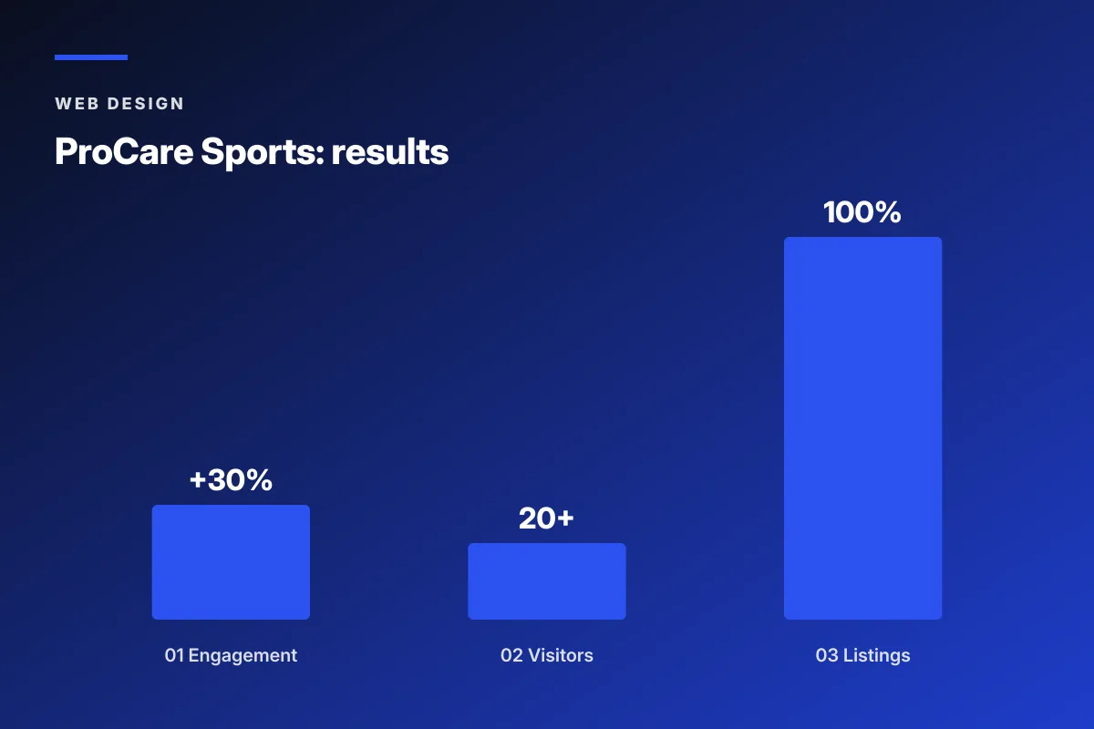
ProCare Sports, a San Diego sports chiropractic clinic, ran the full seven-fix sprint over six months. Their starting position was every CRO project’s worst case: a slow site, no clear offer, stock chiropractor photos, a phone number buried in the footer, and 11 services stacked on one homepage. Here’s what changed and what the numbers actually did.
Where the baseline sat
Site loaded in 6.4 seconds mobile. Hero listed “chiropractic care for the whole family” with no patient focus. Google Business Profile hours disagreed with the site. Yelp listing pointed at an old suite number. Baseline traffic sat at six visitors a day. Paid traffic converted under 2 percent. Every one of the seven habits from the checklist was failing simultaneously.
What the sprint changed
Speed stack rebuilt for under two seconds mobile. Brand-aligned photography of the lead chiropractor with real athletes. Hero rewritten around the sports-injury patient. Header phone number added with tap-to-call. Sticky mobile booking button. Google reviews widget above the fold. Service pages split by condition. Google Business Profile and Yelp brought back into alignment.
The six-month result
Website engagement climbed 30 percent. Daily visitors reached 20+ with steady local growth. Listing accuracy across Google and Yelp hit 100 percent. The paid campaign that had been unviable at 6.4 seconds became productive at $1,800 a month in ad spend and started booking from week one. Every gain traced back to one of the seven fixes, not to a magic feature. That’s what chiropractor website conversion rate optimization actually looks like when it works.

Mistakes That Kill Chiropractor Website Conversion Rate Optimization
Most CRO projects fail on execution, not on the plan. Here are the six mistakes we see every month when a new client shows up asking why the last CRO round produced no change. Each mistake compounds on the next. Any one of them can invalidate a full quarter of work if it goes unaddressed.
The plan on Monday: run 14 A/B tests, three heatmaps, and a full user-testing panel by Friday. The plan on Friday: verify the booking form still works on iPhone Safari. Most of us have been that Monday. Fewer of us finish the Friday work before the next Monday’s ambitions land.
- Running A/B tests before speed is fixed and skewing every result.
- Optimizing form submissions without checking whether the leads are qualified.
- Adding hero video autoplay because a reference site had one.
- Testing button colors before testing hero copy.
- Skipping call tracking and losing half the attribution picture.
- Refreshing the whole site at once with no baseline to compare against.
The button-color trap
Button color moves booking rate by fractions of a percent. Hero copy and above-the-fold proof move it by 20 to 40 percent. Practices that spend three weeks A/B testing green versus orange before rewriting the hero are optimizing the wrong tier of the funnel. Run the copy work first. Test button color once the copy is settled and the traffic is steady.
The unqualified-lead trap
A booking rate that doubles by attracting the wrong patient is not a win. If your prenatal practice starts booking general-adjustment appointments because the hero is now vague, the CRO gain shows up on the dashboard and disappears in the schedule. Track show rate and first-visit revenue alongside booking rate. A gain that survives both is a real gain.
Chiropractor Website Conversion Rate Optimization vs Lead Generation Marketing
CRO and lead generation marketing sit in the same funnel, but they serve different jobs. Lead generation marketing brings the traffic to the site. CRO converts that traffic into booked patients. Doing one without the other is why so many chiropractic marketing dollars disappear with no result.
Traffic without conversion is a waste
A Google Ads campaign pushing 400 visitors a month to a 1.5 percent booking-rate site produces six patients. The same 400 visitors on a 6 percent booking-rate site produce 24 patients. If you have to pick one to fix first, fix the site. Traffic without a converting site is money set on fire. See our lead generation marketing playbook for the traffic side once the site is ready to convert.
PPC exposes site weakness within 48 hours
Paid traffic finds every weakness on the site inside 48 hours because paid clicks arrive with intent to book. If the site loads slowly, the phone hides, or the hero is vague, the paid campaign burns budget with no bookings. Fix the site first, then run the campaign. See PPC for chiropractors for the ordered checklist.
The order that saves the most money
Fix the site to a 4 to 5 percent booking rate first. Then turn on paid traffic. Then optimize the campaigns using data from a converting site. That order saves you a full month of ad budget compared to running paid traffic to a broken site. Most practices do it in the wrong order and lose the equivalent of the CRO sprint budget to wasted clicks before they figure it out.
Tools That Help Chiropractor Website Conversion Rate Optimization
You don’t need a full analytics stack to run useful chiropractor website conversion rate optimization work. Five tools cover 90 percent of what a single-location practice needs. Two are free. Three cost under $100 a month combined. Every tool on this list ties back to the seven fixes above.
Google Analytics 4 for baseline metrics
GA4 sits at the base of every CRO project. Set up goal tracking for booking form completion, phone calls, and directions clicks. Then run the numbers against the 14-day baseline before you change anything on the site. Free tier covers a single-location practice comfortably. See Google’s GA4 setup guide for the current wiring instructions.
Call tracking for the mobile funnel
Roughly 60 percent of chiropractic bookings on mobile come through a phone call, not a form. Without call tracking, you’re blind to which ad, which page, and which time of day drove the call. CallRail, WhatConverts, and CallTrackingMetrics all cover this and start at $45 a month. Pick whichever integrates with your CRM and stop guessing at attribution.
Heatmaps for the qualitative check
Hotjar or Microsoft Clarity give you scroll depth, click maps, and session recordings. Watch ten sessions before you make a change. That single hour of watching real users usually surfaces the two biggest issues on the page. Clarity is free. Hotjar’s free tier covers a single-location practice.
Chiropractor Website Conversion Rate Optimization 90-Day Plan
Here’s the ninety-day plan we run at Redefine Web when a chiropractic client signs on for a CRO sprint. Every week has a specific target. Every month ends with a review against the baseline. This is the plan that produces the 2x to 4x booking-rate results, not a one-off template.
Days 1 to 14: baseline and speed
Set up GA4, call tracking, and heatmaps. Run 14 days of clean baseline data. In parallel, run the Lighthouse audit and start the speed fixes. Cut hero video autoplay, compress images, remove unused plugins and tracking pixels. By day 14, mobile speed should sit under 2.5 seconds.
Days 15 to 45: hero, proof, booking
Rewrite the hero for one patient type and one problem. Add the Google reviews widget above the fold. Install the sticky mobile booking button. Move the phone number to the header with tap-to-call. Book the photo session and swap out the stock library. By day 45, booking rate should be showing 40 to 80 percent improvement against the baseline.
Days 46 to 90: service pages and refinement
Split the services mega-page into one page per condition. Rewrite each service page for the specific patient and search intent. Run one A/B test per week on the highest-traffic page. Day 90 review: compare booking rate, cost per booked patient, and total booked appointments to the day-zero baseline. When you’re ready to run this across the practice, our chiropractor marketing services covers the full stack, retainer starts at $599 a month. For the sibling walk-throughs, see chiropractor business website examples and best websites for chiropractors.
Chiropractor Website Conversion Rate Optimization vs a Full Redesign
Practices routinely ask for a full redesign when a CRO sprint would produce the same booking outcome at a fraction of the cost and timeline. The default answer is CRO first, redesign only if the sprint reveals the current stack cannot support the numbers you want.
When a sprint is enough
Most practices that ask for a rebuild actually need a two-week to three-month sprint on the current site. If your site is on a modern platform (WordPress, Webflow, Squarespace), the seven fixes above are applicable without a rebuild. The sprint saves 60 to 80 percent of the rebuild cost and produces booking-rate results in the same quarter.
When a rebuild is actually needed
Rebuild is the right call when the current site runs on a platform that can’t hit sub-2.5-second load speed, when the booking form is welded to a system your practice management software no longer supports, or when the site was built by a family member in 2011 and hasn’t been touched since. In those cases, no CRO sprint can outrun the underlying platform limits.
The hybrid approach most practices should take
Run the CRO sprint first. Use the numbers from days 30 through 90 to decide whether the current platform can carry your target booking rate. If yes, keep the site and layer in maintenance. If no, use the sprint data to write a specific brief for the rebuild. That order means the rebuild lands on real numbers, not on gut feel, and the new site launches with a plan for CRO built in from day one. See our chiropractor website design guide for the deeper strategic view.
Chiropractor website conversion rate optimization is the highest-ROI marketing work most practices can do. Run the ordered fixes, watch the numbers, and let the site earn the rebuild before you commission one.
Frequently asked questions
What is chiropractor website conversion rate optimization?
Chiropractor website conversion rate optimization is the practice of moving more of your existing website visitors into booked appointments without spending more on ads or SEO. If your Google Ads campaign sends 400 visitors a month and 6 book, that's a 1.5 percent conversion rate. If the same 400 visitors book 32, that's 8 percent. Same traffic, five times the patients. CRO closes that gap through changes to speed, hero copy, above-the-fold proof, booking flow, phone placement, service page structure, and real photography. Each change compounds on the next when they run in the right order.
How much does chiropractor website conversion rate optimization cost?
A full 90-day chiropractor website conversion rate optimization sprint costs $1,800 to $6,500 depending on scope. Solo consultants run the low end for a single-location practice. Boutique agencies with a chiropractic focus run $4,000 to $6,500 for a seven-fix sprint including copy, design, and development. Practices with an in-house marketing lead can often run the same sprint for the cost of tools and one photo session, roughly $600 to $1,200. The ROI usually shows up inside the first 60 days because the fixes compound and start moving booking rate before the sprint completes.
Which fixes move chiropractor website conversion rate optimization the most?
The seven fixes ranked by impact are speed under 2.5 seconds mobile, hero rewrite naming one patient and one problem, Google reviews widget above the fold, sticky mobile booking button, header phone number with tap-to-call, service page split from one page to one page per condition, and real practice photos replacing the stock library. Run them in that order because each one changes the impact math on the next. Skipping the first two and starting with the last three is the most common mistake and produces flat results even when the individual changes look good in isolation.
How long does chiropractor CRO take to show results?
Booking rate improvements from chiropractor website conversion rate optimization usually show up inside the first 30 to 45 days on a properly instrumented site. Speed fixes show up immediately in the Core Web Vitals reports and start moving bounce rate the same week. Hero rewrites and above-the-fold proof changes move booking rate within two weeks of live traffic. Service page splits take longer to show because they depend on organic search re-crawling and re-ranking, which usually completes inside 60 to 90 days. Full sprint results land at day 90 with a clean comparison to the day-zero baseline.
What tools do I need for chiropractor website CRO?
Five tools cover 90 percent of what a single-location practice needs. Google Analytics 4 for baseline metrics and goal tracking. Google Lighthouse for speed and Core Web Vitals audits. Call tracking software like CallRail, WhatConverts, or CallTrackingMetrics for the mobile funnel. Hotjar or Microsoft Clarity for heatmaps and session recordings. A conversion-friendly booking form or embedded calendar. Two of the five are free. The paid tools cost under $100 a month combined. That stack is enough to run a proper CRO sprint without needing an enterprise analytics setup.
Should I run CRO before or after paid advertising?
Fix the site to a 4 to 5 percent booking rate first. Then turn on paid traffic. Then optimize campaigns using data from a converting site. That order saves the equivalent of a full month of ad budget compared to running paid traffic to a broken site. Paid clicks arrive with intent to book, and they find every weakness on the site inside 48 hours. If the site is slow, the phone hides, or the hero is vague, the campaign burns budget with no bookings. Most practices do it in the wrong order and lose the equivalent of the CRO sprint budget to wasted clicks before they figure it out.
What's the difference between CRO and a full website redesign?
A CRO sprint applies the seven high-impact fixes to your current site without rebuilding it. It costs $1,800 to $6,500 and runs 90 days. A full redesign rebuilds the site from scratch and costs $8,000 to $18,000 over 12 to 18 weeks. Most practices that ask for a rebuild actually need a sprint. Run the sprint first. Use the numbers from days 30 through 90 to decide whether the current platform can carry your target booking rate. If yes, keep the site and layer in maintenance. If no, use the sprint data to write a specific brief for the rebuild so the new site launches with real numbers behind every decision.
Book your free 30-minute strategy call.
No spam, no sales rep. We use your email to schedule your call with a senior strategist. That is it.
More from the blog
View all articles → Web Design
 Core Web Vitals Healthcare Websites Actually Need to Book Patients
Read article Web Design
 Professional Services Website Design Best Practices for 2026
Read article Web Design