
Responsive Web Design Ecommerce Patterns That Convert on Mobile
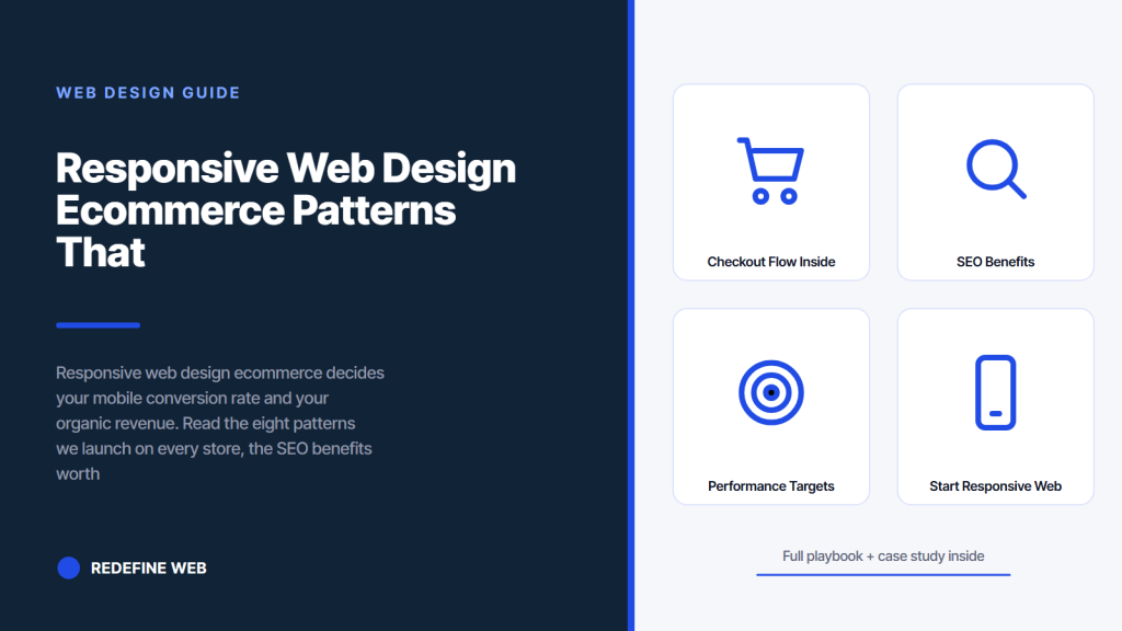
- Product pages drive most revenue. Fix them first.
- Sticky Add to Cart bars grow mobile conversion 10 to 25 percent.
- Slide-out filter drawers beat top-loaded filters on category pages.
- One-column checkout stacks grow completion 10 to 20 percent.
- Abigail Ahern grew revenue 179 percent with these eight patterns.
- Responsive web design ecommerce for product pages
- Responsive ecommerce web design for category pages
- Checkout flow inside a responsive web design ecommerce build
- SEO benefits of responsive ecommerce web design
- Abigail Ahern case study on responsive web design ecommerce
- Platform choices for responsive web design ecommerce
- Performance targets on ecommerce responsive web design
- Where to start with responsive web design ecommerce
Responsive web design ecommerce is the single biggest lever on store revenue in 2026. Mobile now drives 65 to 75 percent of retail traffic across every category worth mentioning. A well-built responsive store matches or beats desktop conversion. A badly built one runs 30 to 50 percent behind and loses recovery down every step of the funnel. This guide is the eight patterns we ship on every Shopify, WooCommerce, or headless store we build, and the numbers behind why each earned its slot.
You will read what responsive web design ecommerce means in a store context, the eight patterns worth adopting in the next sprint, how product pages differ from category pages on mobile, the checkout flow decisions that cut cart abandonment, the SEO benefits your store earns from proper responsive markup, the performance targets Google rewards on mobile ecommerce, and the real Shopify client where these patterns grew revenue 179 percent without a single discount banner on the site.
Responsive web design ecommerce for product pages
Product pages carry the highest conversion weight in a responsive web design ecommerce build. A single product page can drive 30 to 60 percent of a store’s total revenue when the SKU is a hero product. Every design decision on the product template pays back or costs across every visitor for years. The mobile version needs to load fast, communicate the value in the first 400 pixels of scroll, and get the Add to Cart action into the thumb zone.
Beyond the sticky Add to Cart bar, product pages need image galleries that swipe cleanly on touch, variant selectors that respect tap-target minimums, product descriptions that read at 16 pixels minimum, review widgets that do not shift layout, and cross-sell recommendations that respect the single-column mobile stack. Every one of these gets tuned in a proper responsive web design ecommerce build. Every one produces measurable conversion gain on aggregate traffic.
Image gallery patterns for touch
Product image galleries on responsive web design ecommerce need swipe gestures on mobile with visible dot indicators and thumbnail row on desktop. Users expect to swipe. Users notice when they cannot. Every product page image gallery we build supports touch swipe, keyboard arrow keys, and mouse click through the same interaction layer. Zoom on tap-and-hold. Full-screen mode on double-tap. Every gesture matches native app patterns and reads familiar.
Variant selector tap targets
Variant selectors on product pages (size, color, style) need to clear 44 by 44 pixels minimum per option. Color swatches often ship at 24 or 32 pixels on default themes. Users misfire between adjacent swatches. Every responsive web design ecommerce build we deliver sizes color swatches at 44 pixels minimum and often 56 for the primary variant type. Size selectors sit at 56 pixels tall with 8 pixels of spacing between options. That sizing grows conversion 5 to 15 percent on multi-variant products.
Responsive ecommerce web design for category pages
Category pages need to help users find the right product fast. Filter panels, sort controls, and the product grid layout all decide how many taps sit between the visitor and a product page. Every extra tap costs about 20 to 30 percent of the remaining traffic. Every design decision on the category template compounds. A responsive ecommerce web design that gets category pages right sees 40 to 60 percent higher click-through to product pages than default theme layouts.
The slide-out filter drawer is the pattern that moves the metric. Instead of loading 15 filter options at the top of the category page and pushing products below the fold, the drawer sits behind a Filter button in the sticky top bar. Users tap Filter, the drawer slides in from the left, users pick options, users tap Apply, the drawer closes, and the product grid reloads with filtered results. That pattern keeps the product grid above the fold on every viewport.
Slide-out filter drawer details
The slide-out filter drawer opens over the page on mobile and docks to the left sidebar on desktop viewports past 1024 pixels. Same component, different render. Filter options group under collapsible headers. Applied filters show as pills at the top of the drawer with tap-to-remove. Every responsive web design ecommerce build we deliver uses this pattern on category pages with more than five filter dimensions. It reads clean and it converts.
Sort controls in the sticky bar
Sort controls (Price low-high, Newest, Best Selling) sit next to the Filter button in the sticky top bar on category pages. Users tap Sort, a bottom sheet slides up on mobile with the sort options, users tap a choice, sheet closes, grid reorders. That pattern beats a top-loaded dropdown by 15 to 25 percent on filter usage rate. Every responsive ecommerce web design we ship uses this pattern on category pages with more than 20 products.
Checkout flow inside a responsive web design ecommerce build
Checkout is where responsive web design ecommerce earns or loses the sale. Baymard Institute puts average cart abandonment at 70 percent across the industry in early 2026. Every friction point in the checkout flow adds to that number. Every friction point removed pays back across every visitor for years. A one-column checkout stack, big form fields, thumb-zone submit buttons, and clear progress indicators are the four rules that pay back on every store.
Shopify Checkout is the current benchmark for responsive ecommerce checkout. One-page or three-step, mobile-first from base, express payment methods surfaced at the top. Every store we build tunes to match or beat that pattern. WooCommerce stores need custom work to reach parity. BigCommerce ships closer to Shopify defaults. Headless React stores implement Checkout SDK patterns and control every render. All three approaches converge on the same responsive checkout patterns because those patterns work.
One-column checkout stack on every viewport
Checkout runs one column on every viewport up to 900 pixels. Shipping form first, then payment, then review. Every field full-width. Every submit button 56 pixels tall minimum. That layout grows checkout completion 10 to 20 percent versus a two-column layout on mobile because it removes cognitive load and matches natural reading order. Even on desktop, a centered one-column checkout at 640 pixels wide reads calmer than a two-column layout crammed into the same space.
Express payment method placement
Apple Pay, Google Pay, Shop Pay, and PayPal Express buttons sit at the top of the checkout above the form fields. Users who prefer express payments tap once and skip the form entirely. Users who prefer manual checkout scroll past and fill the form. That order grows completion 15 to 30 percent on stores that adopt it. Every responsive web design ecommerce build we deliver surfaces at least two express payment methods on both cart and checkout pages.
Emulators lie. Load your top product on a Android over LTE. If tap targets feel cramped or images stutter, that's why mobile revenue is flat.
SEO benefits of responsive ecommerce web design
The SEO benefits of responsive ecommerce web design compound across every product URL, every category page, and every content page on the store. Google indexes the mobile version first. A store that renders well on mobile earns better rankings than a desktop-first store with a mobile skin. That ranking advantage compounds across every SKU and every category over 12 to 24 months. See Google Search Central mobile-first indexing reference.
Beyond mobile-first indexing, Core Web Vitals field data feeds directly into ranking algorithms for retail queries. Stores that clear LCP under 2.5 seconds, INP under 200 milliseconds, and CLS under 0.1 on mobile field data rank measurably higher than stores that miss any of the three. Every responsive web design ecommerce build we deliver targets green on all three inside 30 days of launch. Every one has hit the target on real user field data.
| SEO benefit | Impact on retail store |
|---|---|
| Mobile-first indexing alignment | Consistent rankings across queries |
| Core Web Vitals field data green | Ranking bump on retail queries |
| Single URL per product | No duplicate content across m-dot subdomain |
| Consolidated backlink authority | All inbound links compound on one URL |
| Faster mobile load | Better dwell time and lower bounce |
| Schema markup consistency | Product rich results in mobile SERPs |
Single URL per product across devices
Responsive web design ecommerce uses one URL per product across desktop and mobile. No m-dot subdomain. No separate mobile URL. Every inbound link, every share, every internal link points to the same URL. Backlink authority compounds. Duplicate content signals disappear. Every store that migrated from m-dot to responsive around 2016 through 2019 saw ranking gains inside 90 days. The pattern is well-documented and the migration is worth doing on any legacy store still running m-dot.
Core Web Vitals field data as ranking input
Google rewards Core Web Vitals field data on retail queries. LCP under 2.5 seconds, INP under 200 milliseconds, CLS under 0.1 all measured from real users on real devices. Stores in the green threshold outrank stores in the red threshold on the same query set. Every responsive web design ecommerce build we deliver targets green on launch and holds it through the first year. Field data below the 75th percentile threshold triggers a fix pass on the responsive design or performance work.
Abigail Ahern case study on responsive web design ecommerce
Abigail Ahern runs a luxury home décor DTC brand out of London. When she came to us in 2020, the Shopify store was running Shopify’s default Debut theme with mobile conversion sitting at 0.9 percent against a 2.4 percent desktop conversion rate. Cart abandonment ran 78 percent, four points above the industry average. Google Analytics showed mobile traffic at 68 percent of sessions but only 42 percent of revenue. The gap was diagnosable in an hour of site walkthrough on a phone.
We rebuilt the Shopify theme with a mobile-first CSS approach and every one of the eight responsive web design ecommerce patterns above. Single-column product grid. Sticky Add to Cart bar. Slide-out filter drawer. Persistent cart drawer. Progressive image loading with AVIF. One-column checkout. Fluid clamp() typography. Full-screen instant search. Across four years of partnership, the store grew revenue 179 percent, paid social ROAS reached 3,000 percent, and paid search ROAS hit 1,588 percent. All without a single discount banner on the site.
Every ecommerce founder who has ever obsessed over the desktop hero image eventually walks over to the couch, pulls out their phone, opens their own store, and watches the mobile Add to Cart button sit approximately six thumb-widths below the fold. That moment is why mobile-first exists on ecommerce. It is also why every senior designer we know at least once has quietly rebuilt an entire theme after seeing the same client’s mobile bounce rate on Monday morning.
Patterns applied on the Abigail Ahern build
Single-column product grid on mobile and two on tablet. Sticky Add to Cart bar on every product page. Slide-out filter drawer on category pages. Persistent cart drawer across the site. AVIF image format with progressive loading. One-column checkout on mobile and centered on desktop. Fluid clamp() typography on product titles and body. Full-screen instant search overlay with keyboard focus trap. Every pattern shipped. Every pattern contributed to the 179 percent revenue growth over four years.
Post-launch metrics on the Abigail Ahern store
179 percent revenue growth over the partnership window. Paid social ROAS 3,000 percent. Paid search ROAS 1,588 percent. Zero discount banners across the site the entire period. Mobile conversion rate closed to within a quarter point of desktop within six months of the theme rebuild. Every one of these numbers traces back to the responsive web design ecommerce pattern set applied across the store. Predictable outcomes when the patterns match the audience.
Platform choices for responsive web design ecommerce
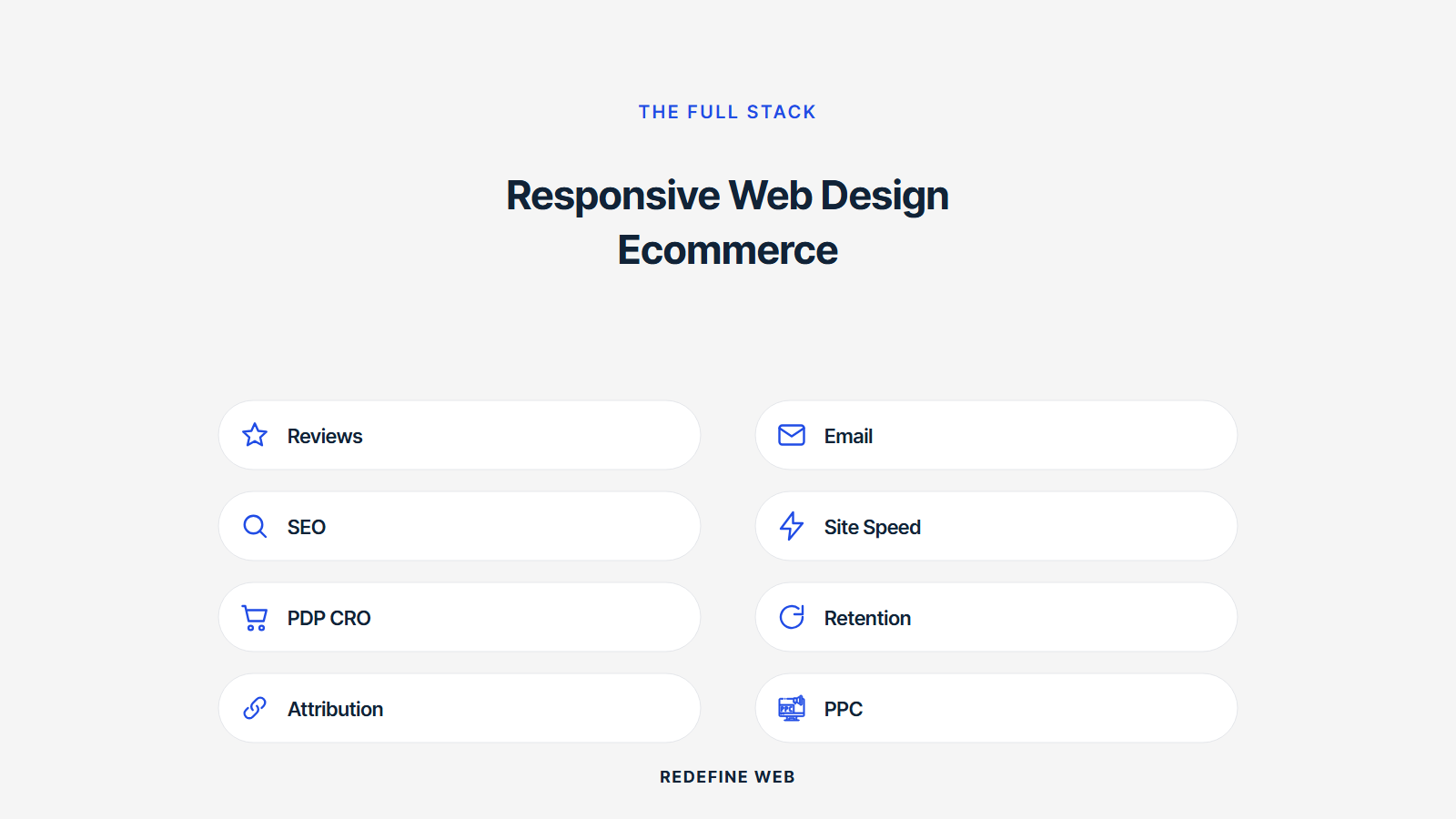
Platform choice matters less than pattern discipline. Shopify, WooCommerce, BigCommerce, and headless React stores can all ship excellent responsive web design ecommerce experiences. Shopify ships closer to the goal out of the box because Dawn theme is mobile-first by default. WooCommerce needs more custom work because Storefront theme was designed pre-mobile-first. BigCommerce sits between the two. Headless React gives you full control at the cost of engineering complexity.
Every platform benefits from the same responsive patterns. Every platform we build on gets tuned to the same mobile-first standard. The choice comes down to team skill, budget, and roadmap. Shopify for speed to launch and merchant simplicity. WooCommerce for WordPress integration and full customization. BigCommerce for mid-market scale. Headless React for custom stack requirements. All four can produce responsive ecommerce web design that hits the conversion and SEO benefits above.
Shopify Dawn as the fastest baseline
Shopify Dawn theme ships as a mobile-first, semantically clean, low-JavaScript base for responsive web design ecommerce work. Adding the eight patterns above to Dawn takes about 2 to 3 weeks of theme development for a 200-SKU store. Every one of the eight patterns fits inside Dawn’s section-based architecture without hacking against the platform. That combination makes Shopify the fastest path to a properly tuned responsive ecommerce build for merchants at the 100-500 SKU tier.
WooCommerce as the WordPress-integrated choice
WooCommerce integrates with the WordPress content stack cleanly. Blog, landing pages, and store share one CMS. That integration matters for stores where content marketing drives 30 to 60 percent of traffic. WooCommerce needs more custom responsive web design ecommerce work than Shopify because Storefront theme and most third-party themes ship desktop-first assumptions. Budget an extra 30 to 50 percent on responsive tuning versus a comparable Shopify build.
Performance targets on ecommerce responsive web design
Performance targets on ecommerce responsive web design track the same Core Web Vitals thresholds as any other site. LCP under 2.5 seconds, INP under 200 milliseconds, CLS under 0.1 on mobile field data. The difference on stores is the third-party script load. Every review widget, every abandonment recovery script, every retargeting pixel adds to the CWV budget. Every launch we do audits third-party scripts against CWV contribution and defers or replaces the offenders. See the web.dev Core Web Vitals reference for current threshold values used in ranking algorithms.
Image weight is the second-biggest performance factor on ecommerce sites. Product image galleries at 5 to 10 images per SKU add up fast. Every image on every product page should ship AVIF format at 200 kilobytes or less, srcset with 4 to 6 variants, and lazy loading below the fold. That discipline keeps mobile LCP under 2 seconds even on image-heavy retail templates. See web.dev image format guidance for the format tradeoffs.
Auditing third-party scripts on stores
Third-party scripts on ecommerce sites often include Klaviyo, Yotpo, Recharge, Loop Returns, Bold Upsell, and half a dozen retargeting pixels. Every one adds JavaScript to the main thread. Every one costs INP milliseconds. Every launch we do audits which scripts add value and which just sit collecting data no one reads. Removing the dormant ones drops INP into green threshold on most stores without touching the core theme code.
Image optimization on product pages
Every product image should ship AVIF format with WebP fallback and JPEG fallback through the picture element. Hero image on the product page gets fetchpriority high. Every image below the fold gets loading lazy. srcset provides 4 to 6 variants sized for common mobile and desktop viewports. That pattern set keeps LCP under 2 seconds on real user field data across image-heavy retail templates. Every responsive web design ecommerce build we deliver applies these rules on every product template.
Where to start with responsive web design ecommerce
Start with your product page template. That page carries the highest revenue weight per visitor. Adopt the sticky Add to Cart bar, single-column mobile stack, and image gallery with touch swipe on your top 10 SKUs first. Measure mobile conversion for two weeks before and two weeks after on the same audience. That before-and-after produces the number that justifies rolling the pattern set across the full catalog.
Once product pages earn the conversion win, roll the slide-out filter drawer to your top three category pages. Same measurement window. Same before-and-after. Every pattern that produced a win on product pages typically repeats on category pages. Every pattern that did not move the metric drops from the priority list. That order of rollout produces measurable outcomes at every step instead of a big-bang rebuild that leaves the team wondering which change earned which gain.
Ready to hire a team that specializes in responsive web design ecommerce work across Shopify, WooCommerce, BigCommerce, and headless React. Our responsive web design services ships every store project mobile-first with the eight patterns applied. For related reading in this cluster, see our responsive web design techniques and best practices, our mobile responsive web design guide, and the SEO impact article at responsive web design and SEO. For platform-side reading, our ecommerce website design services covers the full store build.
Frequently asked questions
What is responsive web design ecommerce?
Responsive web design ecommerce is a full store build where every page, component, and checkout step adapts fluidly from a 320-pixel phone to a 2560-pixel monitor. Not just marketing pages. Not just the homepage. Product pages, category grids, filter panels, cart drawers, and checkout steps all ship responsive from the base template. That completeness separates a real responsive store from a desktop-first store with a mobile skin. Every serious Shopify, WooCommerce, or headless React store built after 2020 uses this approach.
What are the benefits of responsive ecommerce web design?
The benefits of responsive ecommerce web design fall into three buckets. Conversion: mobile add-to-cart rate and checkout completion match or beat desktop when the patterns are right. SEO: mobile-first indexing rewards a well-built responsive store with better rankings across every SKU and category. Cost: one codebase serves every device instead of a separate m-dot subdomain requiring dual maintenance. Every store that migrated from m-dot to responsive around 2016 through 2019 saw ranking and conversion gains inside 90 days.
How does responsive ecommerce web design compare to a mobile app?
A responsive ecommerce web design serves every visitor through the browser without a download. A mobile app serves loyal customers who install and return. Most retail brands should invest in responsive first and add an app only after annual revenue clears $10 million and repeat-purchase rate justifies the engineering cost. Responsive covers every acquisition channel. Apps reward retention. Both can coexist in a mature ecommerce stack but responsive comes first for 95 percent of merchants.
What are the SEO benefits of responsive ecommerce web design?
The SEO benefits of responsive ecommerce web design compound across every URL. Google indexes the mobile version first, so a well-built responsive store outranks a desktop-first store on retail queries. Core Web Vitals field data feeds ranking on mobile queries: stores that clear LCP under 2.5 seconds, INP under 200 milliseconds, and CLS under 0.1 rank measurably higher. Single URL per product means backlink authority consolidates instead of splitting across an m-dot subdomain. Every one of these advantages compounds across every SKU over 12 to 24 months.
Why do ecommerce merchants need mobile responsive web design?
Mobile now drives 65 to 75 percent of retail traffic across every category worth mentioning. A well-built responsive store matches or beats desktop conversion. A badly built one runs 30 to 50 percent behind and loses cart recovery down every step of the funnel. That gap is not the audience. That gap is the build. Every ecommerce merchant needs mobile responsive web design to protect the revenue coming through phone traffic and to earn the ranking that mobile-first indexing rewards. The math is settled.
Which platform is best for responsive web design ecommerce?
Shopify Dawn ships closest to a mobile-first responsive baseline out of the box. Adopting the eight patterns above on a Dawn build takes about 2 to 3 weeks for a 200-SKU store. WooCommerce needs more custom responsive work because most themes ship desktop-first assumptions. BigCommerce sits between the two. Headless React gives you full control at the cost of engineering complexity. Every platform benefits from the same responsive patterns. Choose based on team skill, budget, and roadmap, not on which platform ships responsive best by default.
Book your free 30-minute strategy call.
No spam, no sales rep. We use your email to schedule your call with a senior strategist. That is it.
More from the blog
View all articles → Web Design
 Core Web Vitals Healthcare Websites Actually Need to Book Patients
Read article Web Design
 Professional Services Website Design Best Practices for 2026
Read article Web Design