SEO friendly website design is the set of decisions made while a site is being designed that decide whether its pages can be found, understood and ranked. How your pages are grouped, what the addresses look like, what every template prints in its headings and menus, and how heavy each page is to load all get settled before anyone writes the copy, and all of them are expensive to change afterward. If you are buying the build and the search work together, for example as a website design and SEO package, they are the questions to settle before the design is approved.
That matters to you because most of what search work does later sits on top of those choices. A paragraph can be rewritten in an afternoon. A template that renders every service name as styled body text, or a phone layout that paints its hero image slowly, is a development ticket on every page that uses it. This guide stays on the design decisions. Whether to rebuild at all and which platform to build on are separate calls.
What SEO friendly website design decides before any copy exists
A website is not designed page by page. It is designed as a handful of templates, a service page, an article, a location page, a contact page, and every real page is one of those templates filled in. That is why design decisions carry so much weight in search. A choice made once in a template repeats on every page built from it, good or bad.
Six decisions do most of the work, and each one has a point in the project after which changing it gets expensive.
| Decision | When it gets fixed | What changing it later involves |
|---|---|---|
| Information architecture | Sitemap, before wireframes | New pages, merged pages, rewritten menus and redirects |
| URL pattern | Before the first page is built | A redirect for every address that changes |
| Navigation and link areas | Wireframes | A template change on every page |
| Heading and template markup | Design system and build | Development on every page using the template |
| Page weight and scripts | Component and asset choices | Rebuilding components, not compressing files |
| Mobile layout | Phone designs | Redesigning the phone view of each template |
Design does not decide everything. It cannot make thin pages worth reading, and it cannot earn links from other sites. The keyword research and content priorities that sit on top of the structure belong in an SEO plan. What design can do is make sure none of that later work is fighting the site it runs on.
Information architecture comes before the first mockup
Information architecture is the decision about which pages exist and how they group. It is the first thing to settle, because every later choice, the menu, the URLs, the templates, is built around it.
The working rule is one page for each distinct thing a searcher is trying to do. Picture a practice that offers five services. A common mockup puts all five on one Services page as expanding panels, because it looks tidy. In search terms that is one address trying to answer five different searches, and it will usually answer each of them worse than a page dedicated to it. The opposite fault is just as common, two near-identical pages for the same service written for slightly different phrasings, which leaves Google to pick between them.
Grouping matters as well as the page list. Parent pages such as Services should link down to each service, and each service should link back up and across to the ones related to it. That gives the site a shape Google can follow. Google’s SEO Starter Guide puts it plainly. Google “primarily finds pages through links from other pages it already crawled.” A page sitting outside that structure depends on something else pointing at it.
Service areas are an architecture decision too. Whether each area you serve gets its own page changes how much content the site needs and what local SEO costs to run afterward, so decide it at the sitemap stage rather than after launch.
URL structure that still works when the site grows
Your URL pattern is chosen once and lived with for as long as the site exists, because every change afterward means redirecting the old address. Google publishes its guidance on this in its URL structure documentation, and most of it is simple enough to settle in a single meeting.
- Readable words, not ID numbers. Google recommends that you “use readable words rather than long ID numbers in your URLs.”
- Hyphens between words. The same page says “we recommend using hyphens (-) instead of underscores (_) to separate words in your URLs” because it helps people and search engines pick out the separate words.
- One case. Google notes that it “treats both /APPLE and /apple as distinct URLs with their own content” and so a mixed-case pattern splits one page into two. Pick lowercase and keep to it.
- As few parameters as possible. Filters and tracking tags that add parameters can multiply the addresses Google has to crawl for the same content.
The design decision underneath those rules is the pattern itself. Do services live under a /services/ folder or at the top level? Do articles carry a date in the address? A date looks harmless until you update an article and its address still announces when it was first written. Folders are worth using when they reflect a real grouping. Google’s starter guide says that on sites with more than a few thousand URLs, “using directories (or folders) to group similar topics can help Google learn how often the URLs in individual directories change.” On a thirty-page site that benefit is small, so choose folders for the people reading the address rather than for the crawler.
Navigation is a set of links printed on every page
A menu looks like a design element, and to a search engine it is a block of links that appears on every page of the site. That makes it the strongest internal linking decision you will make, and it is usually made by whoever draws the header.
Three things decide whether it works. First, the links have to be real links. Google’s link documentation says that, generally, it can only crawl a link that is an anchor element with an href attribute, and that links built from other tags that act on script events cannot be extracted reliably. A menu built as buttons that open panels through JavaScript can look identical and pass nothing.
Second, the labels. A menu item called Solutions or What We Do tells neither the visitor nor Google what sits behind it. The words your customers use for a service are the right label, and they are the anchor text Google reads for that page on every page of the site.
Third, what the menu leaves out. Pages that matter commercially but are not in the menu need a route in from somewhere else, a parent page, a related block or a footer. Breadcrumbs are one tidy way to provide that route back up, and Google’s starter guide notes that it “learns breadcrumbs automatically based on the words in the URL” and that is one more reason to get the URL pattern right first.
Internal linking needs room in the template, not only in the copy
Most internal linking advice is written for people editing copy. The design question comes earlier. Does each template have somewhere for links to go, and will the styling make them visible when they are there?
Google’s own guidance sets a floor rather than a target. Its link documentation says “Every page you care about should have a link from at least one other page on your site.” It also refuses to give a count, saying “There’s no magical ideal number of links a given page should contain.” So the job at design time is to make sure every template has a natural place for relevant links, not to hit a number.
- Service pages need a related services area and a spot where supporting articles can be linked.
- Article templates need in-body links styled so readers can see them. A link colored the same as the body text is a link nobody clicks.
- Landing pages built for ads are often left out of the menu on purpose. Decide whether they should rank, and if they should, link to them.
Adding links is not a one-off launch task. As content is published, new pages need links in from older ones, which is why internal linking belongs in the recurring work of an SEO maintenance package. A template with room for those links makes that work a content edit instead of a development request.
Templates decide your headings on hundreds of pages at once
Heading tags are where design and markup most often pull apart. A designer wants a line of text to look large, a developer reaches for whatever tag produces that size, and the page ends up with the brand slogan as its main heading and the service name as a styled paragraph. Because it happens in the template, it happens on every page.
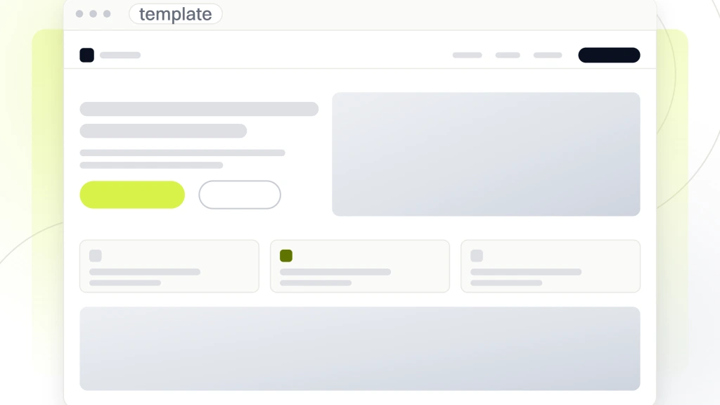
It helps to be accurate about what Google says here, because a lot of advice overstates it. In the SEO Starter Guide, Google writes “Having your headings in semantic order is fantastic for screen readers, but from Google Search perspective, it doesn’t matter if you’re using them out of order.” So a skipped level will not sink a page. What still matters is that headings exist and say something. The same guide lists the title element and other headings on the page among the sources Google uses to generate the title link shown in results, and it advises breaking content into sections with headings to help people navigate.
The fix is to separate how text looks from what it is. The design system should define visual sizes as styles that any tag can use, so a service page template can print the service name as its main heading at whatever size the design calls for. Settle the heading map per template before build, which line is the main heading, which lines are section headings, and make the page title and meta description editable per page rather than inherited from the template.
How design choices set your Core Web Vitals
Core Web Vitals are Google’s measures of how a page loads and behaves for real visitors, and many of the things they record are set by design choices. Google’s Search Central documentation gives the targets. For loading, “strive to have LCP occur within the first 2.5 seconds of the page starting to load.” For responsiveness, “strive to have an INP of less than 200 milliseconds.” For visual stability, “strive to have a CLS score of less than 0.1.” On web.dev, Google adds that “a good threshold to measure is the 75th percentile of page loads, segmented across mobile and desktop devices.”
Each of those numbers maps to decisions in the mockup.
- Largest Contentful Paint is usually the hero. A full-width photograph, an autoplaying video or a rotating slider above the fold is the element being timed.
- Cumulative Layout Shift comes from things that arrive late and push content down, images without reserved space, banners injected after load, and web fonts that reflow text when they swap in.
- Interaction to Next Paint suffers when a page carries heavy scripts, animation libraries, chat widgets and tracking tags that keep the browser busy when someone taps.
Keep the ranking effect in proportion. Google’s page experience documentation says “Core Web Vitals are used by our ranking systems.” The same page adds that good scores do not guarantee top rankings. It also says “Google Search always seeks to show the most relevant content, even if the page experience is sub-par.” Speed will not rescue a page that answers the wrong question. Where many pages are similarly helpful, Google says a great page experience can contribute to success, and that is as far as its wording goes.
What page builders and heavy themes cost you
Declare our position first, because it colors this section. Our own website design and SEO package page describes the build as “Hand-tuned WordPress, not a page-builder and not a proprietary CMS.” We have a stake in the argument that builders cost something, so weigh what follows as mechanism you can check rather than a verdict you should take from us.
The mechanism is general. A visual builder or a multipurpose theme is designed to let anyone create any layout, so it tends to ship the code for many widgets and layouts whether a given page uses them or not, and it often wraps content in extra layers of markup to make drag-and-drop editing possible. A theme sold on its demos may bundle a slider, icon sets and several font families that your site never shows. All of that is weight the browser downloads, parses and runs, which is exactly what the loading and responsiveness measures record.
The cost is not fixed, though. It depends on the tool, its version, which features are switched on, the hosting and how carefully the pages were built. A builder site can pass every threshold, and a hand-coded site with an oversized hero image can fail them. That is why no builder or theme should be picked because someone called it the fastest. Build one real template, load it on a phone and read the numbers.
There is a second cost that is easier to miss. Builders make it easy for anyone editing the site to change heading tags and layouts page by page, which can undo the template discipline described above. A lower-priced SEO tier then spends its limited hours on fixes the site keeps recreating, a pattern worth knowing about before you read what the cheap tier buys.
Mobile layout is the version Google indexes
Google’s mobile-first indexing documentation is direct. “Google uses the mobile version of a site’s content, crawled with the smartphone agent, for indexing and ranking.” For design, that turns the phone layout from a scaled-down afterthought into the version of the site that counts.
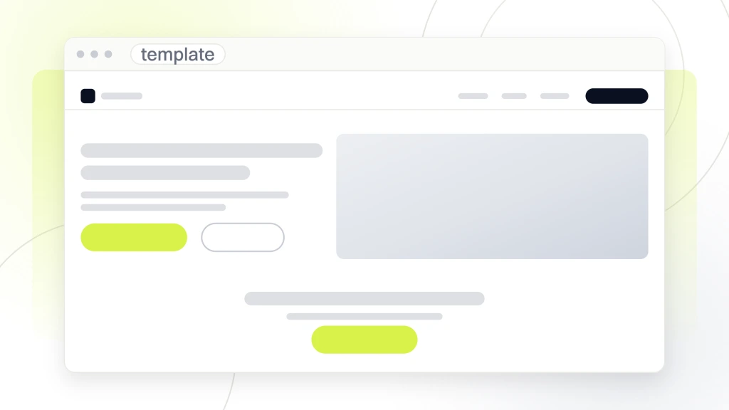
The most common mobile design fault is removing content to simplify the phone view. A shorter service description, a table dropped because it did not fit, a testimonial block hidden below a breakpoint. If it is not in the mobile version, Google is not reading it. Google’s own suggestion for saving space is gentler. Instead of removing content, it says, “consider moving content into accordions or tabs to save space.” It also asks you to “Use the same clear and meaningful headings on the mobile site as you do on the desktop site.”
Responsive design serves the same HTML to every device, which avoids keeping two versions in step, and Google states that it “recommends Responsive Web Design because it’s the easiest design pattern to implement and maintain.” Two other phone decisions belong in the design review. Pop-ups that cover the content on arrival are one of the page experience questions Google asks you to check, “Do your pages avoid using intrusive interstitials?” And the phone hero is usually where the loading measure is won or lost, so it deserves its own asset choice rather than the desktop image shrunk down. When you compare quotes, whether the phone view is designed separately is one of the differences to look for in web design packages tier by tier.
Content that only appears after a click or a script runs
There is a line between content hidden and content missing, and design choices decide which side a page falls on. An accordion whose text is already in the page, just collapsed, is still in the page. Content that is only fetched when someone clicks is a different case. Google’s mobile documentation says “Google won’t load content that requires user interactions (for example, swiping, clicking, or typing) to load.”
Two popular design patterns run into this. The first is the one-page site, where Services, About and Contact are sections of a single long page reached by anchor links. Google’s URL documentation says “Don’t use fragments to change the content of a page, as Google Search generally doesn’t support URL fragments.” Everything on that page competes for rankings as one address, which returns us to the architecture problem of one page trying to answer many searches.
The second is the site rendered entirely in the browser by a JavaScript framework. Google can render JavaScript, and its JavaScript documentation describes the queue pages wait in before rendering. The same page says “server-side or pre-rendering is still a great idea because it makes your website faster for users and crawlers, and not all bots can run JavaScript.” If your build relies on scripts to produce its main content, ask how the HTML looks before any script runs, and ask for that answer in writing.
How to check a design for SEO before anyone builds it
You do not need to read code to review a design for search. You need the sitemap, the mockups for each template in both desktop and phone views, and answers to a short list of questions. Ask them before you sign off the design, because every answer is cheaper to change at that point than at any point after it.
- Does every service, product line or audience you want found have its own page on the sitemap?
- What is the URL for each page, and does the pattern stay readable and lowercase?
- Are menu items real links, and do their labels use the words your customers search with?
- For each template, which line is the main heading, and can the title and meta description be edited per page?
- Where does each template put related links, and are in-body links visibly styled?
- What is the hero on each template in the phone view, and how large is the file?
- Does the phone view contain the same content and headings as the desktop view?
- Which third-party scripts load on every page, and who approved each one?
- Who is responsible for Core Web Vitals, and are they part of the acceptance criteria?
If build and search are split between two firms, this review is where the gap shows. The designer answers to the approval, the SEO provider inherits the result, and nobody owns the questions above. Whether that split suits you is the subject of web design and SEO, one company or two, and the same questions work well when you are choosing an SEO provider to take over a site someone else built.
What we would do first on a new build
We would lock the sitemap and the URL pattern before a single mockup is drawn, because they are the two decisions that cost a redirect to reverse. Then we would write the heading map for each template, so the design system is built around real heading tags rather than retrofitted to them.
After that, we would put Core Web Vitals into the acceptance criteria and test them on the heaviest template on a phone, not on the homepage on a desktop. And we would refuse to approve any phone design that drops content the desktop version carries.
Where we would hold back is chasing a perfect lab score. Google’s page experience documentation says that “trying to get a perfect score just for SEO reasons may not be the best use of your time.” We agree. Once the templates clear the thresholds, the hours are better spent on the pages themselves, which is where the ongoing budget in SEO pricing packages should go.
Take the question list above into your next design review and get written answers before you approve anything. If you would rather have one team make these calls and answer for them after launch, that is what our website design and SEO package is built around.