
Optometrist website design is the single asset that decides whether your Google traffic, your paid ads, and your Instagram followers turn into booked eye exams. Every other marketing channel dumps traffic on it. Every dollar you spend on SEO, PPC, social, and email ends its journey on the same website. Build the site right and every channel books more exams on the same budget. Build it wrong and every channel underperforms as competitors’ sites take the appointments.
This guide is the exact optometrist website design process we run for every practice we build. You get the UX rules for a booking-first site, the CRO patterns that push conversion rate from 3% to 12%, the page structure of a modern optometry site, the trust signals that matter, honest pricing bands, and a Vision Express case study where a rebuilt site drove 62% more booked exams in 6 months. Read straight through in about 11 minutes.
Why optometrist website design matters more than any other channel
Your site is the end of every marketing funnel you run. SEO drives it. Ads drive it. Referrals research on it. Every marketing dollar bottlenecks through a booking form or a phone number sitting somewhere in the page structure. Design the site around booking and every channel wins.
A well-built optometry site converts paid traffic at 12 to 18% and organic traffic at 6 to 10%. A poorly built site converts paid at 3 to 5% and organic at 1 to 2%. Same clicks, same offer, same practice, one design choice, 3x the bookings. Every practice we take over from a prior vendor has a design that loses 60 to 80% of the potential bookings before the receptionist even sees the inquiry. Fixing the design is the highest-return investment we recommend in the first 90 days of every retainer.
Site design beats marketing spend
Doubling your Google Ads budget on a bad site produces 40 to 60% more clicks and roughly zero more booked exams. Rebuilding the site to convert at 12% instead of 3% produces 4x more booked exams on the same click count. The math is not close. Every dollar you spend on optometrist website design pays back 3 to 5 times the return of the same dollar spent on incremental ad budget. Vendors who push more ad spend before fixing the site are optimizing for their percentage-of-spend fee, not your booked exams.
Site design beats SEO velocity
Adding 40 more organic keyword rankings to a bad site adds 800 organic sessions per month and 8 to 16 booked exams. Rebuilding the site to convert existing organic traffic at 8% instead of 2% produces 40 to 60 more booked exams from the same monthly traffic. The site is always the multiplier. SEO is the volume dial. Multiplier first, volume second. Every practice that reverses the order spends a year on SEO before booking any incremental exams.
Site design beats social spend
Instagram and Facebook drive top-of-funnel awareness, and every one of those clicks lands on the site. A visitor who taps a Reel and hits a slow, cluttered landing page bounces inside 3 seconds. The same visitor on a fast, focused landing page books an exam at 8 to 12%. Social spend without a real optometrist website is a slow leak. Fix the site first, then spend on social. The ordering is intentional.
UX rules for website design for optometrists
Website design for optometrists follows 5 UX rules that carry across every page on the site. Break any single rule and the site converts at half the market rate. Follow all 5 and you land in the 12 to 18% conversion band that separates a working site from a broken one.
- Phone number click-to-call in the sticky header on every page
- Book Online CTA button visible above the fold on every service page
- Trust signals in the first 200 pixels (star rating, review count, patient count, years in practice)
- Insurance carrier logos accepted, visible on the homepage and every service page
- Booking form or scheduler embedded on the primary landing pages, not linked out to a third party
Sticky header with click-to-call
The sticky header is the single highest-return UX pattern for an optometrist website. Phone number in the header. Book Online button in the header. Both persist through every scroll on every page. 50 to 70% of your mobile traffic taps the phone number from the sticky header instead of scrolling to find it. Sites that hide the phone number in the footer or need 3 scrolls to reach it lose those calls to the site that keeps the phone number visible always. A sticky header adds one line of CSS and doubles mobile conversions.
Trust signals above the fold
Trust signals in the first 200 pixels decide whether the visitor scrolls or leaves. Specific numbers win. “4.9 stars on real Google reviews” beats “highly rated” every time. “Thousands of patients seen since 2011” beats “experienced staff” every time. “VSP, EyeMed, Davis Vision accepted” beats “most insurance welcome” every time. Vague adjectives do nothing on the SERP and less than nothing on a landing page. 2 hours of pulling specific numbers from your practice management system and adding them to every page hero moves the conversion rate 30 to 50% inside the first month.
Insurance clarity in the hero
Every new-patient search on an optometrist website starts with one silent question. Do you take my insurance. Answer it in the hero. Six carrier logos in a horizontal strip under the headline. A one-line link to a longer insurance page. That single change lifts qualified booking rate 15 to 25% on paid traffic since visitors self-qualify before they fill the form. Sites that bury insurance in the footer force the visitor to hunt, and most of them leave first.
Modern optometrist website page structure
A modern optometrist website runs 12 to 18 primary pages with a locked structure that pushes visitors toward booking on every page. Fewer pages and the site cannot rank for the range of terms an independent practice needs. More pages and the site turns into a maze the visitor cannot navigate. The right number sits between 12 and 18 depending on service scope and geographic reach.

| Page type | Count | Purpose |
|---|---|---|
| Homepage | 1 | Primary landing for branded and generic queries |
| Service pages | 5-8 | One per revenue service (annual exam, contact lens, dry eye, pediatric) |
| Location pages | 1-3 | One per physical location for local SEO |
| Insurance pages | 2-4 | One per major carrier for insurance-specific queries |
| About and team | 2 | Trust signal pages for referrals and research visitors |
| Book online | 1 | Dedicated scheduler page for paid traffic drops |
| Contact | 1 | Simple form plus map plus hours |
Service page structure
Each service page follows the same structure so visitors can move from service to service without learning a new layout. Hero with headline, trust signals, and a Book CTA above the fold. Description of the service in 200 to 300 words. Who this service is for (patient scenarios). What to expect during the visit (walkthrough). FAQ section addressing insurance, timing, and common concerns. Provider bios for the doctors who handle this service. Booking form or scheduler embedded at the bottom. That structure hits 12 to 18% conversion on service-specific paid traffic and 6 to 10% on organic traffic.
Location pages for local SEO
A location page for each physical practice is table stakes for local search ranking. NAP (name, address, phone) in structured schema markup. Embedded Google Map. Hours of operation. 2 to 3 photos of the storefront and interior. Provider bios for the doctors based at that location. Reviews specific to that location pulled from Google Business Profile. Directions section for common landmarks. Location pages that follow this pattern rank in the map pack within 60 to 90 days on a well-optimized optometrist website.
Insurance pages for high-intent queries
Insurance queries like “VSP eye doctor near me” convert 2 to 3 times higher than generic search terms since the visitor has already picked their carrier. A dedicated page per major carrier ranks fast and captures those searches. VSP, EyeMed, Davis Vision, and Superior Vision cover most independent practices. Each page repeats the same 4 blocks. Coverage summary, in-network confirmation, common covered services, and a Book CTA that pre-fills the carrier field. Optometrist websites that skip this step leave the highest-intent traffic on the table.
CRO patterns for optometrist websites that book more exams
Conversion rate optimization on optometrist websites follows the same handful of patterns across every practice we build. Test all 5 in the first year. 2 or 3 become the site’s long-term wins. The other 2 get retired after a month of underperformance.
The 5 CRO patterns are a shortened booking form (3 fields), a click-to-call button above the fold, insurance carrier logos in the trust bar, a patient review carousel with specific dates and photos, and a Book Online sticky button on mobile that follows the scroll. Every optometry site we build runs all 5 out of the box. Sites that skip any of the 5 bleed 8 to 20% conversion rate each. Fixing all 5 during a rebuild is what takes a 3% site to a 12% site inside 90 days. See our Optometrist Website Design service page for the full CRO stack.
3-field booking form
The booking form on paid landing pages has 3 fields. First name. Phone number. Preferred day of the week. That’s it. Insurance carrier goes in the follow-up call. Email is optional. Date of birth belongs on the intake form after they book. Every extra field drops the fill rate 8 to 15%. The paid traffic form’s only job is to capture enough for a receptionist to call back inside 15 minutes. 3 fields fill at 12 to 18%. 7 fields fill at 3 to 5%. Same traffic, one design choice, 3x the bookings.
Patient review carousel
Patient reviews with specific dates and names build trust faster than any static testimonial block. Pull the 6 most recent 5-star reviews from Google Business Profile and rotate them in a carousel on the homepage and every service page. Include the reviewer’s first name, the date the review was posted, and one specific detail from the review that identifies the service. Generic testimonials like “Great service” convert nothing. Specific reviews like “Dr. Chen fixed my dry eye issue in one visit last Tuesday” convert.
Sticky Book button on mobile
A sticky Book Online button anchored to the bottom of the mobile viewport lifts mobile conversion 12 to 18% on its own. The button follows the scroll on every page. It never blocks content since it sits in the safe area under the fold. Visitors who reach the second or third screen of a service page have the highest booking intent, and the sticky button gives them a one-click path to the scheduler. Optometrist websites that hide the Book button in the header alone waste that scroll-depth intent.
Site speed and mobile performance for optometrist websites
Site speed is table stakes. Google Core Web Vitals feed both organic ranking and Quality Score on paid ads. An optometrist website that scores 40 on mobile PageSpeed loses 20 to 30% of paid traffic to slow load before the visitor sees the hero. Every optometry site we build targets 90+ on mobile PageSpeed and stays there.
Hitting 90+ on mobile PageSpeed needs WebP images at compressed sizes, deferred JavaScript for third-party scripts, minified CSS, and a CDN like Cloudflare or BunnyCDN in front of the origin server. Sites hosted on shared WordPress hosting rarely hit above 60 on mobile. Managed WordPress hosting at Kinsta, WPEngine, or Rocket.net hits 90+ out of the box when the theme is built right. See the web.dev Core Web Vitals reference for the current thresholds.
Largest Contentful Paint below 2.5 seconds
Largest Contentful Paint (LCP) measures how fast the biggest visible element loads. For an optometrist website, that is usually the hero image or the hero video. Keep LCP under 2.5 seconds on mobile 3G to score in the green. Practical fixes include compressing the hero image to WebP at 60 to 70% quality, adding fetchpriority=”high” on the hero img tag, and preloading the hero image in the HTML head. Those 3 fixes take about 2 hours of dev time and shave 1.5 to 2.5 seconds off LCP on a typical WordPress site.
Cumulative Layout Shift below 0.1
Cumulative Layout Shift (CLS) measures how much the page jumps around during load. Nothing kills conversion faster than a visitor tapping the phone number and the page shifting a form on top of their thumb, causing an accidental form submission. Setting width and height attributes on every image, avoiding dynamic ad injection above the fold, and reserving space for fonts before they render takes CLS from a red 0.4 to a green 0.05 on most sites. Every optometry site we build targets 0.05 or below.
Interaction to Next Paint under 200 ms
Interaction to Next Paint (INP) is the third Core Web Vitals metric and the one most optometrist websites still fail. It measures the delay between a click and the page responding. Bloated theme JavaScript, uncached form scripts, and chat widgets that block the main thread all push INP into the red 500 ms range. Fix INP by deferring every third-party script, running one lightweight form library, and swapping the chat widget for a click-to-open button that loads on demand. That gets INP under 200 ms on almost every site.
Case study on real optometrist website design
Vision Express, an independent optometry practice competing with corporate chains within a 3-mile radius, came to us with a WordPress site their previous vendor built in 2019 and never updated. Homepage LCP was 5.8 seconds on mobile. The booking form had 7 required fields. There was no click-to-call in the header. Insurance carriers accepted were listed in the footer beneath the copyright line. Site conversion on paid traffic sat in the low single digits. Site conversion on organic traffic sat lower.
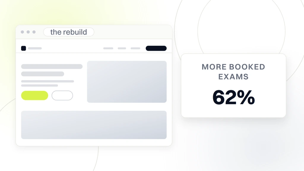
We rebuilt the entire site in 8 weeks on the modern optometrist website structure described in this guide. A new WordPress theme built for optometry with a sticky header, 3-field booking form, 6 service pages, 3 location pages, and a live scheduler embedded on the primary paid landing page. 6 months post-launch, booked exams from the site jumped 62% overall. Organic traffic climbed 135.9% as Google rewarded the improved Core Web Vitals with better rankings. Overall practice growth hit 71% against the prior 6-month baseline.
The Vision Express 6-month numbers
Booked exams up 62% overall inside 6 months. Organic traffic up 135.9% as Core Web Vitals moved into the green. Practice growth up 71% measured against the 6-month prior baseline. Every number came from a scoped optometrist website design project plus the parallel SEO and paid ads work. The design was the multiplier. SEO and paid ads were the volume dials.
Lessons for your own rebuild
2 lessons from the Vision Express rebuild apply to almost every independent optometry practice. First, most practice owners think their site is fine since it looks fine on desktop. Test it on a phone during morning traffic. Time the LCP. Try to book an exam in under 30 seconds. If any of those 3 tests fails, the site is losing bookings every day. Second, the rebuild is not a marketing expense. It is a revenue investment. Vision Express paid the rebuild back inside 4 months on booked-exam revenue alone.
Optometrist website design pricing bands
Optometrist website design pricing splits into 4 honest bands in 2026. Under $2,000 gets you a template with a color swap and vendor copy. $3,500 to $8,000 gets you a template with real copy and one custom section. $8,000 to $18,000 gets you a semi-custom design with proper page structure, SEO built in, and lead capture optimized. $20,000 and up gets you a fully custom build with strategy, content, photography, and a launch plan. Every band is honest. The mismatch shows up when a $2,800 vendor promises $15,000 outcomes.
For most solo and two-provider practices, the $8,000 to $18,000 band is where the math works. Below that you cannot afford real strategy plus custom copy plus proper CRO. Above that you are paying for enterprise process a single-location practice does not need. Add $59 to $199 per month for hosting, $150 to $600 per month for ongoing support, and $299 to $2,400 per year for SSL, plugins, and stock imagery. Budget the fully loaded annual number, not just the build fee. See our Optometrist website maintenance plans for the fixed-scope monthly support tier.
Template versus custom build
Templates work when the practice is a solo location with no e-commerce, no complex service catalog, and no plan to grow. A $2,800 template build for a rural single-location practice is a reasonable investment. Custom builds win when the practice runs 3 or more services, 3 or more locations, or has a growth plan that includes SEO and paid ads at scale. The wrong pick shows up in year 2 when the template site cannot support the growth and needs a full rebuild. Match the build type to the growth stage, not the current headcount.
Hidden costs on a bad quote
Hosting runs $12 to $199 per month depending on tier. Domain and SSL run $20 to $200 per year. Premium plugins for forms, backups, and security add $150 to $600 per year. Stock photography from a real library adds $80 to $400. Copywriting handled by a separate writer adds $600 to $3,000. A vendor whose quote lists none of these has left them for you to discover on your own budget. Ask for the fully loaded annual number, not just the build fee.
CMS choice for optometrist website marketing
WordPress runs about 70% of the optometrist websites we build for one reason. The editor is familiar to office staff, the plugin ecosystem covers scheduling integrations, and the hire pool for future edits is deep. Squarespace runs 15% for design-forward brands that value a cleaner editor and lower monthly cost. Webflow runs 10% for enterprise-tier practices that want editorial-quality visuals. Custom-coded sites make up the remaining 5% and are almost always overkill for a single-location optometry practice.
WordPress on managed hosting is the right pick for content-heavy sites where you or a team member will publish monthly. Squarespace is the right pick for a solo practice that wants a beautiful site and does not plan to publish blog content. Webflow is the right pick when the design has to look editorial and content updates are infrequent. Vendors who push their favorite platform regardless of your workflow are optimizing for their bench, not your booked exams. Ask why they recommended their pick before you agree.
WordPress vs Squarespace tradeoffs
WordPress gives you the widest ecosystem and the deepest talent pool for future edits. It runs $50 to $200 per month on managed hosting and offers the strongest SEO plugin story through RankMath or Yoast. Squarespace gives you a cleaner editor and faster time-to-launch. It costs $23 to $65 per month all-in and has a smaller plugin ecosystem for scheduler integrations. WordPress wins for practices at 3 or more locations. Squarespace wins for solo practices under 30 exams per week. Both are honest picks.
Page builder warning
Elementor, Divi, and other WordPress page builders lock your content into their block format. Migrate away from Elementor and half your layout turns into stripped text. The pick that ages best is a WordPress theme built with the native Gutenberg block editor, which stores content in portable HTML. Vendors who default to Elementor or Divi are optimizing for their own build speed, not your long-term flexibility. Ask which editor your site will use. If the answer is a page builder, ask why.
Integrations every optometrist website needs
Every modern optometry site connects to 5 external systems. Online scheduler, practice management software, insurance verification, review platform, and analytics. Miss any one integration and the front desk works harder than they need to. Get all 5 right and the receptionist confirms same-day bookings without ever manually copying a form submission into the practice management system.
The online scheduler talks to a system like Weave, LocalMed, or 4PatientCare. Practice management software integrations connect to Compulink, Crystal PM, or Revolution EHR through their APIs. Insurance verification runs through the scheduler or a separate integration like DOCS Vision or VisionWeb. Review generation runs through Birdeye, Podium, or a WordPress plugin like ReviewsOnMyWebsite. Google Analytics 4 plus Google Search Console cover the analytics side. See our optometrist marketing agency hub for the full integration stack.
Online scheduler integration
The online scheduler is the single most important integration on the site. Every booking form that submits to a scheduler API confirms the slot on the practice calendar immediately. No manual data entry. No dropped inquiries. No double-booking. The scheduler embed lives on the primary paid landing page, the homepage secondary hero, and the Book Online page. Sites that skip the scheduler integration and require the receptionist to call back inside 15 minutes lose 30 to 40% of bookings to competitors who confirm the slot on the spot.
Review generation integration
Review generation runs automatically once a scheduler booking is completed. The system sends an SMS or email to the patient 24 hours after the exam asking for a Google review. Practices running this integration collect 40 to 80 new Google reviews per year on autopilot. Practices without it collect 5 to 15. The Google review count matters for SEO ranking, paid ad Quality Score, and buyer trust on the site. Every optometry site we build includes this integration by month 2 of the retainer.
Accessibility on an optometrist website
An optometrist website carries a higher accessibility bar than most healthcare sites. Half of your visitors have a vision concern. Fail accessibility and you fail the patient who needs you most. Aim for WCAG 2.1 AA on every page. Contrast ratios of 4.5 to 1 on body text. Focus rings visible on every tab stop. Alt text on every image. Form labels tied to inputs. Skip-to-content link at the top of the page. A screen reader should read the page in the same order a sighted visitor scans it.
The practical fix runs 4 to 8 hours on a well-built optometry site and 20 to 40 hours on a template site with accessibility gaps everywhere. Budget the audit as part of the rebuild, not an afterthought. For a deeper reference on the mechanics that back all this up, see the MDN web performance reference and the Smashing Magazine Core Web Vitals guide.
Analytics that prove an optometrist website is working
Every optometrist website launches with 4 tracking layers on day one. GA4 for session behavior. Google Search Console for organic query data. Meta and Google Ads pixels for paid attribution. Call tracking on the phone number in the sticky header. Miss any layer and you cannot tell which channel booked the exam. Practices that track every layer optimize spend inside 30 days. Practices without it guess for a year.
Call tracking for click-to-call bookings
A dynamic call tracking number swaps the phone number in the sticky header based on the traffic source. Google Ads sees one number. Organic search sees another. Direct traffic sees a third. Every call routes to the front desk transparently, but the source shows up in the CRM. Practices without call tracking credit every phone booking to “other” and cut the paid budget that actually drove the call. That single mistake bleeds 20 to 40% of the ad budget every quarter.
For adjacent context on this topic, see our guides on SEO for optometrists, optometrist website design cost, and optometrist website templates.
Where to start with optometrist website design
Start with an honest audit of your current site. Test it on a phone during morning traffic. Time the LCP. Try to book an exam in under 30 seconds. Count how many taps it takes to find the phone number. If any of those tests fails, the site is losing bookings every day. Budget $8,000 to $18,000 for a real rebuild that hits the CRO patterns and Core Web Vitals thresholds. Expect the rebuild to pay back inside 4 to 6 months on booked exam revenue alone.
Ready to rebuild an optometrist website that books more eye exams. Our Optometrist Website Design covers the full engagement from discovery through launch. For the SEO side that compounds after launch, see our SEO for Optometrists. For the marketing retainer at $1,499 per month that bundles ongoing edits and SEO, see our Optometrist marketing retainer. For an outside reference on web performance benchmarks, see the Smashing Magazine Core Web Vitals guide and the MDN web performance reference.