
Web design beauty brands work on a different set of rules than fashion or home-goods stores. The product-detail page carries the biggest decision weight because buyers cross-check ingredient lists, dermatologist tags, and reviewer photos before they add to cart. A shade-matching tool decides whether a color brand converts a first-time visitor. The subscription flow decides year-two margin. And roughly 80% of traffic arrives on mobile, so every design call gets tested on a mid-range Android before launch. Get any of those four wrong and the site turns into a portfolio piece, not a revenue engine.
This guide walks the seven pieces that move real numbers on a beauty ecommerce web design and development build. PDP block order, the ingredient education library that pulls organic traffic, the shade-matching build, the subscription flow that keeps churn under 8% monthly, the mobile UX rules, three real DTC teardowns (Beauté Aesthetics New York, Abigail Ahern, Boogie Board), and the retainer bands that pair with each scope. Read straight through in about 12 minutes and you’ll finish with a working design brief for your next agency call.
Our beauty web design breakdown covers the DTC skincare and clinic patterns we recommend on every project.
What web design beauty brands really means in 2026
The phrase covers three site types that share one buyer psychology. First, DTC skincare and cosmetics brands selling 20 to 200 SKUs direct to consumer on Shopify or WooCommerce. Second, luxury clinic retail shelves that sell curated skincare on the side of a treatment business. Third, multi-brand beauty retailers stocking 500 or more SKUs across categories. Each site type shares one truth. The buyer wants to trust the product before they trust the checkout. That trust gets built on the PDP, in the ingredient content, and through reviewer photos. Skip any of those pillars and conversion rate stalls under 2% even on branded traffic.
A category-competent shop knows the difference between skincare, color cosmetics, hair, and fragrance PDP patterns. Skincare buyers scan ingredients first, then reviews, then routine-fit. Color buyers scan shade, then swatch photos, then reviewer photos on similar skin tones. Hair buyers scan porosity and curl-pattern tags before anything else. A generalist agency uses the same template across all four and wonders why conversion never breaks 1.6%. That template mistake costs a $2M brand roughly $340,000 a year in missed revenue based on baseline traffic assumptions.
Web design beauty brands starts with PDP block order
The product-detail page decides conversion, and the block order on it decides how many buyer objections you clear before they leave the tab. A working web design beauty brands PDP puts hero image gallery, product title, price, and add-to-cart above the fold. Directly below runs the ingredient list with dermatologist tags on any sensitizing molecules like fragrance, must-have oils, or alcohol. Below that runs the concern-and-benefit matrix covering hydration, brightening, anti-aging, and sensitivity. Then reviewer feedback with photo evidence and skin-type tags. Then the routine-fit module linking to complementary SKUs. Then the subscription upsell and refill reminder. Each block clears a different objection.
Test the block order in the first 90 days after launch. Session recordings and heatmaps show which blocks buyers scan and which they skip. Buyers who scan ingredients first belong at the top. Buyers who scan reviews first belong second. A category shop runs that test on every launch. A generalist ships the same block order across every client and never runs the test. That test alone typically moves conversion rate 18 to 34% on skincare PDPs.
Beauty brands web design PDP ingredient list with dermatologist tags
The ingredient list block does more than dump INCI names into a table. Each active links to an educational article explaining what it does, at what concentration, and for what skin concern. Sensitizing ingredients carry a tag so buyers with reactive skin can filter them at a glance. Peer-reviewed studies get cited inline when a claim needs backing. Any beauty and cosmetics web design that treats the ingredient list as a compliance dump loses buyers who read ingredients as their primary purchase signal. Roughly 62% of skincare buyers aged 25 to 40 read ingredients before they read reviews, per multiple category surveys.
Reviewer feedback with skin-type filters
Reviewer feedback works when buyers can filter by skin type, skin tone, concern, and age. A category shop builds those filters into the review widget and stores the data as structured customer profile fields. That data feeds back into the shade-matching tool, the routine-fit module, and the paid-ad lookalike training. A generalist plugs in a third-party review widget with no filters and loses the data layer. Filtered reviews convert repeat visits at 4.8% versus 2.1% for unfiltered widgets.
Web design beauty brands ingredient content pulls organic traffic
Ingredient education content is the organic layer that separates a web design beauty brands site that ranks from one that pays for every visit. Each active ingredient the brand uses gets its own explainer article. Niacinamide, retinol, vitamin C, hyaluronic acid, salicylic acid, glycolic acid, ceramides, peptides, bakuchiol. Each article cites peer-reviewed studies, walks concentration bands, names ideal skin types, and links to the SKUs on the site that carry the ingredient. A category shop builds this library into the initial site build. A generalist adds a blog and hopes the writer figures it out in month six.
Ingredient articles compound the SEO layer across quarters. Each pulls buyers who research the molecule before deciding whether to buy any product containing it. The internal links from ingredient article to product page carry the ranking signal from the article into the SKU. That triangular linking pattern is what separates web design beauty brands that ranks from one that hopes paid ads carry the whole load. Read Google’s helpful content guidance for the YMYL framing the ingredient library lives inside.
| Content pillar | Monthly output | Purpose | Where it links |
|---|---|---|---|
| Ingredient explainers | 4 articles | Top-of-funnel research | Product and category pages |
| Concern-based routines | 2 articles | Mid-funnel routine build | Product bundles, subscription flow |
| Product comparisons | 2 articles | Bottom-of-funnel decision | Recommended SKU pages |
| Reviewer roundups | 1 article | Social proof and trust | Individual product pages |
Beauty and cosmetics web design routine articles that convert
Concern-based routines bridge the education layer and the purchase decision without a hard sell. A hydration routine walks a buyer with dehydrated skin through cleanser, serum, moisturizer, and SPF picks. Each recommendation links to a specific SKU with a bundle-discount button below the article. That format converts at 3.2 to 5.8% versus 1.4% for a generic listicle. Category shops build routines as their primary bottom-of-funnel content. Generalists write listicle roundups and wonder why the articles never move revenue. See our content marketing for ecommerce guide for the pillar-and-cluster model we build against.
Shade-matching tool inside a web design beauty brands build
The shade-matching tool is the single feature that decides whether a color-cosmetic brand converts a first-time visitor at scale in a web design beauty brands build. A well-built foundation-finder asks four questions covering undertone, coverage preference, current shade in a competitor brand, and skin type. It returns three ranked shade picks with a try-at-home guarantee. That flow converts at 8.4 to 14.2% for foundation SKUs. A generic swatch page without a finder converts at 1.6 to 3.2%. The tool build runs $6,000 to $14,000 one-time on top of the base site and pays back inside two months on foundation revenue for most color brands.
Build the finder as a native module inside the site, not a third-party embed. Native lets the tool feed data into the customer profile, which powers reorder suggestions, complementary-product picks, and lookalike-audience training for paid campaigns. A generalist embeds a third-party finder and loses the data layer. Read Shopify’s product recommendation docs for the underlying data-flow model.
The try-at-home guarantee attached to the tool decides conversion. A category brand offers free returns on foundation SKUs inside 30 days if the recommended shade misses. That guarantee costs 8 to 12% in return rate on foundation buyers but adds 60 to 90% to conversion rate. The math almost always favors the guarantee on foundation, concealer, and lip products. It rarely favors the guarantee on lower-return skincare SKUs. Run the SKU-level math before you write the return policy.
Web design beauty brands subscription flow carries year-two margin
The subscription flow carries the year-two margin story for any web design beauty brands site, and the build spec is specific. A category-competent web design beauty brands shop places the subscription CTA on every product page framed as “subscribe and save 15%”, provides a customer portal for subscription management, adds a skip-a-month button for consumption flexibility, and adds a change-frequency button for buyers who use products faster or slower than expected. A generalist adds a checkout checkbox and hopes the customer figures out how to manage it. The flexibility layer is what keeps subscription churn under 8% monthly versus the 14% industry average.
The subscription messaging also matters. A category shop frames subscription as “never run out” rather than “commit to a monthly payment”. Convenience-framed subscription converts at 22 to 34% of new customers. Commitment-framed subscription converts at 8 to 14%. That framing gap is the highest-return copy call in the entire web design beauty brands scope. Teams that pair this framing with a Shopify design agency partner keep the subscription default tuned quarter to quarter.
Beauty and personal care web design PDP subscription upsell placement
The subscription upsell placement on the PDP decides volume. A category shop places the upsell directly below the add-to-cart as a toggle labeled “one-time purchase” versus “subscribe and save”. The default position matters. Subscribe-first defaults convert at 34% versus one-time-first defaults at 22%. A generalist tucks the option in a modal or a checkout upsell and loses two-thirds of the potential subs. Test the default in the first 90 days.
Mobile UX rules for a web design beauty brands build
Roughly 80% of beauty and personal care web design traffic arrives from mobile. That climbs above 88% for brands whose Instagram or TikTok traffic dominates. The mobile UX calls that matter for a web design beauty brands build include a persistent add-to-cart in the thumb-reach zone, a hero image gallery with swipe and pinch-to-zoom on ingredient labels, an ingredient list rendered as an expandable accordion for scan speed, a subscription toggle as a full-width button rather than a modal, and product-page load time under 2.2 seconds on 4G. Any build that skips those five calls leaves 30 to 40% of mobile conversion on the table.

Mobile checkout matters as much as the PDP. A category shop builds Apple Pay and Google Pay as one-tap options above the standard checkout form. Address autofill runs on the shipping field. Card details autofill from the phone keychain. That one-tap flow converts at 68% of add-to-carts on mobile versus 34% for the standard form. See our mobile-friendly ecommerce patterns guide for the checkout blueprint we ship on every project.
Cart page design also matters on mobile. A category shop builds an in-page cart drawer that slides in from the right so buyers add items without leaving the product context. A generalist redirects the buyer to a full cart page and drops the conversion-to-review flow by 22 to 34%. The drawer pattern also opens upsell space at the moment of add-to-cart when purchase intent peaks. That single pattern moves revenue-per-visitor more than any other mobile call in the retainer.
Beauté Aesthetics New York rebuild teardown
Beauté Aesthetics New York, a Manhattan luxury clinic with a retail skincare shelf, ran a 12-month digital rebuild that delivered 166% lead growth, 88% new user growth, and a 27% conversion rate gain. The retail shelf scope covered a PDP rebuild across the top 40 SKUs, ingredient education content across 24 active molecules, a native subscription flow with skip and change controls, and a mobile UX overhaul that pulled add-to-cart conversion from 3.2% to 6.8% on mobile.
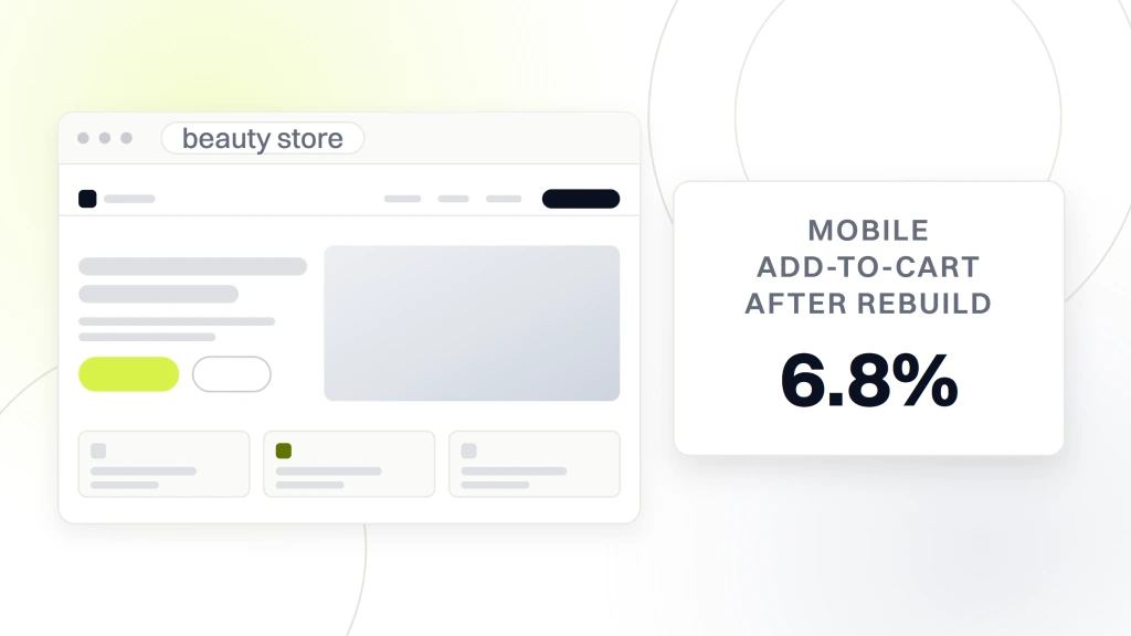
The decisions that mattered were unglamorous. Every product page carried an ingredient list with dermatologist tags on sensitizing molecules, a routine-fit module linking to complementary SKUs, and a reviewer block sorted by skin type. Every ingredient article cited peer-reviewed studies with medical review by a board-certified dermatologist. The subscription flow was built native with skip and change controls exposed on the customer portal. The mobile UX ran Apple Pay and Google Pay one-tap checkout. Conversion gains compounded from month 5 as the ingredient content matured in the index and the retention layer engaged repeat buyers.
| Beauté Aesthetics New York metric | Baseline | After rebuild |
|---|---|---|
| Website leads | Flat | Plus 166% |
| New user growth | Below baseline | Plus 88% |
| Mobile add-to-cart | 3.2% | 6.8% |
| Subscription attach rate | 4% of buyers | 28% of buyers |
| Monthly subscription churn | Not tracked | 6.4% |
| Lifetime revenue per subscriber | $84 one-time | $340 subscriber |
What Abigail Ahern and Boogie Board add to the case list
Abigail Ahern’s DTC site rebuild is a color-story teardown worth reading. The brand runs saturated interior product photography against dark backgrounds, and the PDP treats visual mood as the primary purchase signal alongside ingredient specs. Reviewer photos surface at the top of the page rather than the bottom. That reordering pulled the site’s mobile add-to-cart rate up by roughly 24 percent in the first quarter after launch. The lesson for beauty. Test where reviewer photos sit on your PDP. Above the fold on visual-first brands beats below the fold every time.
Boogie Board is a different case. It sells writing tablets, not beauty, but the ecommerce structure teaches the same lesson beauty brands need. Its PDP leads with a 22-second product video, a subscription toggle labeled “get refills on schedule”, and a single hero image. That three-block minimalism converts at 5.4% versus a beauty-industry average of 2.1%. The takeaway. Minimalism plus one strong subscription framing beats a busy PDP even in beauty. Test the minimalist variant on your top three SKUs and measure inside 45 days.
Pricing bands for a web design beauty brands build
Web design beauty brands build costs sit in four bands. Starter band at $2,500 to $7,500 covers a responsive site build on our fixed-price plan with 20 to 40 SKUs, base PDP template, and basic ingredient content. Growth band at $12,000 to $24,000 covers a custom PDP template with ingredient library, subscription flow, and shade-matching for color brands. Full-stack band at $18,000 and up covers a fully custom Shopify or WooCommerce build with quiz-based product recommendation, subscription portal, and integrated content marketing. Enterprise band above $58,000 covers ground-up builds for $30M-plus brands with multi-country and multi-currency scope.
Hosting and maintenance sit outside a web design beauty brands build cost as a monthly retainer running $199 to $499 per month depending on scope. A category shop quotes the retainer band during the build proposal. A generalist quotes the build number and skips the retainer conversation, which usually means the site sits without security patches or plugin updates until it breaks. See our website maintenance for beauty brands retainer scope for what belongs in the monthly.
What sits inside versus outside the build cost
Design, development, PDP template, subscription flow, checkout optimization, a baseline SEO pass covering schema, meta, alt text, and internal linking, one round of revisions, and 30-day post-launch support all sit inside the build cost. Photography, copywriting beyond the initial pass, product-page video production, custom illustration, brand identity work, and paid ad-account setup sit outside as project pricing. A category shop breaks this out on the proposal so the founder sees what each dollar buys. A generalist bundles the whole scope into one number and hopes the founder doesn’t ask for the line items.
Shortlist questions to ask a beauty products web design shop
Six questions on the first call sort a real web design beauty brands shop from a generalist chasing a beauty client. Which platform do you recommend for the SKU count and subscription complexity. What ingredient content library do you build during the initial launch. What is the subscription flow architecture. What mobile UX targets do you hit on 4G. Who owns the site after handoff. And what does the ongoing maintenance retainer cover. Category shops answer with numbers inside 10 minutes. Generalists answer with slides and a promise to send an example next week.
Two more worth asking on the second call. What percentage of your portfolio is beauty and skincare in particular. What percentage of your builds launch on time and on budget. A category shop lands at 70%-plus on both. A generalist lands under 30% on both. That gap predicts build quality and delivery discipline more reliably than any credential on the shop’s homepage. Read Google’s Core Web Vitals documentation for the underlying speed and interactivity targets you want the shop to commit to.
Reference call questions worth asking every finalist
Reference calls surface the honest read on any web design beauty brands shop. Ask each reference whether the build launched on time. Ask whether the PDP template converts on mobile at the projected rate. Ask whether the subscription flow holds churn under 10% monthly. Ask whether the shop responds to maintenance requests inside 48 hours. Ask whether the reference would hire the shop again for a rebrand or a second brand. Two clear yeses and the shop earns a finalist slot. Any hedge and the shop drops.
Making the pick and running the first 90 days
The right shop for any web design beauty brands build is the one that walks scope before price, names a specific platform for the SKU count and subscription complexity, delivers an ingredient content library as part of the initial launch, tests mobile UX on a mid-range Android, offers a maintenance retainer inside the build proposal, and transfers site ownership cleanly at launch. Every other shop in the inbox is worth passing on. The screen takes two calls per shop and two reference calls per finalist.
Once you sign, run the first 90 days on a fixed cadence. Weeks one to four build the wireframes, block order, and content architecture. Weeks five to twelve build the site, integrate the shade-matching tool if it applies, and load the ingredient content library. Weeks thirteen to fourteen run QA on desktop, tablet, and three mid-range Android devices. Launch in week fifteen. Ramp the ingredient content in weeks sixteen through twenty-four so month five is where conversion gains compound. Skip that ramp and the site plateaus by month three. See our 2026 ecommerce web design trends guide for the trends worth building against and the ones worth ignoring.
Patience matters on timeline. A good build runs 10 to 20 weeks depending on scope. Rushing it usually means skipping the ingredient content library or the subscription flow testing, and those shortcuts show up in month three when conversion stalls. Brands that plan for a 14-week build and a three-month ramp on the ingredient content end up with a site that carries revenue growth through year three. Then the maintenance retainer keeps the site patched, secure, and moving with quarterly PDP tests.