Healthcare web design has one job nothing else in the marketing stack can do. It has to convince a nervous patient, on a phone at 9 p.m., that your practice is the right one to trust with their body, their kids, or their aging parent. Every other element on the page follows from that decision.
If the site looks like it was built in 2014, if the phone number takes 3 clicks to find, or if the booking form asks for insurance details before the patient sees the doctor’s name, the booking is gone. Patients rarely give a second chance in the same session.
This guide covers how we approach healthcare web design at Redefine Web across the 4 levers that move bookings. User experience. Trust. Compliance. Conversion mechanics. None are optional, and practices that skip any single lever leave weekly appointments on the table.
What Healthcare Web Design Actually Has to Solve
Healthcare web design solves one problem. A patient has to decide within about 8 seconds whether you are qualified, safe, close enough, in-network, and reachable. If any of those signals go missing, they hit the back button. Every design decision either helps the patient answer those 5 questions or it wastes the visit.
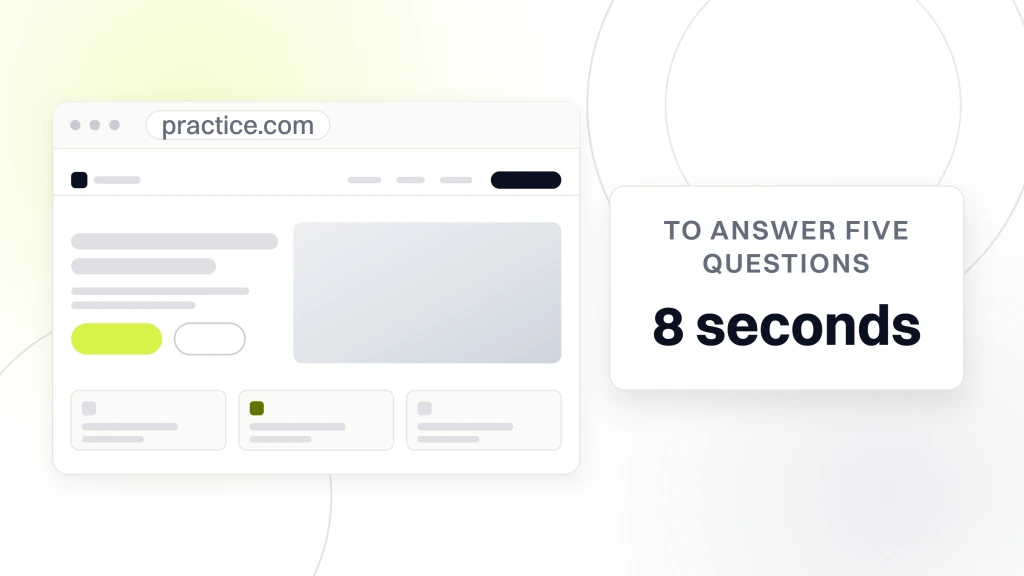
A patient searches for a symptom, a specialist, or a condition. They land on your homepage. If they cannot find the 5 triage answers fast, they pick the next clinic on the list. That is the whole game, and the site either serves it or gets in the way.
The patient is not shopping. They are triaging.
Retail buyers browse. Healthcare patients triage. They already have a problem, and they want the fastest path to a qualified answer. That reframes the whole site. You are not trying to charm anyone. You are the shortest safe route from worry to resolution. Sites that treat patient decisions like retail decisions bury the practical facts under mood photography and headlines about wellness journeys. Patients skip all of that. They scroll for the phone number and the address.
The 5 questions every visit answers in 8 seconds
- Who runs this practice and what is their credential.
- Do they treat what I have.
- Are they close to me or telehealth-friendly.
- Do they take my insurance or offer clear cash pricing.
- How do I actually book without a phone call if I do not want one.
Why the 8-second budget is real
Session-length data across the healthcare accounts we run at Redefine Web shows patients spending a median of 9 to 12 seconds on the first page before they scroll for booking or bounce. That is shorter than a hospital elevator ride. If your hero is a stock photo of a smiling family and a headline about compassionate care, the whole budget gets spent on nothing. That is why we build every healthcare hero around a plain-language service phrase, a specific location, a booking call to action, and the phone number in one glance.
Medical Web Design Starts With the Homepage Hero
Medical web design lives or dies on the hero. It is the only section every visitor sees, and the only one you fully control before scroll behavior kicks in. A working healthcare hero does 4 things at once without cluttering the layout. It names the specialty in plain language. It anchors location so the patient knows you are relevant. It offers a low-friction way to book. And it surfaces trust cues that a nervous patient can verify in a second.
Headline patterns that outperform
The best-performing healthcare hero headlines are boring in the good way. They say what the practice does, for whom, and where. “Family Dentistry for Vista Families Since 2003.” “Pelvic Floor Rehabilitation in New Jersey.” “Emergency Chiropractic Care in Downtown Charlotte.” No poetry. No wellness abstractions. The winning pattern is service plus audience plus location, and it works so well that it answers 3 of the 5 triage questions in one line.
Two calls to action, not one
Every healthcare hero should carry 2 calls to action side by side. A primary button that opens the booking flow, and a secondary click-to-call chip for the patient who wants to talk to a human. Roughly a third of first-time patient inquiries in the accounts we run come by phone even when a full online booking flow exists. Force everyone into a form and you lose that third of your pipeline.
Trust bar under the hero
Directly below the hero, put a thin strip that carries insurance logos, board certifications, and a short review count from Google. Not a full testimonial. Just enough proof to buy the patient another 8 seconds. If the trust bar is missing, the middle of the page has to do double work and rarely gets the chance. The patient has already bounced.
Healthcare Website Design Services That Actually Move Bookings
Healthcare website design services vary in scope depending on the size of the practice, but the categories that move bookings stay consistent. Homepage and hero design. Service page architecture. Provider bio structure. Insurance and pricing pages. Location pages for multi-site practices. Booking flow. Accessibility work. Performance and Core Web Vitals. Analytics and conversion tracking. Any healthcare web design engagement that skips more than one of those pieces is going to under-deliver on the appointment number.
Service page architecture
Each service the practice offers gets its own page, built on the same skeleton. What it treats in plain language. Who it is for. What the visit actually looks like from arrival to check-out. Insurance and pricing information. The provider who leads the service. Two or 3 real patient outcomes without identifying details. A booking module at the bottom. That structure ranks in organic search, converts in paid, and gives referring physicians a clean page to send patients to. For the broader playbook, see our Healthcare Website Design Services.
Provider bios that convert
Provider bios are the second-most-visited page type on healthcare sites behind services. Patients want a photograph they trust, a real credential, and a paragraph of personality. They do not want a CV. Every provider page should carry a portrait shot, a short bio that names training and philosophy, a list of insurances accepted at the provider level, and a booking call to action attached to that individual provider’s calendar.
Location pages for multi-site practices
Multi-location practices need one location page per site, each with its own address, hours, phone number, provider roster, driving directions map, and photos of the actual office. Generic location pages that swap only the city name are the single biggest wasted asset on healthcare sites. Every Redefine Web audit finds them.
Medical and Healthcare Web Design That Passes Compliance
Medical and healthcare web design has to clear compliance obligations that no other vertical carries at the same weight. HIPAA governs how patient data gets collected, transmitted, and stored, which changes the form stack, the analytics stack, and the hosting stack from what a normal marketing site uses. ADA and WCAG accessibility rules apply to every page and every media element. FTC advertising rules limit what the practice can claim about outcomes. All 3 sit on top of the design work and quietly reshape what you can and cannot build.
Forms and the PHI question
Any form that collects protected health information needs an encrypted submission path and a HIPAA-compliant storage backend. Most standard form plugins do not qualify. The design implication is that a healthcare booking form has to be scoped tightly to the details you actually need before the first visit. Full medical history collection belongs in the patient portal after the appointment is booked, not on the public site.
Accessibility is a legal obligation, not a nice-to-have
ADA lawsuits against healthcare websites are a real and growing category. The design implications are concrete. Color contrast has to hit WCAG 2.1 AA on every text element. Every image needs descriptive alt text. Every form field needs a visible label. Every interactive element has to be keyboard-navigable and screen-reader friendly. Video needs captions and transcripts. For the full checklist that our audit team uses, our Accessibility (ADA/WCAG) reference walks through every requirement and the fix pattern for each.
Analytics without exposing PHI
Standard Google Analytics setups on healthcare sites frequently violate HIPAA by capturing URL parameters or form field content that qualify as protected health information. The design and tracking build has to strip those signals at the source, use server-side tagging where possible, and keep patient identifiers out of the analytics stack entirely.
Healthcare Web Designers Do 3 Things Differently
Healthcare web designers who consistently launch appointment-generating sites behave differently from generalist web designers in 3 specific ways. They design content-out rather than aesthetic-first. They treat compliance as a design constraint that shapes layout, not as a post-launch checklist. And they measure success in booked appointments, not in visual awards.
Content-out design
Content-out means the copy for every section gets written before the wireframe is drawn. The design serves the argument the copy is making, not the other way around. Healthcare punishes aesthetic-first design, since the patient wants information dense enough to make a real decision. A gorgeous layout with 3 sentences of copy per screen does not carry enough signal to close a nervous first-time visitor.
Compliance-shaped layout
Real healthcare designers know that a 2-column form with floating labels fails accessibility, that a hero video with autoplay audio violates WCAG, and that a carousel with keyboard traps drops the whole page below AA. They design around those limits from the first sketch instead of patching at QA. The layouts that survive both compliance and conversion look calm, generous, and slightly boring by consumer-brand standards. That is the point.
Booked appointments as the north star
Every design decision on a healthcare project gets graded against one number. Appointments booked per session. Not pageviews. Not time on page. Not bounce rate. Booked appointments. If a hero redesign grows scroll depth but drops booked appointments, the redesign is wrong. If a color change flattens the visual hierarchy but pushes more people through the booking flow, the color change is right. Every other metric is a proxy at best.
Comparing Healthcare Web Design Approaches Side by Side
Not every healthcare practice needs the same design treatment. A single-provider family practice is a different job from a 14-location specialty network. The table below shows the design shape that fits each type of practice and the trap each one usually walks into.
| Practice type | Design shape | Booking flow | Common trap |
|---|---|---|---|
| Solo primary care | Single-provider hero, service list, insurance page | Direct online booking to one calendar | Buried phone number |
| Multi-provider clinic | Provider grid, service pages, per-provider bios | Booking form routed by provider or symptom | Generic provider bios that all read the same |
| Multi-location network | Location grid, per-location pages, unique NAP | Location-first booking with local phone | Cloned location pages that hurt local SEO |
| Specialty group (14+ sites) | Symptom-first navigation, condition-led content | Symptom triage into the right specialist | Corporate homepage that hides the specialty |
| Telehealth-first | Video-forward hero, licensure map, insurance | Instant scheduling with license validation | State licensure not surfaced early enough |
Reading the table honestly
The common trap column matters more than the design shape column. Every healthcare practice we audit walks into one of those 5 traps. The redesign work is often less about visuals and more about pulling the practice out of the trap costing them appointments. If your solo practice has the phone number buried in the footer, or your network has cloned location pages, fix that first regardless of what the rest of the site looks like. Traps cost appointments today. Visual polish and site age do not change that math.
Healthcare Web Design Case Study From a Real Client
Pelvic Rehabilitation Medicine came to Redefine Web with scattered content and a website that could not scale across 14 locations. The specialty is pelvic-pain treatment, an underserved category with a very specific patient journey. The redesign work touched service architecture, provider bios, location pages, and a dedicated patient community platform. Over the 2023 to 2024 engagement, organic keyword rankings expanded 174% year over year and organic traffic grew 166%. The patient community launched as a support hub for pelvic-pain and endometriosis patients, which pulled repeat-visit traffic that had never existed on the previous site.
What actually moved the number
The keyword growth did not come from adding more content. It came from restructuring the service architecture so each condition had its own page with its own patient journey. Search engines could finally index the depth of the practice’s expertise, and patients searching for narrow symptom terms landed on a page that spoke to their exact situation instead of a generic services list.
Why the community platform mattered
Patients with chronic conditions come back to trusted sources for years, not just at the moment of booking. A dedicated community platform gave them a reason to return, which built organic backlink authority and repeat traffic no marketing-brochure site could earn. Every specialty practice can copy this lesson. Give patients a reason to return beyond booking.
Best Healthcare Website Design Depends on Speed and Vitals
Best healthcare website design is a phrase that gets used loosely, but the technical floor is measurable. Core Web Vitals decide whether Google surfaces the site in mobile search and whether patients on 4G at the coffee shop stay long enough to see the booking button. The technical baseline is Largest Contentful Paint under 2.5 seconds, Interaction to Next Paint under 200 milliseconds, and Cumulative Layout Shift under 0.1. Sites that miss any of those benchmarks bleed appointments before design even gets a chance to work. For the full breakdown, our Core Web Vitals reference walks through diagnostics and fixes.
Image weight is the biggest offender
Most healthcare sites we audit are carrying 2 to 5 megabytes of image weight per page. Provider portraits at 3000 pixels wide. Facility photos exported at full resolution from an SLR. Hero backgrounds that could be one-tenth the file size in WebP. Compressing images and switching formats often takes 40% off page weight in an afternoon, which usually clears the LCP threshold on its own.
Font stacks and CLS
Custom fonts loaded asynchronously without a fallback cause layout shifts as the page rehydrates. That kills Cumulative Layout Shift scores and looks visually chaotic to the patient. Every healthcare project should launch with font-display swap, a matched fallback stack for metric compatibility, and preloaded critical fonts to keep CLS below 0.1.
Third-party scripts audit
Every third-party script on a healthcare site earns its keep or gets removed. Chat widgets, review widgets, insurance verification embeds, Google Tag Manager containers, and analytics libraries stack up fast. We routinely find healthcare sites running 8 or 9 third-party scripts, none audited for months. Trim the stack, defer what stays, and INP scores usually recover.
Healthcare Website Development, Security, and Hosting
Healthcare websites live on stacks that carry compliance and security obligations most agencies never think about. HIPAA hosting, encrypted forms, secure headers, patched CMS installs, and enforced backups all sit in the development and hosting layer, not the design layer. But they shape design choices constantly. They limit which plugins, which form stacks, and which third-party integrations you can safely launch. For the development-side breakdown, see our Healthcare Website Development reference.
Form security and BAAs
Any vendor touching PHI needs a signed Business Associate Agreement. That limits the form platform, the email platform, and the storage layer. Standard Contact Form 7 with SMTP through Gmail is not compliant. Neither is HubSpot without the healthcare-tier BAA. The compliant options exist. Specify them at the design phase so the wireframes match what the backend can deliver.
Backups, patching, and uptime
Healthcare sites cannot afford outages during business hours. Nightly encrypted backups, weekly patching, and 24/7 uptime monitoring are baseline requirements, not premium add-ons. Our Security Features for Healthcare Websites reference lays out the specific stack we recommend for practices that have not yet standardized.
Where hosting choices bite design
Hosting decisions that seemed cheap at launch cost design flexibility later. Cut-rate shared hosting rarely supports the caching, CDN integration, and image optimization Core Web Vitals demand. Practices that discover this at year 2 often need to migrate hosts during the redesign, which adds a month to the timeline and an unplanned budget line.
Healthcare Website Redesign Signals You Should Actually Redesign
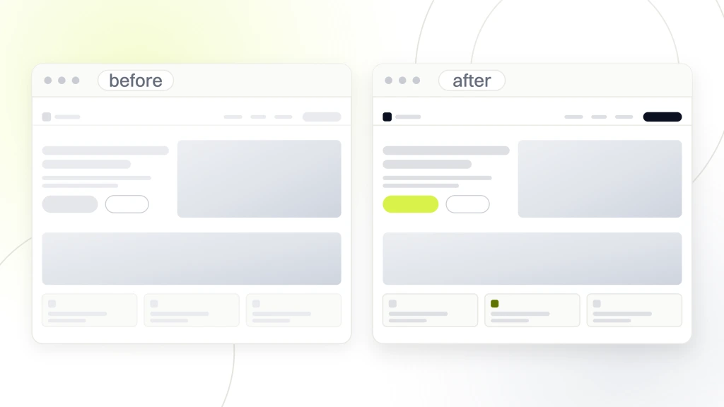
Not every practice needs a redesign. Some need a rebuild. Some need a targeted set of fixes. The 5 signals below tell you which category the current site is in. Any 2 of these at the same time and a redesign is usually the right call. Any 3 and it is overdue. For the deeper decision framework, see our Website Redesign Benefits reference.
- The site is not responsive on modern phones and the mobile bounce rate is above 65%.
- Core Web Vitals are failing on at least 2 of the 3 metrics on mobile.
- The booking flow is a phone number with no online alternative.
- Accessibility audit finds more than 20 WCAG 2.1 AA violations.
- The CMS is on an unpatched version and the plugin stack has not been reviewed in over a year.
The redesign order that actually works
Fix the booking flow first. It starts paying back appointments right away. Then fix mobile responsiveness and Core Web Vitals, since those affect every page. Then rebuild service and location page structures for organic search. Homepage visuals come last, since they are the easiest to iterate on later once traffic and booking mechanics work.
Signals a redesign is not the answer
If the site is technically sound and looks a little dated, a redesign is expensive theater. Skip it. Invest in content, SEO, and paid acquisition instead. Design fatigue is a marketing team problem, not a patient problem. Patients do not tell you a site looks old. They tell you by not booking.
Turning a Healthcare Website That Books Into an Acquisition Engine
A healthcare website that books becomes a real patient acquisition engine when 3 loops are running at the same time. Organic search brings the top of funnel in through condition and symptom pages. Paid search catches high-intent bottom-of-funnel searches that organic cannot reach fast enough. And on-site optimization keeps improving the conversion rate on the traffic those two channels bring. If one of those 3 loops is broken, the other 2 stall. Our Healthcare Web Marketing Strategy reference walks through the full stack.
The design side of paid
Paid search campaigns need landing pages that match the ad copy tightly. If the ad promises pediatric urgent care and the landing page shows the full family practice list, the ad quality score suffers and the CPC climbs. Each meaningful paid campaign needs a matched landing page designed for that campaign’s audience, and that requirement lives on the design team.
Booking is a design discipline, not a plugin choice
The booking module carries more design load than any other component. It has to feel safe, feel fast, and feel understandable to a patient who has never used it before. That means field labels in plain language, no more than 5 steps end-to-end, mobile-first layout, clear error states, and a confirmation screen that tells the patient exactly what happens next. Skip any of those and the module feels unsafe, and unsafe booking modules lose conversions.
The one design tic every healthcare site can afford to lose
Stock photography of doctors laughing at laptops. Nobody has ever booked an appointment after seeing a doctor genuinely enjoying a spreadsheet. If your site has 3 of those, it has 3 too many. Replace them with real photos of the actual providers and the actual office, and conversion rates rise for reasons nobody has to A/B test.
What We Ask Before Starting a Healthcare Practice Web Design Engagement
Before we quote a healthcare practice web design project, we ask a short list of questions that shape the whole scope. The questions are boring on purpose. They force the practice to decide what matters before we spend a day sketching. Any agency that skips this list is guessing.
- How many appointments per month does the practice book today from the website, and what is the target 12 months out.
- Which services drive the majority of revenue, and which the current site fails to serve.
- How many locations, and what is the plan for the next 24 months.
- What is the current booking system, and can it stay or does it need to move.
- Who owns HIPAA compliance internally, and which vendors already have signed BAAs.
- What accessibility issues has the practice already had flagged.
- What is the primary insurance mix, and which payers need to be surfaced on-page.
Why these questions shape the quote
The answers decide whether the project is a homepage refresh, a full rebuild, or a multi-phase engagement that touches SEO, paid, and analytics too. A single-provider practice booking 25 patients a month through the website has very different needs from a 14-site network booking 4,000. Same design vocabulary, wildly different scope. The questions above are how the two get separated.
Timelines that are realistic
Realistic timelines for a healthcare web design project run from 6 weeks for a small single-provider refresh to 5 months for a full multi-location rebuild with SEO migration and paid campaign relaunch. Anything under 4 weeks is either a tiny scope or a red flag. Anything over 8 months without staged deliverables is a scope-management failure waiting to happen.
Where the budget usually goes
On a typical healthcare rebuild the budget splits roughly 30% design and UX, 25% development, 15% copy and content, 15% SEO and analytics setup, and 15% QA including accessibility, security, and performance testing. Practices that under-invest in the last 3 usually launch a site that looks great on day one and stops generating bookings by month 3.
Make Healthcare Web Design Work For Your Practice
Healthcare web design is a working discipline, not a mood board. When you get the fundamentals right, the site starts booking appointments quietly and consistently. When you skip them, no amount of visual polish makes up for the gaps. For deeper reading on the technical floor, see the Google Core Web Vitals documentation, the W3C WCAG 2.1 quick reference, and the HHS HIPAA guidance for professionals. If you want a working audit of where your current site sits against the checklist above, our team runs paid diagnostic engagements that end in a fix priority list you can hand to any developer.